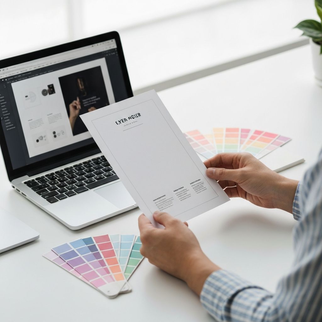
How to Design a Flyer That Actually Generates Business
Learn how to design flyers that drive real business results with practical layout, copy, and distribution tips that turn paper into paying customers.
How to Design a Flyer That Actually Generates Business
In an age of digital ads, social campaigns, and AI-driven marketing, the humble flyer might seem like a relic. But local businesses, event organizers, and even tech startups continue to use flyers because they work — when designed correctly. A well-crafted flyer can generate calls, foot traffic, sign-ups, and sales at a fraction of the cost of paid digital media. The problem is that most flyers fail. They are crammed with text, hard to read, generic, and forgettable. Designing a flyer that actually generates business requires the same strategic thinking as a high-converting landing page, distilled into a single physical page.
How WebPeak Designs Flyers That Drive Real Results
The team at WebPeak helps businesses worldwide create flyers that earn their keep. They blend strategic copywriting, conversion-focused design, and print-ready production into one streamlined service. Their graphic design experts understand that a flyer is not just decoration — it is a sales tool. Whether you need event flyers, promotional handouts, real estate listings, or service brochures, they design pieces that capture attention, communicate value, and prompt immediate action.
Start With a Specific Goal and Audience
Every effective flyer starts with two questions: Who is this for, and what action do I want them to take? A flyer designed for busy commuters needs to communicate in three seconds. A flyer for a community event has more time. A flyer for a B2B service requires credibility signals. Get specific about your audience's age, location, daily routine, and motivation, then design backwards from there.
Define a single primary action: call this number, scan this QR code, visit this URL, claim this offer. Multiple competing actions split attention and reduce response rates. The clearer and simpler the call to action, the higher the conversion. "Call today for a free consultation" beats "Learn more about our wide range of services" every time.
Master the Visual Hierarchy
The eye scans flyers in a Z-pattern: top-left to top-right, diagonal to bottom-left, then to bottom-right. Place your most important element — usually the headline or offer — at the top. Reserve the bottom-right area for your call to action and contact details, since that is where the eye finishes its journey.
Use clear hierarchy to guide attention: a dominant headline, a secondary value statement, supporting bullet points, and a bold CTA. Limit yourself to two fonts maximum and three colors. Generous white space is your friend — it signals professionalism and improves readability. Resist the temptation to fill every inch of the page; cluttered flyers feel cheap and overwhelming.
Write Copy That Sells, Not Just Describes
The most common flyer mistake is writing about features instead of benefits. Customers do not care that your gym has "40 cardio machines" — they care that they will "feel confident in their swimsuit by summer." Translate every feature into a tangible outcome the reader can imagine.
Use power words and numbers. "Save 30%", "Free for 14 Days", "Trusted by 500+ Local Families" all create credibility and urgency. Add testimonials, awards, or guarantees if you have them. Keep paragraphs short, use bullet points for scannability, and end with an unmistakable call to action backed by a deadline ("Offer ends Friday"). Pair this with smart digital marketing follow-up to capture and nurture every lead the flyer generates.
Choose the Right Format and Distribution Strategy
Standard flyer sizes — A5, A4, and DL (long, narrow) — each serve different purposes. A5 works great for handouts and direct mail, A4 commands attention on noticeboards, and DL fits perfectly into envelopes or display stands. Premium paper stock (130gsm or higher) and a soft-touch laminate signal quality, especially for high-end services.
Distribution is where most flyers die. Random street handouts have abysmal response rates. Instead, target specific locations where your audience already gathers: cafes, gyms, community boards, partner businesses, or door-to-door in carefully selected neighborhoods. Track responses with unique URLs, QR codes, or promo codes so you know exactly which distribution channel is paying off, and double down on what works.
Frequently Asked Questions
What is the most effective flyer size for small businesses?
A5 (148×210mm) is the sweet spot for most small businesses. It is large enough to communicate clearly, but small enough to be cost-effective for printing and easy for customers to keep.
How much text should a flyer contain?
Aim for under 150 words total. The headline, sub-headline, 3–5 bullet points of benefits, and a clear CTA with contact details are usually enough. Less is more.
Should I print flyers on glossy or matte paper?
Glossy paper feels premium and makes colors pop, ideal for retail and luxury. Matte feels modern and is easier to write on, ideal for B2B, real estate, and educational content.
How can I measure if my flyer campaign is working?
Use unique tracking elements: dedicated phone numbers, QR codes that lead to landing pages, or promo codes. Compare response rates to distribution numbers to calculate cost per lead.
Are physical flyers still relevant in 2026?Yes. Physical flyers remain highly effective for local businesses, events, real estate, and direct mail campaigns, particularly when integrated with digital follow-up systems.Conclusion
A great flyer is part graphic design, part copywriting, part marketing strategy. By starting with a clear goal, designing for visual hierarchy, writing benefit-driven copy, and choosing smart distribution, you can transform a simple piece of paper into one of your most reliable lead-generation tools. The businesses that still win with flyers are not the ones with the prettiest designs — they are the ones that treat every flyer as a measurable, strategic campaign. Apply these principles, and your next flyer will not just look good; it will pay for itself many times over.
Related articles
 Graphic Design
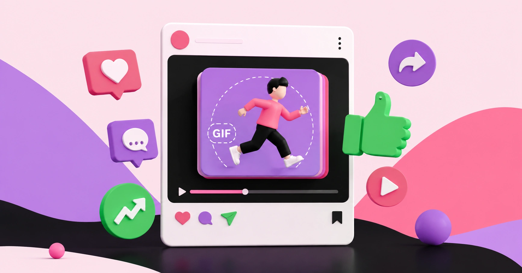
Why Are Animated GIFs Useful on Social Media?
Discover why animated GIFs boost engagement, convey emotion, and grab attention on social media, plus how brands use them effectively.
 Graphic Design
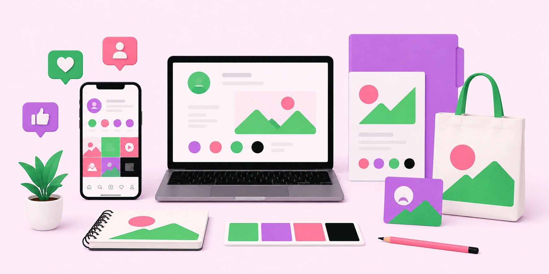
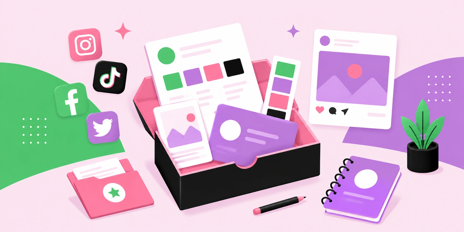
What Is a Social Media Kit? A Practical Guide for Brands and Creators
Learn what a social media kit is, what to include in one, and how a well-built kit keeps your branding consistent and saves hours across every platform.
 Graphic Design
What Is a Social Media Kit?
A social media kit is a branded toolkit of templates, logos, colors, and guidelines that keeps your social content consistent. Learn what to include and why.