How to Create a YouTube Thumbnail That Gets More Views
Learn how to design YouTube thumbnails that boost click-through rates with proven design tips, color strategies, and real-world examples that drive views.
How to Create a YouTube Thumbnail That Gets More Views
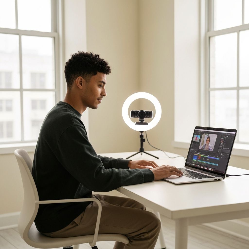
YouTube thumbnails are the single most important factor in determining whether your video gets clicked or scrolled past. With over 500 hours of video uploaded every minute, your thumbnail has milliseconds to compete for attention against celebrity creators, news clips, and algorithm darlings. Even a great video with a weak thumbnail will struggle to reach an audience, while an average video with a magnetic thumbnail can rocket into millions of views. The good news is that designing high-performing thumbnails is a learnable skill — one rooted in psychology, contrast, and storytelling rather than expensive equipment or design degrees.
How WebPeak Helps Creators Win the Thumbnail Game
Behind every viral channel is a thumbnail strategy, and the team at WebPeak helps creators and brands design thumbnails that consistently outperform the competition. Their graphic design specialists understand the psychology of click-through behavior — combining bold typography, expressive imagery, and strategic color theory to make your videos impossible to ignore. Whether you are a solo creator, a podcast brand, or a business publishing weekly content, they craft thumbnails that align with your channel identity and drive measurable lifts in CTR.
Understand What Makes Viewers Click
Before opening Photoshop, study the behavior you are trying to influence. Viewers scan thumbnails in less than half a second, looking for one of three signals: curiosity ("What is happening here?"), value ("This will help me"), or emotion ("This person looks shocked, excited, or relatable"). Your thumbnail must instantly communicate at least one of these.
Open YouTube and analyze the top-performing videos in your niche. Notice the patterns: large faces with strong expressions, bright contrasting colors, minimal text, and clear focal points. This is not coincidence — it is the result of millions of A/B tests by creators who learned what works. Your job is not to copy, but to identify the underlying principles and adapt them to your brand.
Master Color, Contrast, and Composition
Bright, saturated colors stand out against YouTube's white interface. Reds, yellows, and electric blues consistently outperform muted palettes. Use 2–3 dominant colors maximum, and ensure high contrast between your subject and background. A common pro technique is to add a thin colored stroke around the main subject to separate them from busy backgrounds.
Apply the rule of thirds and place your most important element — usually a face or object — slightly off-center. Leave breathing room and avoid cramming the frame. Remember that thumbnails appear at multiple sizes, from tiny mobile previews to large TV displays. Always test your design at 120×68 pixels (the smallest YouTube preview) to confirm the message still reads clearly.
Use Faces, Expressions, and Storytelling
Human faces are one of the strongest psychological triggers in design. The brain is wired to detect and respond to faces, especially expressive ones. Surprised, excited, or curious expressions consistently outperform neutral ones. If your video features a person, put their face in the thumbnail with an emotion that matches the video's energy.
If your content does not feature a person, use objects or scenes that imply a story — a melted credit card for a finance video, a glowing keyboard for a coding tutorial, a half-finished dish for a recipe reveal. Storytelling visuals invite viewers to fill in the blanks, which builds curiosity and drives clicks. Pair compelling thumbnails with strong titles and on-page content using thoughtful content writing to compound your video's discoverability.
Test, Iterate, and Stay Consistent
Use YouTube's built-in thumbnail testing feature (or third-party tools like TubeBuddy and VidIQ) to A/B test variations. Even minor tweaks — changing a facial expression, swapping a background color, or shortening text — can lift CTR by 30% or more. Track which thumbnails perform best for your audience and document the patterns.
Consistency matters too. Successful channels develop a recognizable thumbnail style — a signature color, a recurring layout, a familiar font — so subscribers instantly recognize new uploads. This visual brand identity drives loyalty, not just one-time clicks. Audit your channel page quarterly and refresh older thumbnails that no longer reflect your current style or quality standards.
Frequently Asked Questions
What size should a YouTube thumbnail be?
YouTube recommends 1280×720 pixels (16:9 ratio) with a minimum width of 640 pixels and file size under 2 MB. Use JPG, PNG, GIF, or BMP formats.
How much text should a thumbnail contain?
Less is more. Aim for 3–5 words maximum, and only when text adds critical information not visible in the imagery. The text must be legible at small mobile sizes.
Should every video have a custom thumbnail?
Absolutely. Auto-generated YouTube thumbnails almost always perform worse than custom ones. Custom thumbnails are one of the most important investments any creator can make.
What is a good click-through rate for a YouTube thumbnail?
Anything above 4% is considered good for most channels, while top creators often achieve 8–12%. CTR depends heavily on niche, audience size, and impression sources.
Can I use AI tools to design YouTube thumbnails?
Yes, AI image generators and design tools can speed up your workflow, but human judgment remains crucial for emotional resonance, brand consistency, and high-performing creative decisions.
Conclusion
Designing a YouTube thumbnail that gets more views is part psychology, part design craft, and part relentless testing. By understanding viewer behavior, mastering color and composition, leveraging emotion, and committing to a consistent visual style, you can dramatically increase your click-through rate and grow your channel faster. Treat every thumbnail as a tiny billboard for your content — because that is exactly what it is. Invest the same care into your thumbnail as you do into your video, and the algorithm will reward you accordingly.
Related articles
 Graphic Design
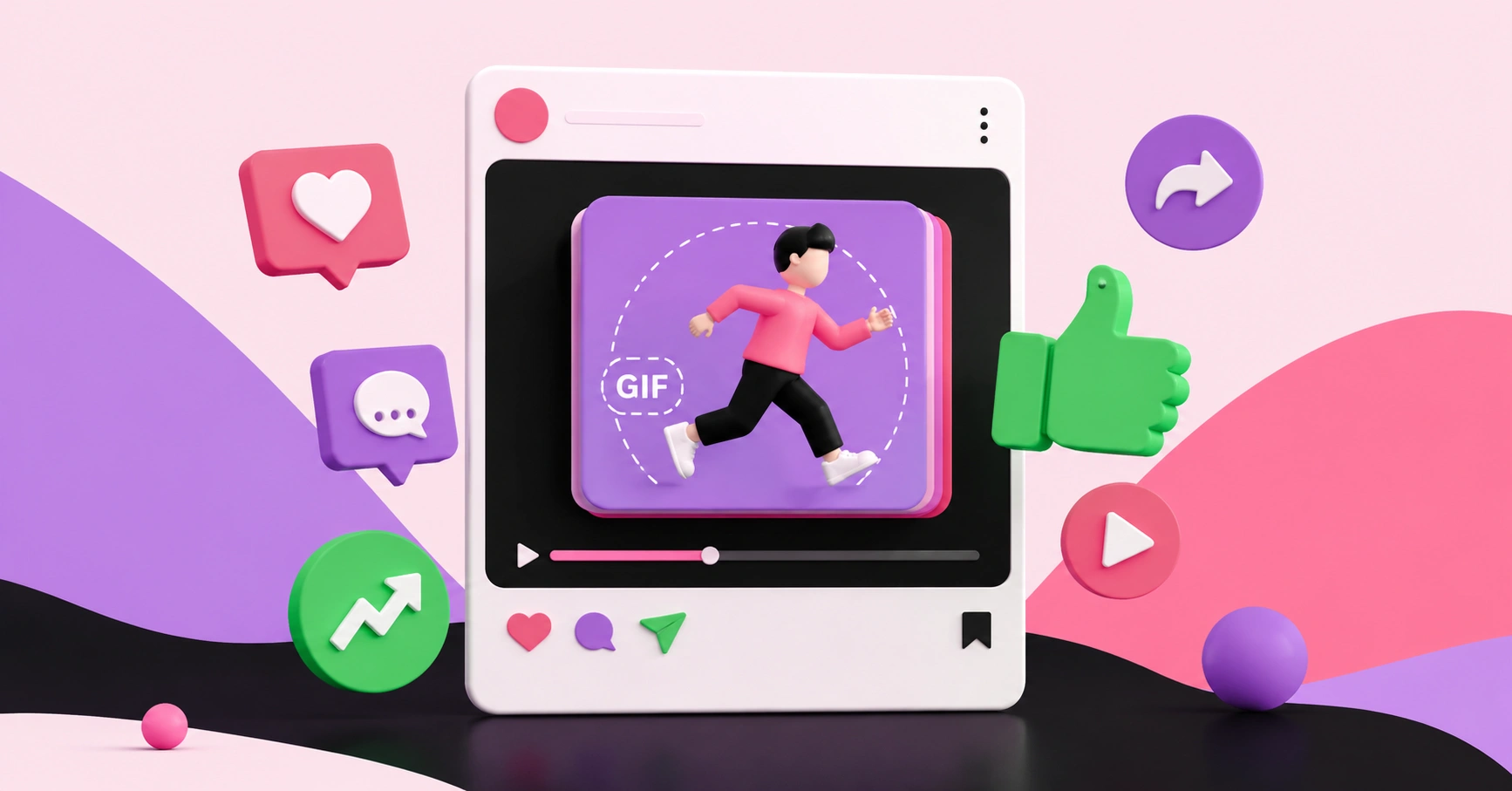
Why Are Animated GIFs Useful on Social Media?
Discover why animated GIFs boost engagement, convey emotion, and grab attention on social media, plus how brands use them effectively.
 Graphic Design
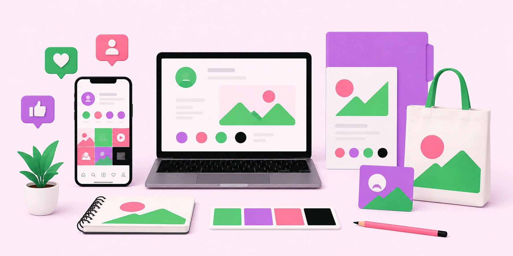
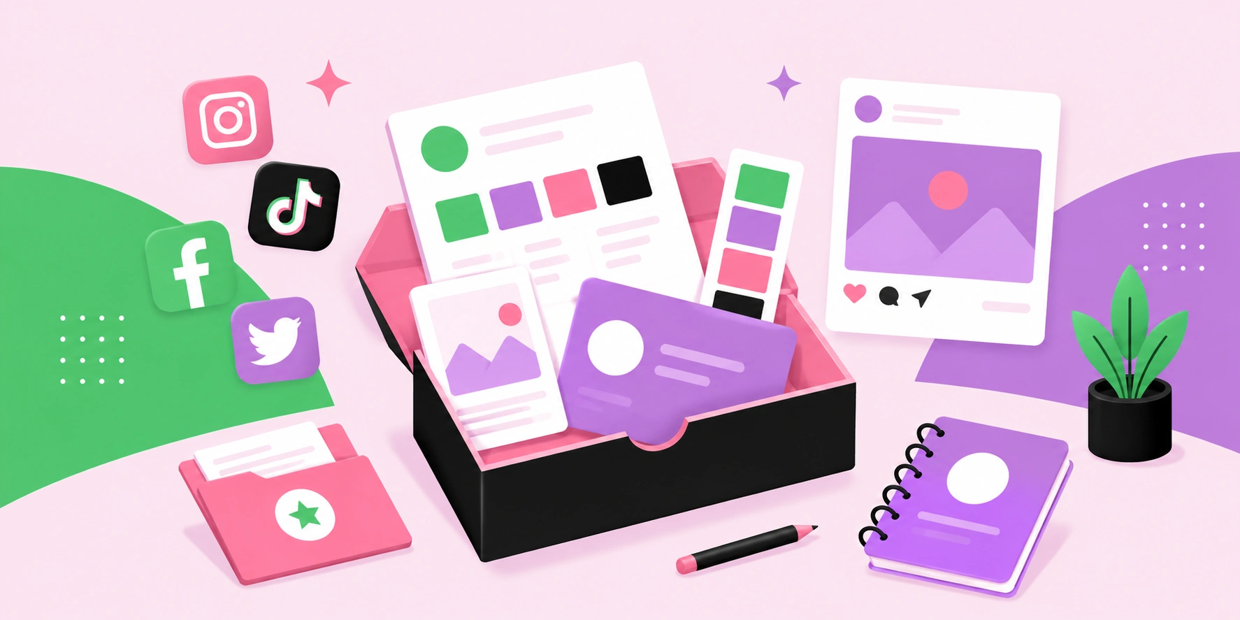
What Is a Social Media Kit? A Practical Guide for Brands and Creators
Learn what a social media kit is, what to include in one, and how a well-built kit keeps your branding consistent and saves hours across every platform.
 Graphic Design
What Is a Social Media Kit?
A social media kit is a branded toolkit of templates, logos, colors, and guidelines that keeps your social content consistent. Learn what to include and why.