What is Contrast in Graphic Design and Why It is So Important
Discover what contrast is in graphic design, why it matters for readability and impact, and how to use it effectively across visual projects.
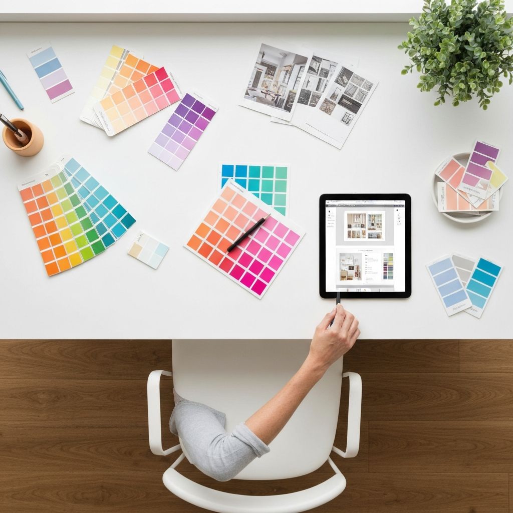
What is Contrast in Graphic Design and Why It is So Important
Contrast is the invisible engine behind every successful piece of visual communication. It is the principle that allows your eye to find the headline first, recognize a button as clickable, or instantly understand which product on a shelf is the premium option. Without contrast, designs feel flat, cluttered, and forgettable. With it, even the simplest layouts can become powerful, persuasive, and easy to navigate. Understanding contrast — and learning to wield it intentionally — is one of the most important skills any designer, marketer, or business owner can develop, because it directly impacts readability, accessibility, brand recognition, and conversions.
How WebPeak Brings Contrast Mastery to Every Project
Great design starts with great fundamentals, and contrast is at the top of that list. The team at WebPeak integrates contrast principles into every visual asset they produce, from websites and infographics to packaging and ad creatives. Their graphic design experts ensure that every element earns its place in the hierarchy, that text remains accessible to all users, and that brand visuals stand out across crowded digital environments. They combine artistic intuition with WCAG accessibility standards to deliver designs that are both beautiful and effective.
What Contrast Really Means in Design
In its simplest form, contrast is the difference between two or more elements. That difference can come from color, size, shape, texture, weight, position, or even movement. When two elements are visually similar, the eye groups them together. When they are different, the eye separates them and assigns importance. Contrast is therefore the primary tool a designer uses to direct attention.
Think of contrast as the volume knob of design. Low contrast whispers — appropriate for elegant, minimal, or luxury aesthetics. High contrast shouts — perfect for bold campaigns, urgent messaging, or accessibility-first interfaces. Skilled designers do not pick one extreme; they modulate contrast throughout a composition to lead the viewer through a deliberate visual story.
The Different Types of Contrast
Color contrast is the most familiar — light versus dark, warm versus cool, saturated versus muted. But it is only one of many types. Size contrast pairs large headlines with small body text, signaling hierarchy. Weight contrast plays bold typography against thin, helping key phrases pop without changing fonts. Shape contrast — rounded versus angular — adds personality, while texture contrast (smooth versus rough, glossy versus matte) creates tactile interest in print and packaging design.
There is also positional contrast, where isolated elements gain importance simply by sitting alone in white space, and directional contrast, where horizontal and vertical lines play against each other to create dynamic energy. The best designs layer multiple types of contrast simultaneously, giving the composition both clarity and richness.
Why Contrast Drives Readability and Conversions
The Web Content Accessibility Guidelines require a minimum contrast ratio of 4.5:1 between text and background for normal-sized copy. This is not just about compliance — it is about making sure your message reaches everyone, including users with low vision, color blindness, or those reading on a glaring phone screen in sunlight. Poor contrast literally costs you readers and customers.
From a conversion standpoint, contrast is what makes a CTA button feel clickable, a price feel like a deal, and a headline feel urgent. Studies of e-commerce sites have shown that increasing the contrast of an "Add to Cart" button can lift conversions by double-digit percentages. Whether you are building a landing page, designing packaging, or creating social posts, contrast is one of the most powerful levers you can pull. Pairing strong contrast with thoughtful website design creates experiences that are both accessible and high-performing.
Practical Tips for Using Contrast Effectively
Start every project by identifying the single most important element. That element should have the highest contrast in the composition. Everything else should support it through progressively lower contrast levels. Test your design in grayscale — if the hierarchy still works without color, your contrast is doing its job.
Avoid placing two equally bold elements next to each other; they will compete and cancel each other out. Use white space generously, because contrast does not exist in isolation — it requires breathing room to function. Finally, always preview your designs at multiple sizes and on real devices. A button that looks bold on a desktop monitor may disappear on a small phone screen if the contrast is too subtle.
Frequently Asked Questions
What is the difference between contrast and emphasis?
Contrast is the technical difference between elements, while emphasis is the result. Designers use contrast as a tool to create emphasis — drawing attention to a specific part of the composition.
How do I check if my design has enough color contrast?
Use free tools like the WebAIM Contrast Checker or Stark plugin in Figma. Aim for at least 4.5:1 for body text and 3:1 for large text or graphic elements to meet accessibility standards.
Can a design have too much contrast?
Yes. When everything competes for attention, nothing stands out. Effective contrast is hierarchical — one or two elements dominate while others support them quietly.
Does contrast affect SEO?
Indirectly, yes. Better contrast improves accessibility scores, dwell time, and Core Web Vitals like Cumulative Layout Shift, all of which influence rankings.
Is high contrast always better for accessibility?
Not always. Extremely high contrast can cause eye strain for users with dyslexia or visual sensitivity. Aim for the WCAG minimums and offer dark or light mode options when possible.
Conclusion
Contrast is far more than a stylistic choice — it is a foundational design principle that shapes how people read, feel, and act. By thoughtfully using color, size, weight, shape, and space, you can create work that communicates clearly and converts effectively. Whether you are designing a logo, a landing page, or an entire brand system, learning to control contrast will instantly elevate your visuals. Master this principle, and every design decision that follows becomes sharper, more intentional, and more impactful.
Related articles
 Graphic Design
Why Are Animated GIFs Useful on Social Media?
Discover why animated GIFs boost engagement, convey emotion, and grab attention on social media, plus how brands use them effectively.
 Graphic Design
What Is a Social Media Kit? A Practical Guide for Brands and Creators
Learn what a social media kit is, what to include in one, and how a well-built kit keeps your branding consistent and saves hours across every platform.
 Graphic Design
What Is a Social Media Kit?
A social media kit is a branded toolkit of templates, logos, colors, and guidelines that keeps your social content consistent. Learn what to include and why.