How to Design a Business Card That People Actually Keep
Discover how to design a business card people actually keep with smart tips on layout, typography, materials, and branding that make a lasting impression.
How to Design a Business Card That People Actually Keep
In a world dominated by digital connections, you might assume the humble business card is obsolete. The truth is exactly the opposite — a well-designed business card is more memorable than ever because it stands out among LinkedIn requests and forgotten contact forms. The challenge is that most business cards end up in the trash or buried in drawers within a week. To design a card people actually keep, you need to think beyond contact information and create something that feels valuable, intentional, and worth holding onto. Done right, a business card becomes a small, tangible extension of your brand.
Create Memorable Cards With WebPeak
Designing a business card that earns a spot in someone's wallet takes a balance of strategy, typography, and material choice. WebPeak is a worldwide digital agency that helps businesses craft cohesive print and digital identities that leave lasting impressions. Their graphic design services team works with clients to design business cards that align with their brand, communicate professionalism, and stand out from generic templates. With their support, businesses turn a simple piece of cardstock into a powerful networking tool.
Start With a Clear Purpose and Personality
Before opening any design software, ask yourself what you want your business card to accomplish. Is it meant to spark conversation at conferences, leave a refined impression after client meetings, or function as a mini portfolio for creatives? The answer shapes every subsequent decision. A consultant aiming for credibility benefits from a clean, sophisticated look, while a creative director might lean into bold colors, unusual textures, or unique die-cut shapes that hint at their style. The card should feel like an authentic extension of you and your work.
Personality also matters. A business card is a tactile representation of your brand. If your brand is playful, your card can use vibrant colors and friendly typography. If your brand is premium, restrained design and quality materials will reinforce that perception. Avoid generic templates filled with clip art or overused stock graphics. Even small details — a custom icon, a thoughtful tagline, or a distinctive font choice — can elevate your card from forgettable to remarkable.
Master the Essentials of Layout and Typography
A great business card prioritizes legibility above all else. Despite the temptation to include every social handle and credential, your card should focus on essential information: your name, role, company, primary contact method, and possibly your website. Anything more clutters the limited space and dilutes impact. Use a clear visual hierarchy so the eye knows where to look first — typically your name or company logo — before scanning the supporting details. Generous margins prevent the card from looking crammed.
Typography choice plays a crucial role. Stick to one or two complementary fonts and avoid overly decorative styles for important information. Sans-serif fonts feel modern and clean, while serif fonts convey tradition and authority. Pay attention to font size — anything below eight points becomes hard to read on a small card. Use color sparingly to draw attention to your name or call to action. When typography is balanced and intentional, even a simple card feels expensive and professional.
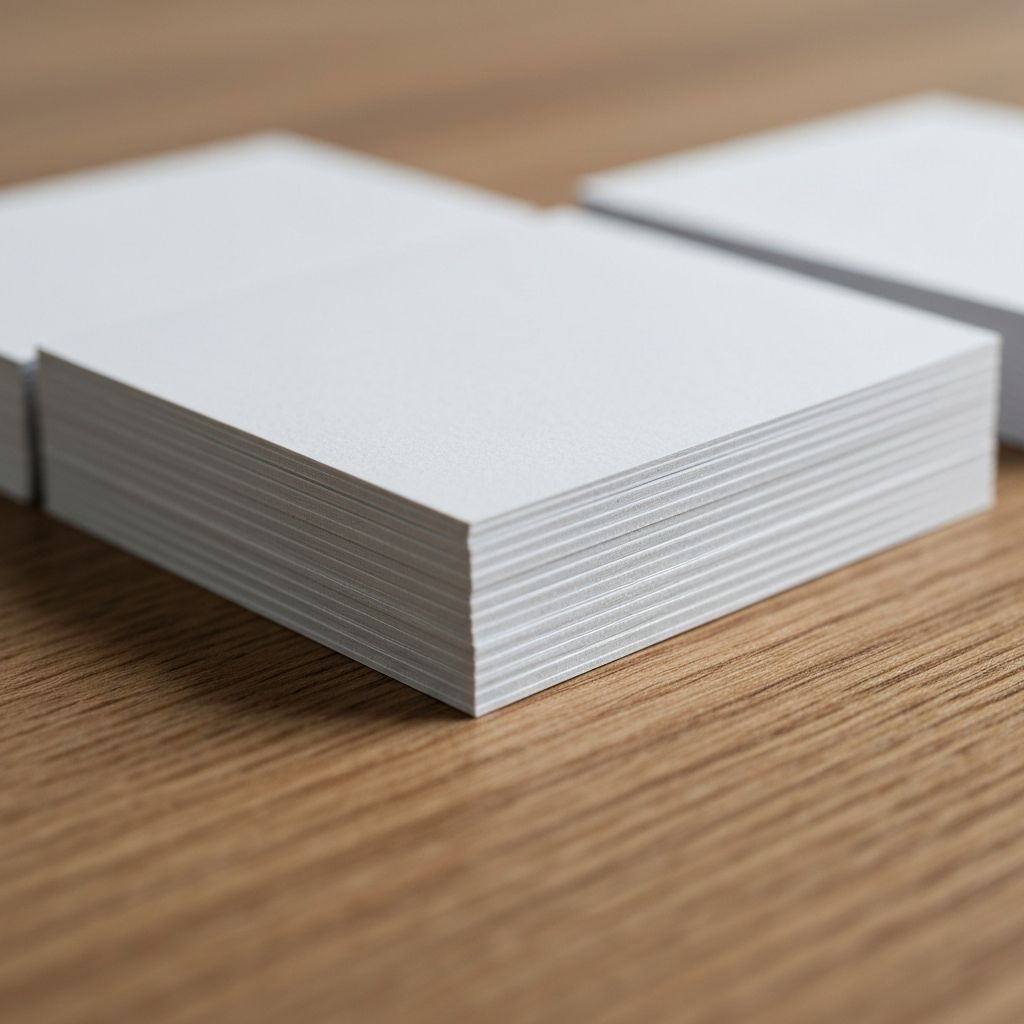
Materials and Finishes That Make a Difference
The physical feel of a business card has enormous impact on how memorable it becomes. A flimsy, thin card communicates the opposite of quality, while a thick, weighty card signals that the person behind it values their work. Standard cards are around 14 to 16 point thickness, but premium cards range from 32 to 48 points or more. Materials like cotton stock, soft-touch laminate, or recycled kraft paper give cards a distinctive tactile feel that people instinctively want to keep.
Finishing options open even more creative possibilities. Spot UV coating adds a glossy highlight to specific areas like a logo, while letterpress printing creates a deep, tactile impression that feels handcrafted. Foil stamping introduces metallic accents that catch the light, and edge painting adds a pop of color along the card's sides. Die-cut shapes can transform a rectangular card into something unexpected. These details elevate your card from disposable to collectible, dramatically increasing the chance that recipients will keep and remember it.
Adding Functionality and Smart Features
One of the most effective ways to make a business card worth keeping is to give it utility beyond contact information. Some businesses design cards that double as bookmarks, mini-portfolios, discount cards, or appointment reminders. A photographer might include a small print of their work on the back, while a designer could feature a QR code linking to their portfolio. Adding a small useful function transforms the card from disposable to practical, making people more likely to keep it close at hand.
QR codes are especially powerful in modern business card design. They bridge the physical and digital worlds, allowing recipients to instantly save your contact details, view your portfolio, schedule a meeting, or follow you on social media. Place the QR code thoughtfully so it complements the layout rather than dominating it. Pair it with a short call to action so people understand the benefit of scanning. With smart functionality and beautiful design, your business card becomes both a brand statement and a practical tool that earns lasting attention.
Frequently Asked Questions
What size should a business card be?
The standard size in the United States is 3.5 by 2 inches, while many European countries use 85 by 55 millimeters. Sticking close to standard sizes ensures cards fit easily in wallets and cardholders, increasing the likelihood they will be kept.
How much information should I include on a business card?
Include only the essentials: your name, role, company, primary phone or email, and website. Adding too many details makes the card feel cluttered and harder to read. A QR code can extend information without crowding the design.
Are paper business cards still relevant in 2026?
Absolutely. Paper business cards remain a valuable networking tool, especially when paired with digital options like QR codes. They create memorable in-person interactions and stand out in industries where digital noise dominates.
What is the best paper weight for business cards?
Premium business cards usually range from 32 to 48 point thickness. This weight feels substantial in hand and signals quality. Thinner cards can feel cheap, while extra-thick cards communicate luxury and care for the brand.
Should I include a tagline on my business card?
A short, memorable tagline can clarify what you do and reinforce your brand, especially for freelancers or small businesses. Keep it concise — ideally under six words — so it adds value without crowding your card design.
Conclusion
A great business card is far more than contact information on cardstock — it is a physical embodiment of your brand and a powerful networking asset. By focusing on clear purpose, smart layout, thoughtful typography, premium materials, and functional features, you can design cards that people actually keep and remember. In a digital-first world, a beautifully crafted card cuts through the noise and creates a tangible connection. Invest the time to design something distinctive, and your business card can become one of the most cost-effective marketing tools you ever produce.
Related articles
 Graphic Design
Why Are Animated GIFs Useful on Social Media?
Discover why animated GIFs boost engagement, convey emotion, and grab attention on social media, plus how brands use them effectively.
 Graphic Design
What Is a Social Media Kit? A Practical Guide for Brands and Creators
Learn what a social media kit is, what to include in one, and how a well-built kit keeps your branding consistent and saves hours across every platform.
 Graphic Design
What Is a Social Media Kit?
A social media kit is a branded toolkit of templates, logos, colors, and guidelines that keeps your social content consistent. Learn what to include and why.