What is Visual Hierarchy and Why It Matters in Design
Learn what visual hierarchy is, why it matters in design, and how to use size, color, contrast, and layout to guide attention and improve user experience.

What is Visual Hierarchy and Why It Matters in Design
Visual hierarchy is the silent language of design. It is the principle that decides what your eyes look at first, what they ignore, and what they remember after the screen disappears. Whether you are scrolling a website, reading a poster, or scanning an email, visual hierarchy is constantly directing your attention without you realizing it. For designers, marketers, and business owners, mastering this principle is one of the highest-leverage skills available, because it directly affects how clearly your message is understood and how often visitors take the action you want. In a world where attention is scarce and competition is everywhere, intentional hierarchy is no longer a nice-to-have — it is essential.
Strengthen Your Designs with WebPeak
Applying visual hierarchy correctly across websites, ads, and brand assets takes both creativity and strategy, which is exactly what WebPeak brings to client projects. Their designers and developers work together to ensure every page, layout, and creative asset guides users toward the right action. Through their website design work, they craft layouts where headlines, visuals, and calls to action are arranged with intention, not guesswork. They also align hierarchy with brand voice and conversion goals, so each piece of content reinforces business outcomes. The result is design that feels effortless to use because every element is exactly where the user expects it to be.
What Visual Hierarchy Actually Means
Visual hierarchy is the arrangement of design elements in a way that signals their order of importance. The most important element should be the most noticeable, the second most important should come next, and so on. When this order is clear, users effortlessly absorb the message. When it is not, they feel confused, overwhelmed, or simply leave. Hierarchy is not about making everything bold and big — that defeats the purpose. It is about making meaningful choices so the eye knows where to start and where to go.
Designers create hierarchy using a combination of tools: size, color, contrast, typography, spacing, alignment, and position. Each of these acts like a volume knob. A bigger element shouts louder. A high-contrast element stands out. Generous whitespace around an item makes it feel more important. The art is using just enough of each tool to guide attention without making the layout feel chaotic.
The Core Principles That Build Strong Hierarchy
Several core principles drive effective visual hierarchy. Size is the most obvious — larger items attract attention first. Color and contrast follow closely; bright or contrasting elements pull the eye even when they are smaller. Typography matters enormously, as different weights, sizes, and styles signal different levels of importance. Whitespace is a quiet but powerful tool: empty space around an element makes it feel more significant and easier to read.
Position also plays a major role. In Western reading cultures, eyes typically scan from top-left to bottom-right, often in F or Z patterns. Smart designers place key messages where the eye naturally lands. Repetition and grouping help too — items that look similar are perceived as related, while clearly separated items feel distinct. When these principles work together, hierarchy stops being theoretical and starts shaping real behavior.
Why Visual Hierarchy Matters for Business Results
Hierarchy is not just an aesthetic concern; it directly impacts conversions, comprehension, and trust. On a landing page, strong hierarchy ensures visitors instantly see the headline, the value proposition, and the call to action. On an e-commerce product page, it directs attention to the product, the price, and the buy button — in that order. On a blog, it makes long content scannable so readers stay longer. Studies consistently show that clarity of layout has a direct relationship with conversion rates, average time on page, and customer satisfaction.
Hierarchy also affects perceived professionalism. A page with chaotic hierarchy feels amateur, even if the underlying brand is strong. A page with confident hierarchy feels intentional and trustworthy, signaling that the company knows what it is doing. This is one of the reasons businesses invest in professional design and strong front-end web development — the visual experience reflects the quality of the brand behind it. When hierarchy is right, every other element of the page works harder.
How to Apply Visual Hierarchy in Your Own Work
You do not need to be a trained designer to apply hierarchy effectively. Start by listing the most important pieces of content on a page in priority order. Then design the layout so that priority is reflected visually — biggest, boldest, and most prominent for the top item, with each subsequent element receiving less visual weight. Resist the urge to make everything stand out; if everything is loud, nothing is.
Use consistent typography styles for headings, subheadings, and body copy so users can quickly understand the structure. Limit your color palette and reserve your boldest accent color for the most important calls to action. Add whitespace generously between sections to give the eye room to breathe. Finally, test your layout with real people. Ask them what they noticed first, what they would click, and what they remember after closing the page. Their answers will tell you whether your hierarchy is doing its job.
Frequently Asked Questions
What is the main purpose of visual hierarchy?
Visual hierarchy guides the viewer's attention through a design in a logical order, helping them understand what is most important and what to do next. It improves clarity, comprehension, and the overall effectiveness of any design.
Is visual hierarchy only important for websites?
No. Visual hierarchy matters in every form of design — websites, apps, posters, presentations, packaging, and ads. Anywhere visuals communicate information, hierarchy plays a role in how that information is perceived.
How do I know if my design has good visual hierarchy?
Show your design to someone unfamiliar with it and ask what they see first, second, and third. If their answers match your intended priority order, your hierarchy is working. If not, you know exactly what to adjust.
Can visual hierarchy improve conversion rates?
Yes. Strong hierarchy makes calls to action more visible, simplifies decision-making, and reduces friction. Even small improvements in hierarchy can lead to measurable lifts in conversions on websites, ads, and emails.
What are common mistakes in visual hierarchy?
Common mistakes include making every element equally bold, using too many fonts and colors, overcrowding layouts, and burying the main message below distracting visuals. The fix is usually subtraction, not addition.
Conclusion
Visual hierarchy is one of the most powerful tools in any designer's, marketer's, or business owner's toolkit. It controls what people see, what they understand, and what they do — and yet it often goes unnoticed when done well. By using size, color, contrast, typography, spacing, and position with intention, you can transform any layout from confusing to compelling. Whether you are designing a landing page, a brochure, or a social media post, treat hierarchy as a core part of the work, not an afterthought. The brands that master it consistently outperform those that do not, and in 2025 that performance is more measurable than ever.
Related articles
 Graphic Design
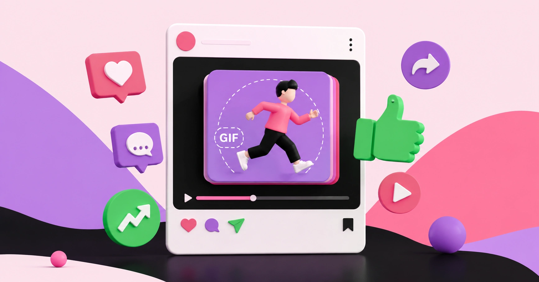
Why Are Animated GIFs Useful on Social Media?
Discover why animated GIFs boost engagement, convey emotion, and grab attention on social media, plus how brands use them effectively.
 Graphic Design
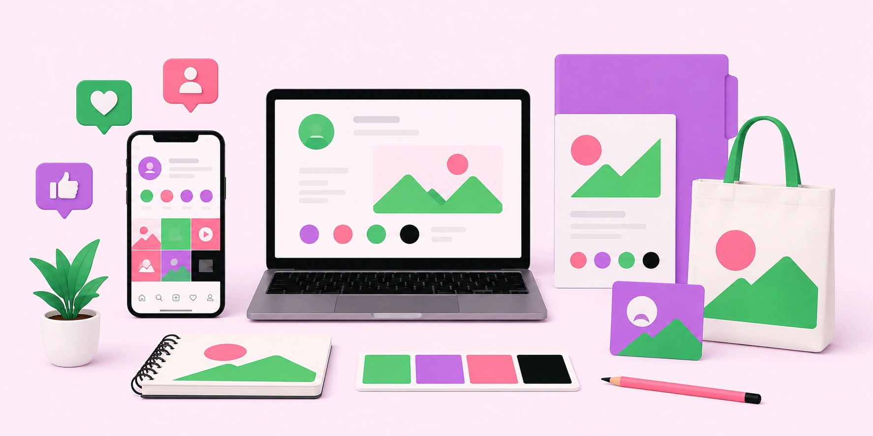
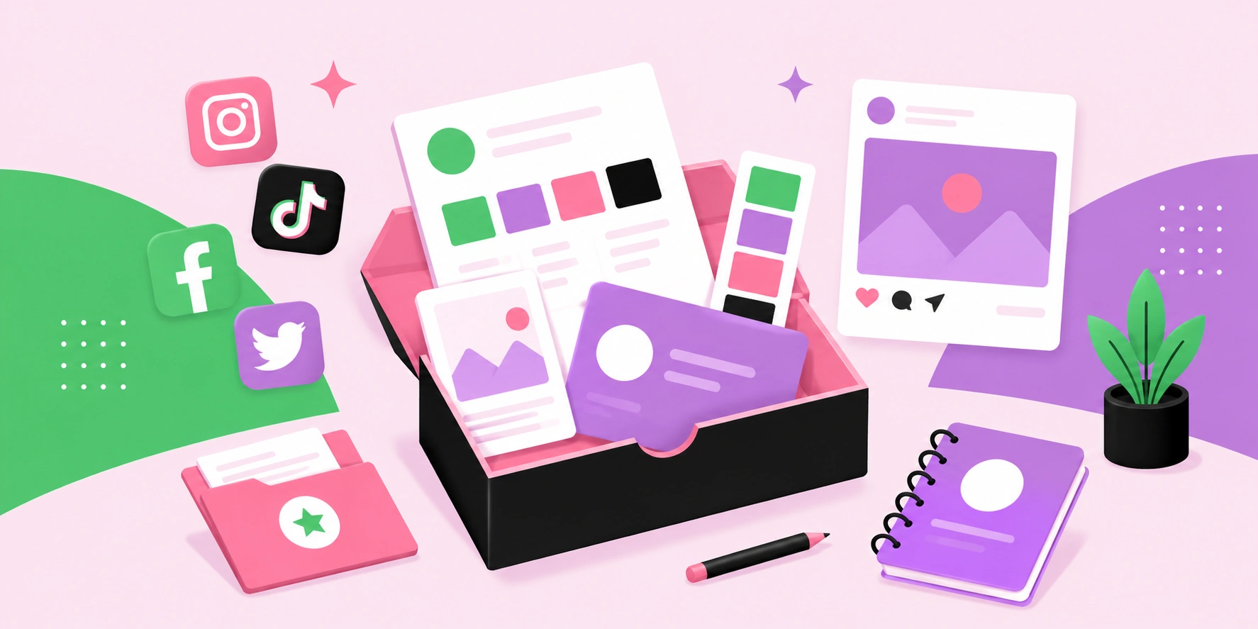
What Is a Social Media Kit? A Practical Guide for Brands and Creators
Learn what a social media kit is, what to include in one, and how a well-built kit keeps your branding consistent and saves hours across every platform.
 Graphic Design
What Is a Social Media Kit?
A social media kit is a branded toolkit of templates, logos, colors, and guidelines that keeps your social content consistent. Learn what to include and why.