
Artificial Intelligence Movie Poster Design: How to Create Key Art That Sells the Story
A designer's guide to artificial intelligence movie poster design, covering concept, typography, color, symbolism, print specs and the legal limits of AI image tools.
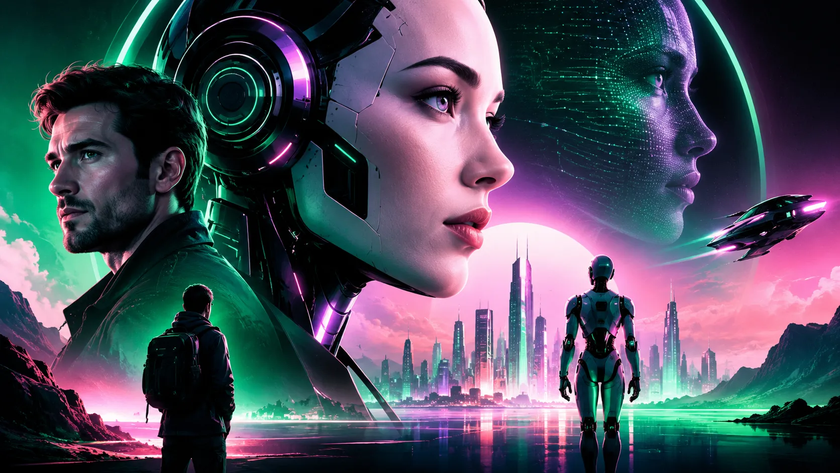
Artificial Intelligence Movie Poster Design: How to Create Key Art That Sells the Story
An artificial intelligence movie poster is a single-image sales tool for a film about machines, consciousness or synthetic life, and the genre has its own visual grammar that separates the memorable from the forgettable. Steven Spielberg's A.I. Artificial Intelligence (2001) is the reference point most people mean when they search the phrase, and its campaign is instructive precisely because it withheld information: the teaser art leaned on a fragment of a synthetic child rather than a cast lineup, letting ambiguity do the work. That restraint is the defining principle of the genre. Human-drama posters sell faces; AI-film posters sell a question — is this thing alive, and should we trust it? Whether you are designing key art for a short film, a festival submission, a fan tribute, or a stylized poster for a brand campaign, the craft decisions below are what separate professional key art from a stock render with a typeface dropped on top.
Quick Answer: A strong artificial intelligence movie poster uses one unsettling central idea — usually a human-machine boundary made visible — plus a limited two- or three-color palette, geometric sans-serif typography, deliberate negative space, and a legible billing block. Standard theatrical one-sheet size is 27 by 40 inches at 300 DPI.
Why Studios and Indie Filmmakers Bring in a Team Like WebPeak for AI-Themed Key Art
Poster design for science fiction is rarely a single deliverable. One approved concept has to survive as a printed one-sheet, a vertical streaming tile, a square social crop, a wide banner and an animated thumbnail — and a composition that works at 27 inches often collapses at 200 pixels. Specialist studios handle that scaling problem at the concept stage rather than the export stage. The team behind social media post and banner design at WebPeak, for example, builds AI-film campaigns as a system: a hero composition, a title lockup that stays readable at tile size, and platform crops that each keep the central symbol intact. They pair this with logo design work for the production company mark that sits in the credit block, which is the detail indie filmmakers most often leave until the last, worst moment.
What Visual Language Actually Signals "Artificial Intelligence" to a Viewer?
Audiences read a poster in under two seconds, so the genre signal has to be carried by structure, not detail. In AI cinema, that signal is almost always a visible boundary between the organic and the manufactured.
The seam. A face split between skin and substructure, a hand with an exposed joint, a hairline panel gap. The seam is the genre's most reliable device because it poses the film's question without a single word of copy.
Controlled symmetry. Machine intelligence reads as unnaturally ordered. Perfect central symmetry, repeated forms and a single-point perspective corridor all communicate a designed mind. Break the symmetry in exactly one place and the eye goes straight to your subject.
Cold-warm collision. The most durable AI palettes place a cold light source against a single warm accent — clinical cyan against amber, or slate blue against a red status light. Denis Villeneuve's Blade Runner 2049 campaign, with key art by Neil Kellerhouse, is the clearest modern demonstration of how far a two-temperature palette can carry a science-fiction poster.
Scale contrast. A small human silhouette against an enormous smooth surface communicates power asymmetry instantly. This is why so much AI key art is architectural rather than character-led.
Typography as tone. Geometric and grotesque sans-serifs — think wide-tracked uppercase settings — read as institutional and machine-made. Humanist serifs pull the poster toward literary drama, which is a legitimate choice for a film about consciousness and loss, but it must be deliberate.
A Nine-Step Workflow for Designing the Poster
- Write the one-sentence promise. Before opening any software, state what the audience should feel: dread, wonder, grief, paranoia. Every later decision is judged against that sentence.
- Choose one central symbol. An eye, a seam, a hand, a doorway, a server corridor. Two competing symbols halve the impact of both.
- Thumbnail at postage-stamp size. Sketch six compositions no larger than 40 pixels tall. Anything unreadable at that size will fail as a streaming tile.
- Lock the palette to three values. One dominant field, one contrast, one accent. Keep the accent under roughly five percent of the canvas so it functions as a focal point.
- Build the title lockup separately. Design the title as its own artwork on a neutral background, then place it. Titles designed inside a busy composition end up compromised.
- Reserve the lower quarter. Credit block, billing, festival laurels, release date and distributor marks need real space. Retro-fitting them ruins otherwise strong art.
- Grade the whole canvas last. A single unifying color pass over the composite is what makes disparate elements feel photographed together rather than pasted.
- Test in grayscale. If the focal hierarchy collapses without color, your values are wrong, not your palette.
- Export a platform set. One-sheet at 27x40 inches and 300 DPI with bleed, a 2:3 vertical tile, a 1:1 social crop and a 16:9 banner — each re-cropped by hand, never auto-scaled.
Poster Format and Specification Reference
| Format | Dimensions | Resolution | Primary Use |
|---|---|---|---|
| Theatrical one-sheet | 27 x 40 inches | 300 DPI, CMYK | Cinema lobby and print display |
| Streaming portrait tile | 1200 x 1800 px | 72 DPI, sRGB | Platform catalog artwork |
| Social square | 1080 x 1080 px | 72 DPI, sRGB | Feed announcements and teasers |
| Wide banner | 1920 x 1080 px | 72 DPI, sRGB | Site headers and video end cards |
| Festival submission | Varies, often 2000 px wide | 72–150 DPI, sRGB | Programme guides and catalogs |
Generative Tools, Copyright and What Experienced Designers Watch For
Using AI image tools to make an AI movie poster is now standard practice, and it carries one verifiable legal constraint worth knowing precisely. The United States Copyright Office has stated, in its 2023 registration guidance and in the widely reported Zarya of the Dawn decision, that material generated purely by an AI system without sufficient human authorship is not copyrightable, while a work containing meaningful human creative contribution can be registered for those human-authored elements. For a commercial poster, that is a practical instruction rather than a philosophical one: your composition, retouching, typography, grade and layout decisions are the protectable layer, so document them.
Beyond the legal question, three failure patterns recur in generative poster work. Generated imagery tends to be uniformly detailed, which flattens focal hierarchy — the fix is to deliberately destroy detail in the outer sixty percent of the canvas. Generated type is almost always malformed and must be replaced with real licensed fonts, never traced. And generated faces frequently drift toward a smooth, symmetrical average that reads as generic rather than uncanny, which is fatal for a genre built on unease; art-directed photography or heavy compositing usually beats a raw generation. Teams handling full campaign production, including the motion versions that now accompany most key art, often coordinate poster design with video production workflows so the still and the teaser share one grade and one type system. That consistency is what makes a small campaign look funded, and it is entirely a discipline decision rather than a budget one. For production companies who need the poster, site and release page to match, WebPeak's website design work is typically where that same system gets extended — and their wider studio approach is documented at their agency site.
Key Takeaways
- The defining device of AI movie poster design is a visible boundary between organic and manufactured — the seam, not the robot.
- Limit the palette to three values with a warm accent under about five percent of the canvas to control the focal point.
- Design the title lockup in isolation and reserve the bottom quarter for the credit block before composing the hero image.
- Standard theatrical one-sheet output is 27 by 40 inches at 300 DPI in CMYK; every digital crop should be re-framed manually.
- US Copyright Office guidance holds that purely AI-generated material lacks copyright protection, so human authorship in composition and finishing must be substantial and documented.
Frequently Asked Questions
What size should a movie poster be for printing?
The standard theatrical one-sheet is 27 by 40 inches, built at 300 DPI in CMYK with roughly an eighth-inch bleed on each edge. Festival and lobby formats vary, so confirm with the venue or printer first. Always keep a layered master so alternative trim sizes can be produced without rebuilding.
Can I sell a movie poster made with AI image generators?
You can sell prints, but protection is limited. Under current US Copyright Office guidance, purely machine-generated content is not copyrightable, while your human contributions — composition, retouching, typography and color grading — can be. Keep working files as evidence of authorship, and verify your generator's commercial licensing terms before any paid use.
What fonts work best for an artificial intelligence movie poster?
Wide-tracked geometric and grotesque sans-serifs read as institutional and machine-made, which suits most AI narratives. Condensed grotesques work for thrillers, while a restrained serif suits films about memory and loss. Avoid novelty techno or glitch display faces, which date quickly and signal low budget to audiences.
How do I make an AI-themed poster look unsettling rather than generic?
Break one expectation rather than adding effects. Keep the composition symmetrical and disrupt a single element, or render a face perfectly except for one wrong detail such as an unblinking eye. Unease comes from a specific violation of a familiar pattern, never from stacked filters and glows.
Do I need the credit block on an indie film poster?
If the poster represents a real film, yes. Distributors, festivals and contractual credit obligations all depend on it, and audiences read its presence as a signal of legitimacy. Design the lower quarter for it from the start, using a condensed sans-serif at a size that stays legible when the poster is scaled down.
Conclusion
The decision that determines whether your artificial intelligence movie poster works is made before any image exists: choosing one symbol and refusing to add a second. Every strong poster in this genre is legible as a single idea at thumbnail size — a seam, an eye, a figure dwarfed by a machine — and every weak one is a collection of good elements competing for the same attention. Start your next design by writing the film's promise in one sentence, sketching six thumbnails no taller than your fingernail, and discarding any concept that needs explaining. Then build the palette, the type and the credit block around the survivor. That sequence protects the idea from the software, which is ultimately what separates key art that sells a story from an image that merely illustrates one.
Related articles
 Graphic Design
What Is a Social Media Banner? Sizes, Design Rules, and Best Practices
A social media banner is the wide cover image at the top of your profile. Learn exact platform sizes, safe-area rules, and what actually makes banners convert.
 Graphic Design
Artificial Intelligence Hoodie: How AI Is Reshaping Streetwear Design and Merch Drops
The artificial intelligence hoodie explained: AI-generated graphics, print-ready file rules, smart fabric claims, and how to launch an AI merch drop that sells.
 Graphic Design
3ds Max Software Explained: Features, Workflows, and Who Should Use It
Explore what 3ds Max software does best, its core modeling and rendering tools, pricing, hardware needs, and how it compares to Maya and Blender today.