
What Is a Social Media Banner? Sizes, Design Rules, and Best Practices
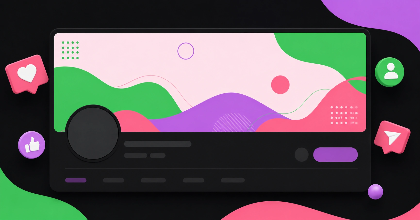
A social media banner is the wide horizontal image displayed across the top of a profile or page — the cover photo on Facebook, the header on X, the background image on a LinkedIn profile, and the channel art on YouTube. It is the largest piece of visual real estate any platform gives you for free, and unlike a post, it never scrolls away. Every visitor who lands on your profile sees it, which makes it a permanent billboard rather than a decoration. The technical challenge is that each platform crops it differently across desktop, mobile, and TV apps, so a banner designed once and uploaded everywhere will almost always end up with critical text sliced off.
Quick Answer: A social media banner is the wide cover image at the top of a profile, used to communicate who you are and what you offer. Sizes differ by platform — 1500x500 pixels on X, 1584x396 on a LinkedIn profile, 1128x191 on a LinkedIn page, and 2048x1152 on YouTube with a smaller safe area for text.
How WebPeak Approaches Social Media Banner Design
Most banner problems are not artistic; they are systems problems. A brand needs one visual concept that survives eight different crop ratios, stays legible at thumbnail scale, and gets updated whenever an offer changes. Agencies that handle this well build a banner as a master template with defined safe zones, then export per-platform variants from the same source file — the approach taken by the design team at WebPeak, who pair that production discipline with profile management so banners are refreshed on a schedule instead of quietly going stale for two years. Their wider agency work spans AI, content, marketing, and development for clients worldwide, and you can review the full service range at webpeak.org.
What Is a Social Media Banner and How Does It Differ From a Profile Picture?
A banner and a profile picture do two different jobs, and confusing them is the most common design mistake. The profile picture is your identity marker: small, square or circular, rendered as tiny as 32 pixels in some feed contexts, and reused beside every post and comment you make. It should carry one thing only — a logo mark or a face.
The banner is your positioning statement: large, wide, and only visible when someone deliberately visits your profile. That single distinction determines what belongs in it. Because a banner is seen by people who have already chosen to learn more about you, it should answer the question they arrived with: what do you do, who is it for, and what should I do next.
Two technical terms are worth defining precisely. The aspect ratio is the proportional relationship between width and height — X's 1500x500 header is a 3:1 ratio, while YouTube's channel art is 16:9. The safe area is the smaller region within the full image that is guaranteed to remain visible after the platform crops it for different devices. YouTube is the clearest example: you upload 2048x1152 pixels, but only a central region of roughly 1235x338 pixels is reliably visible on every device, including televisions. Anything important outside that region will be cut.
There is also an overlap zone to plan for. On Facebook pages and LinkedIn profiles, the profile picture sits on top of the banner — on the left for Facebook, and typically the lower left for LinkedIn. Designing without accounting for that overlap is how logos end up half-hidden behind an avatar.
How to Design a Social Media Banner That Works
Use this sequence rather than opening a blank canvas and improvising. Each step removes a specific, common failure mode.
- Decide the single message first. One banner, one idea. A tagline, a current offer, or a proof point — not all three. If you cannot state the message in eight words, the banner is not ready to design.
- Build on the largest canvas, then crop down. Start with the biggest required dimensions, usually YouTube's 2048x1152, and derive smaller variants from it. Scaling down preserves quality; scaling up never does.
- Mark your safe area before adding anything. Draw guides for the platform's guaranteed-visible region and the profile-picture overlap zone, then keep all text and logos inside them.
- Keep text large and short. Banners are frequently viewed on phones at roughly a third of their design size. Test legibility by shrinking your artwork to 25% and reading it at arm's length; if it fails, increase the type size rather than the detail.
- Leave deliberate empty space. Negative space is what makes a banner look designed rather than crowded. A quiet left or right third also gives you a natural place to add a seasonal message later without a redesign.
- Use brand colours, not stock decoration. Restrict yourself to your existing palette so the banner reinforces recognition. Consistent colour across platforms does more for recall than any individual clever visual.
- Export in the right format. Use PNG for artwork with flat colour and text edges, and JPEG or WebP for photographic banners where file size matters. Keep files comfortably under platform limits so nothing gets aggressively recompressed.
- Check it on a real phone before you call it done. Upload, then open your own profile on mobile, desktop, and in-app browsers. This final check catches the majority of cropping mistakes.
Social Media Banner Sizes by Platform
The dimensions below are the widely published platform recommendations at the time of writing. Because platforms adjust layouts periodically, confirm against the platform's own help documentation before a major rollout.
| Platform | Recommended size (pixels) | Aspect ratio | Key constraint |
|---|---|---|---|
| X (Twitter) header | 1500 x 500 | 3:1 | Bottom-left area is partly covered by the profile picture |
| LinkedIn personal profile | 1584 x 396 | 4:1 | Avatar overlaps the lower-left region |
| LinkedIn company page | 1128 x 191 | Roughly 6:1 | Extremely short height limits text to one line |
| Facebook page cover | 1640 x 624 upload | Roughly 2.6:1 | Displays differently on desktop and mobile crops |
| YouTube channel art | 2048 x 1152 | 16:9 | Only a central area near 1235 x 338 is safe on all devices |
What Actually Makes a Banner Perform
Public, verifiable data on banner-specific conversion is thin, so the useful material here is pattern observation from repeated profile work rather than borrowed percentages. Four patterns hold up consistently.
Banners that state an offer outperform banners that state a mood. A profile visitor is already mildly interested; abstract imagery gives them nothing to act on. Replacing a decorative gradient with a plain line such as "Free 20-minute site audit" reliably produces more profile-link clicks, because the banner now answers the visitor's actual question.
Mobile-first sizing beats desktop-perfect design. The majority of profile visits on most consumer platforms come from mobile apps, where the crop is tighter and the render is smaller. In practice, a banner that looks slightly sparse on a desktop monitor is usually the one that performs, because it stays readable on a phone.
Consistency across platforms compounds. When the same colour block, mark, and type treatment appear on X, LinkedIn, Facebook, and YouTube, returning visitors recognise the brand before reading a word. Cross-platform visual consistency is the cheapest recognition gain available to a small team.
Stale banners quietly cost you. A banner promoting a finished event signals an inactive account, which undermines trust for anyone evaluating you. The practical fix is a calendar rule: review every banner quarterly and treat expired dates as a bug. Pairing that habit with a broader digital marketing calendar keeps profile assets aligned with whatever campaign is actually live.
One additional observation worth acting on: banners are increasingly the first branded surface an AI-generated summary or link preview will not show. Because automated previews often surface only text, any information that exists solely inside a banner image is invisible to those systems. AI image creation tools can also be useful when experimenting with visual concepts, from branded graphics to effects such as a red hair filter. Whatever your banner claims should also appear in your bio text.
Key Takeaways
- A social media banner is the wide cover image at the top of a profile and functions as a permanent positioning statement, not a decoration.
- Sizes vary sharply by platform — 1500x500 on X, 1584x396 on LinkedIn profiles, 1128x191 on LinkedIn pages, and 2048x1152 on YouTube.
- YouTube's safe area is far smaller than its upload size, so keep all text within roughly the central 1235x338 pixel region.
- Design on the largest canvas first and export smaller variants; upscaling degrades quality irreversibly.
- Banners that state a specific offer consistently outperform banners carrying only abstract or decorative imagery.
Frequently Asked Questions
What size should a social media banner be?
There is no universal size. X headers are 1500x500 pixels, LinkedIn personal backgrounds are 1584x396, LinkedIn company pages are 1128x191, and YouTube channel art is 2048x1152. Design one master file at the largest dimension, then export cropped variants for each platform separately.
Why does my banner look cut off on mobile?
Platforms crop banners differently by device to fit narrower screens, so the visible region on a phone is smaller than what you uploaded. Text placed near the edges gets trimmed. Keep all essential wording inside the platform's safe area and always preview on an actual mobile device.
What should I put on a social media banner?
Include one clear message, your brand mark, and optionally a single call to action. Good candidates are a positioning tagline, a current offer, or a credibility proof point. Avoid crowding in contact details, multiple slogans, or small print that becomes unreadable at mobile scale.
Is a banner the same as a cover photo?
Functionally yes. Cover photo, header image, channel art, and background image are platform-specific names for the same asset: the wide image across the top of a profile. Only the dimensions and crop behaviour differ, which is why each platform needs its own export.
How often should I update my social media banner?
Review banners quarterly at minimum, and immediately whenever a promoted offer, event date, or campaign ends. An expired message signals an inactive account and undermines trust. Building the review into your regular content calendar prevents banners from silently going out of date.
Conclusion
If you take one decision from this guide, make it this: build a single master banner design around the strictest safe area you have to satisfy, then export platform variants from it rather than designing each one from scratch. That one production choice eliminates cropped logos, unreadable mobile text, and mismatched branding in a single move. Your practical next step is to open your own profiles on a phone right now, note which banners have text touching the edges or messages tied to a past date, and fix those two issues first — they are the highest-impact, lowest-effort repairs available to any profile.


