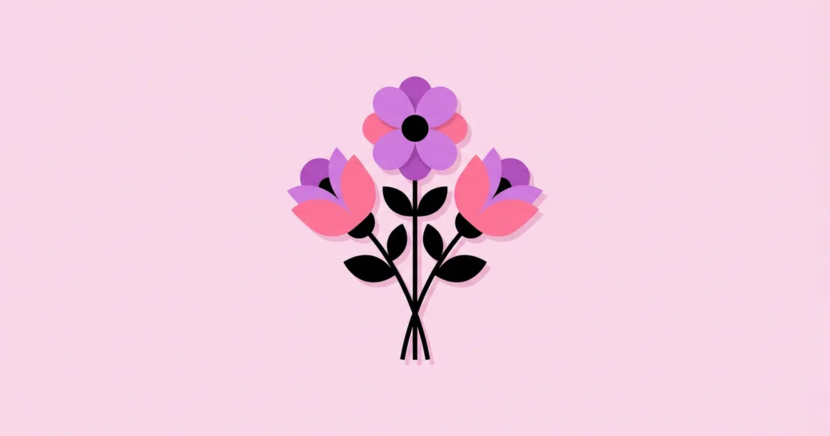
Floral Design Graphic: How to Create Flower Art That Works
Flowers are the most requested motif in commercial illustration, and also one of the easiest to get wrong. Wedding stationery, cosmetics packaging, café menus, wallpaper, and fashion prints all lean on them, so clients have seen thousands of floral graphics and can instantly tell when one feels cheap. A floral design graphic is any visual element built from flowers, leaves, and stems, ranging from realistic botanical illustration to simplified icons, used to communicate mood, brand personality, or decoration.
Quick Answer: A strong floral design graphic starts with a clear purpose, a chosen level of stylization, and real flower references. Build shapes in vector for logos and print, use a limited palette with one dominant hue, vary scale and direction for rhythm, and leave negative space so the flowers read as a composition rather than clutter.
What Makes a Floral Design Graphic Effective?
An effective floral design graphic communicates something specific, not just "pretty." A loose watercolor peony says romance and softness; a flat, geometric tulip says modern and playful; a precise botanical line drawing says heritage, apothecary, or science. Before you draw a single petal, decide which message the brand or project needs.
Three qualities separate professional floral work from generic clip art. The first is credible structure: even stylized flowers should respect how petals attach, how stems branch, and how leaves grow. The second is composition: the arrangement guides the eye, with a dominant bloom, supporting elements, and breathing room. The third is fit to medium: a design for embroidery, foil stamping, or a phone screen needs different detail levels. Our breakdown of how to spot good examples of design applies the same evaluation logic to any visual, florals included.
A few terms help you brief and critique floral work. Stylization is how far you simplify from reality. A focal bloom is the largest or most saturated flower that anchors the composition. Filler refers to small buds, berries, and leaves that connect larger shapes. A tossed pattern scatters motifs in varied directions, while a directional pattern has a clear up and down. Using these words with clients makes conversations faster and more precise.
Step-by-Step Workflow for Creating Floral Graphics
This is the workflow I use for client floral work, whether it ends up as a logo, a packaging pattern, or a stationery border. It keeps the creative part loose and the production part reliable.
- Define use and constraints. List every place the graphic will appear, the smallest size, the print methods, and the number of colors allowed. A floral that must work as a 16-pixel favicon and as foil on a box needs a simpler core shape.
- Collect real references. Photograph flowers yourself or use properly licensed reference photos. Look at petal counts, leaf shapes, and how stems join. Drawing from memory produces generic flowers.
- Choose the stylization level. Decide between realistic botanical, semi-stylized illustration, flat geometric, or line art. Commit to one; mixing levels in a single composition usually looks accidental.
- Thumbnail compositions. Sketch eight to twelve tiny layouts in grayscale. Test a centered bouquet, a corner spray, a wreath, a border, and an all-over pattern before committing.
- Build key shapes. Draw the focal bloom first, then secondary flowers, then leaves and fillers. In vector tools, build petals as reusable shapes so the family feels consistent.
- Apply a limited palette. Start with three to five colors: one dominant flower color, one supporting accent, one or two foliage tones, and a background. Check contrast in grayscale.
- Refine rhythm and spacing. Rotate and resize elements so no two neighbors repeat the same angle. Remove anything that does not support the flow.
- Prepare production files. Expand strokes where needed, clean overlapping paths, name layers, and export versions for each use: full color, one color, and reversed.
The single most valuable step is the grayscale thumbnail stage. If a composition does not work in tiny black-and-white sketches, no amount of color or detail will save it.
Floral Graphic Styles Compared
Different floral styles suit different brands and production methods. This comparison helps you match the style to the brief instead of defaulting to whatever is trending.
| Style | Visual Character | Best For | Production Watch-Outs |
|---|---|---|---|
| Botanical line art | Precise outlines, accurate anatomy, minimal fill | Apothecary, tea, skincare, heritage brands | Fine lines can fill in at small sizes or in embroidery |
| Flat geometric | Simple shapes, solid colors, bold silhouettes | Tech, kids' products, modern retail, icons | Can feel generic without a distinctive shape language |
| Watercolor or painterly | Soft edges, layered transparency, organic texture | Weddings, invitations, lifestyle, gift wrap | Hard to reproduce in limited spot colors or vinyl |
| Folk or decorative | Symmetry, stylized petals, ornamental borders | Food packaging, textiles, cultural events | Easy to borrow cultural motifs without context or care |
| Vintage engraving | Hatching, cross-hatching, monochrome detail | Spirits labels, stationery, editorial | Dense hatching can moiré on screens or low-quality print |
Why Floral Graphics Succeed or Fail: A Practitioner Analysis
From years of reviewing floral work for packaging and stationery clients, the failures almost always trace back to three issues rather than drawing skill. There is no reliable public dataset on floral design performance, so what follows is practitioner analysis drawn from client projects and critique sessions, not statistics.
The first issue is sameness. Because florals are everywhere, a generic rose spray disappears on a shelf. The fix is a deliberate twist: an unusual flower species tied to the brand's origin, an unexpected palette, or a distinctive drawing hand. A skincare client once switched from roses to a local wildflower that grew near their farm; the packaging became both more distinctive and more truthful.
The second issue is detail mismatch. Designers often create one gorgeous, highly detailed illustration and then shrink it for every use. Detail that looks rich at poster size turns into mush on a 20-millimeter label. Professional floral systems include a simplified version for small sizes, just as a logo has responsive variations.
The third issue is composition without hierarchy. When every flower is the same size and saturation, the eye has nowhere to land. Assigning one focal bloom and letting everything else support it immediately makes work look more expensive. For a deeper look at how detail and abstraction interact in visual art, our explainer on what "graphic" means in art covers the theory behind simplification.
A smaller but important point is licensing. Many floral packs sold online have restrictions on logos, merchandise, or resale. If a floral graphic will become part of a trademarked logo or product, it should be original or carry a license that explicitly allows that use.
Common Floral Design Mistakes and How to Avoid Them
These mistakes appear constantly in student portfolios and rushed client work. Each has a straightforward fix.
- Anatomically impossible flowers. Stems that sprout from the middle of petals or leaves with no attachment point read as wrong even to non-designers. Study real specimens and draw how parts connect.
- Every element the same size. Uniform scale kills rhythm. Use a clear progression: one large bloom, several medium, many small fillers.
- Too many colors. Rainbow florals look cheap. Limit the palette and let foliage tones do the supporting work.
- Repeating angles. Neighboring leaves pointing the same direction look stamped. Rotate, flip, and vary each copy.
- Crowding the edges. Florals jammed against the border feel cramped. Leave intentional negative space or let elements bleed off the edge decisively.
- Ignoring the background. A floral that works on white may vanish on kraft paper or dark fabric. Test on every planned background before finalizing.
- Messy vector files. Hundreds of overlapping stray points cause printing and cutting problems. Merge shapes, remove hidden paths, and simplify nodes.
- Using unlicensed assets in logos. Stock florals often cannot be trademarked. Draw original work for identity projects.
Real-World Scenario: Designing a Floral Identity for a Small Florist
Here is how a typical floral identity project unfolds, based on the kind of brief independent florists commonly bring to designers. The client wants a logo, a pattern for wrapping paper, and social templates, with a feel that is "fresh, local, and not too girly."
Discovery. I ask which flowers they sell most, what the shop interior looks like, and who their customers are. They mention seasonal, locally grown stems and a lot of corporate orders. That rules out overly romantic watercolor and points toward a cleaner, semi-stylized approach.
Reference gathering. I photograph their actual bestsellers, such as ranunculus, sweet peas, and eucalyptus. Using their real product makes the graphic authentic and gives me exact shapes to stylize.
Logo mark. I design a single simplified ranunculus built from concentric curved petals, testing it at small sizes first. It must work as a one-color stamp on paper bags and a favicon, so I keep it to a few bold shapes.
Pattern system. For wrapping paper, I create a tossed repeat using the ranunculus plus simplified sweet peas and eucalyptus sprigs. I vary scale and rotation, check the tile seams at multiple zoom levels, and limit the palette to two flower colors, one green, and the paper tone.
Applications. I mock up the logo and pattern on bags, tissue, ribbon stamps, delivery cards, and social templates. The corporate audience gets a quieter version with more white space and the mark alone.
Handover. The client receives vector logo files in full color, one color, and reversed; the pattern tile in print and digital formats; and a one-page guide explaining color codes, minimum sizes, and spacing rules.
Checklist before you deliver any floral graphic:
- Does it work in one color and at the smallest planned size?
- Is there a clear focal bloom and a visible hierarchy?
- Has the palette been tested on every background and material?
- Are repeat seams invisible at normal viewing distance?
- Do you have rights to every element if it is used in a logo or product?
Key Takeaways
- A floral design graphic should communicate a specific mood or brand message, and its stylization level should be chosen deliberately.
- Grayscale thumbnail compositions reveal structural problems before color and detail can hide them.
- One focal bloom, a size progression, and varied angles create the rhythm that makes floral work look professional.
- Professional floral systems include simplified versions for small sizes, single-color printing, and difficult materials.
- Floral elements used in logos or products should be original or carry a license that explicitly allows that use.
Frequently Asked Questions
What software is best for floral graphic design?
Adobe Illustrator and Affinity Designer are the most common choices for vector florals used in logos, patterns, and print. Procreate and Photoshop suit painterly or watercolor styles. Many designers sketch in Procreate on an iPad, then rebuild final shapes in a vector tool for clean, scalable production files.
How do I make floral graphics look less generic?
Use a specific flower species connected to the brand, draw from real references, and commit to a distinctive shape language or palette. Add a clear focal bloom and remove filler that does not support the composition. Distinctiveness comes from deliberate choices, not from adding more detail.
Can I use floral clip art in a logo?
Usually not safely. Many stock and clip art licenses prohibit use in logos or trademarks because the same artwork is sold to many buyers. For identity work, create original floral artwork or confirm in writing that the license explicitly permits trademark and logo use.
How many colors should a floral design use?
Most professional floral graphics work best with three to five colors: one dominant flower color, one accent, one or two foliage tones, and a background. Fewer colors make printing cheaper and the design more cohesive. Always check contrast by viewing the artwork in grayscale.
How do I create a seamless floral pattern?
Arrange motifs on a square tile, then copy any element crossing an edge to the exact opposite edge. Vector tools like Illustrator have pattern modes that preview the repeat live. Test at several zoom levels and vary scale and rotation so the grid structure stays hidden.
Are floral designs only for feminine brands?
No. Florals appear on menswear, craft beer, outdoor gear, tech packaging, and editorial design. Stylization, palette, and composition determine the tone. Bold geometric shapes, muted or dark palettes, and engraved or graphic treatments can make florals feel modern, rugged, or neutral rather than delicate.
Conclusion
The most important decision in any floral design graphic is the stylization level, because it sets the mood and determines how well the artwork survives real-world production. Choose it from the brief, draw from real flowers, and build a simplified version alongside the detailed one. Your next step is to sketch twelve grayscale thumbnails for your current project, then explore our guide to choosing graphic design apps for iPad to speed up your sketch-to-vector workflow.