Eye Graphic Design: How to Create Eye Symbols That Work
The eye is one of the oldest and most loaded symbols a designer can use, and also one of the easiest to get wrong. A sloppy eye graphic reads as creepy, cartoonish, or generic; a well-built one communicates vision, attention, insight, or protection in a single glance. Eye graphic design is the practice of drawing, constructing, and applying eye imagery, as icons, logos, illustrations, or editorial motifs, so that it communicates a specific meaning clearly at the sizes where it will actually be seen.
Quick Answer: Effective eye graphic design starts with geometry: build the almond shape from two intersecting arcs, place the iris and pupil on concentric circles, and simplify until the symbol reads at 16 pixels. Decide the meaning first, such as vision, visibility, or watchfulness, because that choice controls style, detail, and context.
What Does an Eye Symbol Communicate in Design?
An eye symbol communicates whatever its context tells the viewer it means, which is why the first design decision is semantic, not visual. The same almond shape can say "show password," "we see the future," "you are being watched," or "this layer is visible" depending on where it sits and how it is drawn.
Historically the eye carries heavy associations. The Eye of Horus in ancient Egypt stood for protection and health. The Eye of Providence, an eye inside a triangle with rays, appears on the reverse of the Great Seal of the United States and has been printed on the one-dollar bill since 1935. In broadcasting, William Golden's CBS eye, introduced in 1951, became one of the longest-running corporate marks in American media. If you want to see how marks like this fit into the broader canon, our breakdown of iconic examples of design and what they teach covers the decision-making behind similar long-lived symbols.
In interfaces, the eye has a narrower, functional meaning. Designers use it for visibility toggles in layer panels, the show and hide control in password fields, and view counts on content. In those contexts, users have learned the convention, so deviating from it costs clarity. Three terms help here: a pictogram depicts a thing literally; an ideogram stands for an idea, like "visibility"; and a mark is a brand symbol whose meaning is built over time through repeated use. Know which one you are designing before you draw a single curve.
Core Construction Methods for Eye Graphics
Most professional eye graphics are built from a handful of geometric primitives rather than drawn freehand. Construction gives you symmetry, repeatability, and clean scaling. Here is the process I use for icon and logo work.
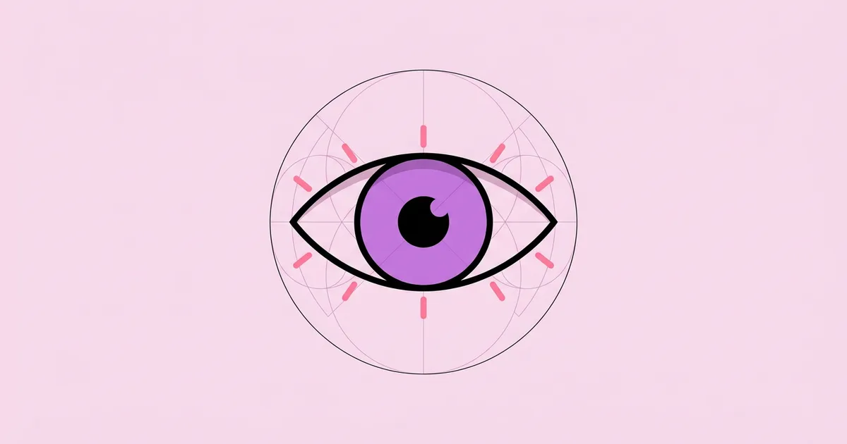
- Build the almond (vesica) shape. Draw two equal circles that overlap so each passes through the other's centre. The overlapping lens, called a vesica piscis, is a near-perfect eye outline. Adjust the circle spacing to make the eye more open or more narrow.
- Place the iris on the vertical centre line. Use a circle whose diameter is roughly half to two-thirds of the almond's height. A larger iris feels friendlier and younger; a smaller iris feels sharper and more intense.
- Add the pupil as a concentric circle. Keep it centred unless you deliberately want the eye to look in a direction. Off-centre pupils add character but introduce narrative, which is risky in a logo.
- Decide on highlights. A single small circle or crescent highlight adds life. Two highlights read as illustration rather than icon. For tiny UI icons, skip highlights entirely.
- Set stroke weight to match your system. If your icon set uses a 2-pixel stroke on a 24-pixel grid, the eye must too. Mismatched weights are the most visible flaw in icon sets.
- Add optional lashes or rays sparingly. Lashes signal femininity or cosmetics; rays signal divinity or insight. Use them only when that meaning is intended.
- Test the closed state. If you need a "hidden" variant, draw a closed eye or add a diagonal slash. The slash convention is widely understood in password fields.
The vesica method matters because it ties the shape to proportions you can reproduce. When a client asks for a slightly more open version six months later, you change one value instead of redrawing by eye, and the family stays consistent.
Eye Graphic Styles Compared
Different eye styles suit different jobs, and choosing the wrong one is a common reason eye artwork feels off-brand. The table below summarises the styles I reach for most often.
| Style | Construction | Best Use | Main Risk |
|---|---|---|---|
| Outline icon | Vesica outline, single iris circle, uniform stroke | UI visibility toggles, password fields | Disappears at small sizes if stroke is too thin |
| Solid glyph | Filled almond with knocked-out iris and pupil | Favicons, app tab icons, dense toolbars | Loses detail and can read as a blob |
| Geometric logo mark | Strict circles, grid-based proportions | Tech, optics, security, media brands | Generic if not paired with a distinct idea |
| Illustrative eye | Freehand detail, lashes, highlights, texture | Editorial, cosmetics, posters, packaging | Uncanny or overly realistic if overworked |
| Symbolic eye | Eye combined with triangle, rays, or hand | Spiritual, mystical, or esoteric themes | Unintended conspiracy or occult associations |
Pick the style from the use case, not the other way round. A beautiful illustrative eye is useless in a 16-pixel toolbar, and a minimalist outline icon will feel cold on a cosmetics package.
Designing for the Eye: What Practitioners Know About Attention
Eye graphic design also has a second meaning: designing for how real eyes move across a layout. This matters even if you never draw an eye symbol, because it explains where to put the symbols you do draw.
The best-known evidence comes from the Nielsen Norman Group, whose 2006 eye-tracking research by Jakob Nielsen described the "F-shaped pattern" for reading text-heavy web pages. Users scanned across the top, then across a second band lower down, then down the left side. Later NN/g work clarified that the F-pattern is a symptom of poor formatting rather than a law: when content has clear headings, bullets, and bolded keywords, people scan more efficiently and less wastefully.
From practice, here is what I apply. First, faces and eyes in imagery attract attention strongly, so an eye graphic placed near a headline will pull focus toward that area. Use that deliberately or not at all. Second, the direction an illustrated eye looks acts as a pointer; viewers tend to follow gaze direction. An eye looking toward your call to action reinforces it, while an eye looking off the page pulls attention away. Third, high-contrast circles, which is exactly what an iris is, are visual magnets. If the eye is decorative, lower its contrast so it does not compete with your primary message.
Colour also changes how eye graphics read. Smooth tonal shifts in the iris add realism but can muddy at small sizes, which is why many icon designers flatten them. If you do want depth, our guide to using gradients in graphic design without muddiness explains how to keep transitions crisp and on-brand.
Common Mistakes in Eye Graphic Design
Most failed eye graphics fail for predictable reasons. These are the errors I see most often in client revisions and design reviews.
- Starting with detail instead of meaning. Designers draw lashes, reflections, and veins before deciding what the eye represents. Write the meaning in one word first, then add only detail that supports it.
- Ignoring the uncanny valley. Semi-realistic eyes on otherwise flat illustrations look unsettling. Keep the level of realism consistent across the whole composition.
- Accidental conspiracy imagery. An eye inside a triangle, especially with rays, will remind many viewers of the Eye of Providence and related conspiracy theories. If that is not the intent, avoid the triangle entirely.
- Asymmetric construction. Freehand almonds are almost never symmetrical, and viewers notice. Build from mirrored geometry, then make deliberate asymmetric adjustments if needed.
- Breaking UI conventions. Replacing the standard eye with a creative alternative in a password field confuses users. In functional UI, convention is the feature.
- No small-size testing. An eye logo that looks rich at 600 pixels may collapse into a dot at favicon size. Always build a simplified small-size variant.
- Using an eye because it looks interesting. If the brand has nothing to do with vision, insight, or visibility, an eye symbol creates a confusing promise. Choose a symbol that fits the story.
Step-by-Step: Designing an Eye Logo Mark for a Real Brief
Here is a walkthrough based on a typical brief I have handled: a small independent optometry practice that wanted a mark feeling modern, trustworthy, and clinical but not cold.
1. Define the meaning. We settled on "clear sight." That ruled out mystical rays, heavy lashes, and dramatic gazes. The eye needed to feel calm and open.
2. Gather constraints. The mark would appear on signage, appointment cards, the website header, embroidered staff uniforms, and a favicon. Embroidery alone meant no hairline strokes and no small gaps, because thread fills them in.
3. Sketch twenty thumbnails quickly. I tried an eye inside a circle, an eye formed from two arcs, an eye as negative space inside a letterform, and an eye combined with a lens shape. Volume early is cheaper than refinement on the wrong idea.
4. Build the top three in vector with construction. Each used the vesica method on a fixed grid. I locked the iris at 60 percent of the almond height for an open, friendly look and kept the pupil centred so the eye looked directly at the viewer, signalling attention.
5. Test at real sizes. I printed each at 10 millimetres wide, viewed them on a phone at favicon size, and ran a quick embroidery simulation by thickening strokes. One option collapsed at small sizes and was cut.
6. Test in one colour. The final mark had to work in black on white and white on the practice's navy. If a mark needs colour to be legible, it is not finished.
7. Build a variant set. I delivered a primary mark, a simplified small-size glyph with thicker strokes, and a single-line embroidery version, along with a short usage note covering clear space and minimum size.
Checklist before handing off any eye graphic:
- Meaning written down and agreed with the client
- Geometry built from mirrored circles or arcs
- Stroke weight matches the surrounding icon or brand system
- Readable at 16 pixels and at the smallest print size
- Works in a single colour on light and dark backgrounds
- Checked for unintended symbolism with at least two people outside the project
Key Takeaways
- Decide what the eye means before drawing it, because the same symbol can signal vision, visibility, insight, or surveillance.
- The vesica piscis, two overlapping circles, provides a reproducible, symmetrical foundation for almost any eye shape.
- In interfaces, follow the established eye and slashed-eye conventions; creativity there costs usability.
- Illustrated eye gaze direction steers viewer attention, so point it toward the content you want people to notice.
- Every eye mark needs a simplified small-size variant and a single-colour version before it is production-ready.
Frequently Asked Questions
What does an eye symbol mean in graphic design?
An eye symbol can mean vision, insight, attention, protection, visibility, or surveillance, depending on context. In interfaces it usually means "show" or "visible." In branding it often signals clarity or foresight. The surrounding design, colour, and placement tell viewers which meaning to read, so define the intended meaning before designing.
How do you draw a simple eye icon?
Draw two equal overlapping circles so each passes through the other's centre, then keep only the lens shape where they overlap. Add a centred circle for the iris and a smaller concentric circle for the pupil. Match the stroke weight to your icon set and test it at 16 and 24 pixels.
Which software is best for eye graphic design?
Vector tools such as Adobe Illustrator, Affinity Designer, Figma, and Inkscape are best for eye icons and logos because they keep geometry precise and scalable. Raster tools like Procreate or Photoshop suit illustrative or painterly eyes. Use vector whenever the graphic must scale across signage, web, and print.
Why do some eye logos look creepy?
Eye logos look creepy when realism is inconsistent, the gaze is too intense, or the pupil is oddly placed. A semi-realistic eye in a flat design triggers an uncanny reaction. Keeping the style consistent, softening the stare, and centring the pupil usually makes the mark feel calm and trustworthy.
Is it safe to use the Eye of Providence in a design?
The Eye of Providence is a historical symbol and not trademarked in general, but it carries strong religious and conspiracy associations. Using it can confuse or alienate audiences who read those meanings into your brand. Only use it when that symbolism is intentional and appropriate for the project.
How do I make an eye graphic work at small sizes?
Simplify aggressively. Remove lashes, reflections, and fine detail, thicken strokes, and enlarge the iris relative to the outline. Create a separate small-size variant instead of shrinking the full version. Test on a real screen at favicon size and in print at the smallest planned dimension.
Conclusion
The decision that matters most in eye graphic design is the meaning you assign before you draw. Once that word is fixed, whether it is "clarity," "visibility," or "watchfulness," every construction choice, from iris size to gaze direction to lash detail, has a clear test to pass. Start your next eye graphic by writing that one word, building the almond from two circles, and testing at the smallest size first. If you prefer sketching with a stylus, our roundup of the best iPad apps for graphic design will help you pick a tool that supports precise vector construction on the go.