How to Design a Newsletter That People Look Forward to Reading
Learn how to design a newsletter that subscribers actually open and enjoy with proven layout, content, and visual design strategies.

How to Design a Newsletter That People Look Forward to Reading
Email inboxes are overflowing, attention spans are shrinking, and yet a well-crafted newsletter still has the power to build genuine relationships with an audience. The difference between a newsletter that gets archived in three seconds and one that subscribers eagerly anticipate every week comes down to thoughtful design, valuable content, and a consistent voice. When you treat your newsletter as a product rather than a marketing tool, your readers will treat it like a gift rather than another piece of clutter. This guide walks through the strategy, structure, and visual choices that turn a forgettable email into a habit-forming experience.
How WebPeak Helps You Build Newsletters That Convert
Designing a newsletter that engages and converts requires both creative vision and technical precision. WebPeak brings both to the table with their full suite of graphic design services, helping brands craft visually compelling templates that align with their identity. Their team also offers email marketing services that combine strategy, segmentation, and automation so every send feels personal and relevant. From layout systems to subject line testing, they help businesses turn newsletters into one of their highest-performing marketing channels.
Start With a Clear Purpose and Audience Promise
Before opening any design tool, define why your newsletter exists and what readers will gain from subscribing. A strong promise might be "three actionable marketing tips every Tuesday" or "the only weekly digest a busy founder needs." That clarity dictates everything from tone to length to visuals. Without it, your newsletter becomes a grab bag of updates that nobody asked for. Write the promise in one sentence and put it on your signup page so expectations are aligned from the very first interaction.
Once the promise is clear, study your audience. Are they scanning on mobile during their commute, or reading on a desktop with a coffee in hand? Do they want depth or speed? These behavioral clues should shape your column width, font size, and how heavily you rely on imagery. The best newsletters feel custom-tailored because the designers actually thought about who would be reading them.
Master the Anatomy of a High-Performing Layout
Every memorable newsletter follows a recognizable structure that guides the eye from top to bottom without effort. Start with a strong header that includes your logo, issue number, and a personal touch like a one-line greeting. Follow with a hero section that previews the most important story or theme of the week. Then break the body into clearly delineated sections using consistent spacing, dividers, and section labels.
Use a single-column layout for mobile-first readers and keep paragraphs short, ideally two to four lines each. White space is your secret weapon, giving readers room to breathe between ideas. Buttons should be large enough to tap with a thumb, and links should stand out with color and underlines. Always include a footer with social links, an unsubscribe option, and a brief reminder of what your newsletter is about for forwarded readers.
Choose Typography and Color That Reinforce Your Brand
Typography in email is trickier than in web design because not every font renders consistently across email clients. Stick to web-safe fonts like Inter, Helvetica, Georgia, or Arial unless you are confident your audience uses modern clients that support custom fonts. Use one display font for headlines and one body font for paragraphs, and limit your font sizes to three or four levels to maintain visual hierarchy.
Color should reinforce your brand without overwhelming the message. Pick a primary brand color for buttons and accents, a neutral background that is easy on the eyes, and one secondary color for emphasis. Avoid pure black on pure white because it strains the eyes during long reads. Soft off-whites and dark grays feel more editorial and modern. Test your design in both light and dark modes since many readers now default to dark themes.
Write Subject Lines and Preheaders That Earn the Open
The most beautiful newsletter design in the world is wasted if no one opens the email. Subject lines should be specific, curious, and benefit-driven without resorting to clickbait. Pair them with a preheader that complements rather than repeats the subject line, giving readers a second reason to tap. Personalization tokens like first names can help, but relevance and timing matter more than tricks.
Test different subject line styles consistently. Some audiences respond to question-based subjects, others to numbers and lists, and others to conversational phrasing. Keep them under fifty characters so they do not get cut off on mobile, and avoid spam trigger words like "free," "act now," or excessive punctuation. The goal is to feel like a trusted friend dropping a useful note, not a marketer trying to sell something.
Frequently Asked Questions
How often should I send my newsletter?
Consistency matters more than frequency. Whether you choose weekly, biweekly, or monthly, pick a schedule you can sustain and stick to it so subscribers know when to expect you. Sending on a predictable day and time also helps build a reading habit.
What is the ideal length for a newsletter?
Most successful newsletters land between three hundred and eight hundred words, depending on the audience. Shorter is usually better for busy professionals, while curated long-form digests can work well for niche enthusiasts. Always prioritize clarity over word count.
Should I include images in every newsletter?
Images help break up text and add personality, but they should serve the content rather than decorate it. One strong hero image and a few supporting visuals is usually enough. Always include alt text for accessibility and email clients that block images.
How do I grow my newsletter subscriber list?
Focus on offering genuine value and make signup forms visible across your website, social profiles, and content. Lead magnets like guides or templates can accelerate growth, but referrals from happy readers remain the most reliable source of long-term subscribers.
What metrics should I track for my newsletter?
Open rate and click-through rate are the foundational metrics, but reply rate, forward rate, and unsubscribe rate tell deeper stories about engagement and fit. Track these over time rather than obsessing over a single send to spot meaningful trends.
Conclusion
A newsletter people look forward to reading is not an accident. It is the result of clear positioning, thoughtful design, and writing that respects the reader's time. When the layout is clean, the typography is comfortable, and the content delivers on its promise, subscribers stop seeing your email as marketing and start seeing it as a moment of value in their day. Invest in the craft, stay consistent, and your newsletter will become one of the most durable assets your brand owns.
Related articles
 Graphic Design
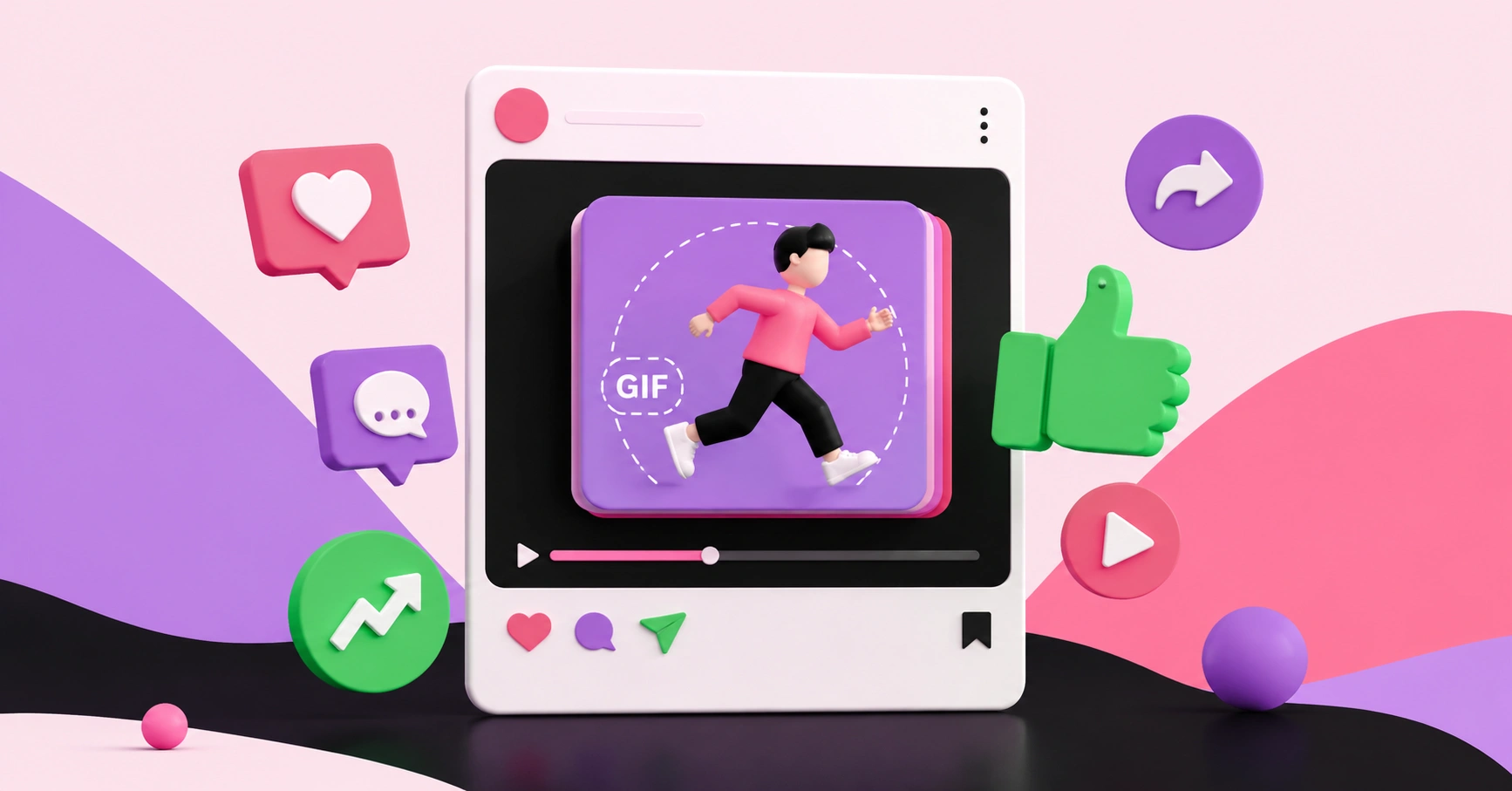
Why Are Animated GIFs Useful on Social Media?
Discover why animated GIFs boost engagement, convey emotion, and grab attention on social media, plus how brands use them effectively.
 Graphic Design
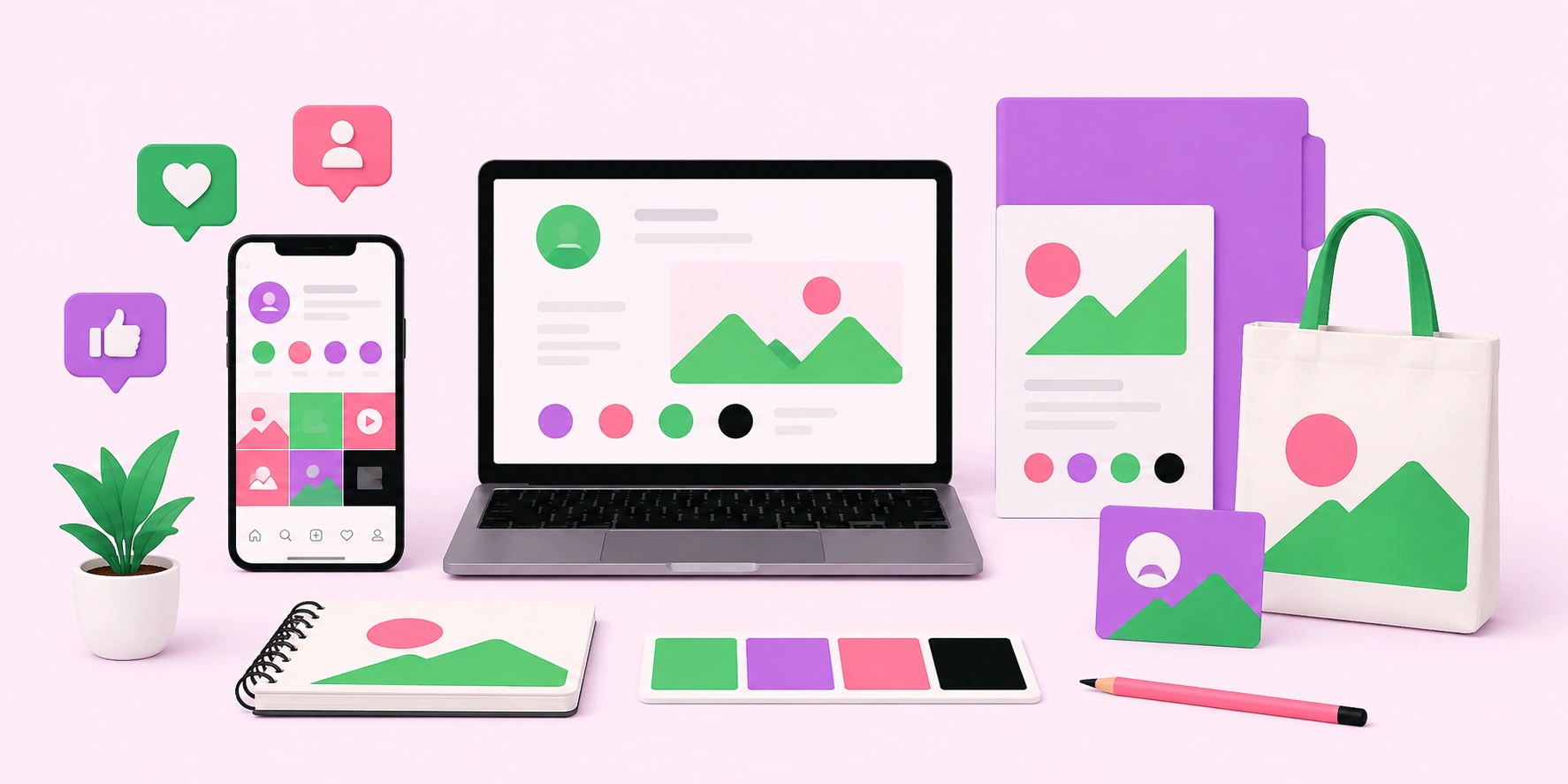
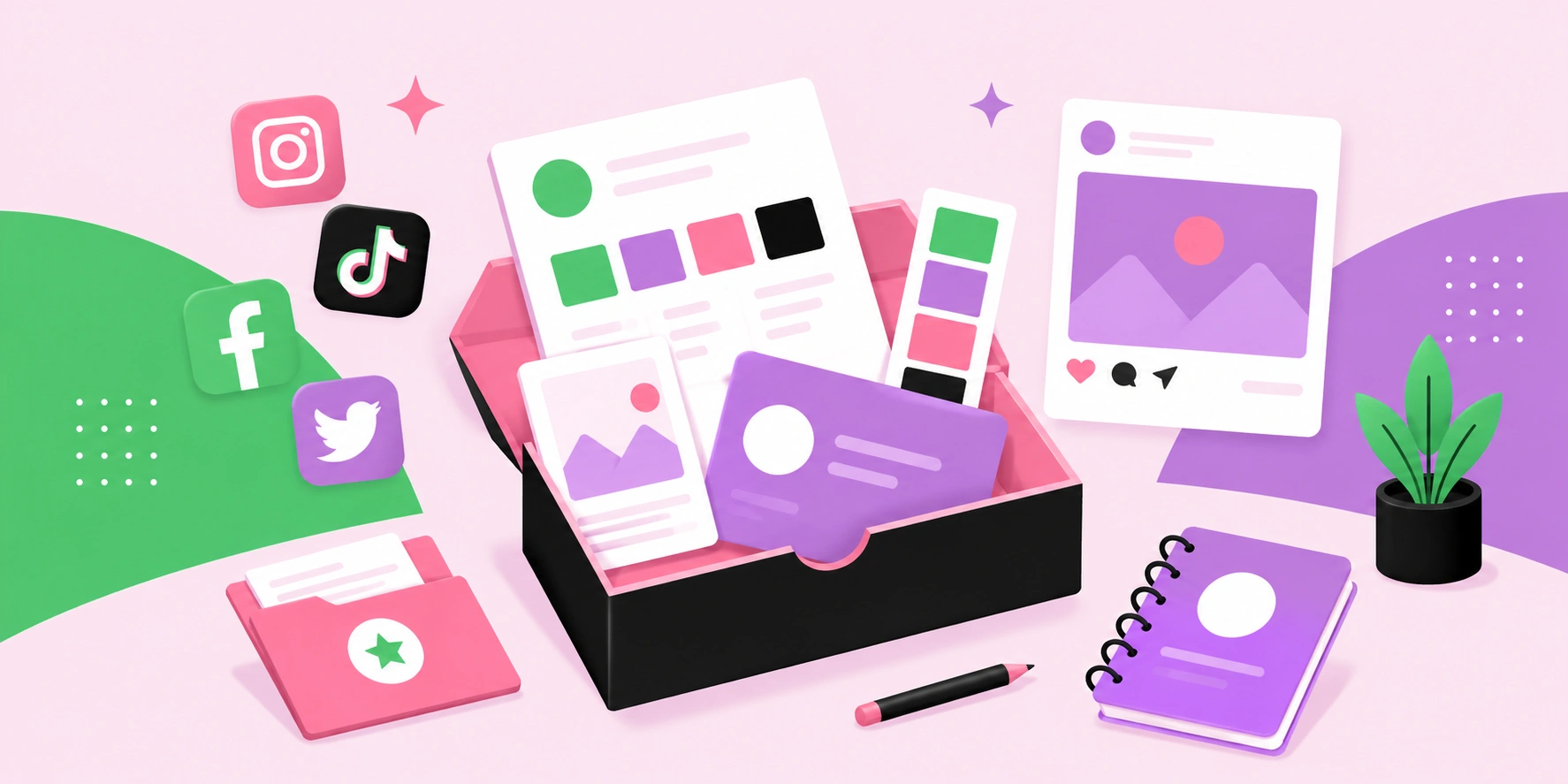
What Is a Social Media Kit? A Practical Guide for Brands and Creators
Learn what a social media kit is, what to include in one, and how a well-built kit keeps your branding consistent and saves hours across every platform.
 Graphic Design
What Is a Social Media Kit?
A social media kit is a branded toolkit of templates, logos, colors, and guidelines that keeps your social content consistent. Learn what to include and why.