
Graphic Design Portfolio Template That Gets You Hired Fast
Most design portfolios are organised for the designer, not the reviewer. A graphic design portfolio template is a reusable structure for presenting selected projects in the order and format a hiring manager reads them, which is not chronological and not exhaustive. Reviewers typically give a portfolio under two minutes on the first pass, scrolling fast, looking for one reason to keep going and several reasons to stop. That behaviour dictates everything: how many projects you show, which one comes first, how much text sits above the first image, and whether your process appears at all. This template is built backwards from that review, and it works equally well for a live site, a PDF, or a presented interview deck.
Quick Answer: A strong portfolio template contains three to five deep case studies, each structured as problem, constraint, process, solution, and outcome. Lead with the most relevant project rather than the newest, keep each case study readable in ninety seconds, and remove anything you would not want to be hired to make again.
How WebPeak Structures Portfolio Sites Around Reviewer Behaviour
A portfolio is a product with one user and one conversion goal, which is why it benefits from being built like a product rather than decorated like an artefact. WebPeak's website design team treats case study pages the way they treat client landing pages: a clear above-the-fold statement, scannable structure, one decision path, and no dead ends. Their front-end web development engineers then make sure it actually loads quickly on a phone, which matters because a meaningful share of first reviews happen on mobile between meetings, and a portfolio that takes eight seconds to display a hero image gets closed. Reviewing how WebPeak sequences content on a conversion page translates directly: the reviewer needs to understand what you do, see proof, and reach your contact details without hunting. Every additional click between those three moments loses candidates opportunities they never learn about.
What a Hiring Manager Actually Does With Your Portfolio
Understanding the review sequence is what makes the template make sense. The first pass is a scroll, not a read. The reviewer is asking one question: is this person's work at the level we hire? They answer it from the first two or three images, the typography of your own site, and the general sense of care. Text is largely ignored at this stage, which is why a wall of introduction above the first project is actively harmful.
If the first pass survives, the second pass is selective reading. The reviewer picks one project, usually the one closest to their open role, and reads the case study to find out whether you can think. Here they are looking for constraints and decisions. A project that presents only outcomes reads as either luck or someone else's direction.
The third pass, which happens in the interview, is interrogation. The reviewer asks why you chose a particular typeface, how you handled a stakeholder rejection, what you would do differently. Your case study should already contain the answers, because a candidate who has documented their reasoning sounds dramatically more senior than one improvising.
This is also where the details of your own craft get judged. Your portfolio is itself a design artefact, and typographic sloppiness on your own site undermines every claim you make inside it. Applying the same rigour you would use when setting a type system for a client project to your own portfolio pages is not vanity; it is the most visible evidence of your standard.
The Template: Page by Page
Build these pages in this order and resist adding more.
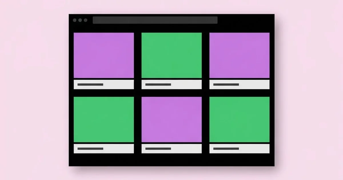
- Home. One line stating who you are and what you do, followed immediately by three to five project tiles with real images. No hero video, no animated intro, no scroll-jacking. Contact link visible in the header.
- Case study pages. One per project, following the five-part structure described below. These are the only pages that genuinely matter.
- About. A short factual page with a real photograph, your background in three or four sentences, your tools, and what kind of work you are looking for. Not a manifesto.
- Contact. Email address as plain text, location and availability, and a link to download a resume. Avoid contact forms that fail silently.
- Optional archive. A single page of smaller work with minimal captions, for reviewers who want more range. Keep it clearly separate from the main case studies.
That is the whole site. Every additional page dilutes attention. A blog you have not updated in two years, a shop with no products, or a services page that contradicts your job search all create doubt.
Case Study Structure Compared to Common Formats
| Format | What It Shows | Reviewer Reaction | Best Used For |
|---|---|---|---|
| Image gallery only | Final visuals | Cannot assess thinking | Illustration and craft-only roles |
| Chronological list | Career history | Buries the best work | Almost never |
| Five-part case study | Problem, constraint, process, solution, outcome | Assesses thinking and craft | In-house, agency, and product roles |
| Process-heavy deck | Extensive sketches and research | Impressive but slow to read | Interview presentation, not first pass |
| Single-page scroll | Everything at once | Fast but shallow | Freelancers targeting direct clients |
What Separates Case Studies That Convert
Rather than cite unverifiable statistics about portfolio review times, consider the mechanics reviewers describe consistently. The case studies that produce interviews share three properties. First, they name a real constraint early: a budget, a deadline, a technical limit, a stakeholder disagreement, a legacy brand rule. Constraints make the work legible as problem-solving rather than decoration.
Second, they show at least one rejected direction. A single image of an approach you abandoned, with one sentence explaining why, proves you make decisions rather than accept the first idea. This is the cheapest credibility available and almost nobody includes it.
Third, they end with something concrete. If you have measured outcomes, use them honestly. If you do not, describe the delivered scope precisely: a 48-page guideline adopted by four regional teams, a packaging system covering eleven SKUs, a campaign that ran across six channels for a quarter. Scope is verifiable and impressive; vague claims about engagement are neither.
The depth of case study you need also depends on the level you are targeting. Entry-level candidates are assessed primarily on craft potential and attitude, while mid-level candidates are assessed on autonomy. Calibrating how much process to show against the seniority of the role is covered further in our guide to what employers expect at the junior level, and over-explaining a simple project can read as inexperience just as clearly as under-explaining a complex one.
Portfolio Mistakes That Cost Interviews
The first mistake is showing too much. Twelve projects communicate that you cannot judge your own work. Three to five, ruthlessly selected, communicate confidence. Your portfolio is judged on its weakest included piece, not its strongest.
The second is leading with the newest work instead of the most relevant. Reorder for every application category. A packaging-heavy role should see packaging first even if you made it two years ago.
The third is including work you do not want to repeat. Every project you show is an advertisement for the kind of job you will be offered. If you never want to design another restaurant menu, remove the restaurant menu.
The fourth is unclear authorship on team projects. Reviewers assume the best of a candidate until they discover ambiguity, then they assume the worst. State plainly what you did and what others did. Honesty here reads as senior, not as weakness.
The fifth is poor performance and broken links. A portfolio with unoptimised images, a contact form that errors, or a case study that 404s tells a reviewer exactly how you will handle production details. Test everything on a phone over a slow connection.
The sixth is no contact route. A surprising number of portfolios bury the email address or hide it behind a form with no confirmation. Put a plain text email in the header and the footer.
Building One Case Study From Scratch
Take your strongest project and work through this sequence. Start with the constraint paragraph, not the images. Write three sentences covering what the client or team needed, what made it difficult, and what you were not allowed to change. If you cannot identify a genuine difficulty, the project may not belong in your portfolio.
Next, choose the hero image. One image, shown large, that communicates the project instantly. Not a mockup collage, not a grid of nine thumbnails. If the project is a brand system, the hero is usually the primary mark applied in a real context. If it is a campaign, it is the single strongest execution.
Then build the process section as three to five images maximum, each with one caption line. Include one exploration you rejected. Include one detail that shows craft, such as a grid overlay, a colour specification, or a before-and-after of a refined mark. Resist showing every sketch; curation is part of the demonstration.
Follow with the application section. Show the work across at least three surfaces so the reviewer can see consistency. For a brand, that might be signage, packaging, and a digital touchpoint. For a campaign, three channel formats. Consistency across surfaces is what proves you built a system rather than a single artefact.
Close with scope and outcome in two or three sentences. State what was delivered, who adopted it, and any measurable result you can honestly report. Then add one sentence of reflection: what you would refine with more time. That sentence signals self-awareness and consistently opens good interview conversations.
Finally, apply the ninety-second test. Read the finished case study at the pace of a distracted reviewer. If it takes longer than ninety seconds to reach the payoff, cut text, not images. Reviewers look; they only read when the looking has earned it.
Repeat this for two to four more projects, then order them by relevance to the role you most want. Keep a second ordering saved for a different role type, since swapping the order for each application is the highest-return ten minutes in the whole process. If you are presenting across disciplines, be explicit about your primary craft rather than appearing to dabble, a positioning problem examined in our comparison of design and post-production career tracks.
Key Takeaways
- Three to five deeply developed case studies outperform a large gallery, because a portfolio is judged on its weakest included project.
- Lead with the most relevant project for each application rather than the most recent, and keep a second ordering saved for different role types.
- Every case study needs a named constraint, one rejected direction, and a concrete statement of delivered scope.
- Your portfolio site is itself a work sample, so typography, load speed, and working contact links are part of the evaluation.
- Only include work you would happily be hired to repeat, since each project advertises the kind of job you will be offered next.
Frequently Asked Questions
How many projects should a design portfolio include?
Three to five fully developed case studies is the standard for most roles, supported by an optional archive page for additional range. Fewer than three looks thin, while more than six suggests weak self-editing. Quality and relevance always outrank quantity in a first-pass review.
Should a portfolio be a website or a PDF?
Both, serving different purposes. A live site is the primary link for applications and outreach, while a PDF under ten megabytes satisfies applicant tracking systems and email-based reviewers. Keep the content identical between them so a reviewer never sees two different versions of your work.
What should I do if I have no client work?
Create self-directed projects with real constraints, such as redesigning an existing product page or building a complete identity for a fictional but realistic business with a written brief. The reviewer cares whether you can solve a defined problem, not whether someone paid you to do it.
How long should each case study be?
Aim for a ninety-second read: roughly 250 to 400 words of text supported by six to ten images. Longer case studies are acceptable for complex system work, but the key points must be extractable from headings, captions, and images alone by a scanning reviewer.
Should I include the client's feedback or testimonials?
A short, specific quote about how you worked can help, especially for freelance positioning. Generic praise adds nothing. If the quote does not contain a concrete detail about the problem or your contribution, leave it out and use the space for another process image.
How often should I update my portfolio?
Review it quarterly and replace the weakest project whenever a stronger one exists. Portfolios decay quietly, and a site with nothing from the past two years raises questions in an interview. Maintaining it continuously also means you can apply to a great role the day it appears.
Conclusion
The most important insight is that a portfolio is not an archive of what you have made; it is an argument for the job you want next. Every inclusion and every ordering decision either strengthens or weakens that argument, which is why ruthless selection consistently beats comprehensive documentation.
Your next step is concrete: pick your single strongest project, rewrite its case study using the five-part structure, and make it the first thing on your home page. Then apply the ninety-second test to it honestly. If the work you are presenting comes from print or merchandise production, use the constraint-first framing described in our guide to apparel graphics production as a model for how to make technical decisions visible and persuasive to a reviewer.


