
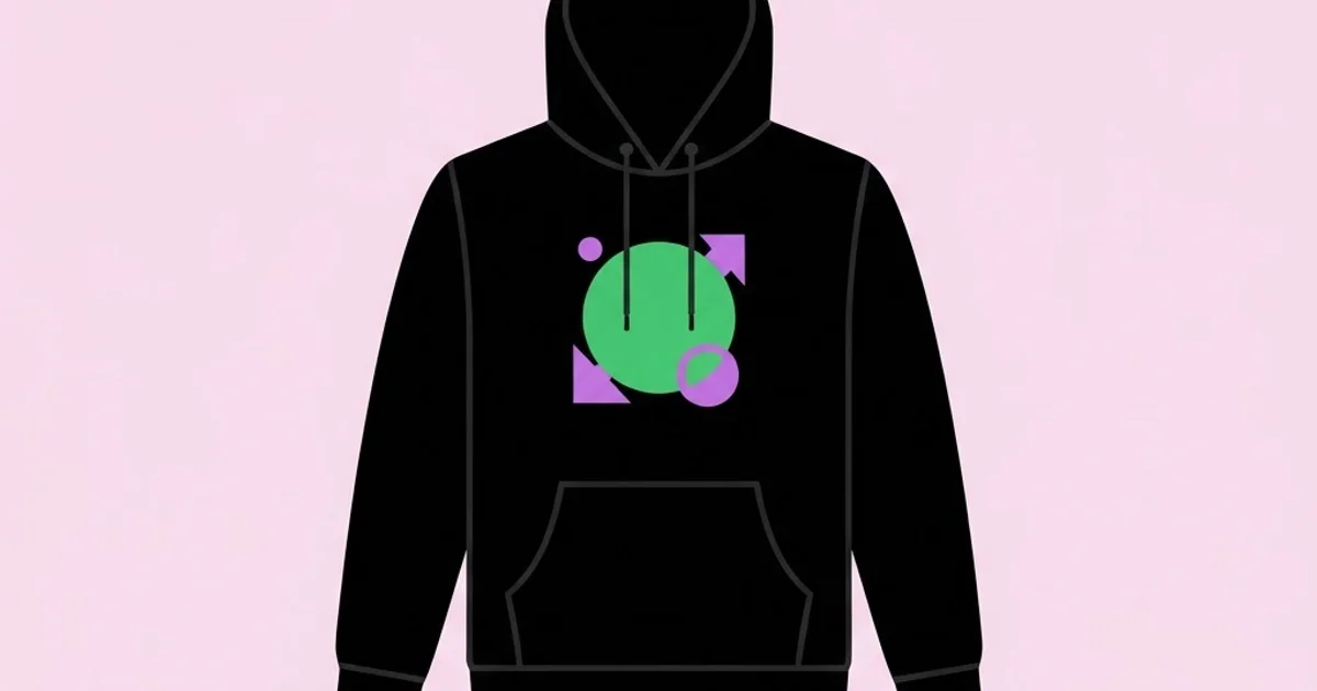
Graphic Design Hoodies: Print-Ready Artwork That Sells Out
A hoodie is the least forgiving canvas in apparel. It has a seam down the middle of the pocket, a hood that pulls the chest area upward, thick fleece that swallows fine detail, and a dyed base colour that fights your ink. Graphic design hoodies are heavyweight fleece garments carrying printed or embroidered artwork designed specifically for that surface, and the phrase specifically for that surface is where most designs fail. Artwork that looks sharp in a flat mockup routinely turns into a smudged, cracked, off-centre print because nobody accounted for fabric stretch, pocket seams, or ink opacity on dark cotton. This guide covers what actually changes between a screen file and a garment that people buy twice.
Quick Answer: Design hoodie graphics as vector artwork at 300 DPI, keep the main print inside a 12 by 14 inch chest area above the pocket seam, limit spot colours to four for screen printing, thicken any line below two points, and always proof on the actual garment colour rather than on white.
How WebPeak Approaches Apparel Graphics and Merch Systems
WebPeak treats a merch drop as a production pipeline rather than a one-off artwork request, which is the distinction that keeps reprint costs near zero. Their process starts with the print method and garment colour locked before a single shape is drawn, because those two variables determine trapping, minimum stroke weight, and the entire colour separation. The team's logo design specialists build simplified single-colour marks for sleeve and hood placements, since a full-colour logo rarely survives a two-inch print area. Meanwhile their social media posts and banner design team builds the launch assets from the same source vectors, so the hoodie on the product page and the hoodie in the campaign creative are pixel-identical. That single-source discipline prevents the classic failure where the marketing image shows a graphic the factory never printed.
What Changes Between Screen Artwork and Hoodie Artwork
The first change is physical: fleece has a nap. Those raised fibres scatter ink, which means hairline details below roughly one point disappear or turn fuzzy. A logo that reads perfectly at business card size will lose its inner counters when printed on a brushed fleece surface. The fix is deliberate thickening, not scaling: strengthen strokes and open up tight negative space by hand rather than enlarging the whole mark until it fits.
The second change is the base colour. On a black hoodie, most inks need a white underbase layer to appear at full saturation. That underbase adds a print station, adds cost, and slightly fattens every shape. If your design has two colours sitting directly adjacent with no gap, the underbase spread can create a visible halo. Professionals solve this with trapping, a small deliberate overlap between adjacent colours, or by leaving a knockout gap of the garment colour between them, which often looks better anyway.
The third change is the geometry of the garment itself. The kangaroo pocket typically starts around 9 to 10 inches below the collar seam. Anything printed across that seam will crack, because the platen cannot hold two thicknesses flat. Anything printed below it is hidden when the wearer puts their hands in the pocket. That effectively caps usable chest area, and designers who ignore this ship artwork the printer has to shrink on their behalf, usually badly.
Typography deserves special attention here, because apparel type behaves nothing like screen type. Condensed faces with tight apertures fill in with ink; delicate high-contrast serifs lose their thin strokes entirely. The same evaluation logic used when selecting typefaces that survive small sizes applies directly to garment printing, except the failure threshold is far more aggressive.
Print Methods and When Each One Is the Right Call
Choosing the method before designing is not optional, because each method imposes different rules on the artwork file.
- Screen printing: the standard for runs above roughly 50 units. Excellent opacity on dark fleece, durable through hundreds of washes, and cheap per unit at volume. Costs scale with colour count, so design in flat spot colours and avoid gradients unless you are comfortable with halftone dots.
- Direct to garment: prints full-colour photographic artwork with no setup screens, ideal for small runs and one-offs. Weaker on heavyweight fleece because the ink sits in the nap, and requires a pretreatment layer on dark garments that can leave a faint rectangle if the garment is washed incorrectly.
- Direct to film transfer: a printed film heat-pressed onto the garment. Handles gradients and fine detail well on dark fabric and is forgiving with small runs. The trade-off is hand feel, since the print sits as a thin film on top of the fabric rather than in it.
- Embroidery: premium perceived value, extremely durable, and the correct choice for small left-chest marks and sleeve hits. Cannot reproduce fine detail, gradients, or anything under about half an inch of legible shape. Requires a digitised stitch file, which is a separate production step.
- Puff and specialty inks: raised or textured effects that read as premium in product photography. They demand simplified, bold shapes with generous spacing, because the ink expands during curing.
A practical rule: if the design has more than four colours and the run is small, choose direct to film. If it has four or fewer colours and the run is large, screen print. If it is a small mark on premium fleece, embroider it.
Hoodie Print Placement and Size Reference
| Placement | Typical Max Size | Best Method | Key Constraint |
|---|---|---|---|
| Full front chest | 12 by 14 inches | Screen print or DTF | Must end above the pocket seam |
| Left chest | 3.5 by 3.5 inches | Embroidery or screen print | Simplify to one or two colours |
| Full back | 13 by 16 inches | Screen print | Hood shadow affects top two inches |
| Sleeve | 3 by 12 inches | Screen print or DTF | Narrow platen, vertical lockup only |
| Hood panel | 4 by 4 inches | Embroidery | Curved surface distorts flat artwork |
What Production Experience Teaches About Merch That Sells
Merch performance is easy to guess at and hard to fake, so it is worth separating what is verifiable from what is pattern recognition. In practice, teams that release a small number of tightly art-directed designs tend to sell through faster than teams that release a wide catalogue, because inventory risk concentrates instead of scattering across sizes and colours that never move. The mechanism is simple: a hoodie is a size-dependent product, and every additional design multiplies the number of SKUs you must forecast correctly.
A second consistent pattern is that wearability beats branding. Designs people wear repeatedly tend to be the ones where the brand is present but not the entire message, which is why oversized logo prints usually underperform a graphic with its own visual idea and a small mark on the sleeve. Treating the garment as a piece of design rather than a billboard is not a philosophical preference; it changes the reorder rate.
The third pattern concerns photography. A flat mockup converts worse than the same garment shown on a body with visible fabric texture, because customers are buying fit and weight as much as artwork. Anyone building a case study around a merch project should document both the artwork and the production constraints, exactly the structure recommended in our guide to building a case-study layout built around production constraints, where showing the constraint is what proves the skill.
Common Hoodie Design Mistakes and How to Avoid Them
The most common mistake is designing on a white artboard for a black garment. Every colour relationship changes on a dark base, and mid-tones that looked balanced on white turn muddy. Set your artboard to the exact garment colour from the blank manufacturer's colour reference before you start.
The second is submitting raster artwork at screen resolution. A 1500 pixel wide PNG is roughly five inches at print resolution. Printers will either reject it or print it soft. Build in vector wherever possible, and when raster is unavoidable, work at 300 DPI at final print size.
The third is ignoring the pocket seam. Measure it on the actual blank you are ordering, because a heavyweight 400 GSM hoodie and a lightweight fashion fit have different pocket positions. Design to the real garment, not to a generic template.
The fourth is unconverted type. If the printer opens your file without your font installed, the type reflows or substitutes. Outline all text before handoff, and keep a separate editable copy with live type for future revisions.
The fifth is neglecting the wash test. Ink adhesion and cracking only reveal themselves after five to ten wash cycles. Order a sample, wash it repeatedly, and inspect the print before authorising a full run. Skipping this is how a brand ends up with two hundred hoodies that look worn out after a month.
The sixth is colour drift between ink systems. A colour that appears correct on your monitor will not match plastisol ink automatically. Specify Pantone references and ask for an ink drawdown on the actual garment colour when the run justifies the cost.
A Production Walkthrough: From Concept to Approved Sample
Start by locking three variables: the blank, the garment colour, and the print method. Order one physical blank before designing. You need to see the fleece weight, measure the pocket seam, and confirm the dye colour under real light. Every later decision depends on these.
Next, build the artwork in vector at the true print dimensions. Set the document to the exact chest print area, not to an arbitrary square. Working at final size stops the scaling errors that make line weights unpredictable.
Then run the simplification pass. Convert every stroke to a filled shape so scaling cannot alter weight. Remove details smaller than one and a half points. Check that no two adjacent colours share an edge without either a trap or a knockout gap. Reduce the palette to the fewest colours that preserve the idea, since each removed colour is a removed screen and a removed failure point.
Build the separation proof. For screen printing, export each colour as its own layer, including the underbase, and confirm the underbase is slightly choked, meaning pulled in from the edges, so no white halo shows around the artwork.
Prepare the handoff package. Include the outlined vector file, a flattened preview at the correct garment colour, exact placement measurements from the collar seam down and from centre out, Pantone references for every colour, and the intended garment size for which the print is scaled. Note that print size usually scales between youth, standard, and extended sizes, and specify how.
Order a physical sample before the run. Inspect it for registration alignment, ink coverage over seams, and hand feel. Then wash it five times. If the print survives with no cracking at the fold lines, approve the run. If the edges are fuzzy, the mesh count was too low for the detail level, and the fix is either a finer mesh or a simpler design.
Finally, photograph the approved sample on a person before building any launch creative. Rendered mockups are for internal review, not for the product page, because fabric drape sells the garment as much as the graphic does.
Key Takeaways
- Lock the blank, garment colour, and print method before drawing, because each one imposes hard constraints on line weight, colour count, and usable print area.
- The kangaroo pocket seam caps the usable chest area at roughly 12 by 14 inches, and artwork crossing that seam will crack in production.
- Screen printing wins above 50 units with four or fewer colours, while direct to film handles small runs with gradients and fine detail on dark fleece.
- Outline all type, convert strokes to filled shapes, and thicken any detail below one and a half points before handoff to avoid ink fill-in on fleece nap.
- Approve nothing without a washed physical sample, since cracking and adhesion failures only appear after repeated wash cycles.
Frequently Asked Questions
What file format do hoodie printers actually want?
Most printers want vector artwork as AI, EPS, or PDF with all type outlined and strokes expanded. If the design is photographic, supply a 300 DPI PNG or TIFF at exact print size with a transparent background. Always include a flattened preview showing the artwork on the correct garment colour.
How large should a front hoodie print be?
A standard full front print fits within roughly 12 inches wide by 14 inches tall, positioned about three inches below the collar seam and ending above the pocket. Smaller chest hits typically run 3 to 4 inches. Confirm exact measurements against the specific blank, since fits vary noticeably between manufacturers.
Why does my print look faded on a black hoodie?
Dark garments absorb ink, so colours printed directly onto them appear dull. The fix is a white underbase layer printed first, which gives the colour ink an opaque surface to sit on. Without it, even bright inks read as muted and washed out on black or navy fleece.
Is embroidery better than printing on hoodies?
Embroidery is more durable and reads as more premium, making it ideal for small left-chest marks, sleeve hits, and hood details. It cannot reproduce fine detail, gradients, or small text reliably. For large graphics or anything with detail, printing is the correct choice, and many brands combine both.
How many colours should a hoodie design use?
For screen printing, four spot colours plus an underbase is a practical ceiling for cost and registration accuracy. Each additional colour adds a screen, setup fee, and alignment risk. Designs that genuinely need more colour depth should move to direct to film or direct to garment printing instead.
Do I need different artwork sizes for different garment sizes?
Yes for wide size ranges. A print scaled for an extra large hoodie will look oversized on a small and may run past the seams. Most printers accept two or three scaled versions, typically one for small and medium, one for large through extra large, and one for extended sizes.
Conclusion
The decision that determines whether a hoodie drop succeeds is made before the artwork exists: choosing the print method and garment colour first, then designing within those constraints instead of retrofitting a screen graphic onto fleece. Every expensive reprint traces back to that sequence being reversed. Designers who internalise this stop producing artwork that printers have to quietly fix.
The next step is to order one blank in your intended colour and measure the pocket seam yourself, then rebuild your current design at true print size on a matching artboard. That single exercise exposes most detail and placement problems in under an hour. If you are building this work into a client-facing case study or a hiring portfolio, structure the presentation around the production constraints using the framework in our guide to the portfolio template that hiring managers actually read, because showing how you solved the fleece problem is far more persuasive than showing the finished mockup alone.


