
80s Graphic Design: Key Styles, Colors, and Modern Uses
Open any streaming service, energy drink can, or synth-pop album cover from the last five years and you will find the 1980s staring back at you. 80s graphic design is the visual language that emerged when cheap colour printing, early desktop publishing, and MTV-era broadcast graphics collided, producing work defined by saturated colour, geometric ornament, gridded perspective, and typography treated as a physical object rather than a quiet servant of the text. Understanding why it worked then is the only reliable way to make it work now.
Quick Answer: 80s graphic design describes the bold, high-contrast visual style of the 1980s, shaped by Memphis Group geometry, New Wave typography, airbrushed chrome, neon palettes, and perspective grids. It rejected minimalist restraint in favour of playful pattern, layered type, and saturated colour, and it remains widely revived in music, gaming, and brand campaigns.
How WebPeak Approaches Retro 80s Visual Systems for Modern Brands
Retro styling fails most often when it is applied as a filter rather than built as a system, and that is the specific gap WebPeak works in. Their design teams treat an 80s-inspired identity the way they would treat any other brand system: they define a restricted palette, a type pairing with a clear hierarchy, a pattern library of grids and geometric primitives, and rules for when each element is allowed to appear. That discipline is what stops a project from sliding into pastiche.
In practice, their logo design work for retro-leaning brands tends to start with a monoline or extended-geometric mark that still reads at favicon size, because an 80s aesthetic that only survives on a poster is commercially useless. From there the style extends into social media posts and banner design, where the grid-and-neon motifs have to compete in a feed, and into website design, where the same motifs must respect contrast ratios, loading budgets, and mobile breakpoints that never existed in 1986. The result is nostalgic on the surface and modern underneath.
What Actually Defined 80s Graphic Design?
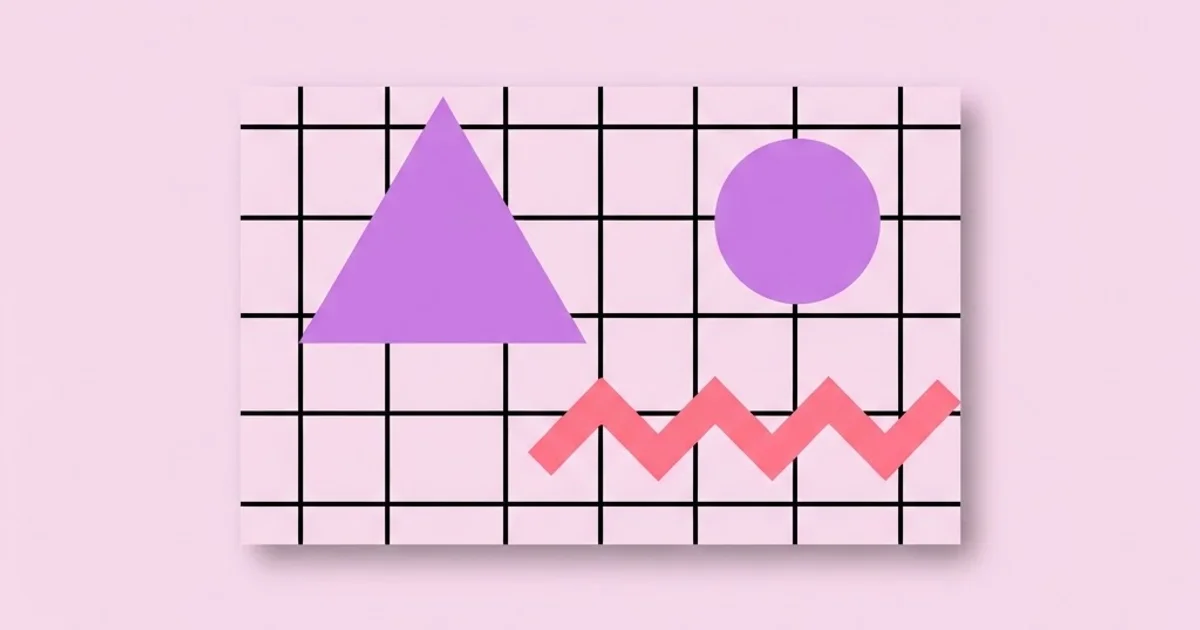
80s graphic design was not one movement but several overlapping ones, and the differences matter when you are trying to reproduce a specific era feeling. The most visually loud strand is Memphis, the Milan-based design collective founded by Ettore Sottsass in 1980, whose squiggles, confetti terrazzo patterns, and clashing primaries were a deliberate rebellion against the sober functionalism of postwar modernism. Memphis is the source of nearly every squiggle-and-triangle pattern now labelled online as "80s".
Running parallel was New Wave typography, sometimes called Swiss Punk, associated with designers such as Wolfgang Weingart and April Greiman. Where classic Swiss design used the grid to create silence, New Wave used it to create tension: letter-spacing stretched to extremes, type set at angles, rules and bars slicing through columns, and layered halftones. Greiman's early adoption of the Macintosh in the mid-1980s matters here, because desktop publishing put layering, scaling, and bitmap texture into the hands of designers who had previously needed a photo lab. If you are studying how visual hierarchy holds together under that kind of pressure, the same principles covered in our guide to visual balance and compositional weight are exactly what keep New Wave layouts from collapsing into noise.
A third strand is the commercial airbrush look: chrome and glass lettering, gradient sunsets, laser grids receding to a vanishing point, and metallic bevels. This came largely from advertising illustration and broadcast title design, and it is the direct ancestor of what people now call synthwave or outrun. Finally there is the early digital strand, where 8-bit and 16-bit constraints produced dithered gradients, chunky pixel type, and limited indexed palettes that designers now reproduce deliberately.
The Core Ingredients of an Authentic 80s Look
If you strip the decade down to reusable components, a small set of ingredients does most of the work. Use three or four of them together; use all of them and the design becomes a costume.
- Saturated, clashing colour. Hot pink, cyan, electric purple, and acid yellow sitting against black or deep navy. The 80s rarely used tints and shades to soften a palette; colours were placed at full strength and allowed to vibrate.
- Geometric primitives as ornament. Triangles, circles, checkerboards, confetti dots, and zigzags scattered as decoration with no functional role, which is the exact opposite of modernist orthodoxy.
- Perspective grids. A horizon line with a receding wireframe plane, borrowed from early 3D wireframe rendering and arcade cabinets.
- Extended and condensed display type. Wide geometric sans faces, italic slab and script logos, heavy outlines, chrome bevels, and drop shadows offset far enough to become their own shape.
- Texture from process. Halftone dots, misregistered colour separations, photocopier grain, and airbrush gradients — artefacts of the production methods of the time.
- Layering without transparency. Elements stacked as opaque cutouts with hard edges, because true alpha compositing was expensive and uncommon.
The last point is the one most digital revivals get wrong. Modern software makes soft glows and 40% opacity overlays trivial, so contemporary "80s" work drifts toward a hazy, blurred aesthetic the decade itself could not easily produce. Hard edges read as more authentic than soft light.
Comparing the Major 80s Design Substyles
Choosing a substyle before you open your design tool prevents the most common failure mode, which is mixing four eras into one incoherent composition. The table below breaks down what separates them.
| Substyle | Defining Visual Traits | Typical Palette | Best Modern Use Case |
|---|---|---|---|
| Memphis | Squiggles, terrazzo confetti, clashing geometric blocks, playful asymmetry | Primary red, yellow, blue with black and white ground | Youth brands, editorial illustration, packaging, event graphics |
| New Wave / Swiss Punk | Angled type, extreme letter-spacing, rules and bars, layered halftone photography | Restrained base with one or two shock accents | Culture magazines, music posters, gallery and festival identities |
| Chrome & Airbrush | Metallic bevels, gradient sunsets, laser grids, lens sparkle, soft illustration | Magenta, cyan, purple on deep black or indigo | Music covers, gaming, streaming key art, nostalgia campaigns |
| Early Digital / 8-bit | Dithered gradients, pixel type, indexed colour, visible scanlines | Limited 16 to 32 colour indexed palettes | Indie games, developer tools, retro tech branding |
| Corporate 80s | Extended geometric sans logos, rainbow stripe motifs, hairline rules | Two-colour corporate blues with a warm accent | Heritage rebrands, anniversary marks, throwback sub-brands |
Why the 80s Revival Keeps Outperforming Neutral Design
There is no credible single statistic that proves retro design converts better, and anyone quoting one should be treated with suspicion. What practitioners can observe consistently is a distinctiveness effect: in categories where every competitor has converged on the same soft-gradient, thin-sans, off-white template, a high-contrast 80s system produces immediate visual separation in a crowded feed or shelf. Teams that adopt it tend to see stronger unaided brand recall in their own qualitative testing, because the work is simply harder to confuse with a competitor.
The second observable effect is emotional shorthand. An 80s palette carries pre-installed associations — arcade, neon, cassette culture, optimism, excess — which means a campaign can skip several steps of narrative setup. That is a genuine efficiency, but it cuts both ways: the same shorthand can signal "unserious" in categories like finance, healthcare, or enterprise software where buyers are risk-averse. The style is a tool with a narrow, powerful application range, not a universal upgrade.
The third factor is production economics. Geometric, flat, high-contrast systems are cheap to extend. Once a team has the palette, the grid, and three pattern primitives, a junior designer can produce fifty on-brand social assets without art direction on each one. Compare that to photographic or 3D-led systems, where every new asset carries real cost. This is the same efficiency logic that makes a well-documented system valuable at any scale, and it is a recurring theme across the classic references listed in our roundup of essential graphic design books worth reading.
Common Mistakes When Designing in an 80s Style
The failure patterns here are consistent enough to name individually, and almost all of them come from treating the decade as decoration rather than as a set of constraints.
Mistake 1: Stacking every motif in one composition. Squiggles plus laser grid plus chrome type plus terrazzo plus VHS scanlines is not 80s, it is a mood board. Authentic period work usually commits to one organising idea. Pick a substyle, then allow at most one borrowed element from another.
Mistake 2: Ignoring contrast accessibility. Hot pink text on electric purple was acceptable on a 1985 record sleeve because nobody had to read it on a phone at 3.2:1 contrast. For digital work, run every text-on-colour pairing through a WCAG contrast check and keep body copy on black, near-black, or the light tint. Use the loud colour pairings on shapes and large display type, where contrast requirements are lower.
Mistake 3: Using the wrong typefaces. Dropping a 2015 geometric sans into a chrome bevel does not produce a period feel. The decade favoured extended geometrics, heavy italic scripts, and wide slabs. If the type is anachronistic, no amount of gradient will rescue it.
Mistake 4: Over-applying texture. A subtle halftone or grain sells the print origin. A heavy VHS glitch overlay on every asset flattens hierarchy, wrecks compression efficiency, and dates the work to the specific year the trend peaked rather than to the 1980s.
Mistake 5: Forgetting the system has to scale down. A neon grid poster is easy. The hard problems are the app icon, the email header, the invoice template, and the one-colour print application. Design those first and the flashy assets take care of themselves.
Mistake 6: Confusing nostalgia with relevance. If the target audience is under twenty-five, they have no lived memory of the decade; they are responding to the aesthetic itself, filtered through gaming and music. That changes which references land. Test with the actual audience rather than with the designers who grew up in the era.
Building an 80s-Inspired Design System, Step by Step
Here is the sequence that reliably produces usable output rather than a single pretty hero image.
Step 1: Pick one substyle and write it down. Commit in a sentence, for example "Chrome and airbrush, night palette, no Memphis ornament." This single decision resolves hundreds of later micro-choices.
Step 2: Lock a five-colour palette. One dark ground, one light tint, one dominant accent, and two supporting accents. Define hex values and assign a role to each, including which are allowed behind text. Resist adding a sixth.
Step 3: Choose two typefaces maximum. A display face carrying the period character and a neutral workhorse for body copy. The workhorse should be boring on purpose; it is what makes the display face feel intentional.
Step 4: Build three reusable pattern primitives. For example a perspective grid, a diagonal stripe block, and a dot halftone field. Save them as vector components with editable colour so anyone can deploy them consistently.
Step 5: Define a layout grid and stick to it. The irony of 80s design is that the best period work was rigorously gridded underneath the chaos. A twelve-column grid with generous gutters lets you place elements at aggressive angles without losing structure.
Step 6: Stress-test the extremes. Produce the smallest asset (favicon or app icon), the densest asset (a data table or pricing page), and the plainest asset (a transactional email) before you produce the hero poster. If the system survives those three, it will survive anything.
Step 7: Document usage rules. Two pages is enough: what to do, what never to do, and three approved example layouts. Undocumented retro systems degrade within a quarter because each new contributor adds one more motif.
A realistic scenario: a synth-hardware startup wants a launch identity. Following this sequence, the team commits to chrome-and-airbrush, locks a black ground with magenta dominant and cyan support, pairs an extended geometric display face with a neutral grotesque, builds a perspective grid plus a bevel treatment plus a halftone field, and ships the icon and the email template before the launch poster. Six months later a contractor can produce on-brand assets without a single art direction call. That is the actual deliverable, not the poster.
Key Takeaways
- 80s graphic design is not one style but at least five distinct substyles, and mixing them indiscriminately is the single most common reason retro work looks amateurish.
- Memphis geometry, New Wave typography, chrome airbrush, and early digital pixel art each came from different tools and different intentions, so each carries a different emotional signal.
- Hard edges and opaque layering read as more period-accurate than the soft glows and low-opacity overlays that modern software makes easy.
- High-contrast retro palettes create genuine distinctiveness in saturated categories, but they can signal a lack of seriousness in risk-averse sectors such as finance and healthcare.
- The test of an 80s design system is whether it survives the favicon, the invoice, and the plain-text email, not whether the hero poster looks good.
Frequently Asked Questions
What colours define 80s graphic design?
The decade favoured fully saturated colour placed against dark grounds: hot magenta, electric cyan, violet purple, acid yellow, and turquoise on black or deep navy. Memphis work leaned on unmixed primaries with white space instead. Tints and pastel washes belong to late-80s corporate and fashion work rather than the core aesthetic.
Which fonts look most authentically 1980s?
Extended geometric sans faces, heavy italic scripts with chrome or bevel treatments, and wide slab serifs carry the period best. Avoid contemporary thin geometric sans faces, which read as 2015 rather than 1985. Wide letter-spacing on display type and aggressive tracking experiments are stronger period signals than any single typeface.
What is the difference between Memphis design and synthwave?
Memphis is an early-80s Italian furniture and graphics movement built on playful geometric ornament, squiggles, and clashing primaries on light grounds. Synthwave is a later retro-futurist revival built on neon gradients, laser grids, and chrome on dark grounds. Memphis is authentic period design; synthwave is a modern reinterpretation of 80s sci-fi imagery.
Is 80s design still relevant for brands today?
It remains highly effective in music, gaming, entertainment, food and beverage, and youth-focused categories where distinctiveness matters more than perceived conservatism. It performs poorly in sectors where buyers associate visual restraint with trustworthiness. Relevance depends entirely on category norms and audience, not on whether the trend is currently popular.
How do I keep an 80s palette accessible?
Reserve the loud colour pairings for large shapes and display type, and set body copy in a near-black or the palette light tint against a high-contrast ground. Check every text and background combination against WCAG contrast ratios. Accessibility failures are the fastest way to make a retro system unusable in production.
What tools reproduce the 80s look best?
Vector tools handle the geometry, grids, and flat colour that carry most of the style, while raster tools add halftone, grain, and airbrush gradients. The specific software matters far less than building reusable components: a saved perspective grid, a bevel style, and a halftone field will do more for consistency than any plugin.
Conclusion
The decision that determines whether 80s-inspired work succeeds is made before any pixel is placed: commit to one substyle and design the boring assets first. Every other choice — palette, typeface, ornament, texture — follows cleanly from that commitment, and skipping it is what produces the overloaded, nostalgia-costume output that fills design feeds. Treat the decade as a constraint system with rules, not as a set of stickers to apply on top of a finished layout. As a practical next step, pick a single substyle from the comparison table, build the five-colour palette and three pattern primitives this week, and then study how the era's leading practitioners handled restraint by reviewing the working methods of the designers who shaped modern graphic art.


