
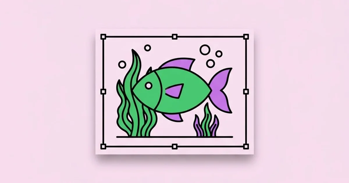
Graphical Underwater 2D Design: A Practical Style Guide
Most underwater 2D scenes fail for the same reason: the artist paints everything at the same visual distance. Graphical underwater 2D design is the craft of using colour temperature, contrast compression, layered parallax and light behaviour to convince a viewer they are looking through water rather than at a blue rectangle with fish on it. It is a systems problem before it is an illustration problem, and once you treat it that way the work gets faster and far more consistent.
Quick Answer: Graphical underwater 2D design uses flat or vector artwork plus depth cues to simulate submersion. The core technique is atmospheric perspective: as elements recede, reduce contrast, desaturate warm tones, shift hue toward the dominant water colour, and soften edges. Add parallax layers, caustic light, and slow particle drift to complete the illusion.
Where WebPeak Fits Into Underwater Scene Production
Underwater scenes rarely ship alone. They land inside a game build, a landing page hero, an explainer animation or a campaign banner set, and each of those destinations has different file, colour and performance constraints. WebPeak, a worldwide full-service digital agency, treats this as a pipeline question rather than an art question: they define the depth-layer system first, lock a five-stop palette, then produce assets in layer groups that survive export to sprite sheets, SVG or animated WebP without re-drawing anything. Teams looking to brief that kind of production-aware illustration work can start at the WebPeak site. Their infographic design practice handles the diagrammatic side of ocean and marine content, while their website design and front-end web development teams make sure a five-layer parallax hero still loads fast on a mid-range Android phone, which is where most beautiful underwater scenes quietly die.
What Actually Makes an Illustration Read as Underwater
Water is not a colour, it is a filter. Light entering water loses wavelengths in order: red disappears first, usually within the first five metres, then orange, then yellow, leaving green and blue to travel furthest. That single physical fact drives almost every credible stylistic decision in the genre. If you want an object to feel deep, you do not just make it smaller and bluer, you remove its warm content entirely and collapse its tonal range toward the mid-tone of the water.
Three terms are worth defining precisely, because designers use them loosely and then wonder why their scenes look muddy. Atmospheric perspective is the progressive loss of contrast and saturation with distance. Caustics are the moving net-like light patterns cast on surfaces when the wavy surface of the water focuses sunlight. Godrays, or crepuscular rays, are visible shafts of light created when suspended particles scatter a directional beam. Caustics live on surfaces; godrays live in the volume between surfaces. Mixing them up is the fastest way to make a scene look like generic stock art rather than considered art direction, the same way a weak concept sinks any piece of design artwork no matter how clean the execution is.
The fourth ingredient is motion logic, even in a still frame. Kelp bends from a base anchor in a slow S-curve, never a straight diagonal. Bubbles accelerate upward and wobble; they do not travel in rigid vertical lines. Fish schools compress and fan. Drawing these correctly in a static illustration is what gives the viewer the sense that the frame was paused rather than posed.
The Seven-Layer Depth Stack That Solves Most Scenes
Rather than improvising, build every underwater scene on the same ordered stack. It makes files predictable, animation trivial and revisions cheap.
- Water gradient base. A single vertical gradient from lighter surface tone to a deeper, cooler floor tone. No detail at all. This is your atmosphere colour and every other layer will be tinted toward it.
- Far silhouettes. Distant reefs, rock walls or trenches at roughly 15 to 25 percent opacity over the base. Shapes only, no internal detail, no outlines.
- Godray volume. Soft-edged angled shafts using screen or overlay blending at low opacity, originating from a single consistent light direction.
- Mid-ground structure. Coral banks, wrecks, rock shelves. Here you allow two tonal values and a hint of the accent hue, but still no warm colour.
- Hero subject. The diver, submarine, character or focal creature. This layer carries the highest contrast, the sharpest edges and the only genuinely saturated accent in the frame.
- Caustic overlay. The rippling light net, masked to the surfaces it should fall on, offset slightly from the light direction established in layer three.
- Foreground debris and particles. Blurred kelp blades, bubble clusters and marine snow, often darkened and partially cropped by the frame edge to force the eye inward.
Two rules keep this stack honest. First, contrast is a budget: the hero layer should hold roughly sixty percent of the total tonal range in the image, and everything else splits the remainder. Second, sharpness is also a budget. Only the hero layer gets crisp vector edges. Far layers lose edge definition, and foreground layers lose it again through simulated depth-of-field, which is what stops a flat vector scene from looking like a sticker sheet.
Choosing a Palette by Depth Zone
Underwater palettes are not interchangeable. The zone you are depicting dictates the hue family, the allowable accents and how much contrast the scene can carry before it stops feeling submerged.
| Depth zone | Dominant hue | Contrast range | Accent strategy | Best used for |
|---|---|---|---|---|
| Shallow reef (0-10m) | Turquoise to aqua | Wide, near full range | Warm coral pinks and corals still readable | Cheerful game levels, kids' content, tourism visuals |
| Mid water (10-40m) | Teal to sea green | Moderate, warms muted | Single saturated accent on the hero only | Exploration scenes, editorial illustration, hero banners |
| Deep open water (40-200m) | Deep blue to indigo | Narrow, compressed mids | Cool cyan rim light, no warm tones | Tension, scale, mystery, documentary framing |
| Abyssal (200m+) | Near-black blue | Very narrow with hard highlights | Bioluminescent greens and violets as the only light | Sci-fi, horror, high-drama key art |
| Murky estuary | Olive to brown-green | Low, heavy haze | Desaturated ochre, silt particles | Realism, environmental storytelling, wrecks |
Practitioner Analysis: Why Flat Scenes Outperform Detailed Ones
In practice, teams that reduce underwater scenes to five or six distinct value steps tend to get stronger results than teams chasing painterly realism, and the reason is structural rather than aesthetic. Water already removes contrast, so a highly detailed render loses most of its detail the moment you apply correct atmospheric perspective. You end up paying for rendering work the medium then deletes. Flat-geometric styling accepts that constraint up front and spends the effort on silhouette clarity instead, which is the one property that survives compression, thumbnail scaling and low-brightness mobile screens.
There is a production argument too. A flat layered scene exports cleanly to SVG or a small sprite sheet, animates with simple transform tweens rather than frame-by-frame redraws, and can be re-coloured for a new campaign in minutes because the palette lives in a handful of fills. A painted scene requires a full repaint for any of those changes. Across a year of campaign work, that difference compounds into a large share of a design team's capacity, which is exactly the kind of efficiency gain a well-chosen toolset delivers; picking the right software matters here as much as it does when you are evaluating apps for graphics designing for any other production workflow.
The honest trade-off is that flat styling exposes weak drawing. When there is no texture to hide behind, an anatomically wrong fish or a badly curved kelp blade is immediately visible. That is why the strongest underwater stylists usually have solid observational drawing behind their vector work, even when the final output has no line weight variation at all.
Common Mistakes and How to Fix Them
The most frequent failure is uniform saturation. Designers pick a beautiful teal and apply it at full strength to every layer, producing a scene that vibrates and reads as a pattern rather than a space. Fix it by desaturating each receding layer by ten to fifteen percent and pushing its hue two or three degrees toward the base gradient.
The second is contradictory light. Godrays fall from the upper left, caustics ripple as if lit from the right, and the hero has a rim light from below. Pick one light vector at the start, write it on the canvas, and mask every light effect to agree with it.
Third is bubble spam. Bubbles are the cheapest signifier of water, so they get overused until they read as visual noise. Restrict them to two or three clusters with varied sizes, always emitted from a plausible source, never scattered evenly across the frame.
Fourth is equal-weight outlines. A uniform two-pixel stroke on every element destroys depth instantly. Either drop outlines on distant layers or scale stroke weight with proximity.
Fifth is floor amnesia. Scenes with no ground plane, no visible floor haze and no cast shadows leave objects hovering in an undefined void. Even a single soft elliptical shadow under the hero anchors the whole composition.
Sixth is ignoring the export target. A gorgeous scene with fourteen blurred layers becomes a two-megabyte hero image that tanks Largest Contentful Paint. Decide early whether blur is baked into the raster export or achieved with CSS filters at runtime, and budget accordingly.
A Step-by-Step Build: Reef Exploration Hero Banner
Here is the sequence I use for a typical 1600x900 hero illustration, start to finish, in roughly four working hours.
Step one, thumbnail the value structure. Spend fifteen minutes producing three greyscale thumbnails at 200 pixels wide. You are only deciding where the darkest dark and lightest light sit. If the composition reads at 200 pixels, it will read anywhere.
Step two, lock the palette. Build a swatch row of exactly six colours: surface tone, deep tone, mid-structure tone, shadow tone, hero accent, and light accent. Name them. Do not add a seventh without deleting one.
Step three, block the stack. Create the seven layer groups described earlier as empty folders before drawing anything. This prevents the classic mid-project mess where the foreground kelp ends up beneath the godrays.
Step four, silhouette pass. Draw every element as a solid single-colour shape with no internal detail. Review at 25 percent zoom. Any shape you cannot identify at that size needs a stronger outline profile, not more detail.
Step five, depth tinting. Apply a clipped fill of the base water colour to each receding group at increasing opacity: 10 percent for mid-ground, 25 percent for far structures, 40 percent for the furthest silhouettes. This single step does more for believability than an hour of detailing.
Step six, light pass. Add godrays on a screen layer at 12 to 20 percent opacity, then caustics masked to upward-facing surfaces only. Keep caustic opacity under 30 percent; beyond that it looks like a fishnet stocking laid over the art.
Step seven, hero contrast. Push the focal subject's darks darker and add a single cool rim light on the side facing the light source. This is where your saturated accent earns its keep.
Step eight, foreground framing. Add two or three cropped, darkened, softly blurred elements at the edges. They should be nearly abstract. Their job is to create a proscenium, not to be looked at.
Step nine, export discipline. Produce a full-resolution master, a 1200-pixel WebP for desktop, an 800-pixel crop for mobile that keeps the hero subject inside the safe area, and a layered source file with the seven groups intact for future animation.
Key Takeaways
- Underwater believability comes from atmospheric perspective, not from adding more bubbles, fish or texture to the scene.
- Build every scene on a fixed seven-layer stack so files stay predictable and animation or re-colouring costs almost nothing later.
- Water removes red wavelengths first, so warm colours must disappear as depth increases or the illusion breaks immediately.
- Caustics belong on surfaces and godrays belong in the volume between them; treating them as interchangeable produces generic-looking art.
- Flat-geometric styling beats painterly rendering underwater because the medium deletes fine detail anyway while rewarding silhouette clarity.
Frequently Asked Questions
What software is best for underwater 2D design?
Vector tools such as Illustrator, Figma or Affinity Designer suit flat layered underwater scenes because depth tinting and re-colouring stay non-destructive. Raster tools like Procreate or Photoshop are better when you want painted caustics and soft particle work. Many practitioners build silhouettes in vector and finish light passes in raster.
How do I animate a 2D underwater scene without heavy files?
Animate transforms rather than pixels. Slowly translate the caustic overlay horizontally, drift particle layers upward on a loop, and apply small rotation oscillations to kelp anchored at the base. Parallax the seven layers at different speeds on scroll. All of this runs on CSS or lightweight tweens without frame-by-frame artwork.
What colours should I avoid in underwater illustration?
Avoid saturated reds, oranges and warm yellows on anything beyond the shallow zone, because those wavelengths are absorbed quickly and their presence reads as an error. Pure white is also risky; it flattens depth. Use a tinted near-white that carries the water hue instead.
How many layers does a good underwater scene need?
Three is the practical minimum for any sense of depth: background, mid-ground and foreground. Five to seven is the sweet spot for hero illustrations and game backgrounds. Beyond nine, file weight and render cost rise faster than perceived quality, especially on mobile devices.
How do I make a deep-sea scene without it going completely dark?
Use bioluminescence as your light source. Place two or three small emissive accents in cool green or violet, give each a soft falloff, and let them describe just enough of the surrounding forms. Keep the overall value range narrow and put the few bright pixels exactly where you want attention.
Is underwater 2D design a good portfolio piece for junior designers?
Yes, because it demonstrates colour control, value structure and environmental storytelling in a single image. Show the layer breakdown alongside the final render. Reviewers care more about seeing your depth system and palette discipline than about the finished picture on its own.
Conclusion
The single decision that determines whether an underwater 2D scene succeeds is made before you draw a single fish: choose your depth zone and commit to the contrast and colour rules that zone imposes. Everything downstream, from palette to particle density to export size, follows from that one choice. Your next step is to take an existing illustration, strip it to greyscale, and check whether your value separation actually matches your intended depth order; if it does not, rebuild the stack before touching colour again. To keep sharpening the fundamentals behind this kind of work, the reading list in our roundup of the best books for graphic design is a reliable place to go deeper on colour and composition theory.


