
Artificial Intelligence Background Image: A Design Guide
How to create or choose an artificial intelligence background image that looks intentional, stays on brand and keeps overlaid text perfectly readable.
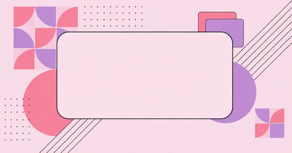
Artificial Intelligence Background Image: A Design Guide
The blue circuit-board brain has become visual wallpaper, and audiences now scroll past it without registering anything. An artificial intelligence background image is a supporting visual placed behind headlines, interface panels or presentation content to signal a technology context without competing with the message. Its job is contrast management and tone, not decoration, which is exactly why so many AI backgrounds fail: they are designed as artwork instead of as a surface.
Quick Answer: A good artificial intelligence background image uses abstract geometry, a restrained two or three colour palette and a large low-detail area where text sits. Generate or select it at the final display size, keep contrast above accessibility thresholds for overlaid copy, and avoid glowing brains, circuit clichés and busy neural network renders.
How a Design Team Builds Reusable AI Background Systems
One background is a graphic; a set of rules is a system, and only the second scales across a website, a deck and a social calendar. WebPeak's banner and social design team typically defines a background family first, fixing palette, shape language and the safe zone where copy always lands, so every later asset stays recognisably related. Their information design specialists extend the same system into diagrams, and their web design group handles how those backgrounds behave responsively when a hero crops from desktop to mobile. Their process for building that kind of visual system is described on the WebPeak website.
What Separates a Usable Background From Stock Noise
A background succeeds when nobody comments on it. That sounds like faint praise, but it is a strict requirement: if a viewer notices the background before the headline, the composition has failed at its only job. The practical test is to add your real headline at real size and check whether it remains the first thing you read.
Three properties make that work. First, a dominant quiet region occupying roughly the middle third where detail drops to near zero. Second, a limited palette, ideally one dominant colour plus one or two accents, because more hues create local contrast that competes with type. Third, consistent shape language, meaning the geometry looks like it came from one system rather than three different generators. Naming the concept clearly in your prompt helps here in the same way precise language helps everywhere else in this field, a point covered in our breakdown of how AI terminology should be used precisely.
How to Generate an AI Background That Works
- Start with the placement, not the picture. Website hero, slide deck, social banner and video call background each need different aspect ratios and safe zones.
- Specify style, palette and mood explicitly. Name the aesthetic, list exact hex values, and state the background colour rather than leaving it to chance.
- Ask for negative space. Request generous empty area on a named side so your copy has somewhere to live.
- Ban the cliches in the prompt. Exclude glowing brains, circuit traces, humanoid robots, lens flares and blurry orbs directly.
- Exclude text explicitly. Generated lettering is almost always malformed, so request no text, letters or numbers.
- Generate at final dimensions. Upscaling a small render introduces artefacts that are obvious on large displays.
- Check contrast with real copy. Overlay the actual headline and verify legibility rather than judging the image alone.
Background Formats and Where They Belong
| Use case | Typical dimensions | Format | Design priority |
|---|---|---|---|
| Website hero | 1920 by 1080 | WebP | Mobile crop safety |
| Social share card | 1200 by 630 | WebP or PNG | Legibility at thumbnail size |
| Presentation slide | 1920 by 1080 | PNG | Low detail behind body text |
| Blog cover | 1200 by 630 | WebP | File size under 200 KB |
| Video call background | 1920 by 1080 | JPG | Quiet edges around the subject |
A Practitioner Perspective on AI Visual Cliches
In practice, the reason circuit-brain imagery persists is that it is the fastest way to communicate the topic, and speed of recognition genuinely matters on a crowded feed. The trade-off is that instant recognition and memorability pull in opposite directions: when every competitor uses the same visual shorthand, recognition succeeds and differentiation fails completely. Brands that switch to abstract geometry usually lose a little immediate topic clarity and gain a visual identity people can actually recall.
The way to keep both is to carry topic meaning in the composition rather than the iconography. A retrieval system can be suggested by layered planes and connecting paths, an evaluation loop by a cycle of repeated forms, a scaling story by a stepped progression. These read as intentional design while still referencing the subject, and they avoid the uncanny quality of literal renders. That deliberate framing mirrors the reasoning discipline discussed in how theory-led thinking differs from pattern imitation, applied to visual work rather than modelling.
Key Takeaways
- A background image succeeds when the headline is still the first element a viewer reads.
- A quiet low-detail zone and a two or three colour palette are the two structural requirements for overlaid text.
- Prompts should name the exact placement, palette, negative space and the cliches to exclude.
- Generating at final display dimensions avoids the artefacts introduced by upscaling smaller renders.
- Abstract compositional metaphors communicate AI topics without the recognisability trap of circuit-brain stock imagery.
Frequently Asked Questions
What size should an AI background image be?
Match the final placement. Website heroes and slides generally use 1920 by 1080, while social and blog cover images use 1200 by 630. Generate at that size directly, because enlarging a smaller render usually produces soft edges and visible artefacts on large screens.
How do I keep text readable over a background image?
Reserve a low-detail region for the copy, then verify contrast with the real headline in place. If contrast is marginal, add a solid or subtly tinted panel behind the text rather than lightening the whole image, which usually weakens the composition.
Why do AI backgrounds all look the same?
Because most prompts describe the topic rather than the design. Asking for artificial intelligence yields the trained average: blue tones, circuitry and glowing brains. Specifying style, palette, shape language and exclusions moves the result away from that default.
What file format is best for web backgrounds?
WebP for most web use, since it produces substantially smaller files than PNG or JPG at comparable quality. Keep blog and social images under a few hundred kilobytes, and reserve PNG for assets requiring transparency or presentation software with limited format support.
Should backgrounds include recognisable AI symbols?
Usually not. Literal symbols such as robots and brains date quickly and appear across countless competitors. Abstract geometry that mirrors the concept, such as layered planes for retrieval or stepped forms for scale, communicates the idea while remaining distinctive to your brand.
Conclusion
The most valuable decision here is treating the background as a surface with a defined safe zone, not as a picture you happen to place text on. Design the quiet region first and the rest of the composition becomes straightforward. Your next step is to define one palette and one shape language, then produce a small family of backgrounds from those rules rather than one-off images. If you are also planning the system behind the visuals, read our breakdown of the five shifts that decide whether an AI project ships.
Related articles
 Graphic Design
Artificial Intelligence Cartoon Design: Practical Guide
How artificial intelligence cartoon workflows actually run, from character consistency and style locking to clean-up, licensing checks and delivery files.
 Graphic Design
What Would Google Look Like If It Was a Human? Explored
What would Google look like if it was a human? The exercise sounds playful but it is one of the sharpest brand personality tools a design team can use.
 Graphic Design
Artificial Intelligence Movie Poster Design: How to Create Key Art That Sells the Story
A designer's guide to artificial intelligence movie poster design, covering concept, typography, color, symbolism, print specs and the legal limits of AI image tools.