What is Typography and How to Choose the Right Fonts for Your Brand
Learn what typography is, why it matters for brand identity, and how to choose the right fonts that build recognition, trust, and a polished visual presence.
What is Typography and How to Choose the Right Fonts for Your Brand
Typography is the art and science of arranging type so that written language is clear, beautiful, and emotionally resonant. It is one of the most powerful tools in design, yet it is often the most underestimated. Long before customers read a single word, the shape of your letters, the spacing between them, and the personality of your typefaces have already shaped their perception of your brand. The right typography can make a business feel premium, friendly, authoritative, modern, or timeless. The wrong choice can quietly undermine credibility, reduce readability, and make even strong content feel forgettable. For any brand serious about growth, understanding typography is non-negotiable.
Refine Your Brand Typography with WebPeak
Choosing and applying typography consistently across digital and print assets requires both design taste and technical discipline, which is where WebPeak adds real value. Their designers help brands select typefaces that align with their personality, audience, and competitive context, then build complete type systems around them. Through their graphic design services, they ensure typography works seamlessly across websites, social media, marketing materials, and product interfaces. They also document everything in clear brand guidelines so internal teams stay consistent over time. With strong typography in place, brands enjoy sharper recognition, better readability, and a more professional feel everywhere customers encounter them.
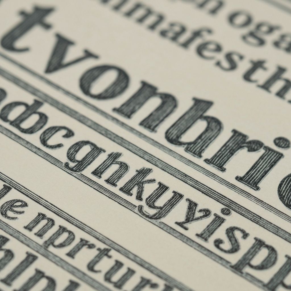
What Typography Actually Is
Typography goes far beyond picking fonts. It includes choices about typefaces (the design family, like Helvetica or Garamond), fonts (specific weights and styles within a family), sizes, line height, letter spacing, alignment, and how all these elements combine into a coherent system. Strong typography balances aesthetics with function: it must look good and be effortlessly readable across screens, sizes, and contexts. Even small details — like the subtle curve of a letter or the spacing between two characters — can shift how a brand feels.
Typefaces fall into several broad categories. Serifs (with small projections on letters) often feel classic, editorial, and trustworthy. Sans-serifs feel modern, clean, and neutral. Slab serifs are bolder and more confident. Scripts and display fonts feel expressive and emotional but are usually reserved for headlines or accents. Each category communicates something different, even before a single word is read.
Why Typography Matters for Brand Identity
Typography shapes brand personality more powerfully than most people realize. Two brands could use the same logo, the same colors, and the same imagery, yet feel completely different simply because of their type choices. A luxury fashion brand uses different typefaces than a children's app, a financial firm, or a tech startup, and those choices reinforce positioning across every touchpoint. Over time, well-chosen type becomes shorthand for the brand itself, instantly recognizable even without a logo present.
Typography also affects readability and accessibility, which directly influence business results. Hard-to-read fonts increase friction, lower comprehension, and reduce conversion. Fonts that are not optimized for screens, mobile, or accessibility standards can quietly exclude segments of your audience. Investing in thoughtful typography is therefore not just an aesthetic decision but a practical one with measurable impact on engagement, retention, and revenue.
How to Choose the Right Fonts for Your Brand
Start with strategy. Define your brand personality in three to five clear adjectives — modern, premium, approachable, technical, playful, etc. Then look at typefaces that genuinely express those traits. A bold geometric sans might fit a tech-forward brand, while a refined serif may fit a heritage or editorial one. Avoid choosing fonts purely because they are trendy; trends fade, but strong typography should last for years.
Most brands work best with two complementary typefaces — one for headlines and one for body text — sometimes with a third for accents. Pair contrasting but harmonious styles, such as a distinctive serif headline with a clean sans-serif body. Test your typography across real contexts: long paragraphs, short headlines, mobile screens, large displays, and printed materials. Many beautiful typefaces struggle at small sizes or in long-form reading, so practical testing is essential. Pair strong type choices with thoughtful article writing and your content gains both readability and visual personality at the same time.
Build a Typography System and Stay Consistent
Choosing fonts is only the beginning. The real power of typography comes from building a clear system and applying it consistently. Define a type scale with specific sizes for each level — H1, H2, H3, body, caption, button — along with line heights, letter spacing, and weights. Decide which typeface is used where, how headlines pair with subheadings, and how typography behaves across breakpoints on websites and apps.
Document everything in your brand guidelines so designers, developers, marketers, and external partners stay aligned. Consistency over time is what turns typography from a creative choice into a recognizable brand asset. As your brand grows, revisit your type system periodically to make sure it still serves your audience and platforms — modern web standards, variable fonts, and accessibility expectations evolve, and your typography should evolve with them. Done well, your fonts will work as silent ambassadors for your brand, communicating quality and personality in every word you publish.
Frequently Asked Questions
How many fonts should a brand use?
Most brands work best with two main typefaces — one for headlines and one for body text — and occasionally a third for accents. Using too many fonts dilutes recognition and makes design more difficult to manage.
Are free fonts good enough for professional brands?
Many high-quality free fonts can absolutely work for professional brands, especially from reputable libraries. The key is choosing fonts that are well-designed, properly licensed, and aligned with your brand personality.
Should I match my fonts to my industry?
Sometimes yes, sometimes no. Industry conventions can help you feel familiar to customers, but distinctive typography can also help you stand out. The right balance depends on your positioning and competitive context.
How do I know if my typography is accessible?
Use sufficient size, contrast, and line spacing for readability. Test your type with accessibility tools and on different devices to ensure users with various visual abilities can read your content comfortably.
How often should a brand update its typography?
Typography systems generally last longer than visual trends, but a refresh every several years can keep things modern. Major changes should be tied to brand evolution rather than fleeting design fads.
Conclusion
Typography is one of the most influential and underrated elements of brand identity. It shapes how customers perceive your professionalism, personality, and credibility, often before they even read a word. By understanding the basics of type, choosing fonts strategically, building a clear system, and applying it consistently, you transform typography from a small design detail into a powerful long-term asset. Whether you are launching a new brand or refining an existing one, treat typography with the same care as your logo and colors, and you will create a visual voice that feels unmistakably yours — across every screen, page, and platform.
Related articles
 Graphic Design
Why Are Animated GIFs Useful on Social Media?
Discover why animated GIFs boost engagement, convey emotion, and grab attention on social media, plus how brands use them effectively.
 Graphic Design
What Is a Social Media Kit? A Practical Guide for Brands and Creators
Learn what a social media kit is, what to include in one, and how a well-built kit keeps your branding consistent and saves hours across every platform.
 Graphic Design
What Is a Social Media Kit?
A social media kit is a branded toolkit of templates, logos, colors, and guidelines that keeps your social content consistent. Learn what to include and why.