What is a Visual Identity and How to Build One for a Startup
Discover what a visual identity is and learn how to build one for a startup with logo, color, typography, and imagery that scale together.
What is a Visual Identity and How to Build One for a Startup
For most startups, the visual identity is the first thing customers experience and the last thing founders prioritize. The result is often a patchwork of assets that look fine in isolation but feel disconnected when seen together. A strong visual identity solves this by creating a cohesive system of design elements that work in harmony across every channel, from a pitch deck to a product UI to a TikTok video. Done well, it makes a young company feel established, credible, and memorable in markets crowded with louder competitors. Done poorly, even great products struggle to break through because nothing about the brand feels distinctive or trustworthy.
How WebPeak Helps Startups Launch With a Strong Visual Identity
Building a visual identity that scales requires both creative vision and strategic discipline. WebPeak works closely with founders to develop identities that capture the essence of a brand while remaining flexible enough to grow. Their logo design service creates the centerpiece mark, while their broader graphic design services extend the identity into typography systems, color palettes, illustration libraries, and brand guidelines. The result is a foundation that supports everything from launch day through Series B without losing its character.
What a Visual Identity Actually Includes
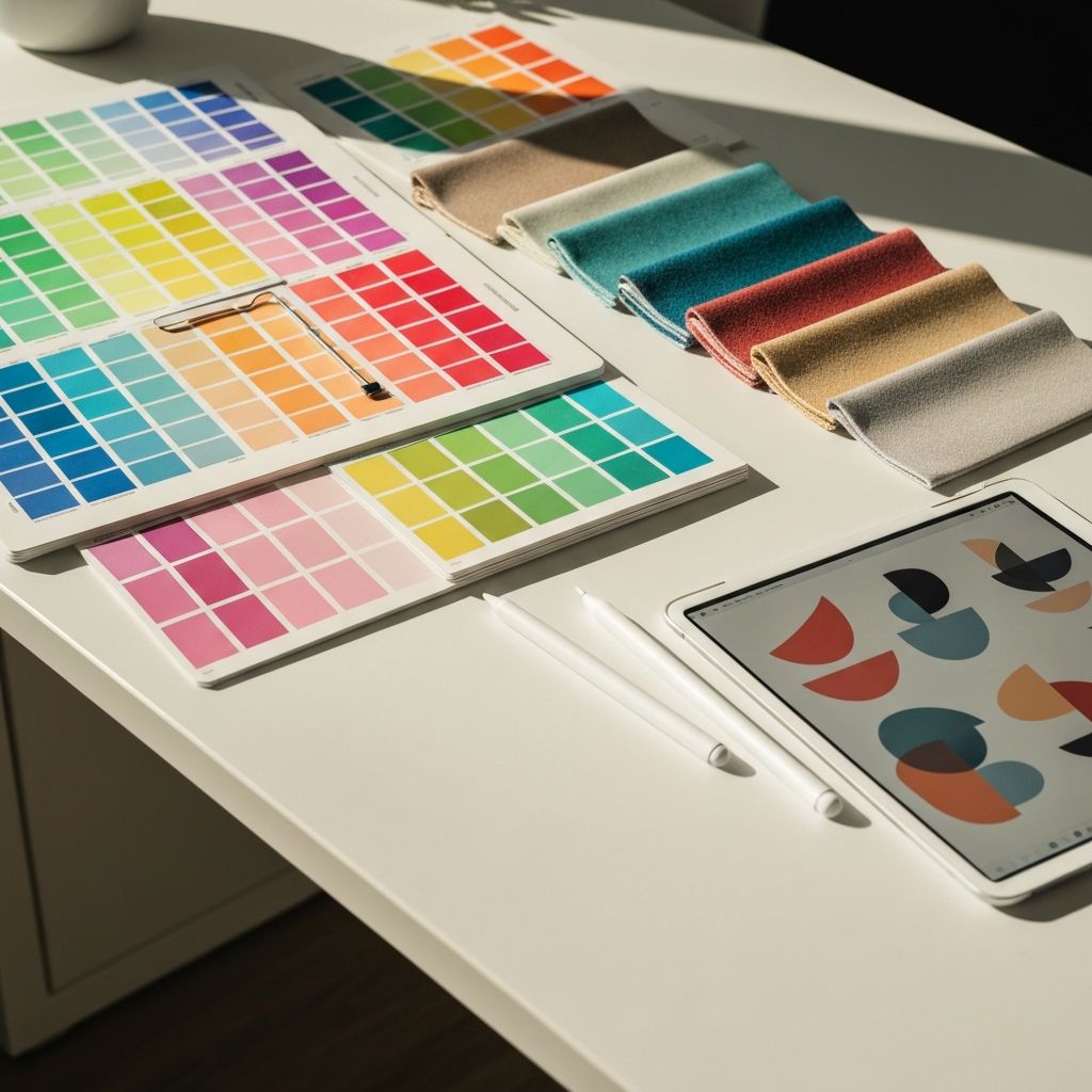
A visual identity is the complete set of design elements that represent a brand visually. The most familiar element is the logo, but it is only one piece of a larger system. Color palettes, typography choices, photography style, illustration approach, iconography, layout principles, and motion language all combine to create the visual fingerprint of a company. Each element carries meaning, and together they communicate the brand's personality before a single word is read.
It helps to think of a visual identity as a vocabulary rather than a single symbol. The logo is one word, the colors are another, the typography is another, and so on. The richness of communication comes from how these elements combine across different contexts. A product UI might emphasize layout and color, a brand video might emphasize motion and typography, and a piece of packaging might emphasize photography and texture. The identity remains coherent because every element draws from the same vocabulary.
Why Startups Need a Visual Identity Early
Many founders postpone visual identity work until after product-market fit, reasoning that brand can wait. The cost of that delay is real. Without a coherent identity, every team that creates anything starts from scratch, leading to wasted hours and inconsistent output. Investors, candidates, and early customers form snap judgments about credibility based on visual signals, and a polished identity quietly removes objections that founders may never even hear about.
Building a visual identity early also forces strategic clarity. The exercise of defining brand personality, audience, and positioning provides answers that ripple through hiring, marketing, and product decisions. Startups that invest in thoughtful identity work often find that the strategic conversations matter even more than the final logos and palettes. The brand becomes a shared north star that helps small teams move in the same direction.
The Process of Building a Visual Identity From Scratch
The process begins with strategy, not pixels. Document who the audience is, what the brand stands for, what makes it different, and how it should feel. Capture this in a brief that includes brand attributes, competitor landscape, and inspiration references. The clearer this foundation, the easier every subsequent design decision becomes.
Next, develop the logo as the anchor of the system. Explore multiple directions in low-fidelity sketches before refining the strongest options. Once the logo direction is locked, build the supporting system around it. Choose two or three core typefaces with clear roles, define a primary and secondary color palette with enough variation for accessibility, and establish photography or illustration guidelines that reinforce the brand mood. Codify everything in a brand guidelines document that explains rules, shows examples, and provides downloadable assets so any team member can stay on brand without guesswork.
Common Mistakes Startups Make and How to Avoid Them
The most common mistake is chasing trends rather than building something durable. Visual trends shift quickly, and what looks fresh today often feels dated within a year. Anchor decisions in brand strategy and timeless design principles rather than the current aesthetic of competitor decks. A second mistake is over-designing the logo. The strongest startup logos are often surprisingly simple, because simplicity ages better and works at every scale from favicon to billboard.
Another pitfall is neglecting the system around the logo. Founders often pour energy into the mark itself and treat color, typography, and imagery as afterthoughts. The result is a logo that looks great on a slide titled "our brand" but falls flat on every actual marketing asset. A final mistake is failing to document the system. Without clear guidelines, even the best identity gets diluted as new team members and freelancers improvise. Investing a few extra days in documentation pays for itself many times over as the company grows.
Frequently Asked Questions
How much should a startup budget for a visual identity?
Budgets vary widely based on agency, scope, and ambition, but most early-stage startups invest between five thousand and thirty thousand dollars on a foundational identity. Spending less is possible with freelancers, while well-funded startups often invest six figures with established studios.
How long does it take to build a visual identity?
A focused identity project typically takes six to ten weeks from kickoff to final guidelines. Faster timelines are possible but usually skip the strategic discovery phase that produces the most durable results.
Can a startup change its visual identity later?
Yes, brand refreshes and rebrands are common as startups evolve. The goal of an early identity is not to be perfect forever but to provide a credible, cohesive foundation that supports the next stage of growth, with flexibility to evolve as the company matures.
Is a visual identity the same as branding?
Visual identity is one component of branding, focused specifically on design elements. Branding is broader and includes strategy, messaging, voice, customer experience, and culture, all of which inform what the visual identity should express.
How important is a brand guidelines document?
A brand guidelines document is essential because it preserves consistency as the team grows and works with external partners. Even a simple ten-page guide prevents most off-brand executions and makes onboarding new contributors much faster.
Conclusion
A strong visual identity is one of the most underrated investments a startup can make. It signals credibility, accelerates marketing output, aligns teams around a shared aesthetic, and gives the brand a fighting chance in crowded markets. Build the identity around clear strategy rather than fleeting trends, design a system that extends well beyond the logo, and document everything so it scales gracefully as the company grows. The startups that take visual identity seriously from day one are the ones that look like the leaders they intend to become long before the rest of the world catches up.
Related articles
 Graphic Design
Why Are Animated GIFs Useful on Social Media?
Discover why animated GIFs boost engagement, convey emotion, and grab attention on social media, plus how brands use them effectively.
 Graphic Design
What Is a Social Media Kit? A Practical Guide for Brands and Creators
Learn what a social media kit is, what to include in one, and how a well-built kit keeps your branding consistent and saves hours across every platform.
 Graphic Design
What Is a Social Media Kit?
A social media kit is a branded toolkit of templates, logos, colors, and guidelines that keeps your social content consistent. Learn what to include and why.