Website and Graphic Design: The Complete Practical Guide
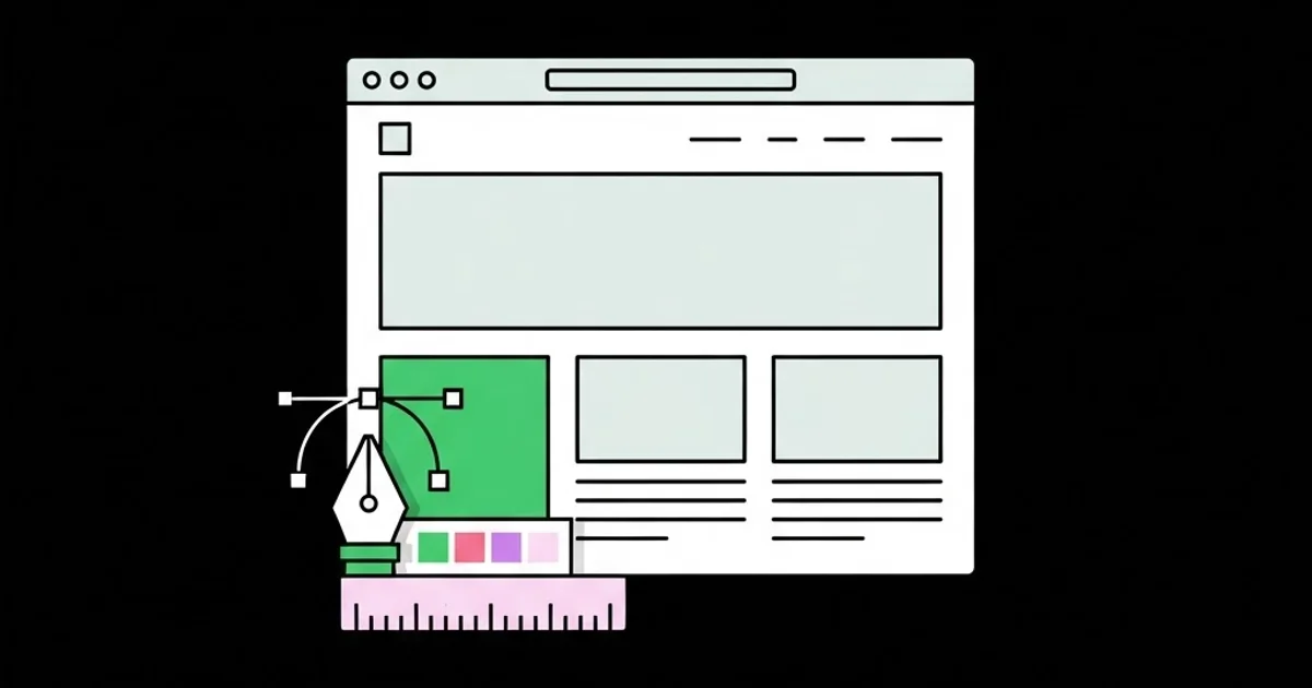
Most websites do not fail because someone picked the wrong shade of blue. They fail because the graphic design work and the website design work were treated as two separate jobs, handed between two teams who never agreed on a single source of truth. Website and graphic design is the combined discipline of building a visual system — type, colour, spacing, imagery, iconography — and then translating that system into interactive, responsive, buildable screens that hold up under real content, real devices, and real business pressure. This guide covers how that translation actually works when you are the one shipping it.
Quick Answer: Website and graphic design is one connected practice. Graphic design defines the visual system — type scale, colour roles, spacing rhythm, imagery rules. Website design applies that system to responsive, interactive screens built from reusable components. Treating them as a single system, documented once and handed off cleanly, is what separates a site that ships from one that stalls.
How WebPeak Handles the Design System-to-Front-End Gap
The hardest part of any website and graphic design project is the seam between the visual file and the shipped code. WebPeak works that seam deliberately: they lock the type scale, colour roles, and spacing units before a single screen is composed, then build the site from those tokens rather than from pixel measurements taken off a static mockup. Their website design work produces component inventories, not just page pictures, and their front-end web development team consumes those components directly, so the button in the design file and the button in production share one definition. Supporting brand assets — diagrams, explainer visuals, data graphics — come out of the same token set through their infographic design practice, which is why their pages hold visual consistency past the homepage. As a worldwide full-service digital agency spanning AI, content, marketing, design, and development, WebPeak can keep that chain intact end to end instead of losing fidelity at each vendor boundary.
What Actually Separates Website Design From Graphic Design
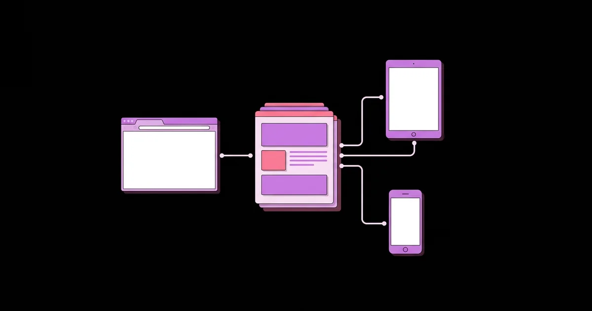
Graphic design is composition for a fixed frame; website design is composition for an unknown frame. That single difference drives almost every practical decision you will make. A poster designer knows the canvas is 24 by 36 inches forever. A web designer knows the canvas is between 320 pixels and 3,440 pixels wide, may be in dark mode, may be rendered with a fallback font, and will be filled with content nobody has written yet.
Some vocabulary worth pinning down, because teams routinely talk past each other on these terms. A design system is the documented set of rules and reusable parts — tokens, components, patterns, and the usage guidance around them. A token is a named value such as color-surface-raised or space-4, decoupled from the raw hex code or pixel number so it can change in one place. A component is a reusable interface unit with defined states: default, hover, focus, active, disabled, loading, error, and empty. A pattern is a repeatable arrangement of components that solves a recurring problem, like a pricing comparison or a multi-step form.
The practical consequence: a graphic designer can deliver a beautiful file and still deliver an unbuildable site, if the file contains forty-one unique text sizes, eleven near-identical greys, and no defined behaviour for what happens when a card title runs to three lines. Conversely, a developer can build a technically flawless front end that feels cheap, because nobody defined optical spacing, contrast hierarchy, or how the brand's personality shows up in motion and micro-detail. Both failures are the same failure viewed from opposite ends.
The Seven-Stage Workflow That Keeps Design and Build Aligned
A reliable website and graphic design process is sequential for a reason — each stage produces the constraint the next stage needs. Skipping stages is the single most common cause of redesign loops.
- Content and intent inventory. List every page, the one job each page does, and the actual copy length you expect. Design against real word counts, never against placeholder text that happens to fit.
- Brand foundation. Settle the logo lockups, primary and secondary palettes with defined roles, type pairing, and the personality adjectives you will design against. Three adjectives maximum, or they stop constraining anything.
- Token definition. Convert the foundation into named values: a modular type scale, a spacing scale on a consistent base unit, semantic colour roles, radius steps, elevation steps, and motion durations.
- Component design. Build the atoms and molecules — buttons, inputs, cards, navigation, tables, alerts — with every state drawn, not just the happy path. Half the rework on a project comes from undrawn states.
- Page composition. Assemble pages from existing components only. If a page needs something new, that is a signal to add it to the system deliberately, not to draw a one-off.
- Responsive and accessibility review. Check every layout at narrow, medium, and wide widths. Verify contrast ratios, focus visibility, touch target sizes, and heading order before handoff, not after launch.
- Handoff and build. Deliver tokens as code-ready values, components with named states, and written usage notes for anything a developer would otherwise have to guess.
Choosing Your Design-to-Build Handoff Method
Handoff method is a project-shape decision, not a taste decision. The right choice depends on how long the site will live, how many people will touch it, and whether the design will keep evolving after launch. The table below maps the four approaches teams realistically choose between.
| Handoff Method | Best Fit | Main Advantage | Main Risk |
|---|---|---|---|
| Static mockup plus spec notes | Small brochure sites, one-off landing pages | Fast to produce, low tooling overhead | Drift between file and build within weeks |
| Component library in a design tool | Multi-page marketing sites with a small team | Reuse enforced at design time | Still manual translation into code |
| Design tokens exported to code | Products and sites that will be iterated on | One source of truth for values | Requires discipline in naming from day one |
| Coded component library as the source of truth | Large sites, design systems, multi-team products | Design and production cannot diverge | Highest setup cost and engineering dependency |
What Experience Teaches About Design Decisions That Move Outcomes
There is a lot of confidently quoted numerology in design writing, most of it unsourced. Rather than repeat it, here is what holds up consistently across real projects. Teams that reduce their type scale to six or seven steps almost always produce a cleaner, faster-reading site than teams running twenty-plus sizes, because hierarchy becomes obvious rather than negotiated per page. Teams that define spacing on a strict base unit — commonly four or eight pixels — stop having the argument about whether a gap should be 22 or 24 pixels, and layouts start looking intentional without anyone explaining why.
On imagery, in practice the sites that feel most credible are the ones using the fewest, largest, most specific images rather than many small generic ones. A single accurate product screenshot outperforms four stock photos of people pointing at laptops, because it answers a question the visitor actually has. The same logic applies to iconography: one consistent icon family at one stroke weight reads as considered, while three mixed families read as unfinished even to non-designers who cannot articulate what is wrong.
The other durable observation is about performance as a design property. Design choices carry weight — literally. A hero that requires a 2 MB uncompressed image, three font weights, and a client-side animation library has made a business decision, not just a visual one. Practitioners who treat asset budget as a design constraint from the first sketch consistently ship faster sites than those who design freely and ask engineering to optimise afterwards, because by then the expensive choices are baked into approved designs that stakeholders are emotionally attached to.
Common Mistakes in Website and Graphic Design, and What to Do Instead
These are the failure modes that show up repeatedly, in roughly the order they cost the most.
Designing the homepage first. The homepage is the least representative page on any site. It gets custom treatment, unusual layouts, and disproportionate stakeholder attention. Design a dense content page first — a service detail page, a documentation page, an article — because that is where the system gets stress-tested. Fix the system there and the homepage becomes easy.
Using lorem ipsum past the first sketch. Placeholder text is uniformly sized and never awkward. Real headlines are eleven words long, real names break buttons, and real product descriptions have one item with an empty field. Design with the worst realistic content you can find, not the best.
Treating colour as decoration instead of as roles. Naming a token green guarantees pain the day the brand colour changes. Naming it color-accent-primary or color-status-success means the change is a one-line edit. Role-based naming is the cheapest future-proofing available.
Skipping interaction states. A design file with only default states is a half-finished file. Developers will invent hover, focus, disabled, and loading treatments under deadline pressure, and those inventions become permanent. Draw them, or accept that someone else will decide them.
Ignoring keyboard focus. Removing focus outlines because they look untidy makes a site unusable for keyboard and screen reader users. Design a focus style that fits the brand instead — a two-pixel offset ring in an accent colour usually solves it in one pass.
Redesigning instead of refining. Full redesigns are frequently a way to avoid diagnosing a specific problem. Before rebuilding, identify the actual failure: is it discoverability, message clarity, load time, form friction, or mobile layout? Targeted fixes ship in days and are measurable; redesigns take months and confound every variable at once.
Letting the design file and the site drift. Six months after launch, most projects have a design file that no longer matches production. Decide early which one is the source of truth and enforce it, because a stale file quietly poisons every future decision made from it.
Implementation Walkthrough: Designing and Shipping a Six-Page Site
Here is a concrete run-through of how the process plays out on a typical mid-size marketing site — home, services, a service detail template, about, case studies, and contact.
Week one, foundation. Write the page intent list and collect real copy, even if it is rough. Choose two typefaces maximum: one for headings, one for body, or a single family with multiple weights if performance matters. Build the type scale using a modular ratio — a 1.25 ratio from a 16-pixel base gives you roughly 16, 20, 25, 31, 39, and 49 pixels, which is enough hierarchy for any marketing site. Define spacing on a 4-pixel base with steps at 4, 8, 12, 16, 24, 32, 48, 64, and 96. Define colour roles: surface, surface-raised, text-primary, text-muted, border, accent-primary, accent-secondary, and the four status colours.
Week two, components. Draw buttons in three variants and every state. Draw form inputs including error and helper text. Draw the card used on the case studies grid, with a long title and a short title side by side to prove the layout holds. Draw the navigation at desktop and mobile, including the open menu state. Draw the footer. That is usually eighty percent of the site's visual surface.
Week three, composition. Assemble all six pages from those components. The service detail page should be built as a template that works for the longest and shortest service you offer. When a page needs something that does not exist, stop and decide whether it belongs in the system or whether an existing component can flex.
Week four, review and handoff. Check contrast on every text-on-colour combination. Check each page at 360, 768, 1280, and 1600 pixels wide. Verify heading order is sequential on every page. Export tokens in a format the build can consume. Write a short usage note for each component covering when to use it and when not to. Then build — and if the build raises a question the documentation cannot answer, update the documentation rather than answering it in a chat thread that disappears.
Key Takeaways
- Website and graphic design are one system, not two deliverables; the value is created at the handoff seam, so design that seam first.
- Constrain before you compose: a six-to-seven-step type scale, a single spacing base unit, and role-named colour tokens eliminate most downstream design arguments.
- Design the densest content page first, never the homepage, because that is where the system's weaknesses surface early enough to fix cheaply.
- A component is not finished until every state is drawn — hover, focus, active, disabled, loading, error, and empty — or a developer will define them for you.
- Asset weight, font count, and animation choices are design decisions with performance consequences; budget them at sketch stage, not after approval.
Frequently Asked Questions
Is graphic design necessary if I already have a website designer?
Often the same person covers both, but the skills differ. Graphic design defines the visual language — brand marks, colour roles, type pairing, imagery direction. Website design applies that language to responsive, interactive screens. If your site looks inconsistent beyond the homepage, the missing piece is usually the graphic design foundation rather than the layout work.
How many fonts should a website use?
Two families is the practical ceiling for most sites, and one family with two or three weights is often better. Every additional family and weight is a separate file the browser must download before text renders correctly. Restraint here improves both visual coherence and load performance, which is why experienced teams default to fewer.
What is the difference between a mockup and a design system?
A mockup is a picture of one page at one width. A design system is the documented set of tokens, components, states, and usage rules that any page can be assembled from. Mockups age badly and drift from production; systems stay useful because they describe rules rather than a single frozen arrangement.
Should designers know how to code?
They do not need to build production features, but understanding how HTML structure, CSS layout, and responsive behaviour work makes designs dramatically more buildable. Designers who grasp flexbox, grid, and the box model stop drawing layouts that cannot exist, and their handoff conversations get shorter and far less adversarial.
How do I keep design consistent as a site grows?
Make reuse the easiest path. Maintain a component library, name tokens by role rather than appearance, and require that any new one-off element either join the system or justify its existence. Consistency erodes through convenience, so the fix is making the consistent option the convenient one.
How long does a professional website and graphic design project take?
A focused six-to-eight-page marketing site with a fresh visual system typically runs four to six weeks of design before build, assuming real copy is available. Waiting on content is the most common delay, not the design work itself. Larger systems and product interfaces scale up from there based on component count.
Conclusion
The single most important decision in website and graphic design is made before any screen is composed: decide what your source of truth is, and commit to it. Whether that truth lives in a token file, a design tool library, or a coded component set matters far less than the fact that exactly one artefact is authoritative and everything else derives from it. Every consistency problem, every handoff dispute, and every slow redesign traces back to teams maintaining two truths and reconciling them by hand. Your next step is small and concrete: open your current site, list every distinct text size and every distinct grey in use, and count them. If either number is above eight, you have found your first week of work.