
Art Deco Graphic Design: Principles, Type and Modern Use
Art Deco is the most frequently imitated and least understood movement in graphic design, because designers copy its ornament while ignoring the geometry that makes the ornament work. Art Deco graphic design is a machine-age visual system built on strict symmetry, stepped geometric forms, radiating motifs, and high-contrast geometric typography, all constructed from repeated modules rather than drawn freehand. Once you understand that every authentic Deco composition is generated from a small set of rules applied rigorously, you can produce work in the idiom that reads as designed rather than as a filter applied after the fact.
Quick Answer: Art Deco graphic design uses strict bilateral symmetry, stepped ziggurat forms, sunburst and chevron motifs, and geometric high-contrast typography. It originated in 1920s and 1930s machine-age optimism. Applied today, it suits luxury, hospitality, and entertainment brands where craftsmanship and formality need signalling.
How WebPeak Applies Period Styles Without Producing Pastiche
The agency's rule on historical styles is worth stating plainly: extract the construction logic, discard the decoration, then rebuild the decoration from the logic. Applied to Art Deco, WebPeak's designers start from the geometric module — a base unit that generates the stepping, the radial divisions, and the type proportions — before any ornament is drawn, which is why their period-influenced logo and monogram work holds up at small sizes where ornate revival marks usually collapse. The same constraint carries into digital surfaces through their website design practice, where Deco geometry has to survive responsive reflow, dark mode, and accessibility contrast minimums that never existed in the 1930s. More on how the team approaches style systems across media is available at WebPeak. The practical point for designers is that a period style is only viable commercially when it is rebuilt as a system with rules; applied as surface decoration, it dates within a season and breaks the first time it is scaled down.
What Defines Authentic Art Deco Graphic Design
Art Deco is defined by geometric construction expressing industrial optimism, not by gold gradients on black backgrounds. The movement emerged in France in the 1920s, took its name retrospectively from the 1925 Exposition Internationale des Arts Décoratifs et Industriels Modernes, and spread rapidly through poster design, architecture, product design, and typography during the interwar period.
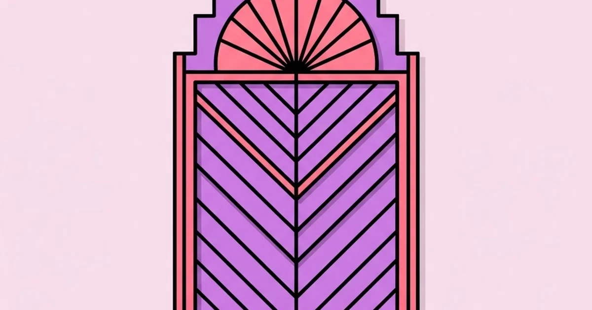
Six characteristics define the visual system. First, strict bilateral symmetry: most compositions balance on a central vertical axis, which is why Deco reads as formal and ceremonial rather than dynamic. Second, stepped forms — the ziggurat profile borrowed from Mesopotamian and Mesoamerican architecture — used in frames, borders, and letterform terminals. Third, radiating motifs: sunbursts, fans, and fountain shapes expressing optimism and energy through repeated angular divisions.
Fourth, streamlining: elongated horizontal lines and speed whiskers borrowed from aerodynamic industrial design, especially in later 1930s work. Fifth, geometric typography with extreme contrast between thick and thin strokes, high waistlines, narrow apertures, and capitals used almost exclusively. Sixth, material references: metallics, lacquered blacks, deep jewel tones, and exotic wood and stone textures, reflecting the luxury craft origins of the movement.
Crucially, Deco is a decorative modernism. It shares the machine-age enthusiasm of the Bauhaus but rejects the functionalist rejection of ornament. That tension is the key to using it well: the ornament must be geometrically justified rather than merely applied, or the result reads as costume. Understanding where this sits relative to other disciplines and movements is easier with a clear map, and the framework in the core graphic design disciplines helps distinguish a style choice like Deco from a discipline choice like packaging or identity.
The Construction Rules That Generate Art Deco Compositions
These are the working rules to apply rather than the characteristics to recognise. Use them in order and the result will read as authentic rather than imitative.
- Establish a module first. Pick a base unit and derive every dimension from it. Deco's coherence comes from proportional relationships, not from individual shapes.
- Set a central axis and commit. Build the composition symmetrically around a vertical spine. Asymmetric Deco exists but is advanced work; start with the formal version.
- Use stepping instead of curves for transitions. Where a form changes width, step it in equal increments rather than tapering smoothly. Equal increments are what make it read as machine-made.
- Divide radial elements into equal angular segments. Sunbursts use consistent angles, never randomly spaced rays. Odd segment counts centre better on a symmetric axis.
- Limit the palette to three or four values. Typically one deep ground, one metallic or bright accent, and one light neutral. Deco palettes are contrasty, not numerous.
- Set type in capitals with generous letterspacing. Use geometric faces with high contrast and high waistlines. Tight setting destroys the formality instantly.
- Frame the composition. Deco almost always contains itself inside a border, panel, or stepped frame, which is a large part of why it reads as considered and complete.
- Add ornament last and only where the geometry permits. Ornament that does not sit on the module grid is the single clearest tell of inauthentic Deco work.
Art Deco Compared With Adjacent Movements
Designers routinely confuse Deco with the movements surrounding it, which leads to mixed-signal work. These distinctions clarify what belongs where.
| Movement | Approximate Period | Attitude to Ornament | Typographic Signature | Composition Logic |
|---|---|---|---|---|
| Art Nouveau | 1890-1910 | Organic, flowing ornament | Hand-drawn, botanical forms | Asymmetric, curvilinear |
| Art Deco | 1920-1940 | Geometric, modular ornament | Geometric capitals, high contrast | Symmetric, stepped, radial |
| Bauhaus | 1919-1933 | Ornament rejected | Functional sans serif, lowercase | Asymmetric, grid based |
| Streamline Moderne | 1930-1945 | Minimal, aerodynamic lines | Elongated, horizontal emphasis | Horizontal, speed oriented |
| Swiss International | 1950-1970 | Ornament rejected | Neutral grotesque, ragged right | Strict modular grid |
Where Art Deco Still Performs Commercially
No public dataset measures the commercial performance of period styles, so treat this as practitioner analysis. Deco continues to perform in categories where the buying decision involves perceived craftsmanship, occasion, and formality: hospitality, spirits and cocktail brands, theatres and live entertainment, luxury property, jewellery, and heritage financial institutions. The common thread is that the customer is buying an experience with a sense of occasion, and Deco's ceremonial symmetry communicates that faster than any contemporary minimal system can.
It performs badly where it is fighting the category's expectations — in software products, healthcare, logistics, or anywhere trust depends on transparency and plainness. Deco reads as curated and exclusive, which is precisely wrong when the user needs to feel that nothing is being concealed.
There is also a practical production consideration that decides many of these projects. Deco relies on fine stroke contrast and detailed ornament, both of which degrade at small sizes and on low-quality reproduction. Brands using it successfully almost always maintain a simplified geometric mark for small applications alongside the full ornamental lockup for hero contexts. That discipline of building a system rather than a single artefact is exactly the lesson visible across the careers examined in the most influential graphic designers, most of whom worked with reproduction limits as a primary design input rather than an afterthought.
Mistakes Designers Make With Art Deco Work
These failures show up constantly in portfolio pieces and client work attempting the style.
Treating gold on black as the style. Metallic accents are a common Deco palette choice, not a defining property. Authentic Deco exists in coral and cream, jade and ivory, deep blue and silver. Leading with the cliché palette is the fastest way to produce work that looks like a party invitation template.
Using decorative fonts without geometric structure. Many typefaces marketed as Deco are novelty faces with Deco-flavoured details and no underlying geometry. Test a candidate face by checking whether its capitals share consistent stroke contrast, a high waistline, and geometric bowls. If the letterforms are inconsistent, the whole composition inherits that weakness.
Ignoring the module. Placing a sunburst here and a chevron there without a shared proportional system produces ornament soup. Every element should measure as a multiple of the base unit. This single discipline separates convincing Deco from decorative noise.
Setting body text in Deco display faces. Deco typography is a display idiom. Extended reading in high-contrast geometric capitals is painful and often fails accessibility requirements. Pair the display face with a neutral, highly legible text face and let the contrast between them carry the period signal.
Forgetting contrast requirements. Period palettes were not designed for screen accessibility. Deep jewel tones against black frequently fail contrast minimums. Adjust luminance values to meet the required ratios, then reintroduce the period character through form rather than colour.
Over-applying symmetry to information. Centred symmetry works beautifully for a poster or a title panel and badly for a data table, a form, or a navigation menu. Use Deco for expressive surfaces and switch to a functional layout logic for dense information.
Skipping the simplified variant. Any Deco identity needs a reduced mark for favicons, embroidery, and app icons. Designers who deliver only the ornate lockup guarantee that someone else will butcher it later.
A Practical Walkthrough: Building a Deco Identity System
Here is a workable sequence for applying Art Deco to a real brief, using a cocktail bar identity as the scenario.
Step one: define the module and the frame. Choose a base unit, then build a stepped rectangular frame whose steps are exact multiples of it. The frame establishes the proportional language everything else inherits. Work in a vector tool with snapping enabled and construct rather than draw.
Step two: build the monogram on the axis. Set the initials in a geometric capital face, then rebuild the letterforms manually so their stroke contrast, waistline, and terminals match your module. Add stepping to terminals and a single radial element behind the letters if the composition needs energy. Keep the element count low; three components is usually the ceiling.
Step three: create the reduction ladder. Produce three versions: full ornamental lockup for hero use, simplified mark for medium applications, and a single geometric glyph for favicons and stamps. Test each at its intended size on an actual device or print, not at zoomed-in screen view.
Step four: set the palette with measured contrast. Choose one deep ground, one accent, one light neutral, and optionally one metallic treated as a print-only specification. Check every text pairing against accessibility contrast minimums and adjust luminance rather than abandoning the hue.
Step five: build the type system in two tiers. Display tier uses your geometric capitals with wide letterspacing for names, headings, and menu titles. Text tier uses a neutral, comfortable face at normal spacing for descriptions, prices, and legal copy. Document the exact spacing values, because inconsistent letterspacing is what makes applied Deco look amateur.
Step six: specify ornament usage rules. State where sunbursts, chevrons, and stepped borders may appear, at what scale, and in what quantity per surface. A one-ornament-per-composition rule prevents the drift toward clutter that affects nearly every Deco rollout after the designer leaves.
Step seven: prototype on the worst surface first. Apply the system to the most constrained artefact — a small social avatar, a printed receipt, a narrow mobile screen — before designing the beautiful poster. If it survives there, the hero applications will take care of themselves.
Key Takeaways
- Art Deco graphic design is generated from a geometric module, strict symmetry, and stepped forms rather than from applied decorative ornament.
- Authentic Deco typography uses geometric capitals with high stroke contrast and generous letterspacing, and should never be used for body text.
- The style performs commercially in hospitality, spirits, entertainment, and luxury categories where occasion and craftsmanship drive the buying decision.
- Every Deco identity needs a reduction ladder, since fine ornament and stroke contrast fail at small sizes and in low-quality reproduction.
- Period palettes frequently fail modern accessibility contrast requirements, so adjust luminance and carry the period signal through form instead.
Frequently Asked Questions
What are the main characteristics of Art Deco graphic design?
Strict bilateral symmetry, stepped ziggurat forms, radiating sunburst and fan motifs, streamlined horizontal lines, geometric high-contrast capital typography, and rich contrasting palettes. All of these derive from a proportional module, which is why authentic Deco reads as constructed and machine-made rather than hand-drawn or organic.
What typefaces work for Art Deco design projects?
Look for geometric display faces with high stroke contrast, elevated waistlines, and consistent capital construction, such as Broadway-style or geometric sans designs from the period. Verify consistency across the full capital set before committing, and always pair the display face with a neutral text face for readable body copy.
Is Art Deco still relevant in modern branding?
Yes, in categories where formality, craftsmanship, and occasion drive purchase decisions, including hospitality, spirits, theatre, jewellery, and luxury property. It is a poor fit for software, healthcare, and logistics, where plainness and transparency build trust more effectively than ceremonial ornament does.
How is Art Deco different from Art Nouveau?
Art Nouveau, roughly 1890 to 1910, uses organic curves, botanical forms, and asymmetric hand-drawn composition. Art Deco, roughly 1920 to 1940, uses geometric modules, strict symmetry, stepped forms, and machine-age references. They represent opposite attitudes toward nature and industry despite both being highly ornamental.
Can Art Deco work for website design?
It can, provided the geometry survives responsive reflow and accessibility requirements. Use Deco treatment on expressive surfaces such as hero panels, section dividers, and headings, and switch to a functional layout for forms, tables, and navigation. Verify all colour pairings against contrast minimums before build.
What colours are used in Art Deco design?
Common palettes combine a deep ground such as black, navy, or emerald with a bright or metallic accent like gold, coral, jade, or silver, plus a light neutral such as cream or ivory. The defining property is high contrast with few colours, not the presence of metallics.
Conclusion
The decision that determines whether Deco work succeeds is whether you build the module before you draw the ornament, because everything that reads as authentic in the style is a consequence of proportional consistency rather than of decorative choice. Start your next period project by constructing the frame and the unit, then earn each ornament by placing it on that grid. If you want to understand the opposite pole of this argument — what happens when designers deliberately strip out ornament and expose raw structure instead — the reasoning in brutalist graphic design makes a useful counterweight to everything covered here.


