
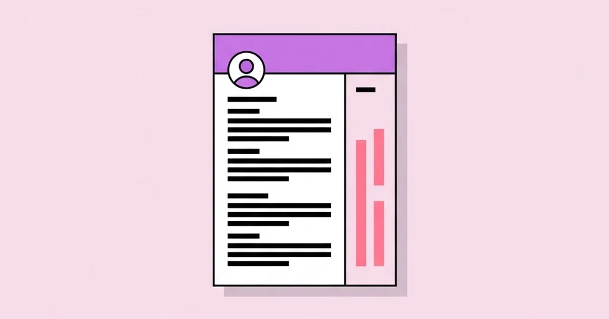
Graphic Design Resume Designs That Land Real Interviews
A graphic design resume is a portfolio piece pretending to be a hiring document. It has to survive automated parsing, hold up during a six-second human scan, and prove typographic control before anyone clicks through to your work. Most designers nail two of those three and lose the role on the one they ignored. The resume is the only artifact in your application where craft and compliance have to coexist, and the designers who get callbacks treat it as a constrained design problem rather than a form to fill in.
Quick Answer: Strong graphic design resume designs use a disciplined single- or two-column grid, two or three type sizes for hierarchy, one accent colour, and selectable machine-readable text instead of embedded images. Keep it to one page, lead with measurable outcomes rather than software lists, and match the typography to your portfolio so both read as one system.
How WebPeak Handles Designer Resume and Personal Brand Systems
WebPeak, a worldwide full-service digital agency covering AI, content writing, digital marketing, graphic design, web development, and web app development, treats a designer's resume as one artifact inside a personal brand system rather than a standalone file. Their approach starts by locking the type pairing, accent colour, and spacing scale first, then applying that same system across the resume, the portfolio cover, the case study pages, and the social profile banners so a hiring manager encounters one consistent voice at every touchpoint. Because their graphic design and web teams ship identity work and portfolio sites side by side, they are unusually strict about the boring parts: consistent baseline rhythm, a single accent applied to no more than three elements, and export settings that keep text selectable. If you want to see how that systems-first thinking is applied across disciplines, their work is documented at WebPeak.
What Hiring Managers Actually Read on a Design Resume
Hiring managers read design resumes in two passes, and the two passes want opposite things. The first pass is a scan that lasts a handful of seconds and looks for four signals only: current or most recent role, seniority level, the kinds of companies or clients you have worked with, and whether the page looks like a designer made it. The second pass, which only happens if the first one succeeds, is a read for evidence — what you shipped, who it was for, and what changed because of it.
Two terms matter here. Applicant tracking system (ATS) parsing is the automated extraction of your name, roles, dates, and skills into a structured database record. Parsers read the text layer of a PDF, so any content baked into an image or hidden inside a text box that exports as artwork simply does not exist as far as the system is concerned. Visual hierarchy is the order in which a reader's eye moves through the page, established through size, weight, spacing, and contrast. A resume with good hierarchy can be understood at arm's length with the text blurred, because the shapes alone tell you where the sections are.
The practical consequence is that your resume needs to be legible to a machine and art-directed for a human at the same time. That is not a contradiction, it is a constraint — the same kind you deal with when a brand system has to work on a billboard and a favicon. Solve it by keeping all content as live text, using standard section labels the parser recognises, and expressing your design skill through spacing, typography, and restraint rather than through decorative containers the parser cannot read.
Building the Layout System Before You Touch the Content
The fastest way to produce a resume that looks designed rather than decorated is to build the grid and type scale first, then pour content into it. Designers who start by typing bullet points end up nudging things into place for hours and still land on something that feels uneven.
- Choose a column structure. Single column reads cleanly and parses perfectly. Two columns fit more content and give you a sidebar for contact details and skills, but you must confirm the parser reads them in the right order. A common safe pattern is a wide main column at roughly two-thirds width with a narrow sidebar at one-third.
- Set a spacing scale. Pick a base unit — 4pt or 6pt works well — and make every margin, gutter, and gap a multiple of it. This single decision eliminates most of the visual noise in amateur resumes.
- Limit the type scale to three sizes. Name, section headings, and body. Anything more fragments the hierarchy. Use weight and letter-spacing to differentiate roles from dates rather than adding a fourth size.
- Pick one accent colour and apply it three times maximum. Section rules, your name, and one small graphic element is plenty. Two accents on a one-page document almost always reads as indecision.
- Set generous margins. Fifteen to twenty millimetres on all sides. Tight margins are the clearest tell that someone ran out of space and compressed instead of editing.
- Establish a baseline rhythm. Line height should be roughly 1.35 to 1.5 for body text, and the vertical gap between sections should be at least double the gap between bullets so the eye can find the section breaks instantly.
- Test at 25 percent zoom. If the grey shapes still communicate structure when text is unreadable, your hierarchy works. If it looks like one grey rectangle, rebuild the spacing.
Only after the system exists should you write the content into it. When the container is disciplined, weak copy becomes obvious immediately, which is exactly what you want while there is still time to fix it.
Comparing Resume Formats for Different Design Roles
Not every design role rewards the same format. A motion designer applying to an agency and a design systems specialist applying to a product company are solving different persuasion problems, and the layout should reflect that.
| Format | Best For | Core Strength | Main Risk |
|---|---|---|---|
| Single column, typographic | Product, UX, and design systems roles | Perfect parsing, reads fast, signals restraint and maturity | Can look plain if the type pairing is weak |
| Two column with sidebar | Brand, print, and generalist studio roles | Fits contact, skills, and tools without crowding the narrative | Sidebar content can be parsed out of order by older systems |
| Editorial grid with strong masthead | Editorial, publishing, and art direction | Demonstrates layout skill directly on the page | Easy to overdesign into an unreadable poster |
| Minimal monochrome with one accent | Senior and lead applications across disciplines | Confident, ages well, keeps focus on outcomes | Offers no cover if the written content is thin |
| Portfolio-cover hybrid | Freelance and direct client pitches | Works as a leave-behind and a first page of a proposal | Usually fails ATS parsing, so keep a plain variant ready |
What Actually Changes a Reviewer's Mind
There is very little trustworthy public data on design resume screening, and the numbers that circulate on social media are usually invented or badly misquoted. So rather than pretending otherwise, here is what consistently shows up in practice when reviewing candidate pipelines with hiring teams.
Reviewers convert interest into an interview when a resume line answers three questions at once: what was the problem, what did you specifically do, and what happened next. "Redesigned the onboarding flow" answers one. "Redesigned a six-screen onboarding flow for a fintech app, cutting the number of required fields from eleven to four after two rounds of usability testing" answers all three and is verifiable in conversation. Teams that rewrite every bullet to that standard tend to see more first-round calls, because each line gives the interviewer something concrete to probe rather than a claim to take on faith.
The second pattern is portfolio-resume coherence. When the resume and the portfolio share a type system and accent colour, reviewers describe the candidate as "considered" and "systematic" without being able to say why. When the two look unrelated, the same reviewers hesitate, because inconsistency reads as either carelessness or borrowed work. This is the cheapest credibility signal available to any designer, and it costs nothing beyond deciding on a system and sticking to it. The same logic is why designers who also produce their own data and process visuals tend to interview well — a single consistent visual voice across case studies, diagrams, and the resume itself makes the whole application feel deliberate.
The third pattern is subtraction. In practice, the strongest resumes are the ones with the fewest elements per square inch. Removing icon rows, skill percentage bars, and decorative dividers almost always raises perceived seniority, because senior work is defined by what a designer chose not to include.
Mistakes Designers Make and What to Do Instead
These are the errors that appear over and over in real candidate pipelines, ranked roughly by how much damage they do.
Exporting the resume as an image or a flattened PDF. This is the single most expensive mistake, because it can remove you from consideration before a person ever sees the file. Fix it by exporting text as live text and confirming you can select and copy every word in a PDF reader.
Skill rating bars. A bar showing you at eighty-five percent in Illustrator communicates nothing verifiable and invites a question you cannot answer. Replace them with context: name the tool and the work you did in it, such as "Figma — maintained a 90-component library across three product teams."
Listing responsibilities instead of outcomes. "Responsible for social assets" describes a job description, not your performance in it. Rewrite as what you produced, at what volume or scope, and what it enabled — for example, building a reusable template system that let a marketing team ship their own campaign banners and social posts without a designer in the loop.
Overdesigning the document. Full-bleed colour blocks, portrait photos, oversized name lockups, and three typefaces are a common attempt to look creative. They almost always reduce readability and make the page feel junior. Restraint reads as confidence.
Burying the portfolio link. The portfolio URL should sit in the header, written in full, and point to a live page that loads fast on mobile. A link in eight-point grey at the bottom of page one is a link nobody clicks.
Ignoring the second page problem. If your content genuinely needs two pages, make page two complete on its own with your name repeated in the header. Pages get separated, printed, and forwarded individually far more often than designers expect.
Shipping one resume to every role. A single generic version underperforms a base template with a swapped opening summary and a reordered experience section. The edit takes ten minutes per application and measurably changes who calls back.
A Practical Build Walkthrough You Can Follow Today
Here is the sequence that reliably produces a finished, defensible resume in a single focused session.
Step one: inventory before you design. Open a blank document and list every role, project, client, and measurable result you can remember, without editing. You are collecting raw material, not writing. Expect this to take thirty to forty minutes and to produce roughly three times more content than fits on a page.
Step two: rank ruthlessly against the target role. Read the job posting and mark each item as core, supporting, or cut. Core items are the ones the posting explicitly asks for. Anything older than about ten years, or unrelated to the target discipline, becomes a single compressed line or disappears entirely.
Step three: rewrite every surviving line as problem, action, result. Keep each bullet to two lines maximum at your chosen body size. If a bullet runs to three lines, the sentence is carrying two ideas and should be split or trimmed.
Step four: build the grid in your tool of choice. Set margins, columns, and the spacing scale before placing a single word. Create paragraph styles for name, section heading, role title, meta text, and body so that changing the system later is a one-click operation rather than a manual sweep.
Step five: place content and edit to fit by cutting, never by compressing. Reducing body text to eight point or squeezing line height to fit one more bullet is always the wrong trade. Cut the weakest bullet instead.
Step six: run the four-part check. Print it in greyscale to confirm hierarchy survives without colour. View it at 25 percent zoom to confirm the shapes read. Copy all the text out of the exported PDF to confirm it parses. Hand it to someone outside design for ten seconds and ask what you do and where you last worked — if they can answer both, the scan layer works.
Step seven: version and name the file properly. Export as "Firstname-Lastname-Role-Resume.pdf". Keep the editable source, a plain-text variant for stubborn application forms, and a dated archive of each tailored version so you are never rebuilding from scratch under deadline pressure.
Key Takeaways
- A graphic design resume must satisfy two readers with opposite needs: an automated parser that only sees live text, and a human who scans shapes and hierarchy in seconds.
- Build the grid, spacing scale, and type system before writing content, because a disciplined container exposes weak copy while there is still time to fix it.
- Every experience bullet should answer problem, action, and result in one sentence, giving the interviewer something concrete to probe.
- Matching the resume's typography and accent colour to your portfolio is the cheapest credibility signal in the entire application.
- Perceived seniority rises with subtraction — removing skill bars, icon rows, and decorative dividers almost always improves the document.
Frequently Asked Questions
Should a graphic design resume be one page or two?
One page is the default for anyone with under roughly ten years of experience. Two pages are acceptable for senior, lead, and academic profiles, but page two must earn its place with substantive work rather than overflow. Always repeat your name and contact details in the second page header.
Do creative resume templates hurt your chances with ATS software?
Heavily designed templates cause problems when content sits inside images, text boxes that export as artwork, or complex table structures. The design itself is not the issue — the text layer is. Test by exporting to PDF and copying all the text out. If anything is missing, the parser will miss it too.
Should I include a photo on my design resume?
It depends entirely on region. In much of North America and the UK, photos are discouraged because they introduce bias risk and many companies strip them. In parts of continental Europe and Asia they remain conventional. When unsure, leave it off and let the work carry the application.
What should replace skill percentage bars on a designer resume?
Replace them with evidence. Name the tool alongside the scope of work you delivered with it, such as maintaining a component library, running a print production handoff, or building a motion system. Context is verifiable in an interview, while an arbitrary eighty-percent rating is not.
How many projects should the resume actually name?
Name three to five projects at most, chosen for relevance to the target role rather than for prestige. The resume's job is to earn the portfolio click, not to duplicate the portfolio. Each named project should include your specific contribution, since team credit without role clarity invites doubt.
Which typefaces work best for graphic design resumes?
Any well-drawn family with a genuine range of weights will work, and a single family used across three weights often outperforms a pairing. If you pair, contrast the categories clearly — a grotesque with a serif, for example — and keep body text between nine and eleven point for print legibility.
Conclusion
The decision that matters most is treating your resume as a designed system rather than a document you fill in. Once the grid, type scale, spacing unit, and single accent are locked, every other choice becomes mechanical, tailoring for a specific role takes ten minutes instead of an afternoon, and the page carries the quiet consistency that reviewers read as seniority. The next step is concrete: rebuild your current resume on a fixed spacing unit with paragraph styles for every text role, then run the greyscale print, the 25 percent zoom, the copy-the-text parse check, and the ten-second stranger test before you send it anywhere.


