Graphic Designers Websites: Build a Portfolio That Sells
Most graphic designers websites fail for the same reason: they were built to impress other designers instead of converting the person holding the budget. A graphic designer's website is a sales asset with a portfolio attached, not a gallery with a contact form bolted on the end. The difference shows up in the inbox. A site that leads with outcomes, names its ideal client in the first screenful, and makes the enquiry path obvious will out-earn a prettier site with mystery navigation every single time. What follows is the structure, the build decisions, and the mistakes that separate a portfolio that gets compliments from one that gets briefs.
Quick Answer: An effective graphic designer's website needs six things: a positioning statement above the fold, six to ten deep case studies instead of forty thumbnails, visible pricing signals, fast image delivery, a single obvious enquiry action, and proof of process. Fewer projects shown in more depth consistently produces more qualified leads than a large, shallow gallery.
How WebPeak Approaches Portfolio Sites for Graphic Designers
Portfolio builds have a specific failure mode that general agencies miss: designers over-specify the visuals and under-specify the funnel. The team at WebPeak tends to start the opposite way around, mapping the enquiry path first — who lands on the site, which three questions they need answered before they will write an email, and what the shortest route to that email looks like — then designing the case study template around those answers. Because they run website design and front-end web development as one pipeline, the layout that gets signed off is the layout that actually ships, rather than a comp that gets flattened during build. For designers who publish new work monthly, their website maintenance and support work matters more than it sounds: a portfolio that is painful to update quietly goes stale within two quarters, and a stale portfolio reads as an inactive practice.
What a Graphic Designer's Website Has to Prove in Thirty Seconds
A portfolio visitor is running a three-part check, usually in under a minute: can this person do my kind of work, have they done it for someone like me, and can I afford them. Everything on the homepage should serve one of those three questions. Anything that serves none of them is decoration.
Start with positioning. "Graphic designer" is not positioning; it is a job title shared by millions. "Packaging and label design for independent food and drink brands" is positioning, because it tells a wrong-fit visitor to leave and a right-fit visitor to keep scrolling. Narrow positioning feels like it shrinks the market. In practice it raises the close rate on the enquiries you do get, because the people who write in have already self-qualified. If you genuinely serve two distinct markets — say, brand identity and editorial layout — build two entry pages and let the homepage route traffic, rather than blending both into one vague sentence.
Next, proof of relevance. A client buying packaging design does not care about your poster series. Order your work by commercial relevance, not by how proud you are of it. The top three slots on the work grid should be the three projects closest to the work you want more of, even if a personal project is visually stronger.
Finally, affordability signalling. Designers resist publishing numbers, and often for good reason, but silence does not remove the question — it just moves the conversation to a call that wastes both parties' time. A starting-from figure, a typical project range, or even a sentence like "most identity projects run four to six weeks" filters out mismatched budgets before they reach your calendar.
The Page Structure That Consistently Converts
Portfolio sites do not need many pages. They need the right ones, in the right order, each with a single job. This is the structure that holds up across freelance designers and small studios alike.
- Home. Positioning line, three to six featured projects, a one-line credibility strip (client names or sectors), a short process summary, and one primary call to action repeated at the top and bottom.
- Work index. A filterable grid, but only if you have more than twelve projects. Below that, filters add friction without adding value. Each tile shows client, discipline, and outcome — not just an image.
- Case study template. The most important page on the site. Brief, constraint, approach, the work itself, and the result. Written once, reused for every project.
- Services and pricing. What you do, what it includes, what it excludes, and what it costs or starts at. Exclusions prevent scope arguments later.
- About. A working biography, not a personality essay. Experience, sectors, tools, and the reason a client should trust the judgement behind the pixels.
- Contact. A short qualifying form — project type, timeline, budget band, description — and a direct email address for people who refuse forms. Never only a form.
Two optional additions earn their place if maintained: a notes or journal section that demonstrates thinking between projects, and a testimonials page pulled from real client emails with names and companies attached. Anonymous praise persuades nobody.
Platform Choices Compared
Platform choice should follow update frequency and image volume, not aesthetics. Every option below can produce a beautiful site; they differ in what happens six months after launch.
| Approach | Best suited to | Update effort | Main trade-off |
|---|---|---|---|
| Hosted site builder | Solo designers with under 15 projects | Very low | Template ceiling on layout and image handling |
| WordPress with a custom theme | Designers publishing regularly or blogging | Low once built | Ongoing updates, plugins, and hosting upkeep |
| Headless CMS plus a React framework | Studios with large media libraries | Low for editors, higher for setup | Needs a developer for structural changes |
| Hand-coded static site | Designers who code and update rarely | High | Every content change is a code change |
| Portfolio marketplace profile only | Early-career designers testing positioning | Minimal | No control over discovery, layout, or client data |
Why Image Performance Decides Portfolio Outcomes
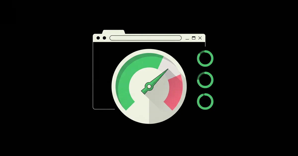
Portfolio sites are the heaviest category of small website on the web, because the product being sold is the imagery. This creates a direct conflict: the designer wants maximum fidelity, and the visitor on a phone wants the page to appear. Google's Core Web Vitals thresholds are public and unambiguous — Largest Contentful Paint should occur within 2.5 seconds, and Cumulative Layout Shift should stay below 0.1 — and portfolio sites routinely miss both because a 4 MB hero image loads before anything else.
In practice, the teams that solve this do four things rather than one. They serve modern formats such as WebP or AVIF with a fallback, they generate multiple widths and let the browser choose using srcset, they set explicit width and height attributes so nothing reflows as images arrive, and they lazy-load everything below the fold while eagerly loading the single hero asset. Done together, these typically cut portfolio page weight by well over half without any visible quality loss on a normal screen.
There is a second, less obvious cost to ignoring this. Slow galleries push visitors to bail before reaching the case study text, which is where the persuasion actually happens. The images earn attention; the writing earns the enquiry. If the images never finish loading, the writing never gets read, and the site becomes an expensive mood board.
Common Mistakes on Graphic Designers Websites and What to Do Instead
These are the recurring problems that show up in portfolio audits, ordered roughly by how much revenue they cost.
Showing everything. Forty projects signals volume, not judgement, and it forces the visitor to do the curation you should have done. Cut to six to ten projects that represent the work you want to repeat. If a piece no longer reflects your rate or your direction, it is actively working against you.
Images without context. A grid of mockups tells a client what you made but nothing about why it worked. Add the brief, the constraint, and the outcome. Even a single sentence — "the range had to read at two metres on a crowded shelf, so contrast beat detail" — converts a picture into evidence of thinking.
Hidden or clever navigation. Experimental navigation is the most expensive flourish in portfolio design. If a visitor has to hover to discover where things are, some percentage of them simply leave. Keep the wayfinding conventional and spend the creative budget inside the case studies.
No pricing signal at all. The most common outcome is a calendar filled with calls from people whose budget is a tenth of your minimum. Publishing a range, or even a single starting figure, changes who writes in.
A contact form with one field. "Message" invites "hi, how much for a logo?" Ask for project type, timeline, and budget band. Slightly more friction produces dramatically better enquiries.
Missing credit and permission hygiene. Publishing work that is still under NDA, or claiming a team output as solo work, is the fastest way to lose a referral. Credit collaborators explicitly and describe your specific role.
Launch-and-abandon. A portfolio with its newest project dated three years ago reads as a closed practice. Book a recurring calendar slot to add one project per quarter, even a small one.
A Practical Build Walkthrough You Can Follow This Month
Here is the sequence that works when rebuilding a portfolio from scratch, assuming roughly four weeks of part-time effort alongside client work.
Week one: decide and write. Pick the one sentence that describes who you serve and what you make. Choose the eight projects that support it. For each one, write the case study before touching layout: one paragraph on the brief, one on the constraint that made it hard, one on the decision that resolved it, and one on the result — a launch, a range extension, a measurable change the client reported, or honest qualitative feedback. Writing first prevents the classic trap of designing a template that cannot hold real content.
Week two: structure and assets. Wireframe the six page types in low fidelity. Export every image at three widths, compress them, and name them consistently. Decide the maximum number of images per case study — six is usually plenty — and stick to it, because unbounded galleries are what make portfolio sites slow.
Week three: build. Implement the case study template first, not the homepage. It is the page with the most structural complexity and the one you will duplicate most. Once one case study looks right with real content, the homepage becomes an assembly job. Set up responsive images, explicit dimensions, and lazy loading as you build rather than as a later optimisation pass.
Week four: qualify and launch. Add the enquiry form with qualifying fields, write the services page with explicit inclusions and exclusions, set page titles and descriptions per project, add structured data for your professional profile, and test the whole thing on a mid-range Android phone over a throttled connection — not just on your desktop. Then ask two people outside design to find your pricing and contact details in under fifteen seconds. If they cannot, fix the navigation before you announce the launch.
Key Takeaways
- Graphic designers websites convert on positioning and proof, not visual novelty — state who you serve in the first screenful.
- Six to ten deep case studies outperform a forty-item gallery because judgement is more persuasive than volume.
- Every case study needs brief, constraint, decision, and outcome; images alone show output without demonstrating thinking.
- Image performance is a conversion issue: responsive formats, explicit dimensions, and lazy loading keep visitors long enough to read the persuasion.
- A qualifying contact form with budget and timeline fields produces fewer, better enquiries than an open message box.
Frequently Asked Questions
How many projects should a graphic designer's website include?
Six to ten is the practical sweet spot. Fewer than five can read as inexperience, while more than twelve dilutes attention and forces visitors to curate for themselves. Prioritise projects closest to the work you want to repeat, and retire anything that no longer reflects your current rate or creative direction.
Should graphic designers put pricing on their website?
Publishing a starting figure or a project range filters mismatched budgets before they reach your calendar. You do not need a full price list. A single line such as "identity projects typically start at a defined minimum" answers the question every visitor is silently asking and dramatically improves enquiry quality.
What is the best platform for a graphic design portfolio?
Match the platform to update frequency. Hosted builders suit solo designers with small portfolios, WordPress suits regular publishers, and a headless CMS with a modern framework suits studios with large media libraries. Hand-coded static sites are fastest but make every content change a development task.
Do graphic designers still need a website if they use social platforms?
Yes. Social profiles rent attention on terms you do not control, cannot present full case studies, and rarely capture qualified enquiry details. A website is the only place where positioning, pricing, process, and contact all sit together under your control and remain findable through search.
How long should a design case study be?
Aim for 300 to 600 words alongside four to six images. That is enough to cover brief, constraint, decision, and result without becoming an essay. Clients skim first and read second, so lead each section with a short, extractable sentence that carries the point on its own.
How often should a portfolio website be updated?
Add at least one project per quarter and review positioning annually. Portfolios decay quietly: a newest-project date more than a year old signals an inactive practice to prospective clients. Schedule the update as a recurring calendar block rather than waiting for a gap between briefs.
Conclusion
The single decision that changes the performance of graphic designers websites is choosing to write before designing. Positioning sentence first, case study narratives second, layout third. Sites built in that order end up simpler, faster, and far more persuasive, because every visual decision has a job to do. Sites built the other way around look accomplished and generate silence. Your next step is concrete: open a blank document, write one sentence naming exactly who you serve and what you make for them, then audit whether your current homepage says that within the first screenful. If it does not, that sentence — not a redesign — is the highest-return change available to you this week.