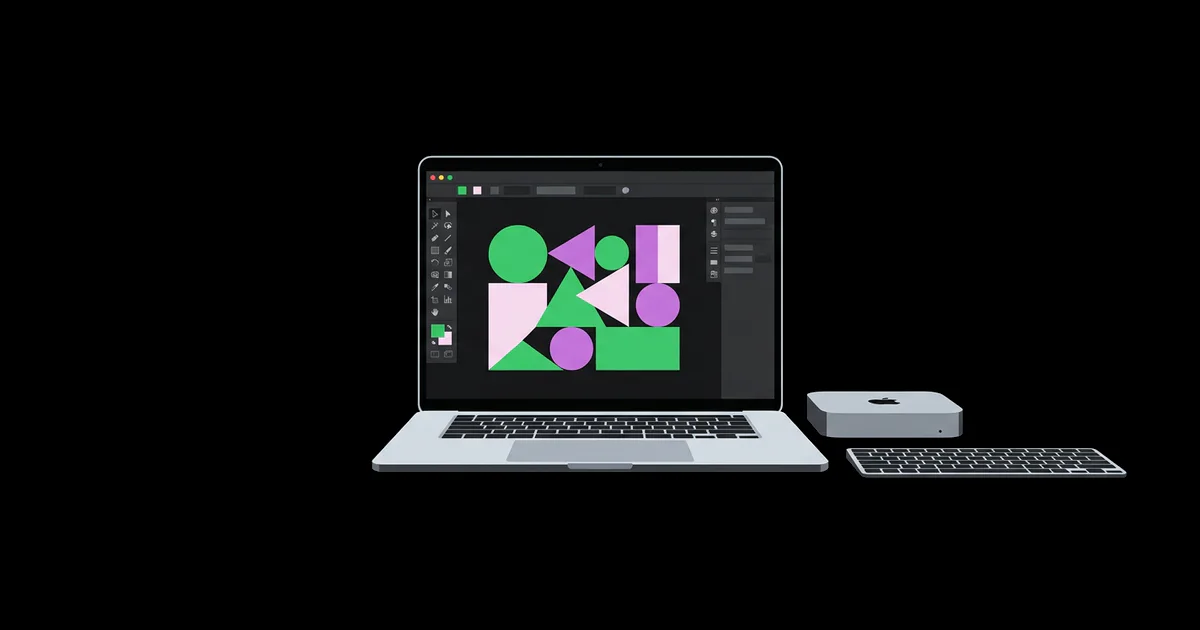
Website Graphic Design: Choosing Visuals That Work
A striking homepage can still leave visitors unsure what a business sells, whether it serves them, or where to click next. The problem is often not a shortage of polish, but a mismatch between the visuals and the decision the page asks someone to make. Website graphic design is the selection and arrangement of images, illustrations, icons, and decorative elements to communicate meaning within a usable web interface. Choosing well means balancing clarity, credibility, accessibility, loading speed, and the realities of different screen sizes. Start with what visitors need to understand, then choose the visual that makes that understanding easier.
Quick Answer: Choose each website graphic for a specific job: explaining an offer, demonstrating a result, guiding attention, or establishing trust. Match its style to the brand, verify usage rights, and test it within the actual page. Prefer visuals that remain clear, accessible, and fast on mobile over decoration that merely fills space.
Which Website Graphics Does Your Page Actually Need?
A page needs graphics that answer visitor questions or support a useful action.
Begin by distinguishing content graphics from interface graphics and decoration. Content graphics carry information: a product photograph shows construction, a screenshot demonstrates software, and a diagram explains a process. Interface graphics help people operate the site, such as a search icon or an expandable section indicator. Decorative graphics establish atmosphere without adding essential meaning. These categories matter because each demands different treatment for accessibility, placement, and evaluation.
When reviewing websites with good graphics, identify the visitor question each visual answers rather than copying its appearance. A close product detail might resolve uncertainty about materials. A clearly labeled workflow might explain a service more efficiently than another paragraph. Record the question, the visual response, and the action that follows. This turns inspiration into a usable brief rather than a collection of attractive references.
Map graphics to page intent. A service landing page may need an outcome example and a process illustration, while a product detail page may need multiple angles, scale references, and installation views. A pricing page often benefits more from readable comparisons than a large lifestyle image. Where precise details matter, avoid generic visuals that suggest evidence without supplying it.
Use a simple removal test: if deleting the graphic changes neither understanding nor navigation, assess whether its contribution to brand recognition justifies its space and loading cost. Decorative work can still be valuable, especially when establishing a distinctive tone, but it should not displace evidence or push the primary action below unnecessary content. Write the intended job beside each proposed asset before commissioning, purchasing, or exporting it.
How to Choose Visuals with a Repeatable Review Process
A repeatable selection process makes visual decisions easier to explain and maintain.
- Define the visitor’s uncertainty. Write a question the graphic should answer, such as “Will this cabinet fit a narrow hallway?” or “What happens after I submit the form?” Reject candidates that merely share the subject without resolving that question. This prevents a relevant-looking photograph from being mistaken for useful information.
- Select the most truthful medium. Use photography for physical appearance, screenshots for real interface behavior, and diagrams for relationships or sequences. Illustration works well for abstract concepts but should not imply that a hypothetical result is documented evidence. Label conceptual or simulated examples where visitors could otherwise misunderstand them.
- Check composition against the layout. Test candidates inside the intended component, not just in an asset library. Leave enough quiet space around adjacent headlines and controls. If a photograph requires an aggressive crop to fit, choose another frame or provide a separate mobile composition rather than cutting away its important subject.
- Review rights and representation. Confirm that the license covers the intended website use, modifications, and any relevant commercial context. Check whether model or property releases are needed. Marketplace terms, subscription access, attribution requirements, and redistribution restrictions vary; save the applicable terms with the asset rather than relying on a remembered purchase.
- Validate in realistic conditions. Inspect the graphic on a small screen, at increased zoom, and during constrained loading. Ask someone unfamiliar with the page what the visual communicates. If their interpretation differs from the intended message, revise the asset or supporting caption before spending time on subtle stylistic refinements.
Document approved choices in a compact asset record containing purpose, source, license, crop instructions, alternative text guidance, and export settings. That record helps future editors preserve meaning when replacing imagery or creating related pages. It also makes approval less dependent on subjective preferences.
Which Graphic Format Fits Each Website Task?
The best graphic format depends on what must remain sharp, editable, transparent, or lightweight.
Separate the visual medium from the delivery format. A photograph is a medium; AVIF, WebP, and JPEG are delivery choices. An icon may begin as vector artwork but arrive as SVG or a raster export. Select formats after identifying the content and checking support in your publishing workflow.
| Graphic task | Practical format | Main advantage | Constraint to check |
|---|---|---|---|
| Product or editorial photograph | AVIF or WebP, with fallback where needed | Efficient delivery of detailed imagery | Inspect textures, skin tones, and compression artifacts |
| Logo or simple interface icon | SVG | Sharp scaling across display sizes | Sanitize untrusted files and remove unnecessary metadata |
| Transparent raster artwork | WebP or PNG | Supports transparency around irregular edges | Check edge quality against light and dark backgrounds |
| Detailed software screenshot | PNG or carefully encoded WebP | Can preserve interface labels and fine lines | Ensure text stays readable at displayed size |
| Instructional sequence | Separate still graphics with HTML captions | Lets visitors control their reading pace | Preserve order and provide equivalent text instructions |
Do not select a format solely because it produces the smallest file. Heavy compression can blur the seam a customer needs to inspect or distort small interface labels. Compare exports at their actual display size and retain the version that preserves useful detail without unnecessary weight.
Deliver appropriately sized variants through responsive image markup. Set intrinsic dimensions so the browser can reserve space, and avoid lazy-loading a prominent first-screen image that visitors need immediately. Below-the-fold graphics are better candidates for deferred loading. For background decoration, verify that it can disappear without removing information, because CSS backgrounds do not provide the same alternative-text mechanism as content images.
Practitioner Analysis: Balancing Brand Character with Usability
From a practitioner’s perspective, a website graphic succeeds when brand expression strengthens comprehension rather than competing with it.
Consider a professional-services homepage choosing between an abstract illustration and a photograph of its team. The illustration may offer a controlled palette and a distinctive composition, but it cannot demonstrate who will perform the work. The photograph can establish that connection, yet a staged, contextless portrait may say little about the service. The stronger choice depends on whether the page currently lacks recognition, explanation, or credible evidence.
This is where web design versus graphic design responsibilities become relevant. Graphic decisions establish visual language and asset quality; web decisions determine responsive behavior, interaction, accessibility, and delivery. These responsibilities overlap when a beautiful asset creates unreadable text, excessive page weight, or an awkward mobile crop. Review the graphic in the working component rather than approving the artwork separately and treating integration as a later problem.
Evaluate options against explicit criteria: message accuracy, visual hierarchy, brand fit, adaptability, and maintenance effort. A custom illustration system can create consistency across complex services, but every new concept may require additional production. A photography system may scale more easily when the organization has reliable access to real subjects, locations, and permissions. Neither is inherently more professional; each has operational consequences.
For important decisions, test comprehension before preference. Ask reviewers what the business offers, what evidence they noticed, and what they would do next. “Which version looks better?” can reveal taste without showing whether the page works. If measuring business outcomes, compare versions under reasonably similar conditions and account for traffic differences. A change in conversions alone does not establish that the image caused it. Use observed misunderstandings to guide revisions, and keep enough documentation to distinguish a successful visual principle from a one-off result.
Common Website Graphic Mistakes and How to Fix Them
Most graphic problems come from weak context, inaccessible information, or delivery choices that ignore the page environment.
Mistake: baking essential copy into an image. Embedded text may shrink beyond readability, resist translation, and become unavailable to assistive technology. Put headings, prices, instructions, and calls to action in HTML. If a diagram requires labels, provide an equivalent explanation nearby and ensure its visual labels remain usable when enlarged.
Mistake: writing alternative text as a keyword list. Alternative text should communicate the image’s purpose in context, not repeat “website graphic” or describe every decorative detail. Describe the meaningful feature of a product view. Use empty alternative text for purely decorative images. For linked images, make the destination or action understandable through the accessible name.
Mistake: relying on color or unfamiliar icons alone. A red outline does not explain a form error, and an abstract symbol may not communicate its action. Add descriptive text, recognizable labels, and appropriate contrast. Check text placed over photographs across the complete responsive crop, not just against one convenient patch of background.
Mistake: uploading one oversized file everywhere. An original suitable for print can waste bandwidth in a small card. Generate sizes matched to the layout, compress thoughtfully, and inspect the browser’s selected resource. Preserve the source separately so later edits do not require enlarging a small export.
Mistake: introducing motion without a purpose. Looping decoration can distract from reading and create discomfort. Prefer a still version when movement adds no meaning. Where motion is useful, respect reduced-motion preferences and provide controls when the content and applicable accessibility requirements call for them.
Implementation Walkthrough: Graphics for a Furniture Product Page
A furniture product page should help shoppers judge appearance, scale, construction, and suitability before purchasing.
Suppose the page sells a compact oak desk. Begin with its decision requirements: buyers need to understand the finish, available legroom, overall dimensions, and cable routing. Translate these into an asset brief: one clear full-product photograph, one contextual room view, a joinery close-up, a cable-slot detail, and a dimension diagram. Exclude a decorative workspace collage unless it answers an additional question.
Choose the full-product photograph as the primary gallery image, using a background that separates the desk edges clearly. Keep its crop consistent across desktop and mobile without trimming the legs. Use the room view to suggest context, but provide actual measurements because perspective and surrounding furniture can mislead. Place the dimension diagram near the written specifications, not exclusively inside the gallery.
Build the gallery with keyboard-operable controls and clear accessible names. Provide a meaningful description for each informative image, while avoiding repeated descriptions on redundant thumbnails when the controls already have appropriate names. Keep captions in HTML. Offer enlarged views for inspection, with visible close controls and appropriate focus handling if an overlay is used.
Export photographic variants at sizes appropriate to the component and display density. Reserve image space to prevent the product title and purchase controls from shifting during loading. Load the initial product image promptly; defer secondary assets where appropriate. Preview the dimension diagram on a narrow screen, and repeat every essential measurement as text so buyers do not need to decipher tiny labels.
Finally, check the published page rather than only the design file. Confirm finish consistency across images, remove unintended customer information from backgrounds, verify rights, and test zoom and gallery navigation. Ask a reviewer to locate the desk width and explain the cable-routing feature. If either task is difficult, revise placement or labeling before adding more imagery.
Key Takeaways
Effective website graphics make specific visitor decisions easier.
- Assign every asset a job, such as explaining scale, proving construction quality, or clarifying the next action.
- Choose photography, screenshots, or illustration according to the evidence needed, not the visual style currently in fashion.
- Evaluate graphics inside responsive components, including mobile crops, readable labels, keyboard access, and realistic loading conditions.
- Record licenses, source files, export settings, and alternative-text guidance so future updates preserve quality and compliance.
- Fix missing information before adding decoration; test what visitors understand rather than relying exclusively on aesthetic preferences.
Frequently Asked Questions
These answers address practical decisions that arise when selecting and publishing website graphics.
How many graphics should a webpage have?
A webpage needs enough graphics to answer its important visual questions. A simple contact page may need almost none, while a complex product page may require several views. Review each asset for distinct informational value, then check whether the combined page remains easy to navigate and efficient to load.
Can stock photography work well on a business website?
Stock photography works best for context rather than proof. It can establish a setting or illustrate a broad topic, but it should not suggest that pictured people are actual employees or customers. Check licensing and releases, avoid recognizable overused compositions, and prioritize original imagery when authenticity affects the purchase decision.
Should a logo be uploaded as SVG?
SVG is often a good choice for a logo. It scales cleanly and can be compact for simple artwork. Confirm that your content management system permits it, sanitize files from untrusted sources, and check rendering. Keep an appropriate raster alternative for workflows or placements that do not support SVG reliably.
What makes a website graphic accessible?
An accessible graphic conveys its purpose without creating a barrier. Informative images need suitable text alternatives; complex diagrams may need longer explanations. Essential text should remain readable, and color should not carry meaning alone. Interactive graphic controls also require understandable names, keyboard operation, and visible focus states within the finished interface.
How do you choose between illustration and photography?
Choose the medium that represents the subject most honestly. Photography is useful when visitors must inspect real people, places, or products. Illustration can clarify invisible processes or simplify complex relationships. Consider production consistency and maintenance too: a distinctive illustration system loses coherence if future pages cannot obtain matching artwork.
Are AI-generated graphics appropriate for websites?
AI-generated graphics require editorial, legal, and visual review. They may suit conceptual decoration, but should not impersonate real evidence, customer results, or actual products. Inspect details for errors, review the tool’s applicable usage terms, and consider disclosure where context requires it. Avoid entering confidential material without an approved data-handling process.
How can you tell whether a graphic is working?
A working graphic improves understanding of its assigned subject. Ask representative visitors to explain what it shows and complete the related task. Watch for missed details, incorrect assumptions, and navigation problems. Performance measurements and business metrics add context, but should be interpreted alongside usability observations rather than treated as automatic proof.
Conclusion
Choosing website graphics is a communication decision supported by design and technical execution.
The strongest assets answer real questions, fit their surroundings, and remain useful across devices and access needs. Start with one important page and audit its visuals against visitor uncertainty, evidence, rights, responsiveness, and loading behavior. Remove assets without a defensible purpose, then repair the most consequential information gap. As your next step, review the graphical elements in a composition and use those principles to refine that page’s hierarchy. A focused revision grounded in a clear visitor task is more useful than replacing every image merely to make the site look different.