What Are Graphical Elements? A Practical Design Guide
A page can contain excellent information and still be difficult to use: a decorative shape competes with the headline, unrelated icons suggest different actions, or a chart hides its most important comparison. These problems often come from individual visual components rather than the overall layout. Graphical elements are the visual components used to communicate information, organize content, establish relationships, and shape a design’s character. Understanding what are graphical elements means looking beyond decoration to ask what each component helps someone notice, understand, or do. This guide explains their roles, selection criteria, and practical implementation.
Quick Answer: Graphical elements include lines, shapes, icons, illustrations, photographs, textures, and data graphics. Typography, color, and space also function as essential visual building blocks. Effective elements have a clear purpose, work together consistently, remain understandable across formats, and support the message instead of competing with it.
Which Visual Components Count as Graphical Elements?
Graphical elements are components whose appearance contributes meaning or structure to a composition.
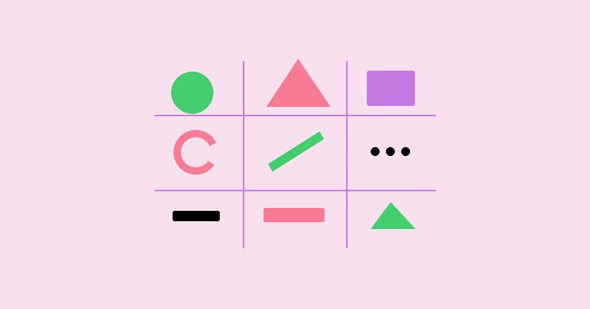
A line can separate sections, connect steps, or indicate movement. A shape can frame a price, represent an object, or create a clickable control. An icon compresses a concept into a recognizable symbol, while an illustration can explain something that cannot easily be photographed. Photographs show appearance and context; charts encode relationships in data. The category depends on function, not file format: the same arrow might be an interface control, a diagram connector, or a decorative accent.
Some terminology needs separating. An asset is a reusable file or resource, such as an SVG icon. An element is a component as used within a design. A style describes its visual treatment, such as geometric, hand-drawn, or distressed. For example, vintage graphic design as an application might combine engraved illustrations, muted colors, and ornamental borders. Those treatments do not change the elements’ underlying jobs: illustration still depicts, color still groups, and borders still contain.
Typography occupies a useful boundary: words supply verbal meaning, while letterforms, size, weight, and spacing create visual hierarchy. Color is often a property of an element rather than a standalone object. Negative space is not an asset, but it actively separates groups and directs attention. Treat all three as part of the visual system when evaluating a composition. Otherwise, you may add more graphics to solve a problem that actually requires clearer type or additional breathing room. A useful inventory therefore records both visible objects and the rules that control their presentation.
How Do Graphical Elements Communicate?
Graphical elements communicate through attention, association, grouping, and visual relationships.
- Establish hierarchy. Size, contrast, placement, and isolation help viewers decide where to look first. On an event page, the event name should usually dominate a background illustration. If the illustration attracts attention first, reduce its contrast or move it away from the reading path. Hierarchy is relative: enlarging every element simply creates louder competition.
- Group related information. Containers, proximity, and repeated shapes show which pieces belong together. A shipping estimate placed inside a product card reads as product-specific; the same estimate above a grid may appear to apply to everything. Before adding borders around every component, test whether consistent spacing can establish the same relationship more quietly.
- Explain relationships. Arrows, connectors, and diagrams show sequence, dependency, or movement. Give each connector a defined meaning. In a process diagram, an arrow might mean “happens next,” not “causes.” Label branches when their conditions matter, and avoid crossing connectors where a reordered layout would make the path easier to follow.
- Support recognition. Repeated icons and visual treatments help people identify familiar categories. Pair unfamiliar symbols with labels, particularly for consequential actions. A star could mean favorite, rating, or featured content. Reusing it for all three makes the system harder to learn, even when the drawings are visually consistent.
- Set context and tone. Texture, photography, and illustration can suggest precision, warmth, playfulness, or urgency. These associations depend on audience and context rather than universal rules. A rough paper texture may support a craft workshop poster but undermine the clarity of a dense technical diagram. Preserve legibility before pursuing atmosphere.
Assign a primary role to every prominent element. A graphic can perform several jobs, but conflicting jobs are a warning sign.
Which Element Should You Choose for the Job?
The best graphical element is the simplest option that communicates the required meaning accurately.
Start with the user’s question rather than an empty space in the layout. Someone comparing dimensions needs scale and measurement, not an atmospheric photograph. Someone evaluating a material may need a detailed photograph rather than a stylized icon. The table below connects common communication tasks with suitable elements and their limitations.
| Communication task | Suitable element | Main advantage | Constraint or check |
|---|---|---|---|
| Identify a familiar action | Icon with a label | Compact, repeatable recognition | Check whether the symbol has competing meanings |
| Show physical appearance | Photograph | Conveys material, detail, and context | Control crop, lighting, and misleading scale |
| Explain an invisible process | Diagram or illustration | Reveals relationships selectively | Distinguish simplification from literal representation |
| Compare quantities | Chart | Makes patterns easier to inspect | Label units, scales, and relevant uncertainty |
| Separate content groups | Spacing, line, or container | Clarifies boundaries | Avoid making noninteractive boxes resemble buttons |
These options can be combined, but combinations need a reason. A product photograph with a dimension diagram answers two different questions. A photograph with an unrelated decorative illustration may add weight without adding understanding. When evaluating a combination, identify the information that would disappear if either component were removed.
Production constraints also affect selection. Vector artwork suits scalable symbols and simple diagrams, while raster images suit photographic detail. SVG is not automatically lightweight: complex paths and embedded images can produce heavy files. For print, check effective image resolution at the intended physical size. For screens, inspect the actual rendered size and export appropriate variants rather than sending the largest original everywhere.
Practitioner Analysis: How Do You Judge Whether an Element Works?
Practitioner analysis evaluates graphical elements by communication value, system fit, and maintenance cost.
Begin with the decision the viewer must make. On a subscription comparison page, the important questions might be what each plan includes and which option fits a particular need. A decorative badge deserves space only if it clarifies a meaningful distinction. If it merely labels the preferred purchase as “best,” it may compete with the evidence users need to compare.
Next, examine the element in context rather than in isolation. A beautifully drawn icon can fail beside heavy typography because its fine strokes disappear. An expressive illustration can work in a large header but become an unrecognizable patch in a small card. This is why website graphic composition should be evaluated across the whole page: contrast, alignment, density, and repetition determine how individual assets behave together.
The trade-off is often distinctiveness versus predictability. Custom symbols may reinforce a visual identity, but familiar symbols usually require less explanation. Reserve expressive treatments for places where exploration is acceptable, and favor established conventions for navigation or critical actions. Even then, verify meaning with labels and context rather than assuming recognition.
Finally, assess ownership and upkeep. Can the team edit the graphic when a product changes? Does a translated label fit? Is there a source file and a clear license for the intended use? Stock libraries and publishing platforms may impose different attribution, modification, or redistribution conditions. Check the applicable terms rather than assuming a downloaded asset is unrestricted. An element that communicates well today but cannot be updated reliably may be the wrong production choice. Record that limitation before approval, while replacing the asset remains inexpensive.
What Common Mistakes Make Graphical Elements Less Effective?
Most graphical-element problems come from ambiguous meaning, inconsistent treatment, or neglected viewing conditions.
Decoration overwhelms information. Multiple shadows, textures, borders, and accents create competing focal points. Remove elements one at a time and check whether anything meaningful is lost. Keep effects that communicate state or grouping; simplify those that only repeat emphasis already supplied by typography.
Visual conventions conflict. A rounded rectangle with strong contrast can look clickable even when it is a static label. Either implement the expected interaction or change its treatment. Likewise, avoid underlining ordinary labels in environments where underlining commonly signals links. Appearance should match behavior.
Color carries the entire message. Red and green status dots may be indistinguishable to some viewers or in grayscale output. Add words, distinct symbols, or patterns. Check text and meaningful interface graphics against applicable accessibility contrast requirements. A contrast checker helps measure colors, but it cannot determine whether the underlying message is understandable.
Assets lose clarity when resized. Thin strokes, tiny labels, and detailed illustrations often collapse at small sizes. Create simplified variants, increase internal spacing, or replace embedded text with live text. Do not assume that shrinking a desktop graphic is an adequate mobile strategy.
Accessibility is handled after export. A meaningful diagram needs a text equivalent that explains its message; a complex chart may also need a data table. Purely decorative images should generally be hidden from assistive technology using the appropriate implementation. Describe purpose, not every visible color and shape, unless those details carry information.
How Do You Build a Useful Graphical System Step by Step?
A practical workflow starts with content and ends with testing the elements in their actual delivery format.
Consider a repair service page that must explain three stages: request an assessment, approve a quote, and receive the repaired item. The key decision is whether customers understand the sequence and know what happens before they commit. Start with those statements in plain text, including any conditions that affect the sequence.
Choose the minimum visual vocabulary. Use a numbered marker for each stage, one short heading, and a supporting sentence. Add simple icons only if they help distinguish the stages. Avoid a shopping-cart symbol for quote approval because it can imply immediate purchase. A labeled document symbol is less likely to create that expectation.
Define consistent rules. Give markers the same dimensions, align headings to a shared baseline, and use one icon family. Establish a neutral connector style that means sequence, not guaranteed duration. Keep the primary action visually separate so the stage markers do not resemble clickable controls.
Plan responsive behavior. On a wide screen, show the stages horizontally if each description remains comfortably readable. On narrow screens, stack them vertically in the same order. Remove horizontal arrows rather than allowing them to point into empty space. Keep numbering and text in the document, not baked into an image.
Implement and verify. Use an ordered list for the stages so their sequence remains meaningful without styling. Treat redundant icons as decorative. Test long translations, text enlargement, high-contrast settings, and the layout without imagery. Ask a reviewer to explain when payment is required; if the graphic implies the wrong answer, revise the wording or connector, not merely the colors. Save the rules and editable assets so future stages can be added consistently.
Key Takeaways
Effective graphical elements make information easier to find, interpret, and use.
- Define each element’s communication job before choosing its visual style or adding decorative treatments.
- Choose photographs, icons, diagrams, and charts according to the question the viewer needs answered.
- Evaluate assets within the full composition, including typography, color, spacing, and surrounding interactive controls.
- Build accessibility and responsive behavior into the element, rather than treating them as final export checks.
- Keep editable sources, usage rules, and licensing information so the visual system remains consistent and maintainable.
Frequently Asked Questions
These answers clarify common boundaries and practical decisions about graphical elements.
Are graphical elements the same as graphic design?
Graphical elements are components; graphic design is the practice of arranging them to communicate. A line, photograph, or icon is an element. Selecting those components, establishing hierarchy, and adapting the composition for an audience are design decisions. Strong individual assets do not automatically produce a clear or usable design.
Does text count as a graphical element?
Text has both verbal and visual functions. Its wording communicates content, while typeface, weight, size, alignment, and spacing influence emphasis and reading order. Treat typography as part of the graphical system, but preserve selectable, accessible text whenever possible instead of converting ordinary headings or labels into images.
What is the difference between an icon and an illustration?
An icon usually identifies a compact concept, while an illustration develops a richer explanation or scene. The boundary is flexible. A small wrench may identify repair services; an illustration of a technician opening a device may explain the repair process. Choose based on required detail and available viewing space.
How many graphical elements should a page contain?
There is no universally correct number of graphical elements. A technical diagram may need many meaningful components, while a simple announcement may need very few. Judge the total by hierarchy and comprehension. Remove an element when it duplicates another signal, obscures content, or adds no useful context.
Can decorative elements still be useful?
Decorative elements can establish tone and visual identity without conveying essential facts. Their value depends on restraint and context. A subtle texture may support a handmade aesthetic, but it should not reduce legibility or suggest false interaction. Important information must remain understandable when the decoration is absent.
Should you use vector or raster graphics?
Use vector graphics for scalable geometric artwork and raster graphics for photographic detail. Icons, logos, and simple diagrams often suit vectors; photographs usually suit raster formats. Check actual file complexity, transparency needs, rendering support, and output size. Neither category guarantees smaller files or better performance in every situation.
How can you test whether an element is understandable?
Test interpretation with a concrete task rather than asking whether the graphic looks good. Show it at its intended size and ask someone to identify an action, explain a sequence, or compare values. Note misunderstandings, then revise labels, grouping, or visual encoding before polishing decorative details.
Conclusion
Graphical elements work best when their appearance serves a clear communication purpose. Lines establish relationships, shapes organize content, icons support recognition, and images explain what words alone may not show efficiently. Their effectiveness depends on context, accessibility, consistency, and the constraints of the final medium—not simply on visual appeal. As a next step, examine websites with good graphics and annotate one page by function: what directs attention, what explains, what groups, and what merely decorates. Apply the same audit to your own layout, then remove or revise the element whose purpose is least clear.