7 Web Development Mistakes That Are Killing Your Conversions (And How to Fix Them)
Discover 7 critical web development mistakes silently killing your conversions — and get clear, actionable fixes to turn your website into a revenue machine.
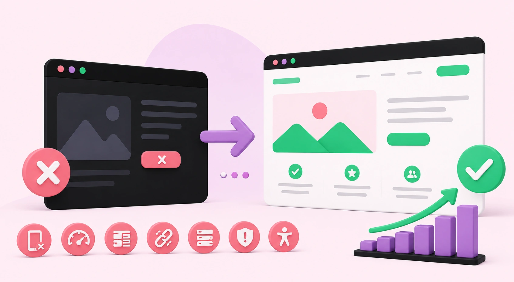
7 Web Development Mistakes That Are Killing Your Conversions (And How to Fix Them)
Your website might look stunning, but aesthetics alone don't pay the bills — conversions do. Whether you run an e-commerce store, a service-based business, or a professional portfolio, your site's primary job is to turn visitors into paying customers, qualified leads, or loyal subscribers. And yet, thousands of businesses unknowingly sabotage that exact goal every single day through entirely preventable web development mistakes.
These aren't obscure technical bugs or rare edge cases. They are systematic errors baked into the structure, design, and functionality of countless websites — quietly draining revenue while business owners puzzle over why their traffic refuses to translate into results. The good news? Every single mistake on this list is completely fixable. In the sections below, we break down the seven most damaging web development errors killing your conversion rate and give you clear, actionable steps to turn things around for good.
1. Slow Page Load Speed
Nothing sends a potential customer running faster than a website that takes too long to load. In today's digital environment, speed is a fundamental conversion driver, not a luxury feature reserved for large enterprises. Research consistently shows that even a one-second delay in page load time can reduce conversions by up to 7%. If your website takes longer than three seconds to fully render, you are silently losing a significant portion of your audience before they have read a single word of your content.
Google's own data confirms that 53% of mobile users abandon a site that loads in more than three seconds. That is more than half your mobile traffic walking out the door before you have even had the chance to make your pitch.
How to Fix It
Compress all images using modern formats like WebP and tools such as TinyPNG. Minify your CSS, JavaScript, and HTML files to reduce unnecessary file weight. Implement a reliable Content Delivery Network (CDN) to serve assets from servers geographically closest to your users. Enable browser caching, use lazy loading for images and videos below the fold, and invest in quality hosting infrastructure. A cheap shared server is often the silent culprit behind sluggish performance, and upgrading to managed or cloud hosting can produce dramatic, immediate improvements.
2. Poor Mobile Responsiveness
More than 60% of global web traffic now originates from mobile devices, yet an alarming number of websites still deliver a broken or frustrating experience on smartphones and tablets. Buttons too small to tap accurately, text overflowing the viewport, menus that collapse poorly, and images that distort or disappear — these issues destroy user experience and directly tank conversion rates on mobile devices where most of your audience actually lives.
Google uses mobile-first indexing, meaning it primarily evaluates the mobile version of your site when determining search rankings. A poor mobile experience doesn't just cost you conversions — it costs you organic search visibility and long-term traffic growth as well.
How to Fix It
Adopt a mobile-first design philosophy from the very beginning of any project. Design for the smallest screen first, then scale up to larger viewports rather than working in reverse. Use responsive CSS frameworks and flexible grid systems that adapt fluidly across breakpoints. Test across multiple real devices and screen sizes regularly — not just inside browser developer tools. Ensure tap targets are large enough, font sizes remain readable without zooming, and that your checkout, contact, or sign-up flows work flawlessly end-to-end on mobile.
3. Confusing Navigation Structure
If a visitor cannot find what they are looking for within a few seconds of landing on your site, they will leave — and they will not return. A confusing menu structure, too many competing navigation options, unclear labels, or a complete lack of logical pathways to your key pages all contribute to elevated bounce rates and lost revenue. Users should never have to work hard to find information. Your navigation should guide them effortlessly from entry point to conversion without friction or hesitation.
How to Fix It
Simplify your navigation menu to include only the pages that matter most to your target audience. Use clear, descriptive labels rather than clever but ambiguous ones that leave users guessing. Add a prominent search bar if your site contains substantial content. Implement breadcrumb navigation on deeper pages so visitors always know exactly where they are within your site hierarchy. Conduct real user testing — watch where people hesitate, click incorrectly, or abandon the journey — then restructure your information architecture around genuine observed behavior rather than internal assumptions.
4. Weak or Absent Call-to-Action Buttons
Your call-to-action (CTA) is the single most important conversion element on any given page. Yet many websites bury their CTAs, use vague language like "Click Here" or "Submit," place them below the fold, or fail to include them altogether. A weak CTA represents a missed revenue opportunity on every single visit your site receives, and the cumulative impact of that missed opportunity over weeks and months is staggering.
Visitors need to be told clearly and compellingly what you want them to do next. Without direct, confident guidance, even genuinely interested prospects will navigate away without taking action.
How to Fix It
Make your CTAs visually prominent by using bold, contrasting colors that naturally draw the eye away from surrounding content. Use action-oriented, benefit-driven language: "Get My Free Quote," "Start Your Free Trial," or "Book a Free Consultation" consistently outperform generic alternatives by significant margins. Position your primary CTA above the fold so visitors never have to scroll to find it. Repeat CTAs at logical intervals throughout longer pages. Run A/B tests on wording, color, size, and placement to identify which combination drives the highest click-through rates for your specific audience and offer.
5. Missing Trust Signals and Security Indicators
Visitors make trust decisions within milliseconds of landing on your website. If your site lacks an SSL certificate, displays no reviews or testimonials, hides contact information, or looks visually outdated, users will hesitate — and hesitation is conversion death. This is especially critical for service businesses and online stores asking visitors to share personal details, financial information, or commit to a purchase decision.
Trust is not purely a design consideration — it is a technical, psychological, and reputational one. Without it, even genuinely excellent products and services will consistently fail to convert curious visitors into paying customers.
How to Fix It
Install an SSL certificate without delay — it is a bare minimum, non-negotiable requirement. Display verified client reviews, detailed case studies, and social proof testimonials prominently on all key landing pages. Add recognized trust badges where they are contextually appropriate. Make your contact information easy to find on every single page of your site. Ensure your overall design looks modern, professional, and polished — a dated visual aesthetic immediately signals to users that a business may not be credible, active, or worth their time and money.
6. Cluttered and Overwhelming Page Design
More is emphatically not more in web design. Pages stuffed with excessive content blocks, competing visual elements, multiple simultaneous pop-ups, auto-playing videos, and a chaotic color palette overwhelm visitors cognitively before they can absorb your core message. When everything on a page fights for attention at the same moment, nothing wins — and users leave without converting, frustrated and overstimulated.
Visual clutter does not just irritate users; it actively erodes trust, buries your value proposition, and makes purposeful decision-making nearly impossible for your audience.
How to Fix It
Embrace generous, intentional white space throughout your layouts. Clean, focused designs naturally guide the eye toward your key value proposition and conversion actions. Audit every element on your most important pages and ask whether it serves a specific, measurable conversion goal — if it does not, remove it without hesitation. Limit your color palette to two or three brand colors and use no more than two font families to maintain visual harmony. Apply the principle of progressive disclosure: deliver information in digestible stages aligned with where users are in their decision-making journey rather than presenting everything at once.
7. No Conversion Tracking or Analytics in Place
You cannot meaningfully optimize what you are not measuring. A surprisingly large number of websites are built, launched, and left running without any real conversion tracking configured. Without clear data on where users drop off, which pages perform strongly, or how visitors actually behave from entry to exit, every improvement decision becomes an expensive, time-consuming guess with no reliable feedback loop.
How to Fix It
Set up Google Analytics 4 and Google Search Console immediately as your foundational baseline. Define your specific conversion goals — form completions, phone calls, purchases, file downloads — and track them explicitly as events within your analytics platform. Install behavior analytics tools like Hotjar or Microsoft Clarity to review session recordings and heatmaps of real user interactions. Schedule dedicated monthly data reviews and make incremental, evidence-based improvements grounded in what the numbers actually tell you. Businesses that grow online consistently treat their website as a living, evolving system rather than a static digital brochure.
Ready to Build a Website That Actually Converts?
Your website should be your most hardworking salesperson — available around the clock, consistently guiding visitors toward action and turning attention into measurable business results. Every mistake covered in this post represents preventable revenue loss that compounds quietly over time. Identifying them is an essential first step, but real transformation happens when they are systematically corrected by professionals who understand the complete picture of conversion-focused development.
At WebPeak, we help businesses build websites that are fast, visually compelling, trustworthy, and genuinely optimized for growth. Our team delivers expert web development services built entirely around your business objectives — from technical architecture and responsive design to performance optimization and conversion rate improvement. Whether you are starting a new project from scratch or need a comprehensive audit and overhaul of an existing site, we are ready to help you transform your web presence into a reliable, revenue-generating asset.
Stop letting preventable mistakes cost you customers every single day. Reach out to our team and let's build something that genuinely works.
Related articles
 Web Development
How to Choose Social Media Share Buttons for Your Website
Learn how to choose social media share buttons that boost shares without slowing your site, with placement, performance, and platform selection best practices.
 Web Development
Community Development Council News
Community Development Council News provides insights into development projects, funding programs, urban planning strategies, and community growth initiatives.
 Web Development
Why Mobile-First Design Is Critical for Travel and Property Searches
Mobile-first design helps travel and property websites deliver faster, smoother, and more user-friendly experiences that drive bookings and inquiries.