Rhythm in Graphic Design: Control Pacing and Visual Flow
Most layouts that feel "off" are not broken because of the typeface or the colour palette. They are broken because nothing in them repeats with intent. Rhythm in graphic design is the deliberate repetition and variation of visual elements — spacing, size, weight, colour, shape — that tells the eye where to move, how fast to move, and where to stop. It is the difference between a page a reader scans in three seconds and a page they abandon in one.
Quick Answer: Rhythm in graphic design is the controlled repetition of visual elements across a layout to create pacing and direct eye movement. Designers build it with consistent spacing intervals, repeated shapes and type scales, then break the pattern intentionally to create emphasis. Regular rhythm feels stable; progressive and flowing rhythm create momentum and direction.
What Rhythm Actually Means in a Layout
Rhythm is measurable, not mystical. In practice it is the interval between things: the gap between two cards, the leading between two lines of text, the step between a heading size and a body size. When those intervals follow a predictable system, the reader's eye develops an expectation. When you then break the interval, that break carries meaning — it reads as emphasis, as a section change, as "stop here."
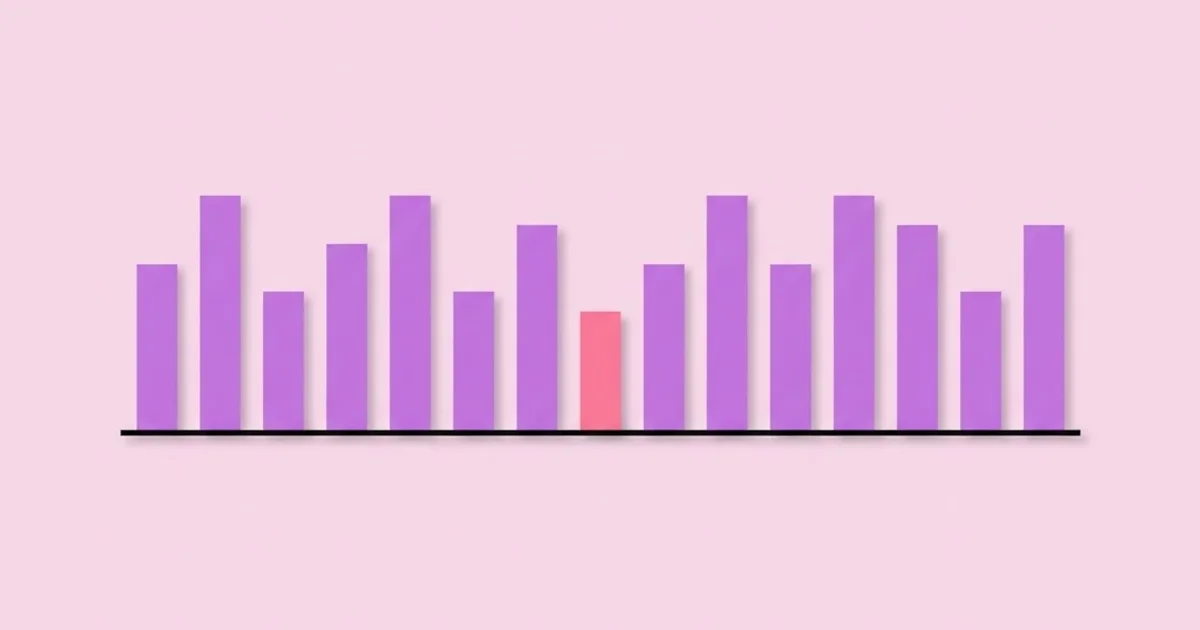
The critical distinction is rhythm versus repetition. Repetition is simply using the same element more than once. Rhythm is repetition organised in time and space so that it produces pacing. A page with twelve identical cards has repetition. A page with twelve cards where every fourth card is double-width and sits against a tinted background has rhythm, because the eye now moves in a measured pattern with punctuation points.
Designers usually classify rhythm into four working types. Regular rhythm uses identical elements at identical intervals — a pricing table, a photo grid, a calendar. It communicates order and comparability but goes flat if it runs too long. Alternating rhythm swaps between two or more states, like a zig-zag content section where the image flips from left to right on each row. Progressive rhythm changes an element incrementally — shapes that grow, colours that deepen, spacing that widens as you scroll. Flowing rhythm is organic and irregular, driven by curves and natural variation, the kind you see in editorial spreads where text wraps around an illustration. These same principles carry straight into screen work, which is why pacing decisions in web and graphic design practice so often come down to interval systems rather than decoration.
One term worth defining precisely because it is constantly misused: visual tempo. Tempo is how quickly the eye is asked to move. Tight spacing, small elements, and high contrast between adjacent items produce a fast tempo; generous whitespace, large elements, and low contrast produce a slow one. A landing page hero should generally run slow — few elements, big intervals. A specification table should run fast. Mixing them without a transition is what makes layouts feel jarring.
How to Build Rhythm Into a Layout, Step by Step
Rhythm is constructed, not discovered. The reliable method is to fix your intervals before you place anything, then design inside those constraints. Here is the sequence I use on every layout, print or screen.
- Set a base unit. Pick a single spacing atom — commonly 4px or 8px on screen, or a pica in print — and commit to it. Every margin, padding value, and gap becomes a multiple of that unit. This one decision eliminates the vast majority of accidental misalignment.
- Derive a spacing scale. Do not use every multiple. Choose roughly six steps, such as 4, 8, 16, 24, 48, 96. A restricted scale forces meaningful jumps, and meaningful jumps are what the eye reads as structure. Arbitrary values like 37px destroy rhythm because they signal nothing.
- Establish a type scale with a fixed ratio. A ratio of about 1.25 works for dense interfaces, 1.333 or 1.5 for editorial layouts. Consistent ratios make heading hierarchy feel rhythmic rather than random.
- Lock the baseline. Set line-height as a multiple of your base unit so text blocks stack on a shared grid. If body text has a 24px line box, every vertical offset around it should be a multiple of 24 or a clean fraction of it.
- Define the interval between sections. Space between sections must be visibly larger than space inside them — typically a 2:1 or 3:1 ratio. This is proximity doing rhythmic work: it groups content into chunks the eye can count.
- Place your repeating element. Cards, rows, list items, columns — whatever repeats, place it first at even intervals, before adding any variation.
- Introduce the break. Now change one thing at a chosen point: a wider card, a colour block, a pull quote, a full-bleed image. One break per screen or spread is usually enough.
- Test the pacing by squinting. Blur your eyes or drop the layout to 25% zoom. You should still see an alternating pattern of dense and open areas. If it reads as one uniform grey mass, there is no rhythm, only repetition.
The step people skip is number seven. They build a perfectly even grid, feel that something is missing, and then add texture, drop shadows, or an extra accent colour to compensate. The actual fix is almost always a change of interval, not a change of decoration.
The Four Rhythm Types Compared
Different rhythm types solve different communication problems. Choosing the wrong one is why a portfolio can feel monotonous or a dashboard can feel chaotic. This comparison maps each type to the work it does best.
| Rhythm type | How it is built | Perceived effect | Best used for |
|---|---|---|---|
| Regular | Identical elements at identical intervals | Stable, ordered, comparable | Product grids, pricing tables, catalogues, data views |
| Alternating | Two or more states swapped in sequence | Engaging, conversational, easy to follow | Long-form marketing pages, feature sections, step narratives |
| Progressive | One property changed incrementally across elements | Directional, building momentum | Onboarding flows, timelines, scroll-driven storytelling |
| Flowing | Organic, irregular intervals following a curve or path | Expressive, energetic, less predictable | Editorial spreads, posters, brand campaign work |
| Random (controlled) | Varied placement inside strict outer constraints | Spontaneous but contained | Collage layouts, event posters, gallery walls |
Notice that the last row qualifies randomness as controlled. Genuinely random placement almost never works, because the eye cannot form an expectation and therefore cannot feel a break. What reads as pleasing randomness is usually irregular placement inside a rigid boundary — a consistent outer margin, a fixed colour set, a shared element size.
What Experience Teaches About Pacing
There is no credible universal statistic for how rhythm affects conversion, and you should be suspicious of any article that offers one. What does hold up across projects is a set of repeatable practitioner observations, and those are worth more than an invented percentage.
The first is that rhythm problems are usually diagnosed as typography problems. A client says the page "feels cheap" or "looks unfinished." Nine times out of ten the type is fine and the vertical spacing is arbitrary — thirteen different gap values on a single page, none of them related. Normalising those to six values from a scale fixes the complaint without changing a single typeface.
The second is that rhythm has a fatigue threshold. A regular grid stays comfortable for roughly three to five repetitions before the eye stops registering individual items and starts skimming past the whole block. If you have twelve items to show, break them into groups of four with a different treatment between groups. This is exactly why long e-commerce category pages insert promotional tiles at intervals: not only to advertise, but to reset attention.
The third is that rhythm is inherited from history far more than most designers realise. The Swiss grid tradition formalised regular rhythm; the psychedelic and disco-era posters of the seventies pushed flowing and progressive rhythm to their limits with stretched type and concentric forms. Studying the visual language of the seventies is one of the fastest ways to understand how far rhythm can be distorted while remaining readable, because that decade ran the experiment in public at poster scale.
The fourth observation is about responsive work specifically. Rhythm rarely survives a breakpoint change automatically. A three-column grid with an alternating accent on every third card collapses to one column on mobile, and the accent now lands on items three, six, and nine in a single vertical stream — which no longer reads as a pattern. Rhythm must be re-specified per breakpoint, not inherited.
Common Rhythm Mistakes and How to Avoid Them
The mistakes below account for most of the rhythm failures I see in portfolio reviews and production files alike. Each one has a concrete fix.
Mistake one: equal spacing everywhere. When the gap inside a card equals the gap between cards, grouping collapses and the layout reads as undifferentiated noise. Fix it by enforcing a ratio — internal padding at one step, external gap at two or three steps up the scale.
Mistake two: too many breaks. If every third element is highlighted, and every fifth has a different background, and every second is reversed, there is no baseline pattern left to break. Establish the pattern for at least three repetitions before interrupting it.
Mistake three: rhythm applied only horizontally. Designers obsess over column grids and ignore vertical intervals entirely. Vertical rhythm is what readers actually experience while scrolling. Audit a page by measuring only the vertical gaps; if they are inconsistent, the horizontal grid will not save you.
Mistake four: decorative repetition masquerading as rhythm. Repeating a brand shape in the corner of every section is repetition, not rhythm, if it does not affect pacing. Ask whether removing the element changes how fast the eye moves. If not, it is ornament.
Mistake five: ignoring content length variance. A card grid designed with equal-length placeholder text will fall apart when real copy arrives at three different lengths. Design the rhythm against worst-case real content: longest headline, shortest body, missing image.
Mistake six: breaking rhythm at the wrong point. The break should land where the message needs emphasis, not where the grid happens to allow it. If the strongest proof point sits in position seven of a nine-item list, restructure so it lands on a break, or move it.
A Practical Walkthrough: Fixing a Flat Landing Page
Here is a real-shaped scenario. A six-section marketing page: hero, three feature cards, a long testimonial block, a stats row, an FAQ accordion, and a footer call to action. The complaint from the stakeholder is that it "feels long and boring." Nothing is technically wrong.
Step one — audit the intervals. Measure every vertical gap. The page uses 40, 56, 64, 72, 80, and 96 pixels between sections with no logic. Immediately consolidate: 96 between major sections, 48 inside sections, 16 inside components. Three values, three levels of meaning. On its own, this change usually resolves half the "feels unfinished" perception.
Step two — establish the base tempo. The hero is the slowest moment: one headline, one line of support copy, one button, and a large open interval around them. Everything after it should feel faster by comparison, or the hero loses its authority.
Step three — set the repeating unit. The three feature cards become the page's regular rhythm. Identical width, identical internal padding, identical icon size. Resist the temptation to make the middle one special at this stage.
Step four — place the break deliberately. The testimonial becomes full-bleed with a tinted background, running edge to edge while every other section is contained. That single width change is the strongest rhythmic punctuation available, and it costs nothing in complexity.
Step five — use progressive rhythm in the stats row. Rather than three equal stat blocks, scale them so the most important figure is largest and the supporting ones step down. The eye reads the sequence in priority order instead of left-to-right by default.
Step six — compress the FAQ. Accordions should run at a fast tempo: tight rows, thin dividers, minimal padding. Slowing down here makes the page feel padded.
Step seven — reset before the final CTA. Insert the largest interval on the page immediately before the closing call to action. Silence before the last note is what makes it land. In practice this means roughly double your standard section gap.
Step eight — re-check at every breakpoint. Take a screenshot at mobile, tablet, and desktop, drop each to 25% zoom, and confirm the dense-open-dense pattern still reads. Fix the breakpoints where the pattern flattens by adjusting gaps rather than removing content.
The page is now the same length with the same content, and it reads faster. No new illustration, no new colour, no animation. That is the leverage rhythm gives you.
Key Takeaways
- Rhythm is the controlled interval between elements, not the elements themselves — fix spacing before adding decoration.
- A restricted spacing scale of about six values, all multiples of one base unit, prevents the arbitrary gaps that make layouts feel amateur.
- Space between sections must be two to three times the space inside them, or grouping collapses and the page reads as undifferentiated.
- Establish a pattern for at least three repetitions before breaking it; a break only carries meaning when an expectation already exists.
- Rhythm does not survive responsive breakpoints automatically and must be re-specified for each layout width.
Frequently Asked Questions
What is rhythm in graphic design in simple terms?
Rhythm is the repetition of visual elements at measured intervals to guide how the eye moves through a layout. Like a beat in music, it sets expectation through consistency and creates emphasis through deliberate interruption. In practical terms it lives in your spacing values, type scale, and the size relationships between repeated components.
What is the difference between rhythm and repetition?
Repetition means an element appears more than once. Rhythm means that repetition is organised with intervals and variation so it controls pacing. Every rhythm contains repetition, but repetition without a measured interval or a planned break produces monotony rather than flow, which is why uniform grids often feel lifeless.
How do I create rhythm without a grid?
Use a consistent spacing scale and repeated element sizes even when there is no column grid. Posters and collages often abandon columns entirely but still maintain rigid outer margins, a fixed set of shape sizes, and a limited colour count. Those constraints supply the predictability that rhythm depends on.
Can too much rhythm hurt a design?
Yes. Unbroken regular rhythm becomes monotonous after roughly three to five repetitions, and the reader begins skipping whole blocks. The remedy is punctuation: change width, background, scale, or direction at planned intervals so attention resets. Rhythm should include contrast, not just consistency.
Does rhythm apply to typography as well as layout?
Absolutely. Line height, paragraph spacing, and the size ratio between heading levels are all rhythmic decisions. Consistent leading creates a vertical beat down the page, and a fixed type scale ratio makes hierarchy feel intentional. Inconsistent leading is one of the fastest ways to make otherwise good typography feel unresolved.
How do I check whether my layout has rhythm?
Zoom out to about 25 percent or blur the screen until text is unreadable. You should still perceive an alternating pattern of dense and open areas with clear grouping. If the page reads as one even field of grey, you have repetition without pacing and need larger interval contrast between sections.
Is rhythm different for print and digital work?
The principle is identical but the constraints differ. Print rhythm is fixed because the page size never changes, so a baseline grid holds perfectly. Digital rhythm must be re-established at each breakpoint because reflowing content changes every interval relationship, which makes responsive rhythm a per-layout specification rather than a single rule.
Conclusion
If you take one decision away from this, make it the spacing scale. Choosing a single base unit and restricting yourself to about six derived values forces every interval in your work to mean something, and meaningful intervals are the entire mechanism behind rhythm. Almost every other rhythmic technique — grouping, breaks, tempo shifts, progressive scaling — is built on top of that one constraint, and none of them work reliably without it.
Your next step is concrete: open your current project, list every unique spacing value in it, and reduce that list to six. Then pick one place to break the pattern on purpose. If you want to go deeper into the theory behind these interval systems, work through a structured reading path on graphic design fundamentals rather than collecting isolated tips — rhythm makes far more sense once you see it alongside proximity, alignment, and hierarchy as one connected system.