
1970s Graphic Design: Style, Typography and Lasting Impact
The seventies are usually reduced to a mood board of warm oranges and bulbous lettering, which misses what actually happened. 1970s graphic design was a collision between two opposing forces: corporate modernism consolidating into rigorous identity systems, and a counterculture given cheap access to production tools for the first time. Understanding that tension is what makes the decade genuinely useful to study rather than merely fun to imitate.
Quick Answer: 1970s graphic design combined rigorous corporate identity systems with expressive countercultural poster and album art. Key traits include heavy rounded display type, tight letterspacing, earth-tone palettes, geometric logo marks, and sunburst or stripe motifs. Photo-typesetting and affordable offset printing made this experimentation commercially viable for the first time.
What Actually Defined the Decade Visually
Before listing traits, it is worth naming the technology, because the look followed the tools. Photo-typesetting replaced metal type for most commercial work during this period, which removed the physical limits on how close letters could sit and how much type could be distorted. That single technical change explains a large proportion of what we recognise as seventies typography: extremely tight letterspacing, overlapping characters, and type stretched or curved into shapes that hot metal could never produce.
The visual vocabulary that resulted has several consistent components. Heavy rounded display faces dominate — geometric, high x-height, generously weighted, often with closed apertures. Tight tracking to the point of letters touching, which produced a dense, wordmark-like block of type. Earth and sunset palettes: burnt orange, mustard, avocado, brown, harvest gold, with hot pink and purple in music and club work. Geometric reduction in corporate marks — simplified, single-weight symbols engineered to survive small reproduction.
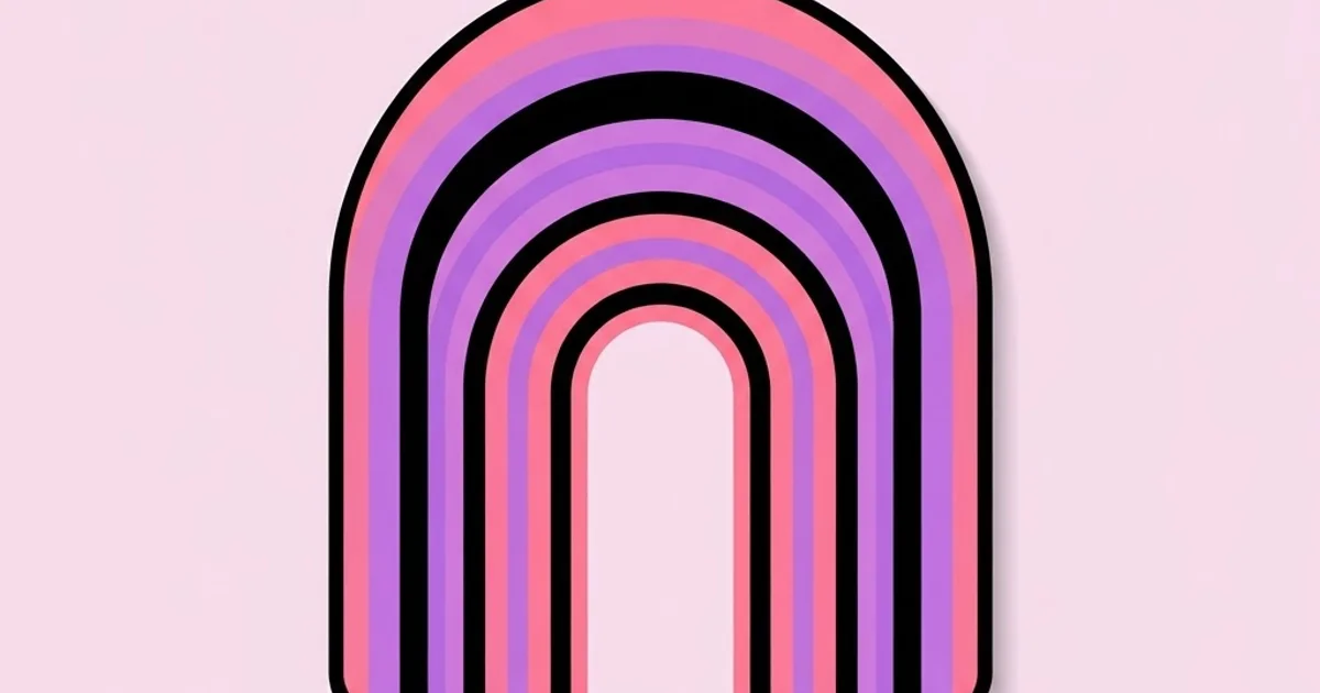
Then the decorative motifs: concentric sunbursts, horizontal stripe bands with rounded ends, arcs and rainbow curves, chunky rounded rectangles, and mirrored symmetry. These were not arbitrary. They were shapes that reproduced reliably in flat spot colours on offset presses, which is why they appear across everything from airline liveries to record sleeves to municipal signage.
The decade also cemented the corporate identity manual as a deliverable. Organisations commissioned complete systems — mark, colour specification, typographic rules, application guidelines, grid standards — documented in binders that production staff followed. This is the direct ancestor of today's design system documentation. Many of the practitioners behind those programmes appear repeatedly in histories of the field, and reading about the designers who built these identity systems makes clear how much of contemporary brand practice was standardised during this ten-year window.
One term to define precisely: supergraphics. This refers to oversized graphic elements — giant type, stripes, arrows, colour fields — applied directly to architecture and interiors. Seventies supergraphics treated buildings as surfaces for wayfinding and identity, an idea that reappears constantly in contemporary environmental branding.
The Core Elements of the Seventies Look
If you are reproducing or referencing the period deliberately, these are the components that actually carry the signal. Getting three of them right reads as authentic; getting one right reads as accidental.
- Display typography as the primary structure. Type is not placed on the layout, it defines the layout. Headlines are set enormous, tightly tracked, and frequently occupy a third or more of the composition.
- Rounded geometric letterforms. Circular bowls, uniform stroke weight, and minimal contrast between thick and thin. Often paired with a plain grotesque for body copy.
- Limited flat colour. Two to four spot colours with no gradients in commercial print work, because that is what offset economics allowed. Gradients appear mostly in airbrush illustration, not in flat graphics.
- Symmetry and centred composition. Much seventies poster work is strictly symmetrical, in direct contrast to the asymmetric Swiss layouts of the preceding decades.
- Arc and stripe motifs. Concentric rings, sunbursts, and multi-band stripes used as structural framing devices rather than as background texture.
- Photographic treatment through duotone and posterisation. Colour reproduction was expensive, so photographs were often reduced to two or three tones, which became an aesthetic in its own right.
- Generous, deliberate borders. Album sleeves and posters commonly used a thick inset frame, which is part of why period work reads as contained and poster-like.
- Hand-lettered logotypes. Custom letterforms rather than typeset words, particularly in music, food packaging, and entertainment.
What is largely absent is equally instructive: no drop shadows on type in commercial print, no photographic collage with soft edges, no fine hairline rules, and very little of the extreme minimalism that dominates contemporary branding. Adding modern conventions to period elements is the fastest way to produce something that looks like a costume rather than a design.
Seventies Design Against Its Neighbours
The decade makes far more sense positioned against what came immediately before and after. This comparison isolates the decisions that actually changed.
| Period | Dominant typography | Colour approach | Composition | Driving technology |
|---|---|---|---|---|
| 1960s | Grotesques, Swiss neutrality and psychedelic extremes side by side | High-contrast primaries, or saturated psychedelia | Asymmetric grid or free-form | Metal and early photo-typesetting |
| 1970s | Heavy rounded display faces, very tight tracking | Earth tones, sunset ranges, flat spot colour | Symmetrical, centred, type-led | Photo-typesetting, affordable offset litho |
| 1980s | Mixed weights, condensed faces, early digital type | Neon, pastel, high-saturation contrast | Layered, fragmented, postmodern | Desktop publishing arrives |
| 1990s | Deconstructed, overlapping, grunge treatments | Muted, murky, texture-heavy | Intentionally chaotic, rule-breaking | Photo editing and digital compositing |
| Contemporary revival | Reissued and redrawn seventies display faces | Muted earth tones with modern accessibility constraints | Symmetrical nostalgia on responsive grids | Variable fonts and web delivery |
The contemporary revival row matters for practical work. Modern brands referencing the seventies almost always dilute the palette and increase contrast, because original earth-tone combinations frequently fail current text-contrast standards on screen. A faithful period palette used for body text on a website is usually an accessibility failure, which is why successful revivals confine the authentic colours to large display areas and use compliant values for reading text.
Why the Decade Still Influences Current Work
I will avoid inventing trend statistics, because none exist with credible methodology. What can be observed directly is where seventies decisions persist in current practice.
The most visible is the return of rounded geometric display type in consumer branding, particularly in direct-to-consumer food, beverage, wellness, and financial products. The reasoning is sound rather than purely nostalgic: rounded heavy letterforms read as approachable and informal, they hold up at small sizes on phone screens, and they differentiate against the wave of neutral corporate sans-serifs that dominated the preceding decade. The seventies simply solved the same problem — friendly, legible, distinctive at low fidelity — under harsher constraints.
The second persistence is the identity manual itself. The structure of a modern design system — tokens, usage rules, do-and-don't examples, application guidelines — is the seventies corporate manual translated into software. Anyone who has written component documentation is continuing a practice formalised in that decade.
The third is environmental graphics. Airport, transit, hospital, and park signage systems designed in the seventies established conventions for pictograms, colour coding, and typographic hierarchy that are still followed because they were tested at enormous scale under real conditions.
There is also a significant cross-cultural dimension that Western design histories frequently skip. The same decade saw the maturation of a distinct Japanese commercial and animation visual language, whose colour treatment, dynamic composition, and lettering evolved into conventions still used globally — and anyone working in that space should study how anime-influenced graphic design developed its own approach to type, panel structure, and motion cues rather than assuming the seventies were purely an American and European story.
Finally, the decade offers a genuinely useful working lesson about constraint. Seventies designers produced extraordinary variety with two or three spot colours and one display face because the press made anything else unaffordable. Contemporary designers with infinite colours and thousands of fonts routinely produce less distinctive work. Imposing artificial limits — three colours, one display face, flat shapes only — is a reliable way to recover that inventiveness.
Mistakes When Referencing Seventies Design
Treating it as one style. The decade contains corporate modernism, disco graphics, punk photocopy aesthetics, environmental supergraphics, and countercultural poster art. Mixing all of them in one piece produces incoherence rather than period accuracy.
Using gradients everywhere. Flat spot colour dominated commercial print. Gradients belong to airbrush illustration of the period, not to logos, headlines, or layout blocks. A gradient-heavy piece reads as eighties or as generic retro.
Ignoring contrast requirements. Brown text on burnt orange is period-accurate and unreadable for many users. Keep authentic combinations for large display elements and use compliant pairings for anything that must be read.
Loose letterspacing. This is the single most common tell. Seventies display typography is tracked extremely tight, often with overlapping letters. Default tracking instantly destroys the effect regardless of typeface choice.
Applying texture as a shortcut. Adding paper grain and print misregistration overlays to a modern layout does not make it seventies, it makes it a modern layout with a filter. The period signal lives in type, colour, and composition.
Copying without a reason. Nostalgia is a legitimate strategy only if the audience has a relationship with the reference. A retro palette applied to an enterprise security product communicates confusion rather than warmth.
Using contemporary minimalist spacing. Period work fills the frame. Modern generous whitespace applied to seventies elements produces a hybrid that reads as neither.
Building a Seventies-Inspired Piece Correctly
Here is a working method for producing period-informed work that holds up commercially rather than reading as costume.
Step one — choose one strand. Decide whether you are referencing corporate identity modernism, music and club graphics, environmental supergraphics, or countercultural print. Each has a different palette, composition logic, and type vocabulary. Commit to one.
Step two — build the palette from three colours. Pick one dominant earth or sunset tone, one supporting tone, and one contrast. Test every text pairing for contrast immediately and define compliant alternatives for reading text before you design anything.
Step three — select one display face and one text face. A heavy rounded geometric for display, a plain grotesque for everything else. Two families maximum. Resist adding a script, which is an eighties instinct.
Step four — set the display type first and tight. Compose the headline before placing any other element, tracked far tighter than feels comfortable. Let the type block define the composition, then build around it.
Step five — add one structural motif. A sunburst, a stripe band, an arc, or a thick frame. One only, used structurally to frame or divide, not scattered as decoration.
Step six — flatten everything. Remove shadows, glows, blurs, and gradients. Every shape should be a flat fill. If the piece looks weak flat, the composition is weak, and effects will not rescue it.
Step seven — treat photography to match. Convert images to duotone or posterised tones drawn from your three colours. Full-colour photography sitting inside a period layout is the fastest way to break the illusion.
Step eight — test at final size and in context. Print it, or view it at actual scale on the device it will appear on. Period work was designed to be read at a distance on a wall or held in the hands as a sleeve, and those viewing distances shaped every size decision.
Run this and you will produce work that references the decade's logic rather than its clichés — which is the difference between a design that feels confident and one that feels borrowed.
Key Takeaways
- Photo-typesetting and affordable offset printing, not fashion alone, produced the tight tracking, flat spot colour, and heavy display type that define the decade.
- The seventies contained several distinct movements, from corporate identity modernism to countercultural print, and mixing them produces incoherence.
- Authentic earth-tone palettes frequently fail modern contrast requirements, so reserve them for display areas and use compliant values for reading text.
- Tight letterspacing is the strongest period signal, and default tracking will undermine an otherwise accurate reference.
- The corporate identity manual formalised in this decade is the direct ancestor of the modern design system and its documentation practices.
Frequently Asked Questions
What defines 1970s graphic design?
The decade is defined by heavy rounded display typography set with very tight letterspacing, flat earth-tone and sunset palettes, symmetrical type-led composition, and geometric motifs such as sunbursts and stripe bands. Alongside this sat a parallel tradition of rigorous corporate identity systems documented in comprehensive brand manuals.
Why does seventies design use so many earth tones?
Partly cultural, reflecting a broader turn toward natural materials and environmental awareness, and partly technical. Flat spot-colour offset printing favoured a limited number of inks, and warm, slightly desaturated tones reproduced more reliably and forgivingly on uncoated stocks than bright, high-saturation colours.
What fonts look like 1970s typography?
Look for heavy geometric sans-serifs with rounded bowls, high x-heights, closed apertures, and minimal stroke contrast, plus the tightly-tracked display faces developed during the photo-typesetting era. Many contemporary foundries offer faithful revivals and reinterpretations designed specifically for modern screen and web use.
How is seventies design different from eighties design?
The seventies favour earth tones, symmetry, flat spot colour, and rounded heavy type. The eighties shift to neon and pastel palettes, layered and fragmented composition, condensed typefaces, and the visual effects that desktop publishing made newly available. Gradients and drop shadows are more characteristic of the eighties.
Is seventies design still relevant for modern brands?
Yes, particularly for consumer brands seeking warmth and approachability. Rounded heavy display type performs well on small screens and differentiates against neutral corporate sans-serifs. The reference works best when the palette is adapted for accessibility and the composition adapted for responsive layouts.
What was supergraphics in seventies design?
Supergraphics were oversized graphic elements — giant letterforms, stripes, arrows, and colour fields — applied directly to walls, buildings, and interiors. They combined wayfinding with identity at architectural scale and strongly influenced contemporary environmental branding in retail, offices, and public buildings.
How do I make retro design look intentional rather than dated?
Choose one strand of the period, use its composition logic rather than only its ornaments, adapt colour for current contrast standards, and apply the reference to a brand where nostalgia genuinely serves the audience. Period accuracy without strategic reason reads as costume rather than design.
Conclusion
The most important thing the seventies teach is that constraint produces invention. Designers working with two spot colours, one display face, and a press that could not hold fine detail generated a visual language distinctive enough that we are still borrowing from it decades later. That was not despite the limits; it was because of them.
The practical next step is to run one project under artificial period constraints: three flat colours, one display face, no effects, symmetrical composition. You will learn more about composition in that exercise than in a month of unconstrained work. To build the historical grounding that makes those references intelligent rather than superficial, work through a structured design reading list that covers the movements on either side of the decade as well as the decade itself.


