Japanese Graphic Design: Principles You Can Actually Use
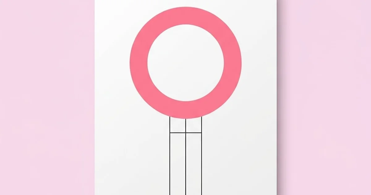
Copying the surface of Japanese graphic design — a red circle, a vertical line of characters, a lot of empty space — produces pastiche. Understanding its underlying logic produces better work in any language. Japanese graphic design is a tradition built on structural constraint: a writing system that permits both vertical and horizontal setting, a print culture with exceptional production standards, and a compositional philosophy that treats empty space as an active element rather than leftover area.
Quick Answer: Japanese graphic design is characterized by rigorous grid structure, deliberate use of negative space, restrained color, and typography shaped by a writing system that supports both vertical and horizontal composition. Its transferable principles are asymmetric balance, extreme reduction, and treating empty space as a compositional element with its own weight.
The Structural Foundations Behind the Aesthetic
The visual character most people recognize comes from practical constraints, not from stylistic preference. Japanese writing combines multiple character sets, and those characters occupy square em boxes of consistent width. That single fact produces the rigid modular grid feeling of Japanese layout: text sets into a lattice of uniform squares whether running vertically or horizontally, which gives designers a structural framework that Latin typography — with its variable letter widths — simply does not provide by default.
Three concepts are worth defining because they get used loosely in design writing. Ma refers to the interval or gap between elements, understood as a meaningful component of the composition rather than as absence. Wabi-sabi describes an aesthetic appreciation of imperfection, asymmetry, and the marks of time; in design it manifests as tolerance for irregular texture and off-center balance rather than as deliberate sloppiness. Kanban, in its original sense, refers to shop signage, a tradition of bold, immediately legible commercial marks that fed directly into modern Japanese logo and poster design.
The other structural driver is production. Japanese print culture has long placed high value on paper, binding, ink density, and finishing. When a designer can rely on the printed result faithfully reproducing subtle tonal shifts and precise register, they design differently: fine hairlines, delicate tints, and tight registration become viable choices. Many of the effects that look like aesthetic bravery are actually confidence in production. That relationship between craft and constraint is the same one that governs apparel and print production work, where what you can design is bounded by what the process can hold.
Principles That Transfer to Any Design Work
These are the specific, portable techniques rather than the stylistic surface.
- Treat negative space as an element with weight. Before adding anything, decide what the empty areas are doing. Space that is doing nothing should be removed or reallocated, not filled.
- Build asymmetric balance. Centering is the easy solution and the weakest one. Offset a heavy element and counterweight it with a small, distant one; the resulting tension holds attention far longer.
- Reduce until removing one more thing breaks it. Reduction is a process, not a starting condition. Design the full version, then strip elements one at a time until the message fails, then restore the last one.
- Limit the palette severely. Two colors plus paper or background is a productive constraint. When color is scarce, each application carries meaning.
- Let one element dominate completely. A single oversized focal element surrounded by quiet space outperforms three competing medium-sized elements almost universally.
- Align to a modular grid, not just to margins. Borrow the em-square logic: build a lattice and place everything on it, including images and rules, not only text.
- Respect the edge. Japanese layout frequently uses the trim edge deliberately, either with generous margins or with elements running fully off the page. Half-measures at the edge look accidental.
- Use texture and material as content. Paper stock, uncoated surfaces, and ink behavior are design decisions, not afterthoughts left to the printer.
Applied honestly, none of these require a single Japanese visual motif. They are compositional disciplines, and that is precisely why they travel.
Comparing Compositional Approaches
Placing traditions side by side clarifies what is genuinely distinctive rather than merely unfamiliar.
| Dimension | Japanese Approach | Swiss / International Style | Common Western Commercial |
|---|---|---|---|
| Use of empty space | Active compositional element with intent | Systematic margin derived from grid | Residual area, often filled |
| Balance | Frequently asymmetric and tension-based | Ordered, often modular and even | Centered or symmetrical by default |
| Typographic axis | Vertical and horizontal both available | Horizontal only | Horizontal only |
| Color strategy | Severely limited, high contrast accents | Restricted, functional | Broad palettes, brand-driven |
| Material treatment | Paper and finish treated as content | Neutral substrate preferred | Cost-driven substrate choice |
The useful insight from that comparison: Japanese and Swiss traditions share rigor but differ in where they place expression. Swiss design locates order in the system itself; Japanese design uses the system to create space for a single expressive gesture. Both are far more disciplined than default commercial layout.
A Practitioner's Reading of Why It Works
I will not attach research statistics to claims about cultural aesthetics, because the credible studies do not exist in the form design writing usually pretends they do. What I can offer is a working analysis from applying these principles in commercial projects with non-Japanese audiences.
The first mechanism is attention economics. A composition with one dominant element and large quiet areas gives the eye a single unambiguous entry point. Most commercial layouts fail because they offer four entry points of equal weight and the viewer resolves the ambiguity by leaving. Reduction is not a taste preference; it is a way of removing competing instructions.
The second mechanism is perceived quality through restraint. When a layout contains few elements, each one is scrutinized. A designer who reduces must then execute perfectly, because there is nothing to hide behind. Audiences read that precision as care, and care reads as quality. This is why minimal work fails so badly when it is merely empty rather than precise — the same scrutiny that rewards good craft punishes sloppiness ruthlessly.
The third mechanism is memorability through singularity. A poster carrying one strong image is recalled as that image. A poster carrying five is recalled as nothing. When clients ask for more elements, they are usually asking for more coverage, and the honest answer is that coverage and recall trade against each other.
The fourth, and the one designers underuse, is rhythm through interval. Varying the gaps between elements — rather than distributing everything evenly — creates a reading order without arrows, numbers, or size changes. Two items close together read as related; a wide gap reads as a new section. You can build an entire information hierarchy out of spacing alone, which is a technique that carries directly into interface and component work such as constructing a consistent icon system where spacing relationships do most of the communicating.
Mistakes Designers Make Borrowing From This Tradition
Treating it as a decorative style. Adding a red circle and cherry blossoms to an otherwise conventional layout is costume, not influence. Borrow the structural logic instead.
Using Japanese characters as ornament. Setting text you cannot read, for visual effect, frequently produces errors that are obvious and embarrassing to any reader of the language. If the audience does not read the language, the text is not serving them.
Confusing empty with minimal. Minimalism is reduction after rigorous decision-making. A sparse layout with arbitrary placement is not minimal; it is unfinished.
Ignoring typographic mechanics. Vertical setting has its own conventions for punctuation, numerals, and Latin insertions. Rotating a line of horizontal type ninety degrees is not vertical typesetting.
Over-reducing functional content. A restaurant menu still needs prices and a website still needs navigation. Reduction applies to expressive elements, not to information the user requires to act.
Copying a specific designer's signature. The tradition contains many distinct individual voices. Absorbing one designer's personal mannerisms is imitation; absorbing the shared structural principles is education.
Neglecting production. Much of what makes this work impressive is paper, ink, and finishing. Designing delicate tonal work and then printing it cheaply produces a muddy result that undermines the entire approach.
Applying the Principles to a Real Brief
Take a conventional commercial brief — a single-page event poster for a local music festival — and work it through these principles rather than the usual process.
Start with the information hierarchy, written as a list. Before any layout, rank every required element by importance: headline act, date, venue, supporting acts, ticket link, sponsor logos. Most posters fail because this ranking was never made and everything ended up medium-sized.
Choose one element to dominate. Give the top-ranked item disproportionate scale — not twenty percent larger than the next item, but several times larger. If the headline act is the draw, the name or the image occupies the majority of the composition.
Build the modular grid. Divide the page into a lattice of equal units rather than into columns alone. Place every element on that lattice, including the image edges and any rules. This produces the structural tightness that reads as intentional even to viewers who cannot articulate why.
Design the intervals deliberately. Group the date and venue tightly together because they are read as one fact. Push the supporting acts far from that group. Isolate the ticket information with a wide gap so it reads as the action step. You have now built a reading order without a single arrow.
Restrict color to two plus the paper. One color carries the dominant element, the second marks only the action step. Sponsor logos convert to a single flat tone rather than retaining their individual brand colors, which is both cleaner and easier to justify to clients than it sounds.
Now remove. Take away one element at a time and evaluate whether the poster still functions. Decorative rules, background textures, and secondary images usually go first. Stop when removal starts to cost information.
Specify the production. Choose the paper stock deliberately — uncoated for tactile warmth, heavier weight for perceived value — and specify ink coverage. If budget forces a cheap substrate, adjust the design toward flat bold shapes that survive poor reproduction rather than delicate tints that will not.
Test at distance and at thumbnail. View the poster from across a room and as a small phone-screen image. If the dominant element does not survive both tests, the hierarchy is not strong enough yet, and no amount of refinement to the small elements will fix it.
Key Takeaways
- The distinctive character of Japanese graphic design comes from structural constraints — a modular writing system and high production standards — rather than from decorative motifs.
- Negative space functions as an active compositional element with its own weight, and should be designed rather than left over.
- Varying the intervals between elements builds an information hierarchy without relying on size changes, arrows, or numbering.
- Extreme reduction only works when execution is precise, because fewer elements means each one receives far more scrutiny.
- Borrowing visual motifs produces pastiche; borrowing the compositional logic of asymmetric balance and reduction improves work in any language.
Frequently Asked Questions
What defines Japanese graphic design?
It is defined by rigorous modular grid structure, deliberate and meaningful use of empty space, severely restricted color, and typography capable of both vertical and horizontal composition. High print production standards also allow finer detail and more delicate tonal work than many commercial contexts support.
What does ma mean in design?
Ma refers to the interval or gap between elements, understood as a meaningful part of the composition rather than as leftover emptiness. In practice it means designing the spaces as deliberately as the objects, and using varied gaps to establish relationships and reading order.
How is Japanese design different from Swiss design?
Both traditions are highly systematic, but they place expression differently. Swiss design locates order and meaning in the grid system itself, while Japanese composition often uses the underlying structure to create room for a single expressive gesture, frequently arranged asymmetrically rather than modularly.
Can I use these principles without Japanese visual motifs?
Yes, and you should. Asymmetric balance, active negative space, severe palette restriction, modular grids, and rhythm through varied intervals are compositional disciplines that apply to any subject in any language. Adding motifs without the underlying structure produces imitation rather than influence.
Why is negative space so important in this tradition?
Because it controls attention. A composition with generous quiet areas gives the viewer one unambiguous entry point, while a crowded layout offers competing instructions and typically loses the viewer entirely. Space also amplifies whatever remains, making a single element read as significant.
What is the most common mistake when borrowing this style?
Treating it as decoration. Adding a red circle, cherry blossoms, or unreadable characters to an otherwise conventional layout is costume. The transferable value lies in hierarchy decisions, interval control, reduction discipline, and production care, none of which are visible as motifs.
Conclusion
The most valuable thing this tradition offers is permission to remove. Nearly every commercial layout would improve if the designer ranked the information honestly, made one element dominant, and deleted everything that survived only because nobody argued against it. That is a decision, not a style, and it is available to you on any project regardless of subject or market. Your next step is to take a recent layout of your own, rebuild it with exactly one dominant element and two colors, and compare the two side by side at thumbnail size. If the exercise convinces you that formal composition training would sharpen your work, weigh it against the practical experience you would get from working inside a studio before choosing a path.