
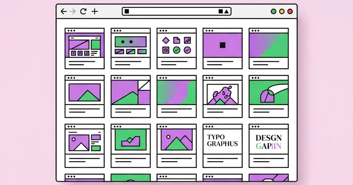
The Best Sites for Design Inspiration, Assets, and Tools
Every designer eventually accumulates a bookmark folder that has become a landfill: three hundred links, forty of them dead, and none of them opened when a real deadline arrives. Sites for design are the web platforms designers use to find inspiration, source assets, learn craft, and showcase work, and the useful skill is not collecting them but knowing which category solves the problem currently in front of you. Reference gathered without a question in mind is just procrastination with a nicer interface.
Quick Answer: The best design sites fall into five categories: inspiration galleries like Behance and Dribbble, real-world pattern libraries like Mobbin and Land-book, asset marketplaces for fonts and vectors, learning resources such as Nielsen Norman Group and Smashing Magazine, and tool ecosystems like Figma Community. Choose by task, not by popularity.
The Five Categories of Design Sites and What Each Is For
Treat design sites as instruments with different purposes. Confusing the categories is why so many designers feel inspired and unproductive at the same time.
Inspiration galleries such as Behance, Dribbble, and Awwwards show curated, often aspirational work. Their value is exposure to visual range and craft ceiling. Their limitation is that entries are optimised to be looked at rather than used, so a gorgeous dashboard shot may contain no error states, no empty states, and no realistic data density. Use galleries for visual vocabulary, never as a specification.
Pattern and product libraries such as Mobbin, Land-book, SaaS Landing Page, and Page Flows capture shipped interfaces from real products. These are far more useful during actual product work because they show flows, edge cases, and decisions that survived engineering. When you need to know how twenty real apps handle onboarding, this is the category to open.
Asset sources cover typography, vectors, photography, and icons: Google Fonts and independent type foundries for typefaces, Unsplash and Pexels for photography, and icon systems like Lucide, Phosphor, and Font Awesome. Licensing discipline lives here, and it is the category where careless use creates legal exposure.
Learning and standards resources such as Nielsen Norman Group, Smashing Magazine, the W3C's accessibility documentation, and platform human interface guidelines contain the reasoning behind decisions. Galleries show what; these sites explain why, which is what actually compounds over a career. This is also where you learn the vocabulary to defend layout decisions, from hierarchy to the principle of unity and how it holds compositions together, instead of arguing from personal preference.
Tool ecosystems and communities such as Figma Community, plugin directories, and open design system documentation give you working files rather than pictures. Being able to open a published design system and inspect its token structure teaches more in an hour than a week of scrolling thumbnails.
How to Choose a Site Based on the Job in Front of You
Start from the task, then pick the category. This ordering sounds obvious and is almost never followed.
- Need visual direction for a brand? Use curated galleries and print-oriented archives, plus historical references. Constrain yourself to collecting twenty images and then articulating what the common thread is.
- Need to design a specific product flow? Use pattern libraries of shipped apps. Study three competitors and two adjacent industries, and note what they all do, because convergence usually signals a genuine user expectation.
- Need type? Start with foundry sites and well-maintained open-source libraries. Check licence terms for web, app embedding, and broadcast separately, since they are priced and permitted differently.
- Need to solve a usability argument? Use research-backed sources. A cited usability finding ends a debate that a Dribbble shot will only prolong.
- Need production-ready components? Use open design systems and component library documentation, which include states, accessibility notes, and behavioural rules that static images omit.
- Need to publish your own work? Use a portfolio platform for reach, but keep an owned site as the canonical version. Platforms change algorithms; your domain does not.
- Need to price or scope work? Use industry salary surveys and professional body resources rather than forum anecdotes.
Design Site Categories Compared
This comparison maps each category to what it is genuinely good at and where it misleads people, which is the part most roundup articles omit.
| Category | Representative Sites | Best Use | Where It Misleads |
|---|---|---|---|
| Inspiration galleries | Behance, Dribbble, Awwwards | Expanding visual range, judging craft standards | Concept work without constraints, states, or real data |
| Shipped product libraries | Mobbin, Land-book, Page Flows | Studying real flows, onboarding, and edge cases | Popular patterns are not always accessible or correct |
| Typography sources | Google Fonts, independent foundries | Pairing, licensing, and variable font selection | Free does not always mean free for every use case |
| Imagery and icons | Unsplash, Pexels, Lucide, Phosphor | Fast, consistent visual assets | Overused stock imagery weakens brand distinctiveness |
| Learning and standards | Nielsen Norman Group, Smashing Magazine, W3C | Understanding reasoning, accessibility, evidence | Slower to consume, so it is skipped under deadline |
| Tool ecosystems | Figma Community, open design systems | Inspecting real files, tokens, and components | Community files vary wildly in structural quality |
A Practitioner's View on Inspiration and Its Failure Modes
After enough years, a specific pattern becomes visible in how designers use these sites, and it is worth naming honestly. Junior designers mostly browse galleries. Senior designers mostly browse shipped products, documentation, and archives. That shift is not about taste maturing. It is about the question changing from "what could this look like" to "what has already been proven to work under constraints similar to mine".
There is a second, subtler failure mode: homogenisation. When thousands of designers draw from the same handful of trending galleries, output converges. You can date a project to within about a year by its shadows, corner radii, gradient treatment, and illustration style. That convergence is fine for conventional interface patterns, where familiarity genuinely helps users, and damaging for brand work, where the entire job is to be distinguishable. The practical countermeasure is to source at least part of your reference from outside the design web entirely: architecture, packaging, signage, editorial print, textile archives, museum collections. Historical archives are especially valuable because they sit outside the current trend cycle, which is why studying something like mid-century graphic design and its enduring lessons produces more original work than another hour in a trending feed.
The third observation concerns how reference is stored. Saving an image is nearly worthless a month later because you have kept the artefact and discarded the reason. The habit that actually compounds is annotating: one sentence stating what specifically works and why. "Type hierarchy survives at thumbnail size because only two weights are used." That sentence is reusable. The image alone is decoration.
Finally, treat licensing as a professional obligation rather than a formality. Free font licences frequently exclude app embedding or broadcast use. Stock photography licences often restrict use in merchandise or on packaging. Icons may require attribution. Community design files may carry share-alike terms. The cost of checking is minutes; the cost of not checking lands on the client, which is far worse than it landing on you.
Mistakes Designers Make With Inspiration Sites
Browsing without a defined question. Open a gallery with a specific question, such as "how do these three products handle a dense table on mobile", and you leave with an answer. Open it without one and you leave with vague dissatisfaction about your own work.
Copying compositions instead of decisions. The valuable part of a reference is the decision behind it: why this hierarchy, why this restraint, why this contrast. Lift the decision and apply it to your own content. Lift the composition and you have produced a worse version of something that already exists.
Trusting concept work as a production standard. Many gallery shots have never been built. They omit loading states, errors, long names, right-to-left text, accessibility contrast, and the ugly realities of real content. Building from them produces designs that fail their first engineering review.
Ignoring accessibility while chasing aesthetics. Low-contrast grey text and near-invisible focus states are endemic in trending work. Check contrast ratios against WCAG guidance before adopting a palette, because retrofitting accessibility after a visual system is approved is painful and expensive.
Hoarding instead of curating. A reference library of two thousand unsorted images is unusable. Keep a small, ruthlessly pruned collection organised by problem type, such as navigation, empty states, or editorial layout, rather than by aesthetic mood.
Using a portfolio platform as the only portfolio. Platform reach is real, but algorithms and policies change. Maintain your own site as the authoritative record with case studies that explain problem, constraints, process, and outcome, because that narrative is what actually converts into work.
Building a Reference System That Survives Real Deadlines
Here is a working system that takes an afternoon to set up and pays back permanently. It is deliberately small, because large systems get abandoned.
Step one: define five problem buckets. Not moods. Problems. For example: navigation and wayfinding, data density, editorial layout, brand identity systems, and motion and transitions. These names should match the kinds of briefs you actually receive.
Step two: pick two authoritative sources per bucket. One should show shipped reality, one should explain reasoning. Two per bucket is enough; more becomes noise and guarantees the system decays.
Step three: annotate everything you save. One sentence, present tense, describing the decision worth reusing. If you cannot write that sentence, do not save the item. This single rule removes about eighty percent of what people currently hoard.
Step four: run a timeboxed reference sprint per project. Give yourself forty-five minutes at the start of a project, gather no more than twenty references, then close every tab. Open-ended browsing during production is the enemy of production.
Step five: convert references into constraints. Before designing, write the three or four rules your references imply: a type scale, a colour role structure, a spacing unit, a photography treatment. Constraints are what turn inspiration into a system instead of a mood board.
Step six: audit licences once, at the point of selection. Record the font, image, and icon licences in the project file the moment you choose them. Retroactive licence archaeology at handover is miserable, and it is the kind of process detail that distinguishes serious practitioners applying for remote design roles from hobbyists with attractive portfolios.
Step seven: prune quarterly. Delete anything you have not referenced in six months. A reference library should feel like a sharp toolkit, not an archive you feel guilty about.
Key Takeaways
- Design sites divide into inspiration galleries, shipped product libraries, asset sources, learning resources, and tool ecosystems, and each solves a different problem.
- Gallery concept work omits states, errors, and real content, so it should inform visual range rather than serve as a production specification.
- Annotating why a reference works makes it reusable; saving the image alone preserves decoration and discards the lesson.
- Sourcing reference from outside the design web, including historical archives, is the most reliable defence against homogenised, trend-dated output.
- Licence terms for fonts, imagery, and icons differ by use case and should be recorded at selection time, not audited at handover.
Frequently Asked Questions
What is the best site for design inspiration?
There is no single best site because the right choice depends on the task. Use Behance or Awwwards for visual range and craft ceiling, and use shipped product libraries such as Mobbin or Land-book when you need patterns that survived engineering, real content, and edge cases.
Are free design resources safe to use commercially?
Often, but never assume it. Free fonts may exclude app embedding or broadcast use, stock photos may restrict merchandise and packaging, and icon sets may require attribution. Read the specific licence for your specific use case and record it in the project file.
How do I avoid my work looking like everyone else's?
Limit how much reference you take from current trending feeds and deliberately source from architecture, packaging, signage, editorial print, and historical archives. Then convert references into explicit constraints such as a type scale and colour roles rather than copying surface treatments.
Is Dribbble or Behance better for getting hired?
Behance generally suits full case studies and long-form project storytelling, while Dribbble favours single visual shots and quick craft signals. Hiring managers respond to documented process and outcomes, so an owned portfolio site with real case studies outperforms either platform alone.
How much time should I spend gathering inspiration?
Timebox it. Around forty-five minutes at the start of a project, capped at roughly twenty references, is enough for most briefs. Open-ended browsing during production consistently delays work and lowers confidence in decisions you have already made correctly.
Where should I learn design fundamentals rather than trends?
Use research and standards sources such as Nielsen Norman Group for usability evidence, W3C documentation for accessibility requirements, and platform human interface guidelines for conventions. These explain reasoning, which transfers across projects far better than any individual visual trend.
Should I keep a personal reference library or rely on platforms?
Keep your own, organised by problem type rather than aesthetic mood, and annotate each entry with the decision worth reusing. Platforms reorganise, deprecate features, and lose content, while a small curated library remains searchable and meaningful to you specifically.
Conclusion
The insight worth carrying away is that inspiration is not a resource you consume but a question you ask, and the quality of the sites you use matters far less than the precision of the question you bring to them. Designers who improve fastest are the ones who look at fewer things more carefully and write down what they learned. Your next step is concrete: define your five problem buckets, assign two trusted sources to each, and delete the rest of the bookmark folder today. Then take the references you keep and turn them into actual system rules, starting with composition, because the fastest way to make gathered reference useful is to apply a clear structural framework such as designing layouts with deliberate unity rather than assembling a collage of things you liked.


