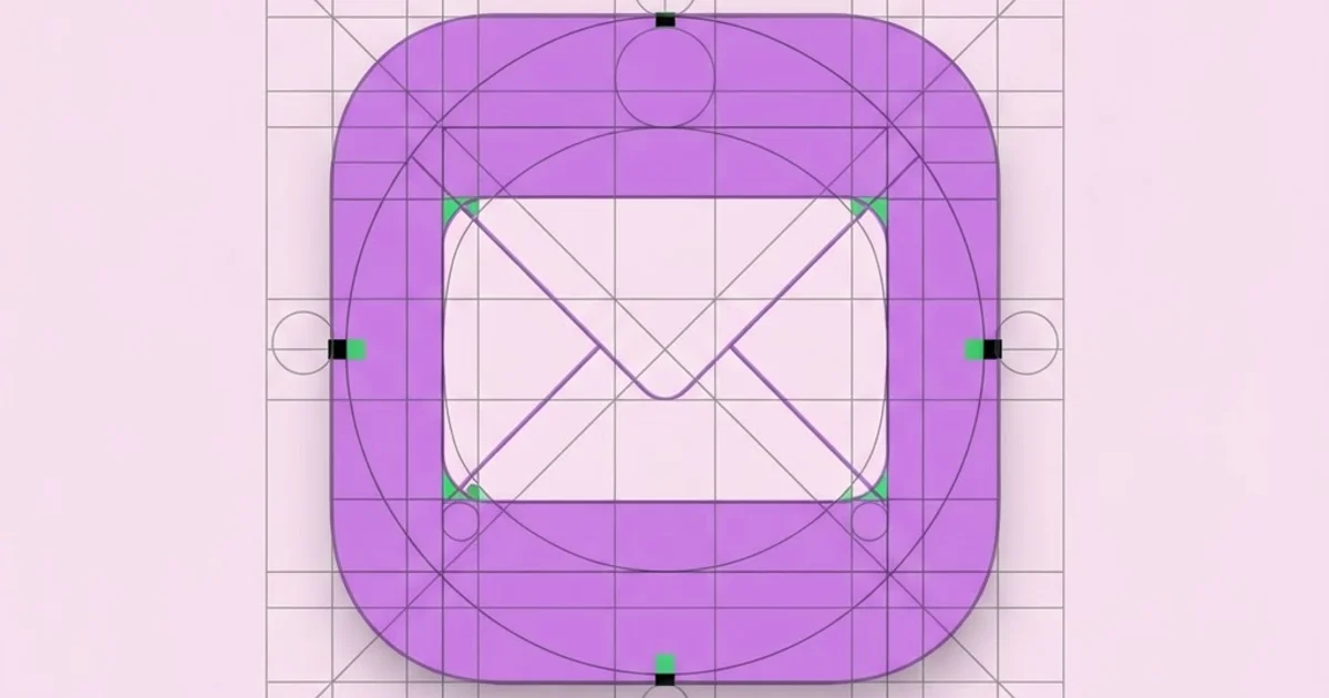
Graphic Icon Design: Rules That Keep Icons Readable
Most icon sets fail for the same reason: they were drawn as illustrations instead of built as a system. Graphic icon design is the discipline of constructing small, repeatable symbols on a shared geometric framework so that every icon in a family reads identically at the same size, in the same context, with the same visual weight. The craft is less about drawing talent and more about constraint management — one grid, one stroke width, one corner radius, one set of terminal rules, applied without exception across dozens or hundreds of glyphs.
Quick Answer: Graphic icon design is the process of building simple symbols on a fixed pixel grid using a shared stroke weight, corner radius, and keyline system. Good icons are recognizable at their smallest intended size, consistent across the whole set, and tested in real interface context rather than judged in isolation on a canvas.
What Separates an Icon From an Illustration
An icon is a functional label, not a picture. Its job is to be identified in under 200 milliseconds by someone who is not looking directly at it. That constraint kills most decorative instincts immediately: gradients disappear, fine detail disappears, perspective disappears, and anything that only reads at 128px becomes dead weight at 16px.
The practical test I use on every glyph is the squint test. Shrink the icon to its smallest production size, blur your vision, and ask whether the silhouette still communicates. A trash can with a lid, a handle, five vertical ridges, and a subtle shadow becomes a grey smudge at 16px. A trash can reduced to a trapezoid body, a lid line, and one ridge stays legible. Detail is not quality in icon work — it is usually the enemy of quality.
This is also where icon design overlaps with broader visual systems thinking. If you are building a brand's full visual language rather than a single icon family, the same constraint logic applies to layout, typography, and color, which is why many designers move between disciplines and why the hiring market rewards system thinkers. Designers building that breadth often study formal approaches like the grid discipline of Japanese design, where reduction and alignment are treated as structural requirements rather than stylistic choices.
Three terms are worth defining precisely before you draw anything. The keyline shape is the set of primitive boundaries — usually a square, a circle, a vertical rectangle, and a horizontal rectangle — that define how much visual area each icon may occupy. The live area is the safe zone inside the artboard where all drawing happens, leaving padding so icons never touch their own edges. The optical weight is how heavy an icon appears, which is not the same as how much area it covers; a solid circle looks heavier than a square of identical dimensions, so the circle keyline is drawn slightly larger to compensate.
Building the Grid System Before the First Glyph
Every professional icon set starts with a specification document, not a sketch. Here is the order I follow, and skipping any step causes rework later.
- Choose the base artboard. 24x24 is the standard for interface icons because it divides cleanly by 2, 3, 4, 6, 8, and 12. Use 16x16 only if your product genuinely renders at that size; use 48x48 for marketing or feature icons.
- Define the live area and padding. On a 24px artboard, a 20px live area with 2px padding on all sides is the common ratio. This padding is not wasted space — it is what prevents icons from colliding with adjacent text and buttons.
- Set the keyline shapes. Square 18x18, circle 20px diameter, vertical rectangle 16x20, horizontal rectangle 20x16. These numbers exist to make a circle and a square feel like the same size even though they are not.
- Lock stroke weight. Pick one value — 1.5px or 2px on a 24px grid — and do not vary it between icons. Varying stroke weight is the single most common reason a set looks amateur.
- Lock corner radius. Typically 2px outer and 1px inner on a 24px grid. Inner radii must always be smaller than outer radii or the shape looks inflated.
- Define terminals and joins. Round caps with round joins, or butt caps with miter joins. Mixing them inside one family is visible even to non-designers.
- Draw the hardest icon first. Not the house or the star — draw the one you are dreading, like settings, filter, or analytics. If your system survives the hard glyph, it will survive the easy ones.
- Expand strokes last. Keep everything as live strokes during design so you can change weight globally, then outline only at export.
One habit that saves hours: keep a single master file with every icon on one artboard row, viewed at 100% zoom. Designers who work icon-by-icon in separate files always end up with a set that drifts, because consistency is a comparative judgment and you cannot compare what you cannot see side by side.
Choosing the Right Icon Style for the Job
Style is a functional decision driven by size, density, and platform, not a taste decision. The table below maps the four styles I see in production work to the situations where each actually performs.
| Style | Best Use Case | Minimum Reliable Size | Main Risk |
|---|---|---|---|
| Outline / stroke | Dense interfaces, toolbars, navigation, data tables | 16px | Strokes visually disappear on busy or low-contrast backgrounds |
| Solid / filled | Active states, mobile tab bars, small sizes, high glare conditions | 12px | Shapes blur together when two solid icons sit close |
| Duotone | Marketing pages, empty states, feature grids, onboarding | 24px | Second color adds contrast and accessibility overhead |
| Glyph / monochrome pictogram | Wayfinding, print, signage, favicons, app badges | 10px | Loss of nuance makes similar concepts indistinguishable |
A pattern worth stealing: ship outline and solid versions of the same icon from a shared source path, and use solid for the selected state. This gives you a state change that requires no color, which means it still works for users with color vision deficiency and still works in grayscale printing.
What Practitioner Experience Says About Icon Comprehension
There is no universal comprehension rate for icons, and anyone quoting one should be treated with suspicion — recognition depends entirely on the audience's prior exposure. What I can report from repeated usability sessions is a consistent pattern: icons fall into three tiers, and treating all three the same is where products lose users.
Tier one icons are culturally fixed. Magnifying glass for search, house for home, envelope for mail, trash can for delete, plus for add. These survive without labels in almost any context because decades of exposure have made them nearly linguistic.
Tier two icons are conventional but context-dependent. The hamburger menu, the three-dot overflow menu, the heart versus bookmark distinction, the share glyph that differs between platforms. These work with labels and in familiar layouts, and they break when a product puts them somewhere unexpected.
Tier three icons are abstractions with no shared referent: "integrations", "workflows", "governance", "insights". No drawing solves these. In testing, users guess tier three icons correctly at rates barely better than chance, and they do not improve with better drawing — they improve with a visible text label. The correct design response is to stop trying to invent a symbol and pair the icon with a word.
The operational rule I apply is simple: never remove the label from a tier two or tier three icon to save space. If space is the problem, the layout is the problem. This is the same trade-off that appears constantly in portfolio reviews and design interviews, and being able to articulate it clearly is often what separates candidates who land entry-level design roles from candidates who present prettier work but cannot defend a decision.
Common Icon Design Mistakes and How to Avoid Them
Designing at the wrong zoom level. Working at 800% zoom produces icons tuned for a size nobody will ever see. Keep a 100% preview panel visible at all times and judge only from that.
Inconsistent optical alignment. Mathematical centering is not visual centering. A play triangle centered by bounding box always looks shifted left; it needs a nudge right so the perceived mass sits center. Same for any asymmetric glyph.
Half-pixel coordinates. A 1px stroke drawn on a whole-pixel coordinate straddles two pixels and renders blurry. On odd stroke weights, place the path on a half-pixel offset so the stroke lands inside one pixel row. This single fix accounts for most "why do my icons look fuzzy" complaints.
Too many metaphors for one concept. If your set has a gear, a wrench, and three sliders all meaning "settings", users will assume they do different things. Audit your set for semantic duplicates before you ship.
Uncontrolled corner radii. Applying the same radius to a large outer shape and a small inner cutout makes the inner shape look swollen. Halve the radius for interior corners.
Ignoring the negative space. The counters — the enclosed gaps inside a glyph — need to be at least as wide as the stroke weight, or they fill in and turn solid at small sizes. When a folder icon becomes a black rectangle at 16px, the counters were too tight.
Exporting without cleanup. Uncombined paths, stray anchor points, non-integer viewBoxes, and embedded fill attributes make SVGs impossible to recolor with CSS. Set fill="currentColor", strip inline styles, and flatten to a single compound path where possible.
A Real Walkthrough: Designing a Filter Icon
Take "filter" — a tier two icon that most sets get wrong. Here is the actual process on a 24px grid with 2px strokes and a 20px live area.
Start with the concept audit. Filter has three competing metaphors in circulation: the funnel, the three horizontal sliders, and the stacked lines that narrow downward. Check what your users already see elsewhere in their workflow. If your product sits next to spreadsheet tools, the funnel wins because that convention is already installed in the user's head. If it sits next to audio or media software, sliders win.
Choose the funnel. Now construct it on the keyline: the funnel is a wide-top, narrow-bottom shape, so it uses the vertical rectangle keyline, 16px wide by 20px tall, centered in the live area. Draw the mouth as a horizontal line at the top of the live area, then two diagonals converging toward center, then a vertical stem dropping to the bottom of the live area.
Now the craft decisions. The angle of the diagonals should be consistent with every other diagonal in your set — pick 45 degrees and stick to it across the whole family. The stem must be at least one stroke width away from the diagonal joins or the shape closes up at small sizes. The join where diagonals meet the stem should be mitered if your set uses miters, and clipped if the miter spike extends beyond the live area.
Test in four conditions before you approve it: at 16px in a light UI, at 16px in a dark UI, next to the three icons it will actually sit beside in the toolbar, and rendered on a non-retina display if your users have any. Then hand the same screen to someone unfamiliar with the product and ask what the icon does. If they say "funnel" instead of "filter", the drawing is fine but the concept needs a label.
Finally, version it. Create the solid variant for the active state, export both with identical viewBox and identical naming, and record the decision — metaphor chosen, keyline used, angle locked — in the system documentation. That record is what stops the next designer from drawing a fourth filter icon in six months.
Key Takeaways
- Icon quality is determined by system constraints — one grid, one stroke weight, one radius set, one terminal style — not by drawing detail.
- The smallest production size is the only size that matters for judging legibility; design with a permanent 100% preview visible.
- Keyline shapes exist because equal dimensions do not produce equal optical weight; circles must be drawn larger than squares to match.
- Abstract concepts cannot be solved with better drawing and must be paired with a visible text label instead.
- Counters inside a glyph must be at least as wide as the stroke weight, or the icon fills in and turns into a solid blob at small sizes.
Frequently Asked Questions
What grid size should I use for icon design?
Use 24x24 pixels as your default interface icon grid because it divides evenly by 2, 3, 4, 6, 8, and 12, which keeps alignment clean at multiple scales. Drop to 16x16 only if your product genuinely renders icons that small, and move to 48x48 for marketing or feature illustrations.
Should icons be outlined or filled?
Use outline icons for dense interfaces where many icons appear together, and filled icons for small sizes, mobile tab bars, and active states. The strongest approach is shipping both variants from the same source geometry, then switching from outline to filled to indicate selection without relying on color alone.
Why do my icons look blurry on screen?
Blurriness usually comes from paths placed on half-pixel boundaries relative to your stroke weight, or from non-integer viewBox values. Align odd-weight strokes to half-pixel offsets so each stroke lands inside a single pixel row, and make sure your artboard dimensions are whole numbers before exporting.
How many icons should a design system include?
Start with the 30 to 50 icons your product actually uses today rather than building a speculative library of hundreds. Every unused icon is maintenance debt that must be updated whenever stroke weight, radius, or style changes, and large speculative sets almost always contain semantic duplicates.
What file format should I export icons in?
Export SVG for all screen use, with fill set to currentColor so CSS can recolor the icon, inline styles stripped, and paths flattened. Provide PNG fallbacks at 1x, 2x, and 3x only for legacy email templates or platforms that cannot render SVG reliably.
Do I need to label every icon in an interface?
Label every icon except the small set of culturally fixed symbols such as search, home, mail, and delete. For anything conventional but context-dependent, and for anything abstract, a visible text label improves task completion far more than any refinement to the drawing itself.
Conclusion
The single most important decision in graphic icon design happens before you draw: committing to a written specification and refusing to break it for a single "special" glyph. Every inconsistent set I have audited became inconsistent through exceptions, not through bad drawing. Write the spec — grid, live area, keylines, stroke, radius, terminals — then draw your three hardest icons against it and see whether the spec survives. Your next step is to open your current icon set, place every glyph on one artboard at 16px, and circle every place where stroke weight or radius drifts; that audit will tell you more in twenty minutes than a month of redrawing. If that audit convinces you to invest in deeper formal training, it is worth weighing whether a graduate design program adds anything your portfolio cannot earn on its own.