
Single or Dual Monitor for Graphic Design: The Real Answer
The single versus dual monitor debate in design is usually argued on productivity grounds, which is the wrong axis. The question of whether to run a single or dual monitor for graphic design is really a question about colour accuracy, panel consistency, and where your eyes spend their time — and the honest answer is that one excellent calibrated display beats two mediocre ones for any work that gets printed or approved on colour, while two displays win decisively for production work where the second screen holds reference and panels rather than the artwork itself. Getting this wrong costs money in two directions: reprints from colour mismatches, and hours lost to window shuffling.
Quick Answer: Choose a single large calibrated monitor if colour accuracy matters, such as print, packaging, or brand work. Choose dual monitors if you do high-volume production, motion, or web design where reference material, panels, and communication tools compete for space. Never colour-critique across two differently calibrated panels.
How WebPeak Standardises Display Setups Across Design and Build Teams
Distributed teams hit this problem harder than studios do, and WebPeak's answer is worth borrowing: they separate the approval surface from the working surface. Designers may work across as many screens as they like, but final colour and layout sign-off happens on one designated calibrated display per person, with a documented profile, so a client approving a palette is not seeing one panel's interpretation of it while the developer implements another. That rule prevents a recurring failure mode in their front-end implementation work, where a design approved on a wide-gamut screen renders noticeably differently in a browser using sRGB. The same standard governs their web interface design builds, where contrast ratios must be verified on a known reference rather than on whichever monitor happened to be closest. Teams can see how this workflow discipline is applied across projects at WebPeak. The transferable principle for a solo designer is simple: you can have many screens, but you must have one truth.
What Each Setup Actually Optimises For
A single-monitor setup optimises for visual consistency and focus. A dual-monitor setup optimises for context switching and parallel reference. These are different problems, and which one dominates your day should decide your purchase.
Consider what happens physically. On a single large display — say a 27 to 32 inch panel at 4K — your artwork, panels, and reference all share one colour profile, one brightness, one viewing angle, and one pixel density. Colour decisions made anywhere on that screen are internally consistent. Your head barely moves, which matters more than designers expect over an eight-hour day, because repeated neck rotation is the most common ergonomic complaint in multi-screen setups.
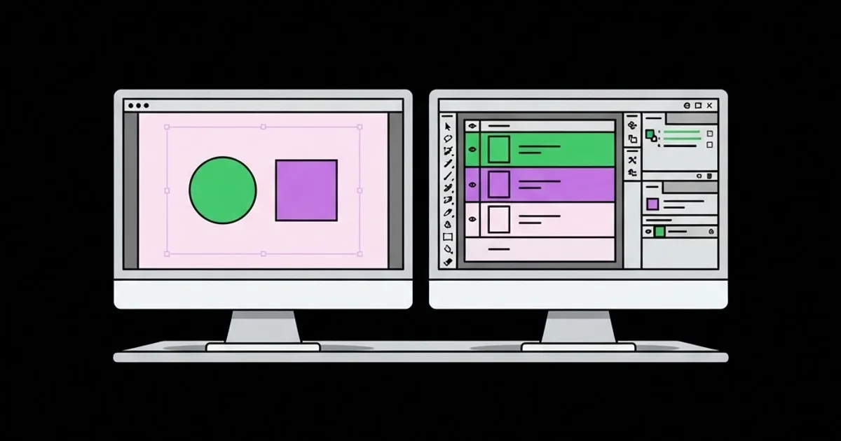
On a dual setup, you gain roughly double the working area, which is transformative for certain workflows: comparing two versions side by side at full size, keeping a client brief or spec sheet permanently visible, running a video call without covering the canvas, or pinning timeline and asset panels off-canvas in motion work. The cost is that the two panels will almost never match exactly. Even identical models from the same production batch drift apart over time, and mixing a laptop display with an external monitor guarantees mismatch.
Density is the underrated variable. Two 1080p 24 inch monitors give you more pixels than one 1440p display, but each pixel is larger and coarser, which makes fine typographic and kerning judgement harder. One 4K 27 inch display has roughly the same physical footprint as a single 1080p monitor and renders type closer to how it will actually print or display. For anyone doing detailed typographic or icon work, density beats area.
Your discipline matters here more than general advice does. Print and packaging designers live and die on colour fidelity; motion and web designers need panel space and preview windows. If you are unsure which category your work actually falls into, the practical distinctions in the main graphic design disciplines will tell you which of these constraints should dominate your setup.
Decision Criteria for Choosing Your Display Setup
Work through these in order. The first criterion that clearly applies to your situation should decide the question; the rest are refinements.
- Is your work colour-critical and reproduced physically? If yes, prioritise one high-quality calibrated display with wide gamut coverage and a hardware calibration option over any quantity of screens.
- Do you spend more than two hours a day referencing external material? Briefs, spreadsheets, spec sheets, or content documents that must stay visible make a second screen pay for itself quickly.
- Do you work in timeline-based or panel-heavy software? Motion, video, and complex 3D interfaces benefit enormously from pushing panels off the main canvas onto a secondary display.
- Is your desk depth under 70 centimetres? Shallow desks force dual monitors into a sharp angle, which worsens both colour consistency and neck strain. A single ultrawide is usually the better fit.
- Do you present or collaborate on video calls while designing? A second screen for the call keeps your canvas uncovered and stops the constant window juggling that fragments attention.
- What is your realistic budget per screen? Splitting a fixed budget across two panels almost always lands you below the quality threshold where colour work is trustworthy. One good screen now, a second later, is the safer sequence.
- Are you on a laptop as your primary machine? A laptop plus one external display is effectively a dual setup already, and the mismatch between the two panels is the most common hidden cause of colour surprises.
Single, Dual, and Ultrawide Setups Compared
The three realistic configurations trade off differently across the dimensions that matter to working designers.
| Setup | Colour Consistency | Usable Working Area | Ergonomic Load | Best Fit |
|---|---|---|---|---|
| Single 27-32in 4K | Excellent, one profile | Moderate | Low, minimal head movement | Print, brand, packaging, typography |
| Dual matched 27in | Fair, drifts over time | High | Medium, frequent rotation | Production design, motion, high-volume output |
| Laptop plus external | Poor, mismatched panels | Moderate | Medium-high, height mismatch | Mobile designers and travel workflows |
| Single 34-40in ultrawide | Excellent, one profile | High | Low to medium | Web, UI, and editorial layout work |
| Primary plus vertical secondary | Fair | High for documents | Medium | Designers handling long-form content and specs |
What Colour Management Reality Says About Multi-Screen Design
There is no reliable public benchmark measuring designer productivity across monitor counts, so treat this as practitioner analysis. The consistent pattern in studio environments is that multi-screen setups create colour errors, not productivity losses. Two panels, even identical models, display the same hex value differently unless both are profiled with a hardware calibrator on a regular schedule. Most designers calibrate the primary display and never touch the second, then spend months unknowingly evaluating assets on an uncalibrated surface.
The practical consequence is a workflow rule rather than a hardware rule: designate one screen as the colour reference and never approve, compare, or critique colour on the other. Use the secondary screen strictly for panels, references, documentation, and communication. Teams that adopt this rule see colour disputes with clients and printers drop sharply, because there is a single defensible source of truth.
Software behaviour compounds the issue. Colour-managed applications apply your display profile; many browsers, chat clients, and file previewers do not, or do so inconsistently. That means the same exported file can look correct in your design tool and wrong in the preview window sitting next to it on the other screen. Understanding which of your applications are colour-managed matters more than adding hardware, and it is worth auditing before you spend on a second panel. If you are still assembling a toolkit, the colour-management behaviour of the options covered in free design software worth using should factor into your choice, because a free tool that ignores display profiles will undo an expensive monitor.
Common Mistakes When Setting Up Design Displays
These errors show up in the majority of home and small-studio setups, and each one quietly degrades output quality.
Buying two screens instead of one good one. A fixed budget split across two panels typically lands you at 90 percent sRGB coverage and factory calibration you cannot trust. The same budget on one display often buys wide-gamut coverage and hardware calibration support. Area is easy to add later; accuracy is not retrofittable.
Mismatched heights and angles. Monitors set at different heights force constant head tilt, and a steeply angled secondary panel shifts colour and contrast dramatically because of viewing-angle falloff. Align the top bezels, set both to the same vertical plane, and keep the angle shallow.
Never recalibrating. Panels drift measurably within months. A calibration performed once when the monitor was unboxed is not a calibrated monitor two years later. Monthly recalibration on the reference display is the realistic minimum for colour-critical work.
Running the screens at different brightness levels. Brightness mismatch makes tonal judgement impossible and causes visible eye fatigue as your pupils adjust with every glance. Match both panels to the same luminance target, commonly around 120 candelas per square metre for indoor work.
Placing a window behind or beside the screens. Ambient light shifts your colour perception more than most hardware differences do. A daylight window behind your monitors is the single most common reason designers produce work that looks wrong everywhere else.
Using the second screen for the artwork. Once you designate a reference display, keeping the canvas on it is non-negotiable. Designers who drag the artwork to whichever screen has room have effectively abandoned colour management entirely.
Ignoring cable and bandwidth limits. Running two 4K panels at full refresh requires sufficient port bandwidth, and daisy-chained or adapter-based connections frequently force chroma subsampling that softens text and distorts colour. Check the actual link rate, not just that the picture appears.
A Practical Setup Walkthrough for Either Configuration
Whichever configuration you choose, the setup sequence determines whether you get its benefits. Here is the process that produces a trustworthy workstation.
Step one: fix the room before the hardware. Position the desk so no window falls directly behind or in front of the screens. Use neutral, consistent artificial lighting at a moderate level. Avoid brightly coloured walls directly behind the monitor, because reflected colour casts shift your perception measurably. This step costs nothing and outweighs a considerable amount of hardware spending.
Step two: set physical geometry. Top of the screen at or slightly below eye level, viewing distance roughly an arm's length, and for dual setups place the reference monitor directly in front of you with the secondary angled in at no more than about thirty degrees. The secondary should never be centred, because that encourages working on it.
Step three: calibrate with hardware. Use a colorimeter, not a visual calibration wizard. Target a neutral white point appropriate to your output, a gamma appropriate to your working space, and a fixed luminance. Save and name the profile with the date. Repeat monthly, and immediately after any panel firmware or driver update.
Step four: define the screen roles in writing. Reference display holds the canvas and all colour decisions. Secondary holds panels, briefs, asset browsers, communication, and previews. Write this down and follow it, because the rule erodes silently under deadline pressure.
Step five: verify with a known test. Open a file with a known, printed reference alongside it. Check neutrals, skin tones if relevant, and deep shadow separation. Then open the same file in a non-colour-managed application and note the difference so you know what your clients on ordinary hardware will see. That last check is the one most designers skip and the one that prevents the most unpleasant surprises at approval.
Step six: revisit the decision after a month. Track how often you actually needed the second surface versus how often it held a chat window. Plenty of designers discover that a single ultrawide plus disciplined virtual desktops delivers the benefit of dual screens without the colour and ergonomic penalty.
Key Takeaways
- One calibrated high-quality display outperforms two mediocre panels for any colour-critical design work, including print, packaging, and brand.
- Dual monitors pay off for production, motion, and reference-heavy workflows where the second screen holds panels and documents rather than artwork.
- Designating a single reference display for all colour decisions is a workflow rule that prevents most multi-screen colour disputes.
- Pixel density matters more than total screen area for typographic and icon work, making one 4K panel preferable to two lower-resolution screens.
- Room lighting, screen geometry, and monthly hardware calibration influence output accuracy more than adding another monitor ever will.
Frequently Asked Questions
Is a single or dual monitor better for graphic design?
A single calibrated monitor is better for colour-critical work such as print, packaging, and brand identity, because all decisions share one profile. Dual monitors are better for production, motion, and web design, where reference material and software panels compete for space with the canvas throughout the day.
What monitor size is best for graphic design work?
A 27 inch display at 4K resolution is the most widely suitable choice, offering high pixel density with a manageable physical footprint. Layout and interface designers often prefer a 34 inch ultrawide, which provides dual-screen width while preserving a single consistent colour profile across the whole surface.
Do two monitors need to be the same model for design work?
Matching models helps but does not guarantee consistency, since panels drift individually over time. What matters is calibrating each display separately with a colorimeter and designating one as the reference for all colour decisions. Never evaluate colour by comparing the same file across two screens.
Is an ultrawide monitor a good alternative to dual monitors?
For many designers, yes. An ultrawide provides comparable horizontal working space with a single colour profile, no bezel gap, and less head rotation. The trade-offs are higher cost per unit, fewer full-height window options, and reduced flexibility compared with repositioning two independent panels.
Does a second monitor actually improve design productivity?
It improves productivity for workflows involving constant reference switching, such as production design, localisation, and motion work. It offers little benefit for focused single-canvas work, where the extra surface tends to accumulate communication tools that fragment attention rather than assist the task.
How often should a designer calibrate their monitor?
Monthly is the practical standard for colour-critical work, and every two to three months for general digital output. Recalibrate immediately after firmware updates, driver changes, or relocating the workstation, since ambient lighting conditions form part of the calibration context and change with the room.
Conclusion
The decision that actually matters is not how many screens sit on your desk but which one you have declared to be the truth. Buy the best single calibrated display your budget allows, establish it as the sole surface for colour and layout approval, and add a second screen later purely as a reference and panel surface once you can afford one that does not undermine the first. If you are negotiating equipment as part of a role or a rate increase, frame the request in the same output-quality terms used in this guide to senior graphic designer roles, because an accuracy argument gets approved where a comfort argument does not.


