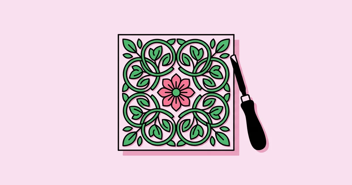
Graphic Design Arts and Crafts Movement: Lessons for Today
Long before design systems and brand guidelines, a group of British designers argued that a book, a wallpaper, or a typeface deserved the same care as a painting. The graphic design Arts and Crafts movement was the late nineteenth and early twentieth century reaction against cheap industrial production that championed handcraft, honest materials, unified decoration, and beautifully made books and type.
Quick Answer: The Arts and Crafts movement influenced graphic design by reviving fine printing, custom typefaces, and integrated page decoration. Led by figures like William Morris, whose Kelmscott Press opened in 1891, it treated the whole page as one designed object. Its ideas shaped the private press movement, Art Nouveau, and later modernist design education.
What Was the Arts and Crafts Movement in Graphic Design?
The Arts and Crafts movement was a design reform movement that began in Britain in the second half of the nineteenth century. It drew heavily on the writings of John Ruskin, who criticized the dehumanizing effects of industrial manufacturing, and it was put into practice most visibly by William Morris, a designer, writer, and manufacturer of textiles, wallpapers, and books.
In graphic design terms, the movement's biggest contribution was restoring the book as a total work of design. Victorian commercial printing at the time often mixed many typefaces carelessly and used poor paper. Morris and his peers responded with carefully proportioned pages, specially designed type, handmade paper, and decorative borders and initials that worked in harmony with the text. Designers who sell modern art print production still borrow this mindset, treating paper, ink, and image as one decision rather than three.
The name itself came from the Arts and Crafts Exhibition Society, formed in London in 1887 to exhibit decorative arts alongside fine art. That act alone was a statement: it argued that a well-designed wallpaper or printed page deserved a place next to painting and sculpture.
The movement spread beyond Britain. In the United States, workshops and communities such as Elbert Hubbard's Roycrofters produced books and printed matter in the Arts and Crafts spirit, and the style influenced furniture, architecture, and illustration on both sides of the Atlantic.
Key Figures and Ideas That Shaped the Movement
A handful of people and principles defined how the Arts and Crafts movement approached graphic work.
- John Ruskin. The critic whose writing on craftsmanship and the dignity of handwork provided the philosophical foundation for the movement.
- William Morris. The central practitioner. Through his firm he produced textiles and wallpapers such as the Strawberry Thief pattern, and late in life he founded the Kelmscott Press in 1891.
- Kelmscott Press typefaces. Morris designed the roman Golden Type, inspired by fifteenth century Venetian printing, and the blackletter Troy and Chaucer types, showing that typeface design could be an act of artistic reform.
- The Kelmscott Chaucer. Published in 1896 with illustrations by Edward Burne-Jones, it is widely regarded as the press's masterpiece and a landmark of fine book design.
- Walter Crane. An illustrator and designer whose children's books and decorative work helped popularize the movement's integrated approach to image and text.
- The private press movement. Presses such as the Doves Press followed Kelmscott's example, often with a more restrained typographic style, and pushed the standard of book printing higher.
- Truth to materials. The principle that a design should respect and reveal the nature of its materials, whether woodblock, paper, or ink, rather than imitating something else.
Together, these figures turned a moral argument about labor into a visual language of pattern, proportion, and careful making.
Arts and Crafts Principles vs Modern Practice
The movement's core principles translate surprisingly directly into modern graphic design decisions. The table maps each principle to how practitioners apply it today.
| Arts and Crafts Principle | Historical Expression | Modern Graphic Design Equivalent |
|---|---|---|
| The page as a unified whole | Text, borders, and initials designed together on a double-page spread | Layout grids and design systems that govern every element consistently |
| Truth to materials | Visible woodblock texture and handmade paper | Choosing paper stock, print methods, and screen formats intentionally |
| Custom type for the purpose | Golden Type, Troy, and Chaucer typefaces | Bespoke brand typefaces and carefully selected type families |
| Nature-based pattern | Stylized plant motifs in wallpapers and borders | Brand patterns, botanical illustration, and packaging motifs |
| Craft over mass shortcuts | Hand-set type and hand-printed editions | Attention to kerning, detail, and production quality over template speed |
The table also shows the movement's limits. Its insistence on handcraft made its products expensive, which conflicted with its own social ideals of beautiful objects for everyone.
Why the Movement Still Matters: A Practitioner's Analysis
The Arts and Crafts movement matters to working designers today less as a visual style to copy and more as a set of habits. In my own branding and editorial work, three of its habits consistently produce better results.
The first is designing the system before the piece. Morris's pages work because borders, initials, type, and margins were conceived together. Modern designers who define the grid, type scale, and pattern language before designing individual layouts produce more coherent brands than those who design one asset at a time.
The second is respecting the medium. The movement's woodblock textures and handmade papers celebrated how things were made. The modern equivalent is designing specifically for the final medium: richer texture and pattern for print, cleaner geometry and contrast for small screens. Hands-on practices such as hands-on collage are a useful way to rebuild that sensitivity to material, especially for designers who only ever work on screen.
The third is valuing detail. Careful letterspacing, consistent margins, and harmonious ornament may go unnoticed individually, but together they signal quality. Clients often cannot name what makes a design feel premium; usually it is this accumulated care.
The movement's influence also ran forward in history. Its belief in uniting art and craft fed into later design education, including the founding ideals of the Bauhaus in 1919, even though the Bauhaus eventually embraced industrial production that the Arts and Crafts reformers resisted. Understanding that lineage helps designers see modernism and craft revival not as opposites but as related answers to the same question: how should well-made things be produced?
Common Mistakes When Borrowing Arts and Crafts Style
The style is popular for heritage brands, craft beverages, bookshops, and wellness products, but it is easy to misuse.
- Copying ornament without structure. Dense floral borders on a weak layout look cluttered rather than historic. Start with strong margins and a clear grid, then add ornament.
- Using blackletter for body text. Blackletter faces are hard for modern readers at small sizes. Reserve them for headings or short phrases and pair them with a readable roman.
- Mixing too many patterns. Morris layered patterns carefully. Combining unrelated motifs quickly turns into visual noise. Limit a design to one primary pattern and one supporting texture.
- Faking texture badly. Low-resolution paper overlays look cheap. Use high-quality scans of real paper or print on genuinely textured stock.
- Ignoring legibility on screens. Fine linework that prints beautifully can disappear on mobile. Simplify motifs for small digital formats.
- Using historic style without meaning. The aesthetic implies craftsmanship and authenticity. Applying it to a brand that is neither creates a mismatch customers sense quickly.
- Tracing historic artwork directly. Copying a museum pattern line for line may raise rights questions with specific reproductions and leaves the brand without anything original. Study the structure of historic motifs, then draw your own.
Underneath all of these mistakes sits one misunderstanding: treating Arts and Crafts as a decorative skin rather than a working method. The reformers began with the purpose of the object and the nature of its material, then let decoration grow from those constraints. A bookplate was designed for the size and texture of the endpaper it would sit on. A wallpaper repeat was drawn around the width of the printing block. When modern designers start the same way, by asking what the item is for, how it will be produced, and at what size it will be seen, the resulting ornament feels earned instead of applied. That is the difference between a brand that feels genuinely crafted and one that simply looks old-fashioned.
Applying Arts and Crafts Principles to a Modern Brand
Here is a practical scenario: an independent bookshop wants a refreshed identity that feels crafted and literary without looking like a costume.
Research the source. Study Kelmscott Press pages, Morris wallpaper patterns, and private press books. Note proportions of margins, the relationship between initials and text, and the rhythm of repeating motifs.
Define a restrained palette. Choose three colors drawn from natural dyes, such as a deep green, a warm red, and an off-white paper tone. Restraint keeps the result contemporary.
Design one signature pattern. Create a single stylized botanical pattern that can tile seamlessly. Draw it as vector linework so it scales from bookmarks to shop windows.
Pair type thoughtfully. Use a readable serif with historical warmth for text and a distinctive display face for the wordmark. Avoid full blackletter unless it is used sparingly.
Build the system. Define how pattern, logo, and type combine on bags, receipts, social posts, and signage. Set rules for when pattern appears and when it steps back.
Choose materials with intent. Specify uncoated paper for bags and bookmarks, and consider letterpress or screen printing for small-run items to make the craft story tangible.
Test digitally. Check the pattern and logo at small sizes on phones. Create simplified versions for icons and avatars.
Key Takeaways
- The Arts and Crafts movement treated the printed page as a unified designed object rather than a collection of separate parts.
- William Morris's Kelmscott Press, founded in 1891, revived fine printing with custom typefaces and integrated decoration.
- Truth to materials translates today into designing specifically for print stocks, print methods, and screen formats.
- The movement's lasting value for designers is its habits of systematic thinking and attention to detail, not just its ornament.
- Modern Arts and Crafts-inspired branding works best with restrained palettes, one signature pattern, and readable type.
Frequently Asked Questions
Who started the Arts and Crafts movement?
The movement grew from the ideas of critic John Ruskin and was led in practice by William Morris in Britain during the second half of the nineteenth century. The name came from the Arts and Crafts Exhibition Society, formed in London in 1887 to exhibit decorative arts alongside fine art.
How did the Arts and Crafts movement influence typography?
It revived interest in typeface design as an art. William Morris created the Golden Type, Troy, and Chaucer typefaces for the Kelmscott Press, inspired by early printed books. This encouraged the private press movement and raised standards for how type, spacing, and margins were handled in books.
What is the Kelmscott Chaucer?
The Kelmscott Chaucer is an edition of Geoffrey Chaucer's works published by William Morris's Kelmscott Press in 1896, with illustrations by Edward Burne-Jones. It is widely celebrated as one of the finest printed books ever made, combining custom type, ornate borders, and woodcut illustrations into a unified design.
Is Arts and Crafts the same as Art Nouveau?
No, but they are related. Arts and Crafts emphasized handcraft, social reform, and honest materials, mainly in Britain. Art Nouveau, which followed and overlapped, was more international and embraced flowing, organic curves and new materials. Both used nature-inspired motifs, and Arts and Crafts ideas influenced Art Nouveau designers.
Which modern brands use Arts and Crafts style?
The style appears most often in heritage and craft-focused categories, including bookshops, tea and coffee brands, craft beverages, botanical skincare, and home goods. Designers use stylized botanical patterns, warm serif type, and textured paper to signal care, authenticity, and slow production.
How can I learn Arts and Crafts pattern design?
Study original Morris wallpapers and textiles in museum collections, many of which offer free online images. Practice drawing stylized plant motifs, then learn to build seamless repeats in a vector app. Recreating a historic pattern for study, then designing your own, builds the skill quickly.
Conclusion
The most valuable lesson from the graphic design Arts and Crafts movement is that quality comes from designing the whole system with care, not from decorating individual pieces. Morris's pages endure because every margin, letter, and border was considered together. Apply that discipline to your next project by defining the grid, type, and pattern language before designing any single layout. Then sharpen that craft further with hands-on design challenges that force you to slow down and refine every detail.