Graphic Design Collage: Techniques for Bold Layered Visuals
Collage looks spontaneous, but the best examples are some of the most carefully controlled compositions in design. Graphic design collage is the technique of combining cut, torn, or digitally layered fragments of images, paper, type, and texture into a single composition that communicates a message through juxtaposition.
Quick Answer: Graphic design collage combines fragments of photos, paper, type, and texture into one layered composition. Strong collages start with a clear concept, use a limited palette, establish one focal point, and control scale and overlap deliberately. Work analog with paper and scans or digitally with masks and blend modes, and always use images you have the right to use.
What Is Collage in Graphic Design?
Collage in graphic design is a compositional method where unrelated visual fragments are assembled so that their combination creates meaning none of them carries alone. A torn newspaper headline beside a flower photograph says something different from either piece on its own; that tension is the core of the technique.
The method has deep roots in modern art. Pablo Picasso and Georges Braque introduced papier collé, pasted paper, into Cubist work in the early twentieth century. Dada artists such as Hannah Höch turned photomontage into sharp social commentary, and Kurt Schwitters built entire works from printed ephemera. These artists valued the visible hand and the honest material, an attitude that echoes the craft-driven design history that preceded modernism, even though the visual results look very different.
In contemporary design, collage appears on album covers, editorial illustrations, event posters, fashion campaigns, social media graphics, and brand identities that want an energetic, human feel. It is popular because it communicates personality quickly and resists the polished sameness of stock-photo layouts.
A few terms are worth defining. Photomontage combines photographs specifically. Mixed media adds paint, drawing, or physical objects. Digital collage recreates the process with layers, masks, and textures in software. All three depend on the same skill: choosing fragments and arranging them with intent.
Core Collage Techniques Every Designer Should Know
Effective collage relies on a handful of techniques that control how fragments relate to each other. Practice these individually before combining them in a finished piece.
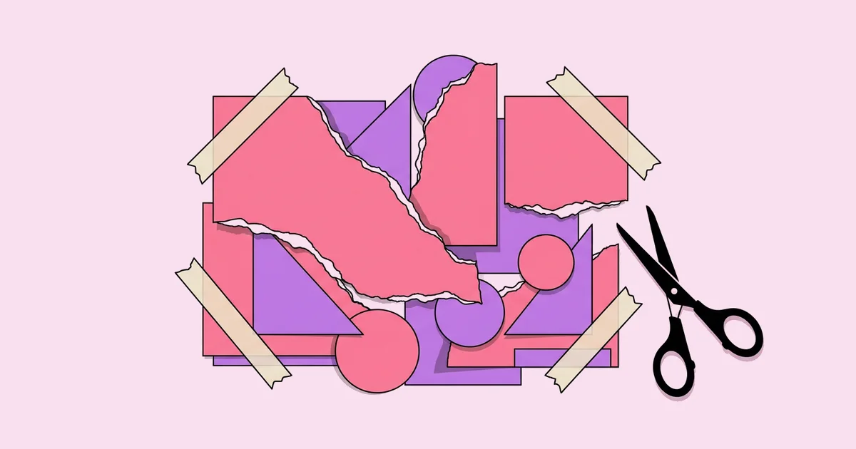
- Cutting versus tearing. Clean cuts read as precise, graphic, and modern. Torn edges read as raw and handmade, and the white paper fibers at the edge add a natural outline that separates layers.
- Scale contrast. Pair an oversized element, such as a giant eye or hand, with tiny figures or objects. Dramatic scale shifts create instant focal points and a sense of surrealism.
- Masking and silhouettes. Cut a subject out of its background and place it into a new context, or use a shape such as a circle as a window revealing another image beneath.
- Color unification. Convert fragments to grayscale, duotone, or a limited palette so images from different sources feel like one composition.
- Texture layering. Add scanned paper grain, halftone dots, tape, or photocopy noise to give digital work a tactile quality. Use texture sparingly so it supports rather than buries the content.
- Typographic fragments. Cut letters from magazines for a ransom-note effect, or set clean type over chaotic imagery to create contrast and keep the message readable.
- Grid anchoring. Even loose collages benefit from an invisible structure. Align key edges to a grid or a strong diagonal so the composition feels intentional.
- Negative space. Leave breathing room. A collage that fills every millimeter tends to read as noise rather than a message.
Combining two or three techniques in one piece is usually enough. Using all of them at once is a common route to clutter.
Analog vs Digital Collage: A Comparison
Analog and digital collage produce different strengths, and most professional workflows blend both. This table compares the two approaches across the factors that matter on real projects.
| Factor | Analog Collage | Digital Collage | Hybrid Workflow |
|---|---|---|---|
| Look and feel | Authentic texture, shadows, imperfect edges | Clean, flexible, can look flat without texture | Real texture with digital control |
| Editing | Changes are slow and sometimes destructive | Unlimited non-destructive edits | Scan pieces once, edit freely |
| Resolution | Depends on scan quality | Depends on source image resolution | High-resolution scans give the best results |
| Client revisions | Difficult to adjust after gluing | Easy to resize and recolor | Easy, with an analog look preserved |
| Best uses | Art prints, zines, editorial originals | Social graphics, campaigns, motion | Posters, album art, brand campaigns |
For client work, the hybrid approach is usually the safest. You get handmade character with the ability to make revisions without rebuilding the piece.
Composition and Licensing: A Practitioner's Analysis
Collage succeeds or fails on two issues designers often underestimate: hierarchy and rights. In practice, these cause more rejected collage work than any lack of creativity.
Hierarchy first. Because collage invites many elements, the viewer can easily lose the focal point. A dependable approach is to decide the hero fragment before gathering anything else. Every other piece then supports the hero through scale, color, or direction. Squint at the composition or view it as a small thumbnail; if your eye does not land on one element first, reduce the number of competing fragments or mute their color.
Rights second. Collage often uses found imagery, and found does not mean free. Copyright protects most published photographs and illustrations, and transforming an image does not automatically make its use lawful. Fair use in the United States is decided case by case and is not a safe assumption for commercial work. For client projects, use your own photographs, public domain material from reputable archives, images explicitly licensed for commercial use, or properly licensed stock. Keep a simple log of every source and its license.
Output also matters. Collages for physical display need high-resolution sources and careful color management, and the steps for turning collage into archival prints include scanning at sufficient resolution, proofing, and choosing papers that preserve texture.
Finally, consistency matters when collage is part of a brand system. Define rules for palette, texture, edge treatment, and type so different designers can produce collages that still feel related.
Common Collage Mistakes and How to Fix Them
Most collage problems come from adding too much or planning too little. These are the mistakes that appear most often in student and professional work.
- No focal point. Everything competes for attention. Fix it by choosing one hero element and scaling or coloring the rest to support it.
- Mismatched lighting and color. Fragments from different sources clash. Unify them with a limited palette, duotone, or consistent shadow direction.
- Low-resolution sources. Small web images fall apart in print. Collect high-resolution material or scan originals at high resolution.
- Unlicensed imagery. Using copyrighted photos in commercial work creates legal risk. Use owned, public domain, or licensed sources and record them.
- Texture overload. Heavy grain, scratches, and halftones on every layer bury the message. Apply texture to a few layers only.
- Illegible type. Text placed over busy imagery disappears. Add a solid shape behind it, increase contrast, or move it to a calm area.
- Digital fakery that looks flat. Digital cut-outs without shadows or edges look pasted on. Add subtle edge highlights, soft shadows, or scanned paper borders.
A useful habit is to remove one element before calling a collage finished. If the piece still works, the element was not needed.
Step-by-Step: Building a Collage Event Poster
This walkthrough shows a realistic hybrid workflow for a music festival poster, from concept to print-ready file.
Write the concept. The festival celebrates local musicians in a riverside park. The concept is sound growing out of the landscape, so the hero image will be an oversized vintage speaker emerging from plants.
Gather material. Photograph a real speaker, collect public domain botanical illustrations from a museum archive, and shoot textures such as torn kraft paper and masking tape. Log every source.
Sketch thumbnails. Draw six quick layouts showing where the hero, supporting plants, and type will sit. Choose the layout where the speaker reads first and the date reads second.
Cut and scan. Print and physically tear the botanical images, then scan them with the paper edges visible. Scan the textures at high resolution.
Assemble digitally. Place the speaker as the hero, layer plants around it with masks, and convert all pieces to a three-color palette of deep green, pink, and off-white so they unify.
Set the type. Use one bold display face for the festival name and a clean sans serif for details. Place the details on a solid pink block so they stay legible.
Prepare for print. Confirm resolution at final size, add bleed, convert to the printer's color profile, and order a proof to check that textures reproduce well.
Adapt for digital. Because the layers are separate, create square social versions and a short animated version where plants slide in around the speaker.
This workflow keeps the handmade energy of analog collage while allowing revisions and multiple formats, which is exactly what clients need.
One more practical habit makes this workflow repeatable: build a personal fragment library. Every time you scan a texture, tear an interesting edge, or photograph an object you own, save it at full resolution in a labeled folder with notes on its source and rights. Over time, this library becomes a distinctive asset. Your collages start to share a recognizable material language that clients cannot get from generic stock, and you spend less time hunting for usable pieces on deadline.
When presenting collage concepts to clients, show the work at actual size or in a realistic mockup. Collage relies on texture and edge detail, which can look muddy on a small screen thumbnail, so presentation context strongly affects approval.
Key Takeaways
- Collage communicates through juxtaposition, so every fragment must earn its place by supporting one concept.
- Choose a hero element first and use scale, color, and placement to make every other piece support it.
- A limited palette or duotone treatment is the fastest way to unify images from different sources.
- Hybrid workflows combine authentic analog texture with the flexibility clients need for revisions and formats.
- Found imagery is not free imagery; use owned, public domain, or licensed sources and log every one.
Frequently Asked Questions
What software is best for digital collage?
Raster editors with strong layer and masking tools, such as Adobe Photoshop, Affinity Photo, or Procreate on tablets, are best for digital collage. They support non-destructive masks, blend modes, and texture overlays. Vector tools work well for clean geometric collages, but photographic collage usually benefits from a raster editor with high-resolution support.
Can I use magazine images in my collage?
You can use magazine images for personal practice and private study, but commercial use is risky because the photographs and illustrations are typically copyrighted. Transformation does not automatically make use lawful. For client work, rely on your own photography, public domain archives, or images licensed for commercial use, and keep records.
How do I make a collage look cohesive?
Make a collage cohesive by limiting the palette, keeping lighting and shadow direction consistent, and repeating edge treatments such as all torn or all cut. Establish one focal point and align major elements to an underlying grid or diagonal. Removing a few competing fragments often improves cohesion more than adding new ones.
What resolution should collage scans be?
Scan collage elements at a resolution that delivers at least 300 pixels per inch at the final printed size. If you plan to enlarge a small fragment significantly, scan it higher to preserve detail. For digital-only use, lower resolutions are acceptable, but higher scans keep options open for future print versions.
Is collage suitable for brand identities?
Collage can work well for brand identities that want energy, creativity, or a handmade feel, such as music, fashion, food, and cultural organizations. It needs clear rules for palette, texture, edges, and typography so different designers produce consistent results. Pair collage with a simple logo and stable type system.
How do I keep text readable in a collage?
Keep text readable by placing it on calm areas or solid shapes, increasing contrast between letters and background, and using bold, simple typefaces for key information. Reserve decorative cut-out letters for short headlines only. Test readability by viewing the design at small sizes and from a distance before finalizing it.
Conclusion
The decision that matters most in collage is choosing your concept and hero element before gathering a single fragment. With that anchor, every cut, tear, and layer has a job, and the result reads as bold rather than chaotic. Your next step is to build one small collage this week using only three colors and five fragments, and if you want a repeatable practice structure, fold it into a weekly design challenge routine so each piece builds on the last.