Graphic Design Art Prints: From File to Gallery-Ready Wall
A design that looks perfect on a monitor can fall apart the moment it hits paper. Graphic design art prints are wall-ready reproductions of typographic, geometric, illustrative, or poster-style designs, produced on quality paper through methods like giclée, screen printing, or risograph, and sold or displayed as art rather than as marketing material.
Quick Answer: To make professional graphic design art prints, build artwork at the final print size with enough resolution, usually 300 pixels per inch for raster files, or in vector. Choose a print method that suits the design, such as giclée for detail or screen printing for flat color, proof on the actual paper, and offer standard frame sizes.
What Makes Graphic Design Work Suitable for Art Prints?
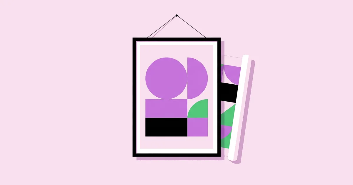
Graphic design work becomes a good art print when it holds attention from across a room and still rewards close viewing. Poster-style compositions, bold typography, geometric abstraction, and limited palettes translate especially well, because they read clearly at a distance and reproduce cleanly on paper.
The key distinction is between commercial design and art print design. Commercial pieces carry a message and a call to action. Art prints carry a mood or an idea and must look good for years on the same wall. That changes your priorities: fewer words, stronger composition, and color choices that age gracefully. Many of today's most collected design prints borrow from the Arts and Crafts printmaking tradition, where pattern, craft, and the physical quality of the print mattered as much as the image.
Edition type is another key term. An open edition can be printed indefinitely. A limited edition caps the number of prints, usually numbered and signed, which supports a higher price. Artist proofs are a small extra run set aside by the artist. Decide your edition strategy before you print, because changing it later undermines buyer trust.
Finally, think about context. Prints for a nursery, a restaurant, and an office lobby all need different scale, palette, and subject matter. Designing a small collection around one context helps buyers imagine the work on their own walls.
Step-by-Step File Preparation for Art Prints
Good prints start with correct files. This is the preparation sequence I follow before any artwork goes to a printer.
- Set the final size first. Build the document at the actual print dimensions, not a screen size. Start from the largest size you plan to sell and scale down, never up.
- Use enough resolution. For raster artwork, 300 pixels per inch at final size is the widely used standard for close-viewed prints. Very large posters viewed from distance can tolerate less, but plan for 300 when in doubt.
- Prefer vector for flat graphics. Geometric and typographic pieces built in vector stay razor sharp at any size and give printers clean separations for screen printing.
- Add bleed and safe margins. Extend backgrounds past the trim line, commonly an eighth of an inch or three millimeters, and keep important elements well inside the edge.
- Handle color deliberately. Ask your printer which color profile they want. Giclée printers often prefer RGB files with an embedded profile, while offset and some digital printers want CMYK.
- Outline or embed fonts. Convert type to outlines for final files or embed fonts in the PDF so nothing reflows at the print shop.
- Export a print-ready master. Save a flattened, high-resolution TIFF or PDF for the printer while keeping your layered source file archived separately.
Skipping any of these steps usually shows up as soft edges, cropped details, or colors that look duller than they did on screen.
Comparing Art Print Methods
Each printing method suits a different type of design. The table below compares the four methods designers use most often.
| Method | How It Works | Best For | Trade-Off |
|---|---|---|---|
| Giclée | High-end inkjet printing with archival pigment inks | Detailed artwork, gradients, small editions on demand | Higher cost per print than mass methods |
| Screen printing | Ink pushed through a mesh stencil, one color per screen | Flat color, bold geometry, limited editions | Setup cost per color makes small runs expensive |
| Risograph | Stencil-based duplicator using soy-based inks in spot colors | Textured, grainy, playful prints in short runs | Slight misregistration and a limited ink palette |
| Offset lithography | Ink transferred from plates via rubber blankets | Large runs of open edition posters | Economical only at higher quantities |
Print-on-demand services typically use giclée or similar inkjet processes, which lets you sell without holding inventory but reduces your control over paper and finishing.
Paper, Color, and Durability: A Practitioner's Analysis
Rather than citing generic market figures, here is what years of proofing prints teaches about the physical side of the product. Paper is the single biggest lever on perceived quality. A heavy, matte, cotton-rag fine art paper makes a simple geometric print feel premium, while a thin glossy stock makes the same file feel like a promotional flyer.
Coated papers hold sharper detail and deeper blacks. Uncoated and textured papers soften edges slightly and give a warmer, more tactile look. For crisp typographic prints, a smooth matte paper is usually the safest choice. For illustrative or textured work, a light texture adds character.
Archival quality matters to buyers who expect a print to last. Pigment inks on acid-free paper resist fading far better than dye inks on standard stock. If you advertise archival quality, confirm that your printer's inks and papers actually support that claim, and keep their specifications on file.
Color behaves differently on every paper. Bright saturated hues can look duller on uncoated stock, and deep blacks may appear slightly gray. Designs that rely on bold contrast, like black and white poster designs, are especially sensitive to paper choice, because the entire piece depends on the depth of the black. Always order a physical proof on your chosen paper before approving an edition.
Common Mistakes With Graphic Design Art Prints
These are the problems I see most often when designers move from screen work into print sales.
- Upscaling small files. Enlarging a low-resolution file creates soft, blocky edges. Rebuild the artwork at size or recreate it in vector.
- Trusting an uncalibrated screen. Bright, uncalibrated displays make prints look darker than expected. Calibrate your monitor and judge color from a physical proof.
- Selling non-standard sizes. Odd dimensions force buyers into expensive custom framing. Offer common frame sizes such as 8 by 10, 11 by 14, 18 by 24, and A-series sizes for international buyers.
- Ignoring aspect ratio across sizes. An 8 by 10 and an 11 by 14 have different proportions, so the same artwork crops differently. Adjust compositions for each ratio rather than letting the printer crop.
- Using unlicensed fonts or images. Selling prints is a commercial use. Confirm that every font, texture, and photo in the design is licensed for products for sale.
- Skipping protective packaging. Bent corners ruin a sale. Ship flat prints between rigid boards or roll larger prints in sturdy tubes with acid-free tissue.
- Misrepresenting the edition. Reprinting a sold-out limited edition in a slightly different size erodes collector trust. Retire limited editions permanently and launch new designs instead.
A less obvious mistake is approving proofs under the wrong light. Most homes use warm indoor bulbs, while many print studios use cool, bright daylight lamps. A print that looks balanced under studio light can turn muddy or yellow in a living room. View every proof under both daylight near a window and a typical warm household bulb before signing off. If the design only works under one, adjust the file, usually by lifting midtones slightly or reducing saturation in the warmest hues, and proof again. This extra round adds a few days, but it prevents the most common customer complaint in print sales: that the piece looks different at home than it did online.
Launching a Small Art Print Collection
Here is a realistic scenario: a designer wants to launch a collection of six geometric prints for a modern home audience.
Define the theme. Pick one visual system, such as a shared palette of three colors and a grid of circles and arches. A coherent collection encourages buyers to purchase sets of two or three.
Design at the largest size. Build each piece at the largest planned size, for example 18 by 24 inches, then create adjusted versions for smaller ratios.
Proof two papers. Order proofs of the strongest design on two papers, such as a smooth matte and a light textured stock. Compare them under daylight and warm indoor lighting.
Choose the edition model. Offer an open edition in small sizes through print on demand, and a numbered, signed limited edition in the largest size printed locally.
Photograph in context. Shoot or mock up each print framed on a wall at true scale. Buyers judge size badly from flat images, so include a scale reference like a sofa or chair.
Price from real costs. Add print, paper, packaging, shipping materials, platform fees, and your time, then compare with similar sellers. Limited editions should cost noticeably more than open editions.
Document everything. Keep a log of edition numbers sold, paper used, and printer details so you can answer buyer questions and maintain trust.
Key Takeaways
- Graphic design art prints succeed when they read clearly from across a room and still reward close viewing.
- Build files at final size, at roughly 300 pixels per inch for raster work, or in vector for flat graphic pieces.
- Giclée suits detail and on-demand runs, while screen printing and risograph suit flat color and limited editions.
- Paper choice is the biggest single factor in how premium a print feels, so always approve a physical proof.
- Standard frame sizes, clear edition policies, and licensed assets protect both sales and buyer trust.
Frequently Asked Questions
What resolution do I need for art prints?
For raster artwork viewed up close, aim for 300 pixels per inch at the final printed size. A 12 by 16 inch print therefore needs about 3600 by 4800 pixels. Large posters viewed from a distance can work at lower resolution, but vector artwork avoids resolution concerns entirely.
Should I use RGB or CMYK for art prints?
Ask your printer first. Many giclée printers prefer RGB files with an embedded color profile because their wide-gamut inkjet systems handle the conversion. Offset and some digital printers require CMYK. Sending the wrong mode can shift colors, so confirm requirements before exporting your final master.
What is the difference between giclée and a poster print?
Giclée uses archival pigment inks on fine art paper and is designed to last for many years with minimal fading. Standard poster prints often use cheaper inks and thinner paper produced in large runs. Giclée costs more per print but supports higher prices and limited edition positioning.
Which sizes sell best for graphic design prints?
Standard frame sizes are the safest choice because buyers can find affordable ready-made frames. Common options include 8 by 10, 11 by 14, 16 by 20, 18 by 24, and A-series sizes such as A3 and A2 for international buyers. Offering two or three sizes is usually enough.
Can I sell prints that use free fonts?
Only if the font's license allows commercial use in products for sale. Some free fonts are licensed for personal use only. Check each font's license, keep a copy with your project files, and prefer fonts with clear commercial terms, such as those under the SIL Open Font License.
How do I price graphic design art prints?
Start with your full cost per print, including printing, paper, packaging, shipping supplies, and platform fees, then add a margin that values your design time. Compare similar work from independent designers. Limited, signed editions and larger sizes should be priced higher than small open editions.
Conclusion
The decision that makes or breaks graphic design art prints is approving a physical proof on your chosen paper before you sell a single copy. Everything else, from resolution to edition strategy, supports that moment when the print in your hands matches the vision on your screen. Start with one strong design, proof it on two papers, and build a small, coherent collection from there. To make your next collection stand out on the wall, study bold color strategies that keep vivid palettes balanced and intentional.