
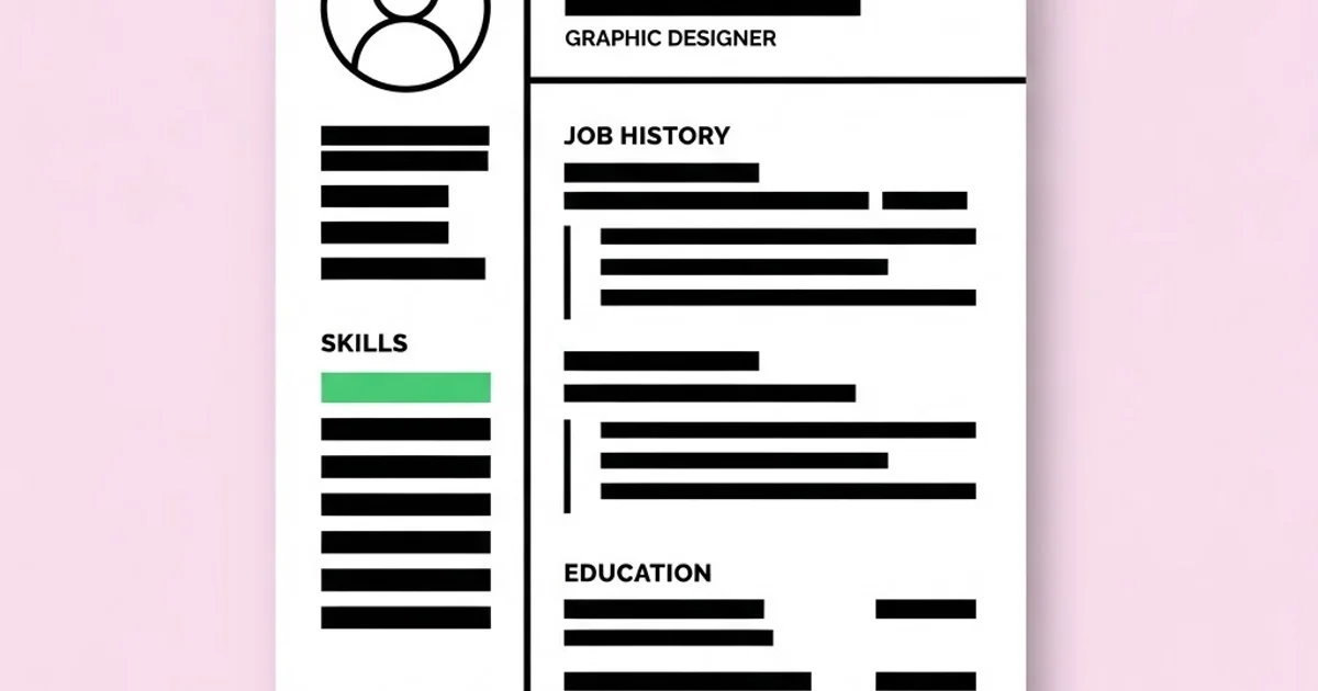
Graphic CV Design: Layout Rules That Get Designers Hired
A graphic CV is a designer's curriculum vitae treated as a deliberate design artefact: a single page where typography, hierarchy, and restraint demonstrate competence before a single project is opened. It is also the most frequently over-designed document in the industry. Hiring managers read it in under a minute, applicant tracking software may read it before any human does, and the version that wins interviews usually looks far quieter than the version designers instinctively want to make.
Quick Answer: A graphic CV should be one page, set in two typefaces or fewer, built on a clear grid with strong hierarchy, and readable as plain text by applicant tracking systems. Show competence through spacing, alignment, and typographic control rather than decoration, colour washes, or skill-rating graphics.
What WebPeak Looks For When Reviewing Designer Applications
Reviewers at studios like WebPeak scan a designer CV for evidence of craft discipline long before they read the employment history, because the document itself is a work sample. Inconsistent spacing between sections, three competing typefaces, or a headline that is only slightly larger than the body copy all signal the same thing: the applicant cannot control a simple hierarchy, so they will not be trusted with a brand system.
What earns attention is specificity tied to real deliverables. A line that says "produced weekly social campaigns across four channels" maps directly onto the kind of high-volume work found in banner and social post production, while "built and maintained a component library" maps onto website design engagements and "prepared print-ready identity packages" maps onto brand mark work. Describing your experience in the vocabulary of the services a studio actually sells makes the reviewer's decision effortless, which is the entire purpose of the document.
What Makes a Designer CV Different from a Standard One?
Every CV must communicate experience clearly. A designer's CV must do that while simultaneously proving typographic and compositional skill, which introduces a tension most applicants resolve in the wrong direction by adding visual interest at the expense of clarity.
The document has three audiences and they want different things. Applicant tracking systems parse text and choke on multi-column layouts, text inside images, tables, headers and footers, and unusual fonts. Recruiters scan for role titles, company names, dates, tools, and location in roughly twenty seconds. Design leads read the typography and spacing as a portfolio piece. A CV that ignores any one of these three fails at a different stage of the funnel, which is why many strong designers never reach a first conversation despite excellent work. Understanding the local hiring pipeline helps you predict which audience matters most — in agency-dense markets like those described in our overview of how design hiring works in Los Angeles, a design lead often sees the document directly, whereas large in-house employers almost always filter through software first.
The practical resolution is a two-version strategy. Maintain an ATS-safe single-column version exported as text-based PDF for online application portals, and a more designed version for direct email, networking, and in-person interviews. The content stays identical; only the layout complexity changes. This takes an extra hour once and removes the most common structural failure point entirely.
The Layout Rules That Consistently Work
- One page, always. Two pages are acceptable only after roughly a decade of relevant experience, and even then the first page must stand alone. If you cannot edit your history to one page, that is an editing problem, and editing is a design skill.
- Two typefaces maximum, ideally one family with multiple weights. Demonstrating that you can create hierarchy from weight, size, and space alone is far more impressive than a clever pairing.
- Establish a real hierarchy with clear steps. Name, section headings, role titles, and body copy should be unambiguously distinguishable. If two levels look similar, merge them or widen the difference.
- Use a grid and hold it. Align every element to a consistent left edge and consistent vertical rhythm. Most amateur CVs fail here rather than on typeface choice.
- Group with space, not with lines and boxes. Proximity communicates grouping more elegantly than rules and containers, and it keeps the document clean for parsing.
- Limit colour to one accent. A single accent used on your name and section headings is sufficient. Full-bleed colour blocks look impressive on a portfolio site and print badly, photocopy worse, and reduce contrast.
- Body copy no smaller than nine or ten point. Tiny type to force one page is a self-inflicted accessibility failure that reviewers notice immediately.
- Write achievements, not duties. "Redesigned the onboarding flow, cutting support tickets" beats "responsible for UI design." Concrete outcomes are the only content that differentiates one CV from another.
CV Section Priorities by Experience Level
| Section | Student or Junior | Mid-Level | Senior or Lead |
|---|---|---|---|
| Portfolio link | Top, immediately under the name | Top, immediately under the name | Top, immediately under the name |
| Experience | Short, includes internships and real freelance | Primary section, outcome-led bullets | Primary section, scope, budget and team size |
| Education | Prominent, near the top | Reduced to two lines | One line at the bottom |
| Tools | Listed plainly, no rating bars | Condensed to a single line | Often omitted entirely |
| Selected projects | Useful to fill genuine experience gaps | Optional, only if exceptional | Replaced by leadership and impact statements |
| Profile statement | Two lines stating focus and target role | Optional | Two lines on specialism and scope |
What Reviewers Actually Notice in the First Twenty Seconds
No published study reliably measures exactly how long a design hiring manager spends on a CV, and the widely repeated figures online trace back to small recruiter surveys rather than design-specific research, so treat them cautiously. What reviewers consistently report in practice is a fixed scanning order: name, current or most recent role, portfolio link, company names, and then dates. Everything else is read only if those five signals pass.
This has a direct design implication. The portfolio URL must be in the top block, plain, clickable, and short. Burying it in a footer or expressing it as a QR code only is a genuine and common reason strong candidates are skipped; the reviewer simply moves to the next applicant rather than hunting. Similarly, dates should be right-aligned in a consistent format, because inconsistent date formatting forces the reader to slow down at exactly the moment you need them moving smoothly.
The second consistent observation is that reviewers penalise unverifiable self-assessment. Skill bars showing eighty-five percent proficiency in a tool communicate nothing measurable and are widely disliked, because nobody knows what the remaining fifteen percent represents. The same logic applies to vague location claims: hiring teams in competitive markets want to know immediately whether you are local, remote, or relocating, and ambiguity there costs you interviews in high-volume markets like those covered in our guide to the Houston design job market.
Mistakes That Get Designer CVs Rejected
Mistake 1: Designing a poster instead of a document. Large decorative graphics, oversized photography, and dense colour blocks look striking in isolation but leave no room for content and signal that you optimise for impression over function.
Mistake 2: Multi-column layouts submitted through application portals. Many parsers read columns in the wrong order, producing a scrambled text version that a human may never correct. Keep the portal version single-column.
Mistake 3: Text embedded in images. Placing your entire CV as a flattened image inside a PDF makes it invisible to search and parsing. Always export with live, selectable text.
Mistake 4: Skill rating bars and star ratings. They are unmeasurable, inconsistently interpreted, and take space that should carry evidence of outcomes.
Mistake 5: Unusual file formats and huge files. Send a PDF under about two megabytes named clearly, for example firstname-lastname-cv.pdf. Editable document formats reflow unpredictably and destroy your layout on someone else's machine.
Mistake 6: Listing every job since school. Unrelated early roles dilute the scan. Compress them into a single line or remove them, and use the space for design outcomes.
Mistake 7: One generic CV for every application. Reordering bullets so the most relevant experience appears first takes ten minutes and measurably improves response rates, because relevance is the first thing a reviewer is testing for.
Mistake 8: Typographic errors in a typography-led document. A stray double space, an inconsistent en dash, or a hyphen used as a range separator undermines the exact skill you are claiming. Proof it printed, not on screen.
Building Your CV Step by Step
Step 1: Write the content in plain text first. No layout, no formatting. This forces you to judge whether your achievements are actually interesting before design can disguise weak content.
Step 2: Cut it by a third. Remove duties, adjectives, and anything that does not demonstrate an outcome, a scale, or a tool used in production. Ruthless editing is what creates the calm layout later.
Step 3: Choose the type system. One family with at least four weights. Set body copy first at a comfortable reading size, then derive heading sizes from it using a consistent ratio rather than arbitrary numbers.
Step 4: Build the grid. A single-column grid with generous margins for the ATS version, and an asymmetric two-column grid for the designed version, with the narrow column reserved for dates and metadata.
Step 5: Set hierarchy with weight and space before adding anything else. If the document is not clearly readable in one typeface and black text on white, no amount of colour or ornament will fix it.
Step 6: Add exactly one accent. Apply it to your name and section headings only. Check the contrast ratio and confirm it still reads when printed in greyscale.
Step 7: Run the three tests. Print it and read at arm's length. Copy all the text out of the PDF and check the order is sensible. Show it to someone outside design for fifteen seconds and ask what they remember. If they cannot recall your role and specialism, the hierarchy is wrong.
Step 8: Version and tailor. Keep a master file, then produce role-specific variants by reordering bullets and swapping the profile line. Name files consistently so you can tell six applications apart three weeks later.
Key Takeaways
- A designer CV is judged as a work sample first, so spacing, alignment, and hierarchy carry more weight than any decorative element.
- Maintain two versions: a single-column, text-based PDF for application portals and a more designed version for direct email and interviews.
- The portfolio link belongs in the top block in plain, clickable text, because reviewers will not hunt for it.
- Skill rating bars, text-in-image layouts, and multi-column portal submissions are the three most reliable ways to be filtered out before a human reads your work.
- Write outcomes with scale and consequence rather than job duties; specificity is the only thing that separates your document from a hundred similar ones.
Frequently Asked Questions
How long should a graphic design CV be?
One page for the vast majority of designers, including most mid-level applicants. Two pages become defensible after roughly ten years of relevant experience or when leadership scope requires it, and even then the first page must communicate your role, specialism, and portfolio link on its own.
Should a designer CV include a photo?
It depends on region. In much of Europe and Asia a photo remains conventional, while in the United States, United Kingdom, Canada, and Australia it is generally discouraged because it introduces bias risk and some employers discard such applications. Check local norms for the market you are applying to.
Do creative CVs pass applicant tracking systems?
Heavily designed CVs often fail parsing because columns, tables, text inside images, and header or footer content are read incorrectly. A single-column layout with live text, standard section headings, and a straightforward PDF export parses reliably while still allowing strong typographic control.
Should I include a portfolio link or attach the portfolio?
Include a short, plain URL in the top block and attach a compact PDF portfolio only if the job posting requests one. Large attachments are frequently blocked by email systems. If you do attach, keep it under about ten megabytes and lead with your strongest three projects.
What file format is best for sending a design CV?
A text-based PDF under roughly two megabytes, named with your full name and the word CV. PDFs preserve typography across systems, while editable word processor files reflow unpredictably and can destroy your layout before the reviewer ever sees the intended design.
How do I show experience when I have almost none?
Use real constrained work rather than invented roles: student client projects, volunteer nonprofit work, freelance jobs, and internships all count. Describe the brief, the constraint, and the outcome. A selected-projects section with three genuine engagements outperforms an experience section padded with unrelated jobs.
Conclusion
The most valuable decision in graphic CV design is choosing restraint on purpose, because a calm, precisely spaced document proves the exact judgement employers are hiring for, while an elaborate one invites them to question it. Write the content in plain text, cut a third of it, build hierarchy with weight and space, then add a single accent and stop. Do the copy-out-of-the-PDF test before you send anything. Once the document is right, aim it at the market where your skills are in demand rather than applying blindly, and if you are still building credentials, review what employers expect from graduates in our guide to the two-year design degree route.


