
1980s Graphic Design: Styles, Tools and Modern Revival
The 1980s is the decade most often imitated and most often misunderstood, because the visual language people copy — neon grids, chrome type, confetti shapes — was produced by a specific collision of new technology and a deliberate revolt against Swiss restraint. 1980s graphic design is the body of work created between roughly 1980 and 1989 in which postmodern experimentation, Memphis-group geometry and the arrival of desktop publishing replaced the grid-driven modernism that had dominated the previous twenty years. Understanding why those choices were made is what separates a considered revival from a costume.
Quick Answer: 1980s graphic design combined Memphis-style geometric shapes and clashing colour with postmodern typography that broke the Swiss grid, then accelerated when the Macintosh and PostScript put typesetting on the desktop. Revive it by borrowing its structural playfulness and layering, not just its neon palette.
How WebPeak Handles Retro-Referenced Brand Systems
Retro references fail commercially when the nostalgia overwhelms the message, and the brand studio at WebPeak treats an eighties reference as a constraint set rather than a mood board. In practice that means isolating two or three structural devices from the decade — asymmetric grid breaks, a flat geometric confetti layer, a single high-chroma accent — and then running them through a contemporary accessibility and legibility pass so body copy still hits modern contrast expectations. Their social media posts and banner design work is where this gets stress-tested, because eighties compositions are dense and mobile feeds are not forgiving. On the build side their front-end web development team reproduces those geometric layers as CSS shapes and SVG rather than flattened images, which keeps the page fast, and their website design process documents which retro devices are allowed where, so the system does not drift into pastiche after the first campaign.
What Actually Defined the Decade Visually
Three forces shaped eighties graphic design, and none of them were nostalgia. The first was postmodernism, which argued that the Swiss International Style had become impersonal and that ornament, historical quotation and visual humour were legitimate again. Designers began deliberately breaking the grid, rotating type, mixing incompatible typefaces and letting layers overlap.
The second was the Memphis Group, founded in Milan in 1980 by Ettore Sottsass. Memphis was a furniture and product movement, but its vocabulary — squiggles, terrazzo speckles, primary geometry, laminate pattern — leaked into print and broadcast graphics almost immediately. The key point is that Memphis was about clashing on purpose: patterns that should not sit together, placed together, at full saturation.
The third was technology. Before 1984, type was set by specialists on dedicated equipment. The Macintosh, PostScript and page-layout software moved that capability onto a desk, and the immediate result was a wave of work that looked new because it was made by people who had never been trained in traditional typesetting rules. Early digital type was coarse, screens were small, and those limitations became a style. The same pattern of tools reshaping output plays out in every era, including the way brand teams evaluate hardware today, as covered in the junior graphic designer skill guide.
The Core Devices You Can Actually Borrow
Not everything from the decade transfers. These devices still work in contemporary commercial design when used with restraint.
- Deliberate grid breaks. Establish a clean grid, then let one element — a headline, an image, a shape — violate it decisively. The tension only reads if the underlying grid is visible.
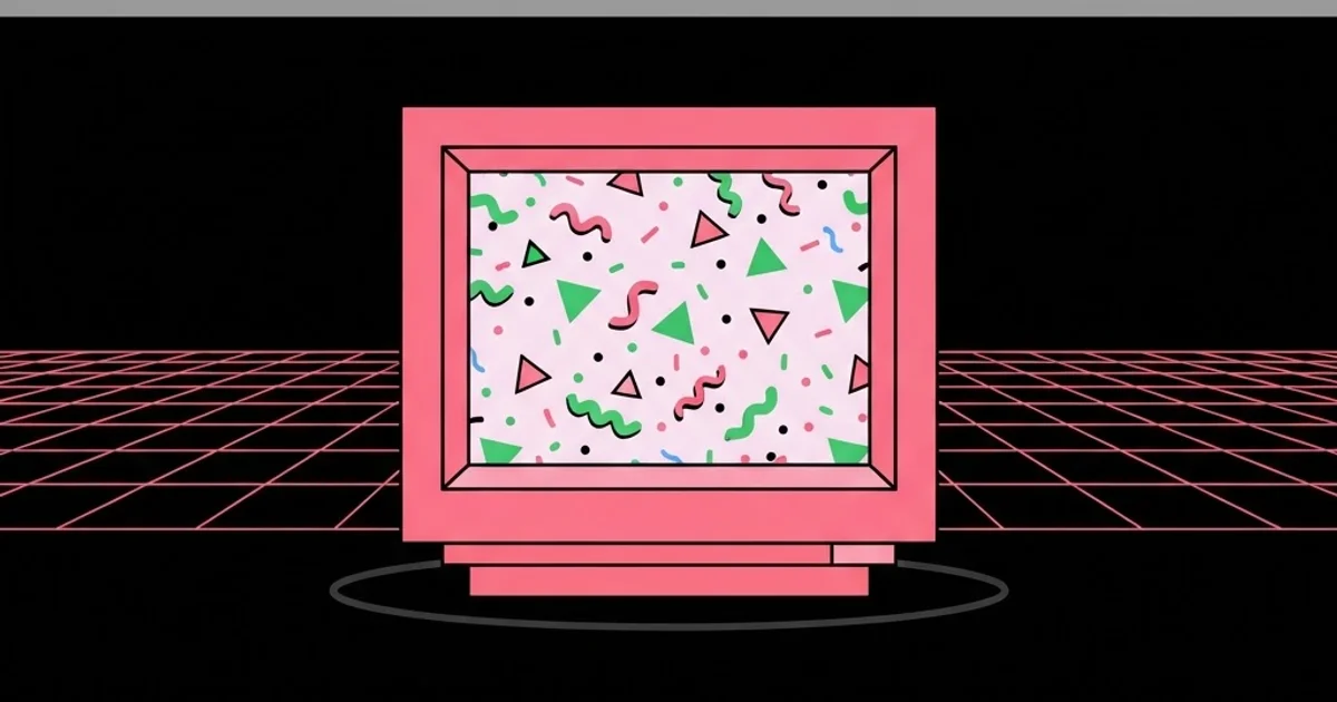
- Flat geometric confetti. Small triangles, dots, squiggles and quarter-circles scattered with intent, not randomly. Keep them on a single layer and a single colour family or the composition turns to noise.
- Terrazzo and speckle textures. A Memphis staple that still works as a background surface, particularly in packaging and editorial.
- High-chroma accents on a neutral base. The decade is remembered as loud, but the strongest work used one or two saturated colours against black, cream or grey.
- Perspective grid horizons. The vanishing-point grid reads instantly as eighties and works well as a hero background when everything else stays flat.
- Stacked, tightly-tracked display type. Large headlines set in condensed faces, stacked in blocks, with negative leading.
- Layered rules and bars. Thin horizontal rules and thick colour bars used to divide and frame rather than decorate.
Eighties Design Movements at a Glance
The decade contained several distinct strands that are often flattened into one aesthetic. Knowing which one you are referencing keeps the execution coherent.
| Strand | Visual Signature | Typical Application | Still Works For |
|---|---|---|---|
| Memphis | Squiggles, terrazzo, clashing primaries, laminate pattern | Product, packaging, editorial spreads | Youth brands, food and drink, event collateral |
| Postmodern typographic | Rotated type, mixed faces, visible grid breaks | Posters, album art, cultural institutions | Arts venues, festivals, independent publishing |
| Corporate high-tech | Chrome gradients, perspective grids, airbrush glow | Technology advertising, broadcast idents | Nostalgia campaigns, gaming, music |
| Early desktop publishing | Coarse bitmap type, heavy rules, limited palette | Zines, newsletters, small-run print | Indie brands, merch, deliberate lo-fi campaigns |
Why the Decade Looked the Way It Did: A Practitioner Reading
It is tempting to explain eighties design purely as a reaction to modernism, but the tooling explanation is more useful for working designers. When typesetting required a trained operator and a machine costing more than a car, layouts were conservative because iteration was expensive. Once a designer could set type, place an image and print a proof in an afternoon, the cost of trying something strange collapsed. In practice, whenever iteration cost drops sharply, output gets more experimental before it gets more refined — the same pattern appeared with early web design and again with the first generation of generative tools.
That reading has a practical consequence. If you want work that genuinely feels like the decade rather than a filter applied to it, build in the constraint that produced it: limit yourself to a small type library, a coarse grid and a restricted palette, then compose fast and keep the first energetic version rather than polishing it into neutrality. Designers who want to turn this kind of stylistic specialism into client demand should pair it with the positioning work described in choosing the right keywords as a graphic designer, because a recognisable niche is far easier to market than general-purpose availability.
Common Mistakes When Reviving Eighties Design
The first mistake is confusing the eighties with synthwave. The neon-on-black, chrome-lettering, sunset-grid look is a 2010s internet aesthetic that references a narrow slice of eighties advertising and film titles. Real eighties print work is far more varied, and clients who ask for eighties often mean Memphis or postmodern rather than synthwave.
The second mistake is saturating everything. Memphis compositions have large areas of flat neutral ground; the clash comes from placement, not from filling every pixel with colour. Turn the background back to cream, grey or black and the accents start working.
The third mistake is ignoring contrast requirements. Eighties palettes love mid-tone colour on mid-tone colour, which fails modern accessibility standards. Keep body text on a high-contrast surface and reserve the clashing pairs for large display elements and decorative shapes.
The fourth mistake is using period typefaces without period spacing. The look depends as much on tight tracking, negative leading and stacked headline blocks as it does on the faces themselves. Set an eighties typeface with default modern spacing and it reads as a generic sans.
The fifth mistake is shipping the decoration as flattened raster images. Geometric confetti and terrazzo rendered as PNG bloats pages badly; the same shapes as inline SVG or CSS cost a fraction of the weight and scale cleanly on high-density screens.
Building an Eighties-Referenced Campaign, Step by Step
Take a drinks brand launching a limited edition and wanting a Memphis-referenced campaign across packaging, three social formats and a landing page. The constraint is that the brand's existing wordmark is a neutral grotesque that must remain unchanged.
Start with the ground. Choose a single neutral — a warm cream works better than white for this vocabulary — and commit to it across every surface. Then select exactly three accent colours and assign roles: one dominant for large shapes, one secondary for pattern, one reserved purely for small emphasis marks. Resisting a fourth colour is the single highest-leverage decision in the whole project.
Next, build a shape kit rather than composing each asset from scratch. Draw eight to ten geometric elements — a squiggle, two triangles, a quarter-circle, a speckle tile, a stepped bar, a thin rule set — as vectors on a shared grid. Every asset in the campaign then gets composed from that kit, which is what produces family resemblance across formats.
For the packaging, let the shape kit run edge to edge and place the neutral wordmark in a clean reserved panel, so the brand stays readable against the visual noise. For social, rebuild each composition per aspect ratio instead of cropping; eighties layouts depend on edge relationships and crop badly. For the landing page, reproduce the shapes as inline SVG positioned with CSS grid, keep body copy on a solid high-contrast panel, and add a reduced-motion fallback if any shapes animate.
Finish with a one-page rule sheet: the three accents with their roles, the neutral ground, the shape kit file, the tracking and leading values for display type, and an explicit statement that the wordmark never receives decoration. That sheet is what keeps the campaign coherent when a third party produces the next asset.
Key Takeaways
- 1980s graphic design emerged from postmodern reaction, the Memphis movement and the arrival of desktop publishing, not from nostalgia.
- The decade contains at least four distinct strands, so clarify whether a brief means Memphis, postmodern typography, corporate high-tech or early DTP.
- Authentic eighties compositions keep large neutral grounds; the clash comes from placement and saturation contrast, not from filling every area with colour.
- Period spacing — tight tracking, negative leading, stacked headline blocks — matters as much as the typefaces themselves.
- Build a reusable geometric shape kit so every asset in a campaign shares a family resemblance instead of being composed ad hoc.
Frequently Asked Questions
What defined graphic design in the 1980s?
Three things defined it: postmodern rejection of the Swiss grid, the Memphis Group's clashing geometric vocabulary, and the shift of typesetting onto desktop computers after 1984. Together they produced layered, asymmetric, highly saturated work that deliberately broke the rules of the previous two decades.
Is synthwave the same as 1980s graphic design?
No. Synthwave is a contemporary internet aesthetic built from a narrow selection of eighties references — neon grids, chrome type, sunset gradients. Actual eighties print design spans Memphis pattern, postmodern typography and early desktop publishing, most of which looks nothing like synthwave.
Which typefaces feel authentically eighties?
Condensed grotesques used for stacked headlines, geometric sans faces set very tight, and early digital display faces with coarse construction all read as period-correct. The spacing matters more than the specific family: tight tracking and negative leading carry most of the signal.
How do I use eighties colour without failing accessibility?
Keep the saturated clashing pairs for large display shapes and decorative layers only. Place body copy on a solid high-contrast surface such as cream on near-black or black on cream, and check every text and background combination against contrast requirements before shipping.
What technology changed design in the 1980s?
The Macintosh, the PostScript page description language and desktop page-layout software moved typesetting from specialist equipment to an ordinary desk. That collapse in iteration cost let far more people produce typographic work, which directly widened the range of styles being published.
How do I avoid eighties design looking like a costume?
Borrow structure rather than surface. Use the grid breaks, the layering logic and the shape-kit approach, but keep contemporary spacing, contrast and performance standards. Limit yourself to two or three period devices per project instead of stacking every recognisable trope at once.
Conclusion
The most important decision when working with eighties references is choosing which strand of the decade you are actually citing, because Memphis, postmodern typography and corporate high-tech pull a project in three incompatible directions. Pick one, build a small reusable shape kit inside it, and let a neutral ground carry the composition. If the project is heading toward a website rather than print, read the practical guide to 2D illustrated scene design next for how to keep a heavily illustrated layout fast and structurally sound.


