Gothic Graphic Design: Blackletter, Arches, and Dark Style
Gothic design appears everywhere from craft beer labels and tattoo studios to luxury fashion, heavy metal album covers, and newspaper mastheads. Yet "gothic" means several different things in design, and confusing them leads to work that looks like a costume rather than a deliberate style. Gothic graphic design is a visual approach that draws on medieval Gothic art, architecture, and blackletter lettering, often combined with dramatic, dark, or ornate aesthetics, to communicate heritage, mystery, gravity, or rebellion.
Quick Answer: Gothic graphic design uses blackletter typefaces such as Textura and Fraktur, motifs from Gothic architecture like pointed arches, rose windows, and stained glass, and dramatic palettes of black, deep jewel tones, and metallics. Use it for short, high-impact elements, pair it with readable type, and match it to the brand's genuine tone.
What Does "Gothic" Mean in Graphic Design?
In graphic design, "gothic" has three distinct meanings, and knowing which one you are working with prevents confusion with clients and printers. The first is blackletter, the dense, angular script used across much of medieval Europe, which many people call "Gothic script." The second is Gothic architecture and art, the style of pointed arches, ribbed vaults, rose windows, and stained glass that emerged in twelfth-century France and spread across Europe. The third is a historical American type term: in the nineteenth and early twentieth centuries, "gothic" was used for sans-serif typefaces, which is why typefaces like Franklin Gothic and News Gothic, both designed by Morris Fuller Benton, have no blackletter features at all.
Modern gothic graphic design usually combines the first two meanings, often with an added layer of dark, romantic, or subcultural aesthetics drawn from music, fashion, and horror. If you want to understand how a specific motif like this becomes a strong visual identity, our guide to building floral graphics with structure and rhythm covers the same principles of stylization and composition.
Some useful terms: Textura is the tall, narrow, highly angular blackletter style associated with the Gutenberg Bible. Fraktur is a later, more curved German blackletter style. Rotunda is a rounder Southern European form. Schwabacher is a heavier, rounder style that preceded Fraktur in Germany. Tracery refers to the decorative stonework patterns in Gothic windows. Using these names precisely in briefs saves a surprising amount of back-and-forth, because "make it gothic" can otherwise produce anything from a medieval manuscript to a newspaper sans-serif.
Core Elements of Gothic Graphic Design
These elements appear most often in successful gothic-inspired design. Strong work uses a few of them deliberately rather than all of them at once.
- Blackletter typography. Dense, angular letterforms that create a dark, textured "color" on the page. Best for headlines, logos, and short phrases.
- Pointed arches and frames. Lancet arches and ogee shapes create instantly recognizable frames for labels, posters, and packaging.
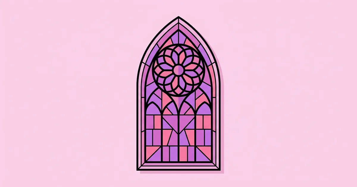
- Rose windows and tracery. Radial, symmetrical patterns based on Gothic windows work well as emblems, badges, and background ornaments.
- Stained-glass color blocking. Jewel-toned shapes separated by dark lines mimic leaded glass and add richness without photography.
- Symmetry and verticality. Gothic architecture emphasizes height and symmetry. Tall, centered compositions feel solemn and monumental.
- Dramatic palettes. Black, deep burgundy, purple, emerald, and gold or silver metallics create mood and luxury.
- Ornament and flourishes. Decorative initials, thorny vines, and engraved textures add craft and historic character.
- High contrast. Strong light-and-dark contrast mirrors the drama of Gothic interiors and keeps intricate designs legible.
A practical rule from my own branding work: let one element lead. If the logo is blackletter, keep frames simple; if the composition is built around a detailed rose window, keep type cleaner. The tension between one ornate element and calm surroundings is what makes gothic work feel considered instead of crowded.
Blackletter Styles Compared
Choosing the right blackletter style changes the tone of a design dramatically. This comparison covers the main historical styles and how they read today.
| Style | Visual Character | Modern Associations | Best Uses |
|---|---|---|---|
| Textura | Tall, narrow, angular, very dense | Medieval manuscripts, solemnity, heritage | Mastheads, certificates, short logotypes |
| Fraktur | Broken curves, more open, ornate capitals | Germanic tradition, craft beer, metal music | Labels, posters, band and apparel graphics |
| Rotunda | Rounder, wider, less angular | Southern European manuscripts, warmth | Hospitality, food, more readable headings |
| Schwabacher | Heavy, rounded, robust | Early printing, folk and rustic character | Packaging, signage, editorial accents |
| American "gothic" sans | Sans-serif, no blackletter features | Newspapers, signage, utilitarian clarity | Headlines, body text, wayfinding |
Readability, History, and Meaning: A Practitioner Analysis
Gothic design is powerful because it carries strong associations, but those associations cut both ways. This analysis combines well-documented history with practitioner experience from heritage and lifestyle branding projects.
Historically, blackletter was the everyday script and type of much of Northern Europe. Gutenberg's Bible, completed around 1455, was printed in a Textura-style type, and Fraktur remained common in German-speaking countries for centuries. In 1941, the Nazi regime issued a decree abandoning blackletter in favor of roman type, a reversal of its earlier promotion of the style. This complex history is one reason blackletter can carry unintended connotations, and why designers should consider context carefully, especially for audiences sensitive to those associations.
Readability is the most practical concern. Modern readers are far more familiar with roman and sans-serif letterforms, so blackletter is harder to read in long passages and at small sizes. Some characters, like certain capitals in Fraktur, are unfamiliar to many readers. In my experience, gothic logotypes work well when the word is short and recognizable, such as a brand name used consistently, but fail in taglines, menus, or body text.
Meaning also depends heavily on audience. For a brewery, blackletter can signal tradition and craft. For a streetwear brand, it can signal rebellion and subculture. For a luxury house, combined with refined spacing and metallics, it can signal exclusivity. The same letterforms can communicate very different things, which is why understanding the brand's real positioning is essential. Our framework for evaluating whether a design fits its purpose is useful for testing gothic concepts before committing to them.
Custom lettering often solves the tension between character and clarity. Rather than using an off-the-shelf blackletter font, I frequently redraw a few problem letters, simplifying capitals, opening up counters, or making ambiguous letters like a lowercase "f" and long "s" more familiar. The word keeps its gothic texture while becoming readable at a glance, and the brand gains a logotype no competitor can download.
Common Mistakes in Gothic Graphic Design
These mistakes make gothic work look cheap, unreadable, or unintentionally offensive. Each has a straightforward fix.
- Setting long text in blackletter. Paragraphs become exhausting to read. Use blackletter for headlines and pair it with a readable serif or sans for body text.
- All caps in blackletter. Blackletter capitals are elaborate and often unreadable in sequence. Use title case or lowercase.
- Mixing too many ornate elements. Blackletter, detailed frames, heavy textures, and ornaments together create clutter. Choose one hero element.
- Ignoring historical context. Some blackletter styles and symbols carry associations with extremist groups. Research symbols and consider your audience before using them.
- Low contrast on dark backgrounds. Dark purple on black may look moody but is hard to read. Test contrast and use metallic or light accents for key text.
- Using generic "Old English" fonts. Overused default blackletter fonts look cheap. Choose well-crafted typefaces or customize letterforms.
- Thin details at small sizes. Fine hairlines in blackletter and tracery disappear on labels and screens. Create simplified versions for small applications.
- Confusing "gothic" sans with blackletter. Specify exactly which style you mean when briefing printers or other designers.
Designing a Gothic Label: A Step-by-Step Walkthrough
Here is how I approach a typical gothic-inspired brief: a small brewery wants a label for a dark seasonal beer that feels historic and dramatic but sells on a modern shelf.
Step 1: Clarify tone. The brewery wants "old-world craft with a modern edge," not horror or fantasy. That points toward refined Fraktur-inspired lettering with clean modern supporting type.
Step 2: Choose the hero element. I make the beer's name the hero, set in customized Fraktur-style lettering with simplified capitals for readability.
Step 3: Build the frame. A simple pointed arch frames the name, referencing Gothic architecture without heavy ornament. A small rose window emblem sits above it as a secondary badge.
Step 4: Set the palette. Deep black, burgundy, and a gold accent create drama and a premium feel. I limit the palette to these three plus the paper color.
Step 5: Add readable information. Style, alcohol content, and legal text use a clean sans-serif with generous spacing, keeping regulatory information easy to read.
Step 6: Test at shelf distance. I print the label at actual size, place it on a bottle, and view it from a few meters away beside competitor products to check that the name reads and the arch silhouette stands out.
Step 7: Prepare production files. I separate gold foil or metallic ink onto its own layer, check minimum line weights for printing, and create a simplified version for small-format uses like coasters and social avatars.
Gothic design checklist:
- Is blackletter limited to short, recognizable words?
- Is there one clear hero element?
- Does supporting text use a readable typeface?
- Have symbols and styles been researched for unintended associations?
- Do fine details survive at the smallest production size?
Key Takeaways
- "Gothic" in design can mean blackletter type, Gothic architecture and art, or, in historical American usage, sans-serif typefaces such as Franklin Gothic.
- Textura, Fraktur, Rotunda, and Schwabacher are distinct blackletter styles with different tones and levels of readability.
- Blackletter works best for short, high-impact elements like logos and headlines, paired with readable type for longer text.
- Gothic motifs such as pointed arches, rose windows, and stained-glass color blocking create recognition without relying on heavy ornament.
- Researching historical and subcultural associations is essential before using blackletter or gothic symbols in a brand.
Frequently Asked Questions
What is gothic graphic design?
Gothic graphic design draws on medieval Gothic art, architecture, and blackletter lettering, often combined with dark or ornate aesthetics. It typically features blackletter typefaces, pointed arches, rose windows, stained-glass color blocking, and dramatic palettes. It is used to communicate heritage, mystery, luxury, or rebellion.
What is the difference between blackletter and gothic fonts?
Blackletter refers to the dense, angular medieval script and its typefaces, such as Textura and Fraktur, which many people call gothic fonts. However, in historical American type terminology, "gothic" also meant sans-serif typefaces, such as Franklin Gothic and News Gothic, which have no blackletter features.
Is blackletter hard to read?
Blackletter is generally harder for modern readers to read than roman or sans-serif type, especially in long passages, all caps, or small sizes. It works best for short, familiar words like brand names and headlines. Pair it with a readable typeface for body text and important information.
What colors work best for gothic design?
Gothic design commonly uses black, deep burgundy, purple, emerald, and metallic gold or silver. These colors create drama, richness, and a sense of history. Use strong contrast for readability, limit the palette to a few colors, and test dark-on-dark combinations carefully.
Which brands use gothic or blackletter styles?
Blackletter appears in many newspaper mastheads, craft breweries, streetwear and luxury fashion labels, tattoo studios, and music genres such as heavy metal. Its meaning varies by context, signaling tradition and authority in some cases and rebellion or subculture in others.
How can I make gothic design feel modern?
Combine one gothic element, such as blackletter lettering or a pointed arch, with clean modern layout, generous spacing, and a contemporary sans-serif for supporting text. Use a limited, refined palette and simplify ornament. Contrast between historic and modern elements is what makes gothic design feel current.
Conclusion
The most important decision in gothic graphic design is choosing which meaning of "gothic" you are using and letting one element lead, whether blackletter, architectural motifs, or a dramatic palette. Limit blackletter to short, high-impact words, support it with readable type, and research symbols carefully. Your next step is to sketch three label or poster concepts with a single hero element each, then explore our guide on how the word "graphic" is defined in art to deepen your understanding of stylization.