
Best Computer Monitor for Graphic Design: Buyer's Guide
A computer monitor for graphic design has one job that no other category of display shares: it must tell you the truth about colour. Gaming monitors optimise for speed, office monitors optimise for price, and consumer televisions optimise for punch. A design monitor optimises for accuracy and consistency, which means predictable colour, even backlight distribution, adequate pixel density for typographic judgement, and the ability to be calibrated and stay calibrated. Everything else on the specification sheet is secondary, and several of the numbers manufacturers advertise most loudly are close to irrelevant for design work.
Quick Answer: For graphic design, prioritise an IPS panel with at least 99 percent sRGB coverage, hardware or software calibration support, a resolution giving roughly 140 to 220 pixels per inch, and factory colour accuracy. Refresh rate, response time and HDR marketing tiers matter very little for static design work.
The Specifications That Actually Affect Design Work
Start with colour gamut, which describes the range of colours a display can physically reproduce. The baseline for web and screen work is sRGB, and you want near-complete coverage of it. If you prepare work for print, Adobe RGB coverage matters because it contains cyan and green tones sRGB cannot represent. If you touch video or work in wide-gamut pipelines, DCI-P3 coverage becomes relevant. Percentages above one hundred are not automatically better; a display covering 140 percent of sRGB without accurate mapping will oversaturate everything and make your colour judgement worse, not better.
Next is colour accuracy, usually expressed as a Delta E value. Delta E measures the difference between the colour requested and the colour displayed, and lower is better. Values under two are generally considered imperceptible to most viewers in normal conditions. A factory calibration report shipped in the box is a meaningful quality signal, because it means the manufacturer measured that specific unit rather than the model in general.
Panel technology comes third. IPS and its variants remain the practical default for design because of consistent colour at off-axis viewing angles. OLED offers exceptional contrast and is increasingly used, with the caveat of potential burn-in from static interface elements such as toolbars, which is a real consideration if you keep the same application open for eight hours daily. VA panels deliver strong contrast but shift colour off-axis. TN panels should be avoided for colour-critical work entirely.
Resolution matters through pixel density rather than raw numbers. A 27-inch display at 4K gives around 163 pixels per inch, which renders type crisply and lets you judge letterform detail honestly. A 32-inch display at 1440p gives roughly 93 pixels per inch, where type looks softer than it will in print or on a modern phone. If you design typography or detailed interfaces, density is the specification you will notice every single day. For anyone producing files destined for physical production, such as client-facing identity projects that end up on packaging and signage, both density and gamut accuracy directly change how confident you can be before committing to a proof.
Specifications You Can Safely Deprioritise
Monitor marketing is aimed overwhelmingly at gamers, so a large share of the headline numbers do not apply to design. Knowing which to ignore prevents overspending and, more importantly, stops you from choosing the wrong panel because it scored well on irrelevant tests.
- Refresh rate above 75 Hz. Higher refresh makes cursor movement feel smoother and nothing else. It has no bearing on colour or detail accuracy. Take it if it comes free, never pay a premium for it.
- Response time in milliseconds. Designed to measure motion blur in fast games. Static artboards do not move. Ignore it.
- Adaptive sync technologies. Useful for variable frame rates in games, irrelevant for design applications.
- Entry-level HDR badges. Low-tier HDR certification often means a standard panel with a brightness boost and no local dimming. It can actively harm colour consistency. Only meaningful HDR implementations with proper dimming zones are worth considering, and mainly for video work.
- Curved screens. A matter of comfort preference, but curvature introduces subtle geometric distortion that is unhelpful when judging straight lines and grids.
- Built-in speakers. Almost universally poor and never a reason to choose one display over another.
- Extreme peak brightness. Most calibrated design work happens at roughly 120 candelas per square metre in a controlled room. Enormous brightness figures mainly indicate the display can be uncomfortable.
The pattern is straightforward: anything selling motion performance is irrelevant, and anything selling dramatic contrast or brightness should be treated sceptically until you know how it behaves when calibrated.
Monitor Categories Compared for Designers
Rather than comparing individual models that go out of production constantly, it is more useful to compare the categories displays fall into and what each realistically delivers.
| Category | Typical colour coverage | Best suited to | Trade-off to expect |
|---|---|---|---|
| Budget office IPS | Around 95 to 99 percent sRGB | Students and screen-only work on a tight budget | Uneven backlight and no hardware calibration support |
| Prosumer 4K IPS | Full sRGB plus partial DCI-P3 | General design, UI work and typography | Print gamut coverage is incomplete |
| Wide-gamut reference IPS | Wide Adobe RGB and DCI-P3 coverage | Print production and colour-critical retouching | Significantly higher cost and needs calibration discipline |
| OLED creator panel | Very wide gamut with deep contrast | Motion, video and mixed creative work | Static interface burn-in risk over long daily use |
| Ultrawide IPS | Varies widely by model | Timeline and multi-panel workflow layouts | Lower pixel density and often weaker edge uniformity |
Most working designers are best served by the prosumer 4K category, stepping up to wide-gamut only when print colour decisions carry commercial consequences.
Why Calibration Matters More Than the Purchase
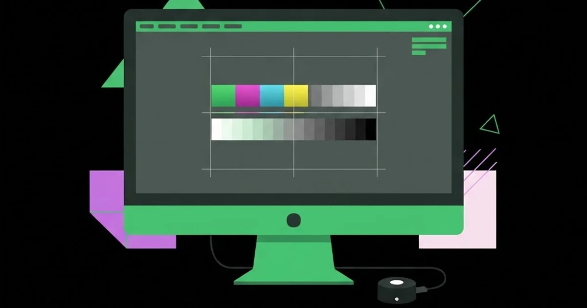
An expensive uncalibrated monitor is less trustworthy than a mid-range calibrated one, and this is the point most buying guides bury. Displays drift over time as backlights age, and every unit leaves the factory with some variance. Calibration uses a hardware colorimeter placed against the screen to measure output and generate a correction profile your operating system then applies. Software-only calibration using your eyes is better than nothing but cannot measure anything objectively, which is precisely what the process requires.
There are two implementations worth distinguishing. Software calibration adjusts the signal sent by your computer, which works but can slightly reduce the available tonal range. Hardware calibration writes the correction into the monitor's own lookup table, preserving full range and keeping the profile intact across different computers. Hardware calibration support is one of the clearest dividing lines between consumer and professional displays, and it is a feature worth paying for if colour decisions are part of your job.
Environment matters alongside the device. Calibrate in the lighting you actually work in, avoid direct sunlight or coloured walls reflecting onto the panel, and keep ambient light reasonably constant. A neutral grey desktop background instead of a saturated image genuinely improves colour judgement, because surrounding colours bias perception. Recalibrate monthly for professional work and quarterly for general work. Designers producing print-ready apparel artwork should also keep physical references such as printed swatch books on the desk, since no screen can fully substitute for comparing against the real substrate.
Buying Mistakes That Cost Designers Money
Buying gamut you cannot use. A wide-gamut display without calibration and colour-managed applications will display oversaturated colour and lead you to make bad choices. If you will not calibrate, a good sRGB display is the safer purchase.
Choosing size over density. Large low-density panels make type look worse and encourage layouts that fall apart at real sizes. A smaller high-density screen almost always serves design better than a larger coarse one.
Ignoring the connection chain. Cheap cables, older ports and some docking stations quietly limit bandwidth, dropping you to a lower refresh rate, reduced colour depth or chroma subsampling. Verify that your cable and port support the full resolution and colour depth at the intended refresh rate.
Mismatched dual-monitor setups. Two different panels will never match perfectly, and the discrepancy erodes trust in both. If you run two screens, buy matching units or designate one as the colour-accurate reference and treat the other purely as a tool panel.
Forgetting ergonomics. Height adjustment, tilt and a VESA mount are not luxury features. A display fixed too low causes neck strain across thousands of hours, and no colour accuracy compensates for that.
Treating glossy versus matte casually. Glossy panels render colour with more apparent depth but reflect every light source behind you. Matte coatings reduce reflections at a slight cost in perceived sharpness. Choose based on your actual room, not on a showroom.
Setting Up a Colour-Managed Workstation Step by Step
Buying the display is the beginning. This sequence turns it into a trustworthy tool.
Step one: position and warm up. Place the screen perpendicular to windows, not facing or backing them. Let it run for at least thirty minutes before calibrating, since output shifts as the panel reaches stable temperature.
Step two: set the target values. For most print and general design work, a white point around D65, a gamma of 2.2 and a luminance near 120 candelas per square metre is a sensible starting configuration. Adjust luminance to match your room rather than copying a number blindly.
Step three: run hardware calibration. Use a colorimeter with the monitor's own calibration utility where supported, so corrections are stored in the display itself. Save the resulting profile with a dated name.
Step four: verify colour management in your applications. Confirm that your design software is using the new profile, set a consistent working colour space across applications, and check that soft-proofing profiles for your print supplier are installed.
Step five: build a reference check. Keep one test image containing skin tones, neutral greys, saturated primaries and fine black-and-white detail. Open it after every calibration. Deviations you can see in a familiar image are the fastest early warning of drift.
Step six: control the room. Use neutral desk lighting, avoid strongly coloured walls in the field of view, and keep a plain grey desktop background. These cost nothing and measurably improve judgement.
Step seven: schedule recalibration. Put a recurring reminder in your calendar. Drift is gradual and invisible day to day, which is exactly why it catches people out on the one job where it mattered.
Key Takeaways
- Colour gamut coverage, factory accuracy and calibration support determine a design monitor's usefulness far more than any motion specification.
- Pixel density between roughly 140 and 220 pixels per inch makes typographic judgement reliable, which large low-resolution panels cannot deliver.
- A calibrated mid-range display is more trustworthy than an expensive uncalibrated one, so budget for a colorimeter alongside the screen.
- Wide-gamut displays only help inside a properly colour-managed workflow and can actively mislead outside one.
- Cables, ports and docks can silently limit colour depth, so verify the full signal chain rather than assuming the monitor is the bottleneck.
Frequently Asked Questions
What monitor size is best for graphic design?
A 27-inch display at 4K resolution suits most designers, offering enough working area for palettes and artboards while keeping pixel density high enough for crisp type. Larger 32-inch screens work well at 4K but feel coarse at lower resolutions. Judge by density and viewing distance rather than diagonal size alone.
Do I need a 4K monitor for graphic design?
Not strictly, but higher density makes typography, fine detail and interface work noticeably more accurate to judge. At 27 inches, 4K is a clear improvement over 1440p for type-heavy work. If budget forces a choice, prioritise colour accuracy over resolution for print work and density for screen work.
Is Adobe RGB coverage necessary?
Only if you prepare work for professional print and can calibrate properly. Adobe RGB includes cyan and green tones sRGB cannot show, which matters when proofing press output. For web, app and social design, full sRGB coverage with accurate calibration is entirely sufficient and often more predictable.
Are OLED monitors good for graphic design?
They offer excellent contrast and wide colour, making them strong for video and mixed creative work. The concern for designers is static burn-in from toolbars and panels that remain in identical positions for hours daily. Panel-care features reduce the risk but do not eliminate the consideration.
How often should a design monitor be calibrated?
Monthly for colour-critical professional work and roughly quarterly for general design. Backlights drift gradually and imperceptibly, so calendar-based recalibration is more reliable than waiting to notice a problem. Always recalibrate after changing room lighting, moving the desk or updating display drivers.
Can a laptop screen replace a design monitor?
Modern high-end laptop displays can be genuinely accurate and are workable for travel, but the small working area, fixed viewing angle and glossy finish limit sustained studio use. Most designers pair a laptop with an external calibrated display and treat the laptop panel as secondary.
Conclusion
The most important insight in this entire category is that a monitor is not a purchase, it is a measurement instrument, and an instrument you never calibrate is an instrument you cannot trust. Designers routinely spend heavily on a display and nothing on the colorimeter that would make it accurate, which inverts the actual value. If your budget is fixed, buy one tier lower on the screen and use the difference on calibration hardware.
Your next step is to test what you already own before spending anything: open a familiar image containing neutral greys and skin tones, compare it against a printed reference, and see how far off you are. That single comparison usually tells you whether you need a new monitor or simply a calibration routine. If your work is heading toward physical products rather than screens, understanding production colour constraints matters even more, and the apparel design career path is a good example of how much on-screen accuracy affects real manufactured output.


