
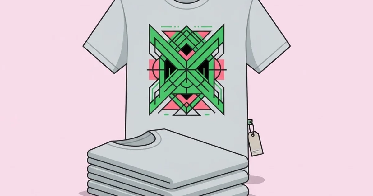
Designer Graphic T Shirts: How to Build a Line That Sells
Designer graphic t shirts fail commercially for reasons that have almost nothing to do with the graphic. They fail because the blank feels cheap in hand, because the print cracked after four washes, because the line had nine hero pieces and no volume drivers, or because the unit maths never worked at the price the market would accept. The design is the visible part of a product that is mostly decisions about materials, methods, quantities and margins. Get those right and a modest graphic sells steadily; get them wrong and a brilliant graphic sits in boxes.
Quick Answer: A viable graphic tee line needs a considered blank, a print method matched to run size, a balanced mix of hero and volume designs, and pricing built from true landed cost including waste. Design the graphic around production limits rather than adapting production to a finished illustration.
The Blank Decides More Than the Graphic Does
Customers form an opinion about a t-shirt in the first two seconds of handling it, long before they analyse the artwork. That opinion comes from the blank: its weight, fabric composition, knit structure, shoulder construction and fit. Weight is usually described in grams per square metre or ounces per square yard, and it correlates strongly with perceived quality. Lightweight jerseys drape softly and suit fashion-oriented fits; midweight is the reliable everyday choice; heavyweight blanks feel substantial and structured, which is why streetwear labels favour them despite the higher cost.
Fabric composition changes both feel and printability. Ringspun cotton is smoother and stronger than standard carded open-end cotton, which matters for fine print detail. Combed cotton removes short fibres for a cleaner surface. Tri-blends feel exceptionally soft and drape well, but they take ink differently and produce a more vintage, faded result. Polyester requires sublimation or specific inks and behaves differently again. Choosing a blank without testing print on that exact fabric is a gamble that regularly goes wrong.
Construction details separate premium from generic. Side-seamed bodies fit better than tubular construction. Shoulder taping improves durability and shape retention. A double-needle hem resists curling. Neckband width and rib quality are among the first things to fail on cheap blanks. Ask any experienced hiring a clothing graphic designer conversation to cover blanks early, because designers who understand fabric behaviour make artwork decisions that actually survive production.
Practical advice: order blank samples in every colour you intend to sell, wash them five times, and only then commit. Colour consistency between dye lots and shrinkage behaviour are things you find out the hard way otherwise.
Matching Print Method to Run Size and Design
Your print method sets your cost floor, your minimum order and your design ceiling simultaneously. Work through these considerations before finalising artwork.
- Screen printing costs per screen to set up but very little per unit afterwards, so it rewards larger runs and punishes high colour counts. It produces the most durable result and the widest range of specialty finishes.
- Direct-to-garment has no setup cost, making single units viable, but per-unit cost stays constant. It handles unlimited colours and photographic detail, with softer results on lighter cotton.
- Direct-to-film transfer sits between the two, allowing small runs in full colour on a wider range of fabrics, with a slightly stiffer feel on large solid areas.
- Embroidery signals quality on small placements such as left chest or sleeve, but cannot reproduce fine detail or small type and is priced by stitch count.
- Sublimation enables all-over prints that no other method can match, but only on light polyester, which constrains the product itself.
- Specialty finishes such as puff, high-density, discharge, water-based and metallic inks change hand feel dramatically and are how premium lines differentiate from generic print.
The strategic point is that method choice should follow your commercial model. Print on demand with digital methods removes inventory risk and compresses margin. Screen-printed batch production improves margin and durability but requires capital and forecasting. Many small labels run both: screen printing for core sellers, digital for tests and one-offs.
Line Structure and Unit Economics
A line is a portfolio, not a collection of favourites. Each design should occupy a defined commercial role, and the mix determines whether the drop as a whole works.
| Design role | Purpose in the line | Typical print complexity | Share of the drop |
|---|---|---|---|
| Hero graphic | Generates attention and defines the season | High, often multi-colour or specialty ink | One to two pieces |
| Core volume | Reliable repeat sellers carrying margin | Low, one to two colours | Largest share |
| Brand mark tee | Everyday identity piece for loyal customers | Very low, single colour or small embroidery | One to two pieces |
| Experimental piece | Tests a direction for future seasons | Variable, often small batch | One piece, low quantity |
| Collaboration | Borrows a new audience | Medium to high | Occasional, limited run |
Once roles are assigned, build the cost model. Landed cost per unit includes blank, print, any specialty finish, labels and tags, polybag and packaging, inbound shipping, and a realistic allowance for defects and misprints. Add fulfilment, payment processing and returns to get true cost to serve. Many first-time founders price from blank plus print only, then discover their margin disappeared into the items they never counted.
What Actually Drives Repeat Purchases
Observed across small apparel brands, repeat purchase behaviour correlates less with graphic novelty than with three unglamorous factors. The first is fit consistency: customers who know their size in your shirt buy again without hesitation, and changing blanks between drops destroys that confidence faster than almost anything else. The second is print durability, because a graphic that cracks is a permanent negative reminder worn in public. The third is delivery reliability, which sets expectations for every future order.
Novelty drives first purchases; reliability drives the second and third. That is why established labels are conservative about blank changes and invest disproportionately in wash testing. If you must change blanks, communicate it openly and publish updated measurements rather than hoping nobody notices.
There is also a persistent misconception that designing tees is a low-skill shortcut into apparel. In practice the discipline rewards technical depth heavily, and the people who build durable businesses tend to understand separations, fabric behaviour and costing as well as they understand composition. Anyone weighing this as a career or side business should look honestly at designer pay for apparel work alongside the margin maths of running a line, because the two paths have very different risk profiles and cash requirements.
Mistakes That Sink Small Apparel Lines
Ordering deep before validating. Buying five hundred units of an untested design ties up cash in inventory that may never move. Test with a small batch or a print-on-demand run, then reorder into proven demand.
Ignoring the size curve. Ordering equal quantities across every size guarantees leftover extremes. Order according to expected demand distribution, weighted toward middle sizes, and adjust with real sales data each drop.
Designing without a colourway plan. A graphic that works on white may be illegible on black or clash on heather. Decide garment colours first and design within that constraint, checking ink opacity on dark grounds.
Skipping wash testing. Print durability is invisible at point of sale and decisive for reputation. Wash and dry samples at least ten times at realistic settings before committing to production.
Underestimating photography. Flat-lay and on-body photography sells the product more than the design file does. Budget for it as a real line item rather than shooting on a phone against a wall.
Pricing from competitor screenshots. Copying a larger brand's retail price without their cost structure produces a loss per unit. Price from your landed cost and required margin, then decide whether the market supports it.
Using unlicensed references. Pulling type, illustration or imagery from existing sources is a legal exposure that can force a full product withdrawal. Draw originals and keep licences for commercial fonts.
Taking a Drop From Concept to Delivery
Here is a sequence that works for a small independent line producing four to eight designs per drop.
Step one: define the drop. Set the theme, the number of designs, the roles each will play, the target retail price and the total budget before designing anything. Constraints improve output.
Step two: select and test blanks. Order samples, wash them, check shrinkage and measure them. Record the measurements, because you will publish them and answer questions about them constantly.
Step three: design to method. Decide print method per design, then build artwork inside those limits at true print size. Produce separations where relevant rather than handing the printer a flattened file.
Step four: order strike-offs. Get test prints on the actual blank and colourway. Check ink opacity, hand feel, registration and placement measurement from the high shoulder point. Correct precisely rather than approximately.
Step five: finalise costing and pricing. Rebuild the cost model with real quoted numbers, add defect allowance, and confirm the margin survives discounting, returns and fulfilment.
Step six: produce in a conservative quantity weighted to a realistic size curve, and keep budget in reserve for a reorder of whatever sells first. Reordering a winner is far cheaper than discounting a loser.
Step seven: shoot, launch and measure. Photograph every colourway properly, publish measurements, and track sell-through by design and size. That data is what makes the next drop smarter, and it compounds in a way that intuition does not.
Key Takeaways
- The blank determines perceived quality within seconds of handling, so fabric, weight and construction deserve more attention than they usually get.
- Print method must be chosen before artwork is finalised, because it sets colour limits, minimum quantities and durability simultaneously.
- A profitable line balances hero pieces with low-complexity volume sellers rather than filling the drop with ambitious graphics.
- Landed cost must include packaging, defects, fulfilment and returns, since pricing from blank and print alone erases real margin.
- Repeat purchases come from fit consistency, print durability and reliable delivery far more than from graphic novelty.
Frequently Asked Questions
What makes a t-shirt feel designer rather than generic?
Fabric weight and hand feel, side-seamed construction, neckband quality, considered fit, thoughtful colourways and print finishes that sit into the fabric rather than on top of it. Branded details such as woven labels and printed care tags reinforce the impression, but the blank and print quality do most of the work.
How many designs should a first drop include?
Four to six is a practical range for an independent launch. It gives enough variety to photograph as a coherent collection without spreading capital across too much unproven inventory. Include one attention-driving hero piece and weight the remainder toward simpler designs likely to sell repeatedly.
Is print on demand viable for a designer tee brand?
It is excellent for validating designs and avoiding inventory risk, with the trade-off of thinner margins, less control over blanks and finish, and longer shipping. Many brands validate with print on demand, then move proven sellers to screen-printed batches to improve both margin and product quality.
How do I price a graphic t-shirt?
Calculate true landed cost including blank, print, labels, packaging, inbound shipping and a defect allowance, then add fulfilment and payment costs. Apply the margin your business model requires, allowing headroom for discounting and returns. Finally test that figure against what your specific audience will actually pay.
What resolution and format should tee artwork be?
Vector artwork is preferred for screen printing and scales without loss. Where raster elements are required, work at true print dimensions at high resolution rather than upscaling later. Supply layered source files plus the flattened export, and confirm the printer's preferred format before sampling.
How do I stop prints cracking after washing?
Ensure the printer cures ink to the correct temperature, avoid excessively thick ink deposits on stretchy fabrics, choose inks matched to the fabric composition, and wash-test samples ten times before production. Advising customers to wash inside out at lower temperatures also meaningfully extends print life.
Conclusion
The most consequential decision in a graphic tee business is choosing your blank and print method before you finish a single design, because those two choices silently determine your cost structure, your colour limits, your minimum order and the quality impression a customer forms in their hands. Designers who reverse that order spend their careers compromising finished artwork into production constraints they could have designed within from the start.
Your next step is to order sample blanks in your three intended colourways, wash them ten times, and print one test graphic on each before planning anything else. That single experiment will inform your pricing, your artwork and your marketing simultaneously. If you are still defining the visual territory the line will occupy, studying tightly focused categories helps, and fishing-themed graphic work is a useful example of how a narrow audience supports a distinctive and defensible style.


