
1950s Graphic Design: Style, Icons, and Lasting Lessons
The 1950s is the decade where graphic design stopped being commercial art and became a profession with a theory. It produced both the exuberant, illustrative advertising most people picture when they hear "mid-century" and the austere, grid-driven rationalism that would govern corporate design for the next forty years. 1950s graphic design refers to the post-war visual language spanning American advertising illustration, Swiss typographic modernism, and the birth of systematic corporate identity, and its arguments are still being had today.
Quick Answer: 1950s graphic design combined two opposing movements: exuberant American advertising with hand-lettering, illustration, and atomic-age motifs, and Swiss International Typographic Style built on grids, sans-serif type, and objective photography. The decade also established corporate identity as a discipline, producing design systems that still influence brand practice today.
Two Design Cultures, One Decade
Understanding the 1950s requires holding two very different visual cultures in mind simultaneously, because they were developing in parallel and largely in opposition.
American advertising design was driven by post-war consumer expansion. Its language featured hand-lettered scripts alongside bold sans-serifs, stylised illustration rather than photography, atomic and space-age motifs, textured printing, and a palette of teal, mustard, coral, and warm cream. Composition was energetic and asymmetric, often with figures and type interlocking. The underlying message was optimism and abundance, and the technique reflected the commercial printing realities of the period, including limited spot colour runs and registration tolerances that designers learned to exploit deliberately.
Swiss International Typographic Style, developing primarily in Basel and Zurich, pursued the opposite goal: objective, universal communication with the designer's personality removed. Its tools were the mathematical grid, sans-serif typefaces, flush-left ragged-right setting, generous white space, and documentary photography instead of illustration. Helvetica and Univers both emerged in 1957, and their arrival gave the movement its defining voices.
The third development, quieter at the time and enormously consequential, was systematic corporate identity. Designers began producing not just a logo but a coordinated programme covering typography, colour, signage, packaging, and printed matter, documented so that others could apply it consistently. This is the direct ancestor of the modern design system, and the reason contemporary brand work still speaks in terms of standards and specifications rather than one-off artefacts. The discipline it required is the same discipline that governs coherent work now, and it maps closely onto what modern practitioners describe as unity as an operational design principle rather than a stylistic preference.
The Techniques That Defined the Decade
These are the concrete practices that produced the look, listed so you can apply them rather than merely recognise them.
- Limited spot colour. Most work was printed in two or three inks, not full colour. Designers built richness through overprinting, tints, and knocked-out shapes. Constraining yourself to three colours reproduces the period's discipline instantly.
- Hand-lettering as a design element. Display type was frequently drawn rather than set, letting letterforms respond to the composition. Lettering carried personality that available metal type could not.
- Flat, stylised illustration. Figures were simplified into shapes with minimal modelling, often with linework offset slightly from colour fields, echoing and exaggerating print registration.
- Textural print artefacts. Halftone dot patterns, paper grain, and slight misregistration gave surfaces character. Reproducing these subtly, not heavily, is what separates convincing mid-century work from filter application.
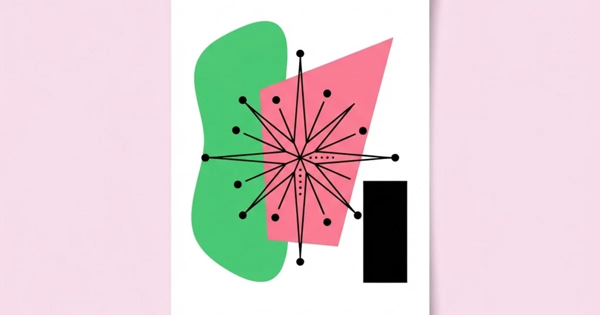
- Atomic and organic motifs. Starbursts, boomerang shapes, molecular diagrams, and amoeba-like forms expressed post-war scientific optimism and appear across print, textiles, and architecture.
- Mathematical grids. On the Swiss side, column and modular grids determined every placement. The grid was not a convenience; it was an ethical position about objectivity and clarity.
- Asymmetric typographic composition. Flush-left ragged-right setting, dramatic scale contrast between few sizes, and generous margins replaced centred, decorative arrangements.
American Mid-Century Versus Swiss Modernism
The contrast is sharp, and knowing which tradition you are drawing from prevents the muddled hybrid that characterises much contemporary "retro" work.
| Attribute | American Mid-Century | Swiss International Style |
|---|---|---|
| Primary goal | Persuasion, warmth, consumer appeal | Objective clarity and universal legibility |
| Typography | Hand-lettered scripts mixed with bold sans and slab | Neutral sans-serif, strict hierarchy, few sizes |
| Imagery | Stylised illustration, character-led | Documentary photography, objective framing |
| Layout | Energetic asymmetry, interlocking elements | Mathematical grid, modular alignment |
| Colour | Teal, mustard, coral, cream, limited spot inks | Restrained, often black, white, and one accent |
| Legacy | Advertising, packaging, branding warmth | Corporate identity, wayfinding, design systems |
Why 1950s Work Still Holds Up: A Practitioner's Reading
Plenty of mid-century work looks dated in the ordinary way, but a striking proportion still looks contemporary, and the reasons are instructive rather than sentimental.
The first reason is that constraint forced clarity. When a poster can carry two inks and one photograph, and when type must be specified for someone else to set in metal, every decision has a cost. That cost pressure eliminated the decorative hedging that fills work produced with unlimited options. Contemporary designers have effectively infinite colours, fonts, and effects, and infinite options tend to produce averaged results rather than decisive ones.
The second reason is that the period professionalised documentation. Identity programmes were written down as standards so they could be executed by people who had never met the designer. That requirement forced designers to articulate rules rather than rely on taste, and articulated rules transfer across time in a way that individual artefacts do not. This is precisely why modern teams still borrow mid-century structural thinking when building systems, and why mid-century archives remain among the most useful references you can keep, far more useful than another scroll through trending galleries, as discussed in this guide to choosing design reference sources deliberately.
The third reason is durability of structure over surface. Swiss work survives because grids, hierarchy, and neutral typography are close to the mechanics of reading itself. American mid-century work survives differently, through personality and craft in lettering and illustration, qualities that remain scarce because they require drawing skill rather than software proficiency.
It is also worth being honest about the period's limitations. The universality claimed by Swiss modernism was rooted in a specific European cultural context, and its neutrality has been reasonably criticised as a stylistic position rather than an absence of one. American advertising of the decade reflected narrow social assumptions about who audiences were and what they wanted. Borrowing the formal intelligence of the era does not require inheriting its worldview, and the best contemporary mid-century-influenced work is clear-eyed about that distinction.
Mistakes When Working in a Mid-Century Style
Blending the two traditions without intent. Swiss rationalism and American advertising exuberance had opposing aims. Combining a strict grid with atomic starbursts and script lettering produces something that belongs to neither tradition and reads as generic retro.
Overdoing the print texture. Heavy grain overlays and exaggerated misregistration look like a filter because they are one. Period artefacts show subtle, uneven imperfection concentrated where ink coverage was heaviest. Restraint and variation are what make it convincing.
Using too many colours. The palette reads as mid-century partly because of which colours were used and substantially because of how few appeared together. Adding a fifth and sixth colour destroys the effect even when each individual colour is period-accurate.
Setting display type instead of drawing it. Retro font packages approximate hand-lettering but repeat identical letterforms, which period lettering never did. Customising key letterforms, adjusting terminals, and fitting the lettering to the composition restores the handmade quality.
Ignoring the reproduction context. The work was designed for offset litho on uncoated stock, for screen printing, or for newsprint. Applying those characteristics to a high-resolution screen without adaptation produces artefacts that read as errors rather than as references.
Mistaking nostalgia for strategy. Mid-century styling signals craft, heritage, and warmth, which suits some briefs and actively harms others. Choose it because the brand's positioning benefits from those associations, not because the reference images looked appealing in a mood board.
Applying Mid-Century Thinking to Current Work
Here is a practical process for using the decade properly, whether you are producing period-styled work or simply borrowing its rigour.
Step one: choose your tradition explicitly. Decide whether the project draws on American advertising warmth or Swiss systematic clarity. Write the choice down, because it will resolve dozens of later decisions automatically.
Step two: impose artificial constraints. Limit yourself to three inks, two typefaces, and one illustration technique. Constraint is the mechanism that produced the period's decisiveness, and it is the one element of mid-century practice you can adopt immediately regardless of style.
Step three: build a real grid. Define columns, a baseline rhythm, and a modular structure before placing content. On the Swiss side this is non-negotiable; even on the American side, the best work has underlying structural logic beneath its energy.
Step four: draw something. Customise lettering, build a bespoke icon set, or produce original illustration. The distinctiveness of mid-century work comes substantially from the absence of stock assets, and this remains the fastest route to distinguishing contemporary work too.
Step five: study the printing. Look at actual artefacts, not scans of scans. Notice where ink is heavy, how colours overprint, how registration drifts, and how paper colour affects the palette. These observations produce far better reproduction decisions than any preset.
Step six: document the system. Write the rules: type roles, colour roles, grid specifications, illustration treatment, and permitted exceptions. This is the genuine inheritance from the 1950s corporate identity pioneers, and it is what makes work survive its author.
Step seven: apply it beyond print. Mid-century principles adapt well to garments, packaging, and merchandise, where limited ink counts and flat colour separations are still real production constraints, which is why the era's methods remain directly relevant to apparel graphics and screen-print workflows today rather than being purely historical interest.
Key Takeaways
- The 1950s contained two opposing design cultures: American advertising exuberance and Swiss systematic rationalism, each with distinct goals and techniques.
- Limited spot colour printing and metal type specification imposed constraints that forced decisive, clear design decisions rather than hedged ones.
- The decade established documented corporate identity programmes, the direct ancestor of modern design systems and brand guidelines.
- Convincing mid-century work comes from restraint in palette, subtle rather than heavy print texture, and custom lettering rather than retro font packages.
- The most transferable lesson is not the visual style but the practice of working within deliberate constraints and writing down the resulting rules.
Frequently Asked Questions
What are the main characteristics of 1950s graphic design?
Key characteristics include limited spot colour palettes, hand-lettered display type, flat stylised illustration, atomic and organic motifs, visible print texture, and on the Swiss side, mathematical grids with neutral sans-serif typography and objective documentary photography rather than illustration.
What typefaces define 1950s design?
Helvetica and Univers, both released in 1957, define the Swiss side of the decade and shaped corporate typography for generations. American advertising relied heavily on custom hand-lettering, scripts, and bold slab and sans-serif faces rather than a single canonical typeface family.
What is the Swiss International Typographic Style?
It is a design movement developed principally in Basel and Zurich emphasising objective communication through mathematical grids, sans-serif typography, flush-left ragged-right text, generous white space, and documentary photography. It sought to remove the designer's personality in favour of clarity and universality.
Why does mid-century design still look modern?
Because its strongest work is built on structure rather than ornament. Grids, clear hierarchy, restrained palettes, and neutral typography align with how people actually read, so they age slowly. Craft qualities such as original lettering and illustration also remain scarce and therefore distinctive.
How do I recreate 1950s print texture authentically?
Study real artefacts and reproduce imperfection selectively rather than uniformly. Concentrate halftone texture and registration drift where ink coverage is heaviest, vary the effect across the composition, and keep it subtle. Uniform heavy grain overlays read immediately as a digital filter.
How many colours should a mid-century style design use?
Two or three, occasionally four. The period look depends as much on colour scarcity as on colour choice, because commercial printing typically used a small number of spot inks. Adding more colours dissolves the effect even when every individual hue is period-accurate.
Is mid-century style appropriate for modern brands?
It suits brands positioning around craft, heritage, optimism, and warmth, and it fits categories such as food, hospitality, and cultural institutions well. It works poorly where a brand needs to signal cutting-edge technology, since the associations pull directly against that message.
Conclusion
The lasting value of 1950s graphic design is not its palette or its starbursts but its demonstration that constraint produces clarity and that written rules outlive individual artefacts. Designers of that decade had fewer options and produced more decisive work, which should be uncomfortable reading for anyone with a font library of thousands. Your next step is to run your current project under artificial constraints for one session: three colours, two typefaces, one illustration technique, and a real grid, then compare the result with your unconstrained version. To take the structural half of that inheritance further, work through how those rules translate into contemporary practice in this guide to building cohesive layouts with a documented system.


