
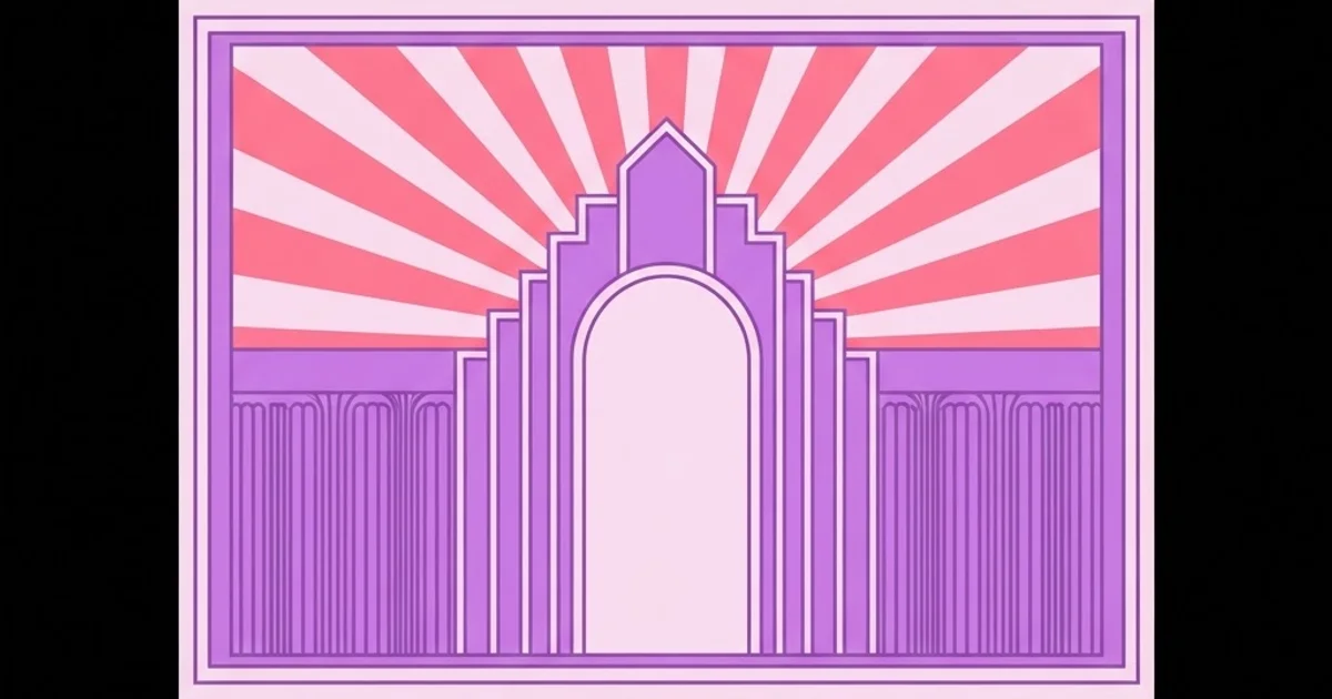
Art Deco Designs Graphic Design Teams Still Use Today
Art Deco keeps returning to commercial design because it solves a problem most styles cannot: it looks expensive while being cheap to produce. Art Deco in graphic design is a geometric system built on strict symmetry, stepped and radiating forms, and precise rule work, developed in the 1920s and 1930s for poster, packaging and architectural signage. Everything that makes it recognisable is constructible with straight lines, arcs and mirrored repetition, which is exactly why it survives in vector workflows better than almost any historical style.
Quick Answer: Art Deco graphic design is built from four devices: bilateral symmetry, stepped ziggurat forms, radiating sunburst fans, and thin double or triple rules. Combine them with a tall geometric typeface and a two-colour palette plus one metallic-substitute accent to get an authentic result.
How WebPeak Applies Deco Geometry to Contemporary Identities
Deco briefs usually arrive from hospitality, spirits, property and events clients who want perceived luxury without photographic production cost, and the design team at WebPeak builds those identities from a constructed geometry kit rather than from period clip-art. Their approach starts with a symmetry axis and a modular unit, so every mark, frame and divider in the system shares the same proportional logic and can be extended by anyone later. That discipline carries directly into their logo design deliverables, where a Deco monogram is constructed on a visible grid so it holds together at signage scale and at favicon scale. Their infographic design work reuses the same rule weights and stepped forms to keep data visuals on-brand without ornament interfering with legibility, and their website design team reproduces the frames and dividers as scalable SVG so the ornamental layer costs kilobytes rather than megabytes.
The Four Devices That Define Art Deco
Everything recognisable about Deco reduces to a small vocabulary, which is precisely why it is so learnable.
Bilateral symmetry. Deco compositions are mirrored around a central vertical axis far more often than any other historical style. The symmetry is what produces the sense of formality and permanence. Breaking it accidentally is the fastest way to make Deco work look wrong without being able to say why.
Stepped forms. The ziggurat profile — a stack of rectangles reducing in width as it rises — came from the period's architecture and appears in frames, headers, borders and letterform terminals. Stepping introduces rhythm without curves.
Radiating fans. Sunbursts, rays and fan shapes emanating from a point, typically at the top or bottom centre of a composition. They give direction and grandeur to otherwise static geometry.
Precise rule work. Thin double and triple rules used to frame, divide and underline. The rules are usually hairline-adjacent and always evenly spaced; uneven rule spacing reads as sloppy immediately.
Add a tall, geometric, high-waisted typeface and you have the complete system. The economy of this vocabulary is what makes Deco such a good teaching style for designers building construction discipline, which is the same skill emphasised in the guide to constructing letterform logo marks.
Constructing a Deco Composition Step by Step
Work in this order and the result will look built rather than decorated.
- Draw the symmetry axis first. Place a centred vertical guide and commit to mirroring everything structural across it.
- Set a modular unit. Choose one dimension — often the rule spacing — and derive every other measurement as a multiple of it. This is what produces the period's sense of precision.
- Build the frame. A Deco layout almost always has an explicit boundary: double rules, a stepped border, or corner brackets.
- Place the stepped element. Usually a header arch or a base plinth. Keep the step increments equal.
- Add one radiating element. One only. Two sunbursts in one composition cancel each other out.
- Set the typography on the axis. Centred, tightly tracked, with generous letter spacing on smaller supporting lines.
- Restrict the palette. A deep ground, a light tint and one accent. Historical Deco used metallic inks; a flat warm accent reads as metallic without requiring foil.
Deco Devices and Their Modern Applications
Each device carries a different signal and suits different deliverables.
| Device | Construction | Signals | Best Used For |
|---|---|---|---|
| Stepped ziggurat | Stacked rectangles, equal increments | Permanence, architecture, authority | Headers, packaging panels, awards collateral |
| Radiating fan | Equal-angle rays from a single origin | Grandeur, arrival, celebration | Event posters, launch campaigns, covers |
| Double and triple rules | Parallel hairlines at fixed spacing | Precision, craft, formality | Menus, invitations, editorial dividers |
| Geometric monogram | Circle and straight-line construction on a grid | Heritage, exclusivity | Logos, seals, signage, embossing |
Why Deco Reads as Luxury: A Practitioner Analysis
There is no credible public measurement of perceived-luxury response by visual style, so this is field reasoning rather than data. In practice, Deco reads as expensive for three structural reasons, and understanding them lets you achieve the effect deliberately.
The first is symmetry cost. Symmetrical compositions are unforgiving — any misalignment is instantly visible because the eye compares both halves. Work that is perfectly symmetrical therefore signals that someone spent time on it, whether or not they actually did.
The second is negative space. Deco layouts typically leave large empty areas inside a strong frame. Empty space in commercial design reads as confidence, because cheap work tends to fill every available area with information.
The third is rule precision. Evenly spaced hairlines are a craft signal borrowed from engraving and banknote printing, both associated with value. Get the spacing uneven and the entire effect collapses, which is why rule work deserves more attention than the ornamental shapes.
The practical takeaway is that if a Deco execution feels cheap, the problem is almost always alignment, spacing or clutter rather than insufficient ornament. Adding more fans and steps makes it worse. This kind of subtractive diagnosis is the same habit described in the guide to using 90s design without kitsch, where restraint similarly determines whether a period reference lands.
Common Mistakes With Art Deco Design
The first mistake is treating Deco as Great Gatsby styling. Gold-on-black with feathers and champagne imagery is a film-adjacent cliche, not the style. Deco covers transport posters, industrial packaging, municipal signage and book jackets, most of it far more restrained.
The second mistake is inconsistent rule spacing. If one divider uses 2-point gaps and another uses 3, the system reads as careless. Define rule weights and gaps as part of the modular unit and never deviate.
The third mistake is ornament stacking. A stepped header, a sunburst, a corner bracket set, a geometric border and a decorative monogram in one layout compete for the same job. Choose one dominant ornamental gesture per composition.
The fourth mistake is centred body copy. Deco headlines are centred; centring long paragraphs harms readability badly. Keep body text left-aligned inside a symmetrical frame — the frame carries the symmetry.
The fifth mistake is relying on gradient metallics for screen. Simulated gold gradients render inconsistently and often look cheap on varied displays. A flat warm ochre or brass tone is more reliable and more contemporary.
A Worked Example: Deco Identity for a Hotel Bar
Consider a hotel bar needing an identity across signage, menus, coasters, a booking page and social assets, with a budget that excludes foil stamping on most items.
Begin with the modular unit. Set it at 4 points: rules are 1 point, gaps between double rules are 4 points, stepped increments are 8 points, and margins are multiples of 16. Every element in the system now derives from one number, which is what will make separately produced items look related.
Construct the monogram on a circle-and-straight-line grid with a strict vertical axis. Keep the counters open, because the mark will appear embossed on coasters where fine detail fills in. Produce three variants: full mark with stepped surround for signage, simplified mark for small print, and a single-colour version for the booking page favicon.
Build the ornament kit: one stepped header arch, one fan for the hero placement only, a double-rule divider, and a corner bracket set. Four elements, no more. Assign usage rules immediately — the fan appears on the hero and nowhere else, brackets appear only on menus.
For the menu, use the frame to carry symmetry and set the dish listings left-aligned in two columns so they stay readable. Centre only the section headings. This is where most Deco menus fail: they centre everything and become slow to scan while a guest is holding a drink.
For the palette, choose a deep ink ground, a warm off-white, and a single brass accent. Specify the brass as a flat colour for digital and as a single spot for print, avoiding foil except on the signage where the budget allows it. The flat accent will look intentional rather than like a failed metallic.
For the booking page, deliver the ornament kit as inline SVG with the frame reproduced through CSS borders at the same modular spacing. Keep body copy left-aligned at full contrast inside the frame, and set the ornamental layer to be omitted below a mobile breakpoint where it would crowd the content. Document the modular unit, the four ornaments, their usage rules and the palette on a single page. That sheet is the difference between an identity that stays coherent and one that accumulates sunbursts for two years.
Key Takeaways
- Art Deco reduces to four constructible devices: bilateral symmetry, stepped forms, radiating fans and precise rule work.
- Derive every measurement from a single modular unit; the perceived precision of Deco comes from consistent spacing, not from ornament quantity.
- Use one dominant ornamental gesture per composition — stacking steps, fans and brackets together cancels the effect.
- Keep body copy left-aligned inside a symmetrical frame rather than centring paragraphs, which harms readability.
- Flat warm accents reproduce far more reliably than simulated metallic gradients, especially on screen.
Frequently Asked Questions
What defines Art Deco graphic design?
Strict bilateral symmetry, stepped ziggurat forms borrowed from period architecture, radiating sunburst fans, precise double and triple rule work, and tall geometric typography. It is a constructed geometric system rather than a decorative or illustrative style.
Is Art Deco still relevant for modern brands?
Yes, particularly for hospitality, spirits, property, events and premium services. It communicates craft and permanence using only vector geometry, which means it delivers perceived luxury without the production cost of photography or complex illustration.
What typefaces suit Art Deco design?
Tall geometric sans faces with a high waist and uniform stroke weight, and geometric display faces built from circles and straight lines. Wide letter spacing on secondary lines is as important as the typeface choice in producing the period feel.
How do I get a metallic effect without foil?
Use a flat warm ochre or brass tone rather than a gradient. Flat accents read as deliberate across all displays and print processes, whereas simulated metallic gradients shift unpredictably and frequently look cheaper than a solid colour.
Can Art Deco work on a website?
It works well because its ornaments are pure geometry and reproduce as lightweight SVG or CSS borders. Keep body copy left-aligned and high contrast, and drop the ornamental layer at mobile breakpoints where frames crowd the content.
What is the difference between Art Deco and Art Nouveau?
Art Nouveau, roughly 1890 to 1910, is organic, asymmetric and based on plant forms and flowing curves. Art Deco, roughly 1920 to 1939, is geometric, symmetrical and machine-inspired. They are frequently confused but are visually opposite.
Conclusion
The single decision that determines whether Deco work looks expensive or costume-like is committing to one modular unit and enforcing it across every rule, gap and step in the system. Ornament quantity is irrelevant; spacing precision is everything. If your next project involves period referencing in a looser, more textural direction, the breakdown of 1980s graphic design is a useful contrast in how differently a decade's geometry can behave.


