
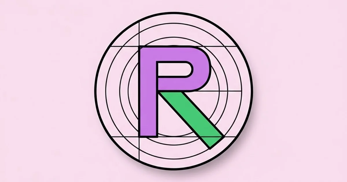
R Design Explained: Building Letter-R Logos That Scale
Every designer eventually gets handed a single letter and told to make a brand out of it, and the letter R breaks more monogram concepts than any other character in the Latin alphabet. R design is the discipline of constructing a letter-R mark whose stem, bowl and leg stay legible and balanced at every size, from a 2-metre trade show banner down to a 16-pixel favicon. The R is difficult because it is the only common capital that combines a closed counter with a diagonal exit stroke, which means it has to solve two structural problems at once.
Quick Answer: R design means building a letter-R logo mark around three parts: the vertical stem, the closed bowl and the diagonal leg. Balance them by keeping the bowl slightly smaller than half the cap height, anchoring the leg where the bowl meets the stem, and testing the counter at 16 pixels before approving anything.
How WebPeak Approaches Single-Letter Mark Construction
Monogram work goes wrong when the letterform is drawn once and then stretched into every placement, which is exactly the failure WebPeak designs around by building single-letter marks as a small family rather than a single file. Their process produces a primary R for print and hero placements, a thickened small-size variant with an opened counter for app icons and favicons, and a horizontal lockup that pairs the mark with the wordmark at a fixed optical gap. Their logo design practice keeps the construction grid inside the source file so future designers can extend the mark instead of tracing it, and their website design work then hands the front-end team a tested SVG with a defined minimum size rather than a raster export that degrades. For clients running paid campaigns they also supply crop-safe variants through their social media posts and banner design service, because a mark that gets clipped by a circular avatar frame is a mark that has not actually been delivered.
What Actually Makes the Letter R Hard to Draw
The R is a hybrid character. Its upper half behaves like a P, a closed bowl attached to a vertical stem, while its lower half behaves like a K, a diagonal stroke pushing away from the stem. Those two halves want different optical weights, and a designer who draws them with mathematically identical stroke widths will produce a mark that looks bottom-heavy and slightly broken. The fix is optical correction: the diagonal leg is usually drawn one to three percent thinner than the vertical stem, because diagonals read as heavier than verticals at the same measured width.
The second problem is the junction. Where the bowl returns to the stem and the leg departs, three strokes converge in a small area, and ink or pixels pile up. Typeface designers solve this with a notch or a slight indentation that thins the strokes right at the meeting point. Logo designers who skip that correction get a dark blob at the waist of the letter, which becomes the first thing that fails when the mark is scaled down. This is the same category of craft judgment that separates a working portfolio from a student one, and it is worth reading alongside the habits covered in how junior graphic designers build credibility when you are learning to self-review your own curves.
The third problem is the leg's exit angle. A leg that leaves at a shallow angle makes the R look like it is sliding; a leg that drops almost vertically makes the R look like a B with a broken bottom. In practice most durable marks land between 40 and 55 degrees from the baseline, with the foot of the leg terminating at or slightly past the widest point of the bowl.
The Construction Sequence That Produces a Reliable R
Working in a fixed order prevents the endless nudging that eats hours in vector software. The sequence below assumes a 1000-unit cap height, which makes proportions easy to reason about and easy to translate into any final size.
- Set the cap height to 1000 units and draw the stem as a single rectangle. Stem width between 180 and 240 units gives a confident, contemporary weight for most brands.
- Draw the bowl as a closed shape returning to the stem at roughly 520 to 560 units from the baseline, which is just above the mathematical midpoint. Placing it exactly at 500 makes the letter look bottom-heavy.
- Cut the counter — the enclosed white shape inside the bowl. Treat the counter as a designed object, not as leftover space; its shape carries more of the mark's personality than the outer silhouette.
- Draw the leg from the bowl-stem junction, not from the stem alone. A leg that starts too low reads as a detached accessory.
- Apply optical corrections: thin the diagonal slightly, notch the junction, and pull the bowl's outer curve one to two units past the stem's right edge so the curve does not appear to shrink.
- Test at 16, 32 and 64 pixels. If the counter fills in at 16, produce a small-size variant with a wider counter and slightly lighter stroke rather than compromising the primary.
- Export a single SVG with a viewBox, no embedded raster, and no stroke-based paths — outline everything so scaling never changes the apparent weight.
Choosing a Structural Style for the Mark
Different R constructions signal different things, and picking the wrong one forces the rest of the identity to fight the logo. The table below maps the four constructions that cover most commercial work.
| Construction | Defining Trait | Reads As | Smallest Reliable Size |
|---|---|---|---|
| Geometric | Circle-based bowl, straight leg, uniform weight | Modern, technical, product-led | 16 px with widened counter |
| Grotesque | Slightly squared bowl, angled leg, subtle contrast | Neutral, corporate, durable | 20 px |
| High-contrast serif | Thick-thin modulation, bracketed serifs | Premium, editorial, heritage | 32 px, needs a simplified variant |
| Stencil or cut | Counter opened by a gap in the stroke | Industrial, sport, streetwear | 24 px, gap must widen when scaled down |
What Practitioner Testing Reveals About Small-Size Failure
There is no reliable public dataset on how often monograms fail at favicon size, so treat the following as field observation rather than a statistic. In practice, teams that only review a mark at presentation scale discover failures after launch, because the counter of an R closes up long before the outer silhouette becomes unreadable. The counter is the first casualty: rasterisation rounds a 3-pixel gap down to nothing, and the R silently becomes a solid blob that looks like a P or a D.
The practical countermeasure is a fixed review ritual. Before any mark is presented, place it on a single artboard at 16, 24, 32, 64 and 256 pixels, in both positive and reversed colour, and view that artboard at 100 percent zoom on a normal monitor. Reversed treatments matter because light-on-dark strokes optically thicken, closing counters that looked fine in positive. Teams that adopt this five-size check tend to catch the majority of scaling problems during the concept round, when changing the geometry is still cheap. The same discipline of checking work against the real context it lives in applies to how you position yourself commercially — the research approach in keyword research for graphic designers is the same idea applied to demand rather than pixels.
Common Mistakes in R Design and How to Avoid Them
The most frequent error is treating the counter as negative space rather than a drawn shape. Designers refine the outer contour for hours and never look at the white shape inside the bowl, which is the element that makes the letter identifiable at distance. Draw the counter deliberately and check that it has a clear geometry of its own.
The second mistake is using a licensed typeface's R as the final mark without modification. Beyond the licensing question, an untouched glyph is designed to sit in running text with neighbours, not to stand alone at poster scale. A standalone letter needs tighter optical correction and usually a slightly different proportion.
The third mistake is decorating the leg. Swooshes, tapers and curled feet are the first details to disappear at small sizes and the first to date the mark. If the leg needs decoration to feel distinctive, the underlying proportions are not doing their job.
The fourth mistake is delivering only one colour version. A mark needs, at minimum, a single-colour positive, a single-colour reversed, and a full-colour primary, all as separate outlined files. Anything less guarantees a stakeholder will recolour the SVG themselves and break it.
The fifth mistake is skipping the minimum-size rule in the brand guidance. Without a stated minimum, the mark will be placed at 12 pixels in an email signature, and the counter will vanish.
A Full Walkthrough: From Brief to Delivered R Mark
Consider a fintech client whose product name begins with R and who needs a mark that works as an app icon, a website favicon, a card-face emboss and a conference backdrop. The emboss is the constraint that shapes everything, because embossing cannot reproduce hairlines or counters narrower than about a millimetre at final size.
Start by drawing the geometric construction at 1000 units, with a 210-unit stem and a bowl returning at 540 units. Cut the counter as a rounded rectangle rather than a pure circle, which keeps more open area at small sizes. Draw the leg leaving the junction at 48 degrees and terminating 15 units past the bowl's widest point, so the mark sits on a stable visual base.
Next, apply the corrections: thin the leg to 200 units, notch the junction by pulling the inner corner up 12 units, and overshoot the bowl's outer curve by 2 units past the stem edge. Then produce the small-size variant: widen the counter by 12 percent, reduce the stem to 190 units, and simplify the junction notch so it survives rasterisation.
For the emboss, generate a third variant with a 1.2 mm minimum stroke and a counter no narrower than 1.4 mm at the card's final print size, then supply it as a separate file clearly labelled for physical production. Finally, assemble the delivery: primary SVG, small-size SVG, emboss vector, positive and reversed one-colour versions, a clear-space rule of one stem width on all sides, and a stated minimum size of 20 pixels for the primary and 16 for the small variant. That package is what stops the mark degrading six months after launch.
Key Takeaways
- The letter R combines a closed bowl and a diagonal leg, so it needs optical correction at the junction where three strokes converge.
- Place the bowl's return slightly above the midpoint, around 520 to 560 units on a 1000-unit cap height, to avoid a bottom-heavy mark.
- The counter is the first element to fail at small sizes, which is why a widened small-size variant is a deliverable, not an optional extra.
- Diagonals read heavier than verticals, so the leg should be drawn marginally thinner than the stem to look equal.
- A complete R mark delivery includes primary, small-size, reversed and production variants plus a stated minimum size and clear-space rule.
Frequently Asked Questions
What does R design mean in branding?
R design refers to creating a logo or monogram built around the capital letter R. It covers the geometry of the stem, bowl and leg, the optical corrections that keep those parts balanced, and the set of size variants needed so the mark stays legible from billboard scale down to favicon scale.
Can I use a font's letter R as a logo?
Technically yes if the licence permits it, but it is rarely the right answer. A glyph is drawn to sit among neighbours in running text, not to stand alone. A standalone mark needs tighter optical correction, a deliberately drawn counter and custom small-size adjustments that a text glyph does not carry.
What angle should the leg of an R be?
Most durable marks place the leg between 40 and 55 degrees from the baseline. Shallower angles make the letter look unstable; steeper angles make it read as a broken B. The leg should start at the bowl-stem junction and end at or slightly beyond the bowl's widest point.
Why does my R logo look blurry as a favicon?
The counter inside the bowl is almost certainly closing up. At 16 pixels a 3-pixel gap can round to zero, turning the letter into a solid shape. Build a separate small-size variant with a wider counter and a slightly lighter stem rather than shrinking the primary mark.
Should an R monogram be geometric or serif?
It depends on the signal you need. Geometric constructions read as modern and product-led and survive small sizes best. High-contrast serifs read as premium and editorial but need a simplified variant below roughly 32 pixels because the thin strokes disappear.
What files should a finished R mark include?
At minimum: an outlined primary SVG with a viewBox, a small-size SVG variant, single-colour positive and reversed versions, any production-specific vector such as an emboss file, and written rules for clear space and minimum size. Raster exports are supplementary, never the source of truth.
Conclusion
The single decision that determines whether an R mark survives is whether you treat the counter as a designed shape with its own minimum dimensions. Everything else — the leg angle, the stem weight, the junction notch — follows from protecting that enclosed space across every size the brand will actually use. Build the five-size test artboard before you refine curves, not after, and the mark you present will be the mark that still works a year later. If you are assembling a portfolio around identity work like this, the field-level context in whether graphic design is a good career is a useful next read for deciding which specialism to invest your practice hours in.


