
Anime Graphic Design: Visual Language, Type and Layouts
Anime graphic design is not "drawing characters with big eyes." It is a specific set of production conventions — flat cel shading, screen tone, speed lines, panel structure, title-card typography, and dense bilingual lettering — that were developed to solve real constraints in animation and print manga. Designers borrow from it constantly for music, streetwear, gaming, and campaign work, and the difference between borrowing well and borrowing badly comes down to understanding why each convention exists.
Quick Answer: Anime graphic design applies the visual conventions of Japanese animation and manga to graphic work: flat cel-shaded colour, halftone screen tone, radial speed lines, diagonal panel grids, heavy outlined title typography, and mixed Japanese and Latin lettering. These conventions originated as production shortcuts and now function as a recognisable stylistic language.
The Conventions and Where They Came From
Almost every element of the anime visual vocabulary began as a cost or time constraint. Understanding the origin is what lets you apply the element intelligently instead of decoratively.
Cel shading — flat blocks of colour with hard-edged shadow shapes rather than smooth gradients — exists because hand-painted animation cels had to be reproduced consistently across thousands of frames by many painters. A two-tone or three-tone shadow system was the only way to hold consistency. Graphically, it gives you clean, reproducible forms that scale to any size, which is exactly why it works so well for merchandise and screen-printed apparel.
Screen tone is the halftone dot and line pattern used in printed manga to create tonal value without colour. Black-and-white print on cheap paper could not hold grey reliably, so tone sheets simulated it. As a graphic device today, tone gives texture and depth without adding a single colour to your palette, which is genuinely useful in constrained print work.
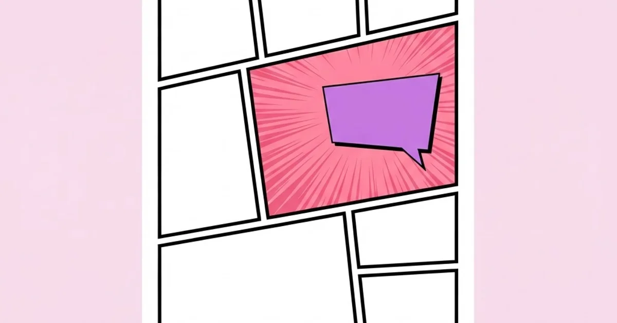
Speed lines and impact frames — radiating or parallel line fields, sudden inverted-colour frames, motion streaks — communicate movement and energy in a still image. In animation they compensated for limited frame counts. In graphic design they are one of the most effective tools available for implying motion in a static composition.
Diagonal panel structure. Manga pages break the rectangular grid with angled panel dividers to control reading speed and intensity. It is a pacing mechanism first and a stylistic signature second, which is worth remembering because the same underlying logic governs any layout. If you understand how the graphic conventions of a period like the 1970s emerged from press limitations, you will recognise the identical pattern here: the constraint produced the style, and the style outlived the constraint.
Title-card typography is its own discipline. Heavy weights, multiple stacked outlines, hard offset shadows, gradient fills, and slight rotation are standard because titles had to remain readable over moving painted backgrounds at broadcast resolution. That is also why the style reads so well on busy photographic backgrounds and video thumbnails today.
One definitional caution. Anime refers to animation produced in Japan; manga refers to the printed comic form. The graphic conventions overlap but are not identical — screen tone is a manga device, cel shading is an animation device, and using the terms interchangeably signals to an informed audience that you have not studied the source.
Building an Anime-Influenced Design System
If you are designing a poster, album cover, apparel range, or campaign in this language, work through these components deliberately rather than adding elements until it "looks anime."
- Choose the era you are referencing. Seventies and eighties cel work, nineties OVA and VHS aesthetics, early-2000s digital, and contemporary compositing all look distinctly different. Nineties references carry scanline artefacts, heavy grain, and limited palettes; contemporary work is cleaner with atmospheric lighting. Mixing eras reads as unintentional.
- Build a flat palette with a defined shadow rule. Pick base colours first, then define exactly one shadow tint and optionally one highlight per base. The discipline of a fixed shadow rule is what makes cel shading look professional rather than sloppy.
- Set a line-weight hierarchy. Outer contour lines heaviest, internal detail lines lighter, interior texture lightest. Uniform line weight throughout is the most common giveaway of inexperienced work in this style.
- Introduce tone, not gradient. Use halftone dots or line screens for value transitions. Reserve smooth gradients for skies and atmospheric backgrounds, which is where the source material uses them.
- Choose your motion device and use it once. Radial speed lines, parallel streaks, or an impact burst. One per composition. Stacking all three creates noise that cancels the energy you were trying to create.
- Design the title treatment as a component. Base weight, outline count and thickness, shadow offset, and rotation angle should all be specified so secondary titles match the primary one.
- Handle bilingual typography with care. If you use Japanese text, have it written or checked by someone who reads Japanese, set it with a genuine Japanese typeface, and respect that vertical and horizontal setting follow different rules. Decorative nonsense text is both unprofessional and immediately visible to a large part of your audience.
- Decide the grain and artefact layer last. Scanlines, chromatic aberration, and paper grain are finishing, not structure. If the piece does not work clean, artefacts will not fix it.
The ordering matters. Designers who start with the grain filter and the chromatic aberration produce work that looks like a preset. Designers who start with palette rules and line hierarchy produce work that holds up printed at any size.
How the Main Visual Approaches Differ
Within anime-influenced graphic design there are several distinct approaches, each suited to different commercial contexts.
| Approach | Key visual traits | Reproduces well on | Best commercial fit |
|---|---|---|---|
| Classic cel | Flat two-tone shading, clean heavy contours, limited palette | Screen print, vinyl, merchandise, large format | Apparel, posters, brand mascots |
| Manga monochrome | Black and white, screen tone, diagonal panels, dense line work | One-colour print, newsprint, packaging | Editorial, zines, low-cost print campaigns |
| Nineties VHS revival | Grain, scanlines, chromatic shift, muted saturated palette | Screen, social, video thumbnails | Music, gaming, streetwear drops |
| Contemporary digital | Atmospheric lighting, soft rim light, detailed backgrounds | High-resolution screen and print | Key art, streaming platforms, campaigns |
| Graphic minimal | Single motif, flat colour, no rendering, typographic focus | Everything, including tiny sizes | Logos, icons, app and product branding |
The last row is the most commercially useful and the least used. Reducing the language to a single flat motif with strong typography gives you something that works as an avatar, an app icon, and a billboard. Highly rendered key art looks impressive in a portfolio but fails completely at small sizes, which is where most brand assets actually live.
What Works in Practice, and What Does Not
There is no reliable published data quantifying commercial performance of anime-influenced design, and any specific figure you see quoted should be treated with suspicion. What is observable is how this work behaves across real projects.
The most consistent practical finding is that legibility is the failure point. Title typography in this style carries multiple outlines, shadows, and fills, all of which reduce effective contrast against busy backgrounds. Work that looks striking at full artboard size becomes unreadable in a feed at thumbnail scale. The fix is to design the title at final delivered size first, then scale up, rather than the reverse.
The second finding concerns audience specificity. This visual language carries strong cultural association. For audiences with a genuine relationship to it — gaming, music subgenres, streetwear, certain tech communities — it signals belonging immediately. Applied to an audience without that relationship, it reads as confusing or juvenile. The style is a targeting decision before it is an aesthetic one.
Third, and importantly, intellectual property is a real constraint. Character designs, specific title logotypes, and recognisable art styles tied to an individual artist are protected work. Referencing conventions of a medium is legitimate; reproducing a studio's character design or reusing an existing series' logotype treatment is not. If a client asks for something "like" a specific series, the professional response is to build from the shared conventions rather than from that property.
Fourth, distribution has changed the requirements. Most of this work is now consumed on screens, in feeds, at variable sizes, and frequently in motion. That makes it a digital design problem as much as an illustration one, and the same discipline involved in translating visual identity across to screen surfaces applies directly — component thinking, size testing, and contrast validation matter here exactly as much as they do in interface work.
Finally, there is a craft observation worth stating plainly: the strongest anime-influenced graphic design is usually restrained. One motif, one motion device, a tight palette, and confident typography beats a dense collage of effects every time. The source material is often busy because it is a single frame in a moving sequence; a poster or cover has to survive sustained looking, which rewards clarity.
Mistakes to Avoid in Anime-Influenced Work
Using Japanese text as decoration. Machine-translated or randomly selected characters are visible errors to a substantial portion of the audience. Either use verified, correctly set Japanese, or use Latin typography confidently.
Setting Japanese with the wrong typeface. Latin fonts cannot render Japanese, and forcing a fallback produces inconsistent, mismatched letterforms. Use a proper Japanese family and match its weight and mood to your Latin face.
Uniform line weight. Without a contour-to-detail hierarchy, forms flatten and read as clip art. Vary the weight deliberately, heaviest on outer silhouettes.
Overloading the effects stack. Grain, scanlines, chromatic aberration, glow, and halftone all at once destroy the clean forms that make the style legible. Choose at most two finishing treatments.
Copying a specific property. Reproducing a recognised character, logotype, or key art composition is a legal and ethical problem, not a stylistic choice. Build from conventions, not from a single source.
Ignoring small-size performance. Detailed rendering disappears at avatar and thumbnail scale. Always produce a reduced, simplified variant of the primary asset for small placements.
Treating the style as a shortcut to youth appeal. Audiences familiar with the source material recognise superficial application immediately, and it damages credibility more than a neutral design would.
A Worked Example: Designing an Album Cover
Here is a concrete walkthrough for a common brief: cover art for an electronic music release aimed at an audience that grew up with nineties anime.
Step one — fix the era and the reference set. Nineties OVA aesthetic: limited palette, visible grain, flat cel rendering, heavy title typography with hard offset shadow. Collect eight to ten reference frames and note what is consistent across them — usually palette temperature, line weight, and how much of the frame the subject occupies.
Step two — define the palette as rules. Four colours: a dominant saturated base, a desaturated secondary, one shadow tint applied consistently, one hot accent used on less than five percent of the surface. Write the rule down, because the accent discipline is what creates the focal point.
Step three — block the composition flat. Silhouette only, no detail, in two values. If the composition does not read as a clear shape arrangement at this stage, no amount of rendering will save it. Check it at 100 pixels square — the size it will appear in a streaming app.
Step four — apply cel shading with a fixed light direction. One light source, hard-edged shadow shapes, no soft blending. Consistency of shadow edge quality is what makes it read as authentic rather than as a filter.
Step five — add tone, not gradient. Introduce halftone in the mid-values to create depth. Keep the dot size consistent across the piece; mixed dot sizes look like a mistake rather than a deliberate texture.
Step six — build the title treatment. Heavy face, two outlines with clearly different weights, hard offset shadow in the accent colour, slight rotation. Test at final delivery size immediately. If the outlines merge at small size, reduce to one.
Step seven — add one motion or energy device. Radial lines behind the subject or a single impact burst. One only. Position it so it reinforces the focal point rather than competing with the title.
Step eight — finish with restraint and export variants. Add grain at a level that is visible but not dominant. Then produce the square streaming crop, a small avatar-scale simplified version, and a print-resolution version. The simplified small version is the one most people will actually see.
Key Takeaways
- Anime visual conventions originated as production constraints, so applying them intelligently means understanding what problem each one solved.
- Cel shading requires a fixed light direction and a defined shadow rule; inconsistency here is the clearest marker of amateur work.
- Line-weight hierarchy — heavy contours, lighter interior detail — is what gives forms depth without rendering.
- Japanese typography must be verified and set in a genuine Japanese typeface; decorative pseudo-text undermines credibility with the audience most likely to engage.
- Design the title treatment and check the whole composition at final delivered size first, because this style fails most often at thumbnail scale.
Frequently Asked Questions
What is anime graphic design?
It is graphic design that applies the visual conventions of Japanese animation and manga — flat cel shading, halftone screen tone, speed lines, diagonal panel structure, and heavy outlined title typography — to posters, covers, apparel, branding, and digital assets. It borrows a production language rather than simply drawing characters.
What is the difference between anime and manga styling?
Anime conventions come from animation: flat cel shading, limited palettes, painted backgrounds, and title cards designed for broadcast. Manga conventions come from print: black-and-white line work, halftone screen tone, and angled panel grids that control reading pace. Many designers mix them, but the origins and technical logic differ.
Can I use anime style commercially?
Yes, the general visual conventions of a medium are not owned by anyone. What you cannot do is reproduce specific characters, logotypes, key art, or the distinctive work of an identifiable artist without permission. Build from shared conventions rather than replicating a particular property.
Which fonts work for anime-style design?
For Latin text, heavy geometric or grotesque faces with strong weight contrast handle multi-outline title treatments well. For Japanese text, use an authentic Japanese family with gothic or mincho classification depending on tone. Never rely on a Latin font to render Japanese characters, as the fallback rendering will be inconsistent.
How do I make anime-style artwork look professional?
Fix a single light direction, define one shadow tint per base colour, establish a line-weight hierarchy, limit yourself to one motion device, and restrict finishing effects to two at most. Professional quality in this style comes from consistency of rules, not from the number of techniques applied.
Is anime-influenced design suitable for corporate brands?
Only when the audience has a genuine relationship with the reference, such as gaming, music, streetwear, or certain developer communities. The style carries strong cultural signalling, and applying it to an audience without that connection reads as confused targeting rather than as a bold creative choice.
What is screen tone and should I still use it?
Screen tone is the pattern of dots or lines used in printed manga to create tonal value without grey ink. It remains highly useful today because it adds depth and texture without expanding your colour count, which makes it economical for one-colour printing, apparel, and packaging work.
Conclusion
The decision that determines whether this work succeeds is audience fit, not execution quality. A technically flawless anime-influenced campaign aimed at an audience with no relationship to the reference will underperform a plain, well-made alternative, while a restrained piece aimed at the right community will outperform far more expensive generic work.
The practical next step is to build one asset under strict rules: four colours, one light direction, one motion device, one title treatment, tested at 100 pixels square before anything else. When you are refining the composition, pay particular attention to how interval and repetition direct the eye, because panel structure and speed-line spacing are rhythm devices, and treating them as such is what turns an imitation into a design.


