
Balance in Graphic Design: Types, Rules, and Real Examples
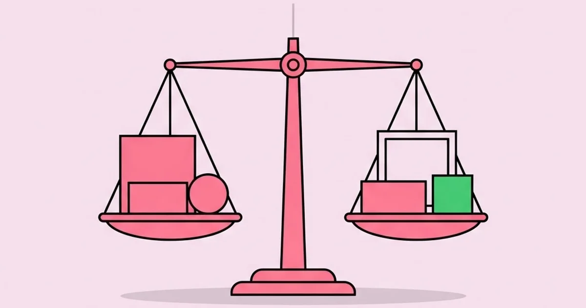
Balance in graphic design is the distribution of visual weight across a composition so that no area pulls the eye unintentionally and the layout feels resolved rather than tilted. It is the principle clients describe without naming it when they say a layout "feels off" but cannot explain why. Weight comes from size, darkness, colour saturation, texture density, isolation, and implied direction, and the designer's job is to arrange those forces deliberately instead of hoping alignment alone will do the work.
Quick Answer: Balance in graphic design means distributing visual weight so a layout feels stable. The main types are symmetrical, asymmetrical, radial, mosaic, and crystallographic. Weight is created by size, value, colour, texture, and isolation, and balance is achieved by arranging those forces around a real or implied axis.
How WebPeak Uses Compositional Balance to Solve Real Layout Problems
Most layout revision cycles are caused by unresolved weight, not by taste, and the design teams at WebPeak fix that structurally rather than by moving elements until something feels acceptable. When a design team receives feedback like "the header feels heavy" or "the page looks empty on the right," the underlying problem is almost always a single dominant element with no counterweight, or a grid that was abandoned halfway down the page.
That diagnostic approach runs through their work in website design, where balance has to hold across three or more breakpoints so a composition that resolves on desktop does not collapse into a top-heavy stack on mobile, and in infographic design, where the tension between data density and readability is entirely a weight-distribution problem. The same reasoning applies in social media and banner work, where a single square frame gives you no room to hide an imbalance. Teams that treat those as structural problems rather than styling problems ship layouts that survive stakeholder review intact.
What Creates Visual Weight in the First Place?
You cannot balance something you cannot measure, so the first skill is learning to read weight. Six properties generate it, and they compound rather than simply adding.
Size is the most obvious: a larger element carries more weight than a smaller one of the same value. Value is often stronger than size — a small block of solid black outweighs a much larger area of pale grey. Saturation behaves similarly, which is why a single saturated accent can hold an entire page against a large neutral mass. Texture and detail density add weight because the eye spends longer decoding them; a dense paragraph of small type is heavier than the same area of empty space even though it looks lighter in a squint test. Isolation amplifies weight: an element surrounded by generous space attracts attention far beyond its size. Implied direction adds weight too, because faces, arrows, and diagonal lines push the eye in a direction and that vector has force.
This is also where the difference between compositional intent in commercial and gallery work becomes practical rather than philosophical: a designer balances a layout to serve a message and a reading order, while an artist may deliberately leave a composition unresolved to create discomfort. If that distinction interests you, it is explored in more depth in our comparison of how fine art and graphic design differ in purpose and process. The practical takeaway for designers is that imbalance is a legitimate tool, but only when it is chosen rather than inherited from carelessness.
A reliable diagnostic: blur the layout heavily or reduce it to a thumbnail. The composition becomes a set of grey masses, and any weight problem becomes immediately visible once the content is unreadable. Most designers can spot in three seconds at thumbnail size what they argued about for an hour at full size.
The Five Types of Balance and When to Use Each
Different balance types produce different emotional readings, and choosing one deliberately is faster than discovering it by accident.
- Symmetrical balance. Elements mirror across a central axis. It reads as formal, stable, traditional, and authoritative, which is why it dominates certificates, luxury packaging, wedding invitations, and institutional identities. Its weakness is that it can feel static and predictable.
- Asymmetrical balance. Unequal elements are arranged so their weights offset — a large pale mass balanced by a small dark one placed further from the axis, following the logic of a lever. This is the workhorse of modern editorial and digital design because it creates energy and clear hierarchy while remaining stable.
- Radial balance. Elements radiate from a central point. It forces attention inward and works for circular badges, pie-based data visuals, and campaign artwork with a single hero subject. It is difficult to sustain across a multi-page system.
- Mosaic balance. Also called crystallographic balance, this distributes weight evenly across the whole field with no single focal point, as in a dense pattern or a wall of equally weighted thumbnails. It reads as texture rather than hierarchy, which is useful for backgrounds and gallery grids and dangerous for anything requiring a reading order.
- Off-balance by intent. Deliberate instability, used to signal disruption, urgency, or movement. It only works when everything else in the composition is controlled, otherwise the audience reads it as a mistake rather than a statement.
Balance Types Compared at a Glance
| Type | Structure | Emotional Reading | Best Applications | Main Risk |
|---|---|---|---|---|
| Symmetrical | Mirrored across a central axis | Formal, stable, trustworthy | Certificates, luxury packaging, institutional identity | Static and forgettable |
| Asymmetrical | Unequal weights offset around an implied axis | Dynamic, modern, confident | Editorial spreads, web layouts, posters | Collapses without a grid underneath |
| Radial | Elements radiate from a centre point | Focused, ceremonial, energetic | Badges, seals, single-subject campaign art | Hard to extend across a system |
| Mosaic | Even distribution with no focal point | Textured, busy, egalitarian | Patterns, backgrounds, gallery grids | No hierarchy, nothing to read first |
| Intentional imbalance | Deliberate weight concentration off-axis | Tense, urgent, disruptive | Protest posters, music and event graphics | Reads as an error if not clearly controlled |
What Experienced Designers Actually Do to Fix Imbalance
There is no published metric that scores balance objectively, and any tool claiming to do so is measuring pixel distribution rather than perceived weight, which is a different thing. What practitioners rely on instead is a repeatable diagnostic sequence, and in practice teams that adopt one tend to cut layout revision rounds significantly because the conversation moves from opinion to structure.
The sequence runs like this. First, identify the single heaviest element and confirm it is the thing you actually want read first; if it is not, the problem is hierarchy, not balance. Second, find the axis — real or implied — and check whether weight is distributed around it or piled on one side. Third, look for an orphaned corner, since most imbalance presents as one quadrant carrying nothing. Fourth, check whether white space is doing work or is simply leftover; active negative space is a counterweight, residual gaps are a symptom. Fifth, test the layout at thumbnail size and upside down, which strips out semantic meaning and exposes pure mass.
The most common structural fix is counterweighting by distance rather than by size. Rather than enlarging a small element to match a large one, move it further from the axis. This preserves hierarchy while equalising force, and it is why so many strong editorial spreads place a tiny caption or folio far from the centre. Historical styles exploited this aggressively — the layered, angled compositions described in our look at the visual language of 1980s design hold together precisely because extreme elements are counterweighted by distance rather than tamed into similarity.
Common Balance Mistakes and How to Correct Them
Mistake 1: Confusing centring with balance. Centring every element produces symmetry, but if one centred element is far heavier than the rest the composition still tips vertically. Balance operates on both axes; vertical weight distribution is the one most often ignored.
Mistake 2: Treating white space as empty. Negative space has weight and shape. When designers fill a gap to "use the space," they usually destroy the counterweight that was holding the composition together. Before adding anything, ask what the space is currently doing.
Mistake 3: Balancing only at one viewport. A desktop layout that resolves beautifully often becomes a top-heavy column on mobile because the counterweighting element has reflowed below the fold. Balance must be evaluated independently at each breakpoint, not inherited.
Mistake 4: Ignoring optical versus mathematical centre. The optical centre sits slightly above the mathematical centre, which is why a mathematically centred element looks low. The same applies to optical alignment of round shapes against flat edges and to type that is mathematically centred in a button but reads as sitting too far down.
Mistake 5: Letting colour override structure. A single saturated element can outweigh everything else on the page. Designers frequently balance shapes in greyscale, then add brand colour and unknowingly destroy the arrangement. Always re-evaluate weight after colour is applied.
Mistake 6: Using symmetry as a safety net. Symmetry is not neutral; it carries a formal, conservative reading. Defaulting to it in a category that rewards energy produces work that is technically balanced and commercially invisible.
Mistake 7: Forgetting that text blocks have texture weight. Two columns of equal dimensions are not equal if one is set in a dense bold face and the other in a light face with generous leading. Match texture, not just area.
A Practical Walkthrough: Balancing a Real Layout
Consider a common brief: a landing page hero containing a headline, a paragraph of support copy, two buttons, and a product image. The default outcome is a left text stack and a right image, which nearly always tips because the image carries more weight than the type.
Step 1: Establish the grid. A twelve-column grid with defined gutters. Every decision that follows references it, which turns subjective nudging into measurable choices.
Step 2: Assign the dominant element. Decide explicitly whether the headline or the image leads. Only one can. If the image leads, the headline must be smaller and closer to the axis; if the headline leads, the image needs cropping or desaturating to reduce its pull.
Step 3: Counterweight by distance. Push the lighter cluster outward toward the margin rather than scaling it up. A small, high-contrast button placed far left can hold a large image on the right.
Step 4: Shape the negative space deliberately. Aim for negative space that forms a clean, intentional shape rather than a set of random slivers. If the gaps have recognisable geometry, the composition usually reads as balanced.
Step 5: Apply colour, then re-test. Add brand colour and immediately return to the thumbnail test. If the accent colour has become the new heaviest element and it is not the intended focal point, reduce its area or move it toward the axis.
Step 6: Test each breakpoint independently. At mobile width the two-column arrangement becomes a stack; decide whether the image sits above or below the copy based on which creates a stable vertical rhythm, and adjust image crop ratio rather than accepting the desktop crop.
Step 7: Validate with distance and inversion. View at twenty-five percent, then flip the artboard horizontally. Weight problems that were invisible while you were reading the words appear instantly when the content becomes abstract shapes.
Running this sequence on a hero section takes roughly fifteen minutes and typically removes one full round of stakeholder revisions, because the resulting layout gives feedback nowhere obvious to land.
Key Takeaways
- Visual weight comes from size, value, saturation, texture density, isolation, and implied direction, and value usually outweighs size.
- Asymmetrical balance is the default for modern editorial and digital layouts because it produces hierarchy and energy while remaining stable.
- Counterweighting by distance preserves hierarchy; counterweighting by enlargement destroys it.
- Negative space is an active compositional force, so filling a gap often removes the very element holding the layout together.
- Balance must be re-evaluated after colour is applied and independently at every breakpoint, because both routinely break an arrangement that worked in greyscale on desktop.
Frequently Asked Questions
What is balance in graphic design in simple terms?
Balance is the even distribution of visual weight in a layout so the composition feels stable rather than tilted. Weight is generated by how much attention an element demands, which depends on its size, darkness, colour, detail, and surrounding space, not just its physical dimensions on the page.
What are the main types of balance?
The standard types are symmetrical, asymmetrical, radial, and mosaic or crystallographic balance, with deliberate imbalance sometimes treated as a fifth category. Symmetrical mirrors across an axis, asymmetrical offsets unequal weights, radial arranges elements around a centre, and mosaic spreads weight evenly with no focal point.
Is asymmetrical balance better than symmetrical?
Neither is superior; they signal different things. Symmetry communicates formality, stability, and tradition, which suits institutional and luxury contexts. Asymmetry communicates energy and modernity and gives you stronger hierarchy. Choose based on the message and category conventions rather than on which feels more sophisticated.
How do I check whether my layout is balanced?
Reduce the design to a thumbnail, apply heavy blur, or flip it horizontally. Each technique strips readable meaning and leaves only masses of tone, which makes weight problems obvious. If one quadrant looks empty or one element dominates unintentionally at that scale, the composition needs restructuring.
Does white space affect balance?
Yes, significantly. Negative space isolates elements and increases their perceived weight, and it functions as a counterweight in its own right. Well-shaped negative space is a deliberate part of the composition; leftover slivers between elements are a symptom of an unresolved layout rather than an aesthetic choice.
How does balance change on mobile layouts?
Multi-column arrangements collapse into a single vertical stack, so horizontal counterweighting disappears entirely and weight distribution becomes a question of vertical rhythm. Elements that balanced each other side by side now follow each other, which commonly produces a top-heavy page unless image crops and type scale are adjusted per breakpoint.
Conclusion
The single most useful shift in thinking about balance is to stop moving elements until something looks right and start identifying which force is unopposed. Once you can name the heaviest element, locate the axis, and decide whether to counterweight by distance, by value, or by negative space, layout becomes a solvable problem rather than a matter of taste, and stakeholder feedback stops being an argument. Make the thumbnail-and-flip test a non-negotiable step before any layout leaves your desk. To build the underlying vocabulary faster, work through the compositional classics listed in our guide to the design books that teach fundamentals properly.


