
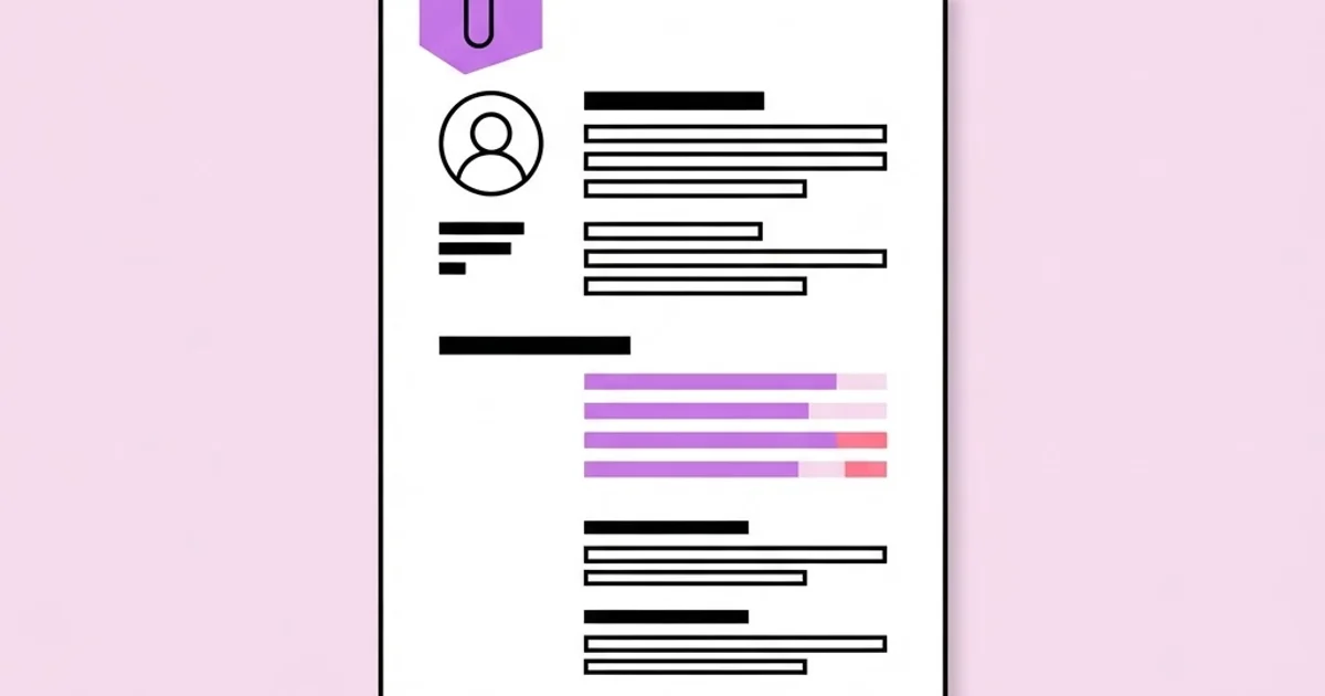
Creative Graphic Designer Resume: Land More Interviews Now
A creative graphic designer resume has to do something contradictory: demonstrate visual judgement while being parsed correctly by software that cannot see design at all. Most designers resolve that tension badly, in one of two directions. Either they build an elaborately art-directed document with columns, icons and infographic skill bars that screening systems mangle into nonsense, or they submit a plain text document that reveals nothing about their eye. The resumes that generate interviews do both jobs at once: structurally simple enough to be read by a machine, typographically controlled enough that a design lead notices the craft in three seconds.
Quick Answer: A strong graphic designer resume uses a single-column layout, standard section headings, real typographic hierarchy instead of decoration, and outcome-focused bullet points. Keep it to one or two pages, place the portfolio link in the header, and tailor the wording to each specific job description.
What Hiring Teams Actually Do With Your Resume
Understanding the review sequence changes how you write the document. In most organisations of any size, an application passes through three filters. First a parsing system extracts text into structured fields, which is where multi-column layouts, text inside images and unusual heading names cause damage. Second a recruiter or hiring coordinator spends a very short time scanning for role fit, tool familiarity, seniority and location. Third, and only if you survive both, a design lead opens your portfolio and reads the resume properly alongside it.
Each filter wants something different. The parser wants clean structure and conventional section names such as Experience, Education and Skills. The recruiter wants immediate confirmation that you match the listing, which is why mirroring the job title and key requirement wording matters. The design lead wants evidence of thinking, ownership and range, which is where your bullet points and portfolio link do the work. Writing for only one of these three is the most common reason strong designers get filtered out early.
This is also why the header matters disproportionately. Your name, target role, location or timezone, email and portfolio URL should all sit in plain text at the top, never inside a graphic. If the portfolio link is unclickable or trapped in an image, you have removed the only element that reliably converts a resume into an interview. That single detail matters as much when searching for local design jobs as it does for competitive national roles, because the reviewer's next action is always the same: click through or move on.
One useful mental model: your resume is not a portfolio, it is the argument for why someone should open your portfolio. Judge every element against that purpose and most of the decoration falls away on its own.
The Structure That Works, Section by Section
This ordering has proved consistently reliable for design roles, and it deliberately front-loads what reviewers look for first.
- Header. Name, target role, location and timezone, email, phone, portfolio URL and professional profile. Plain text, no image, no icons substituting for labels.
- Positioning line. Two sentences maximum stating what kind of designer you are, your focus areas and your strongest proof. Replace generic objective statements entirely; nobody has ever been hired because they were seeking a challenging opportunity.
- Selected work. For designers, place two or three flagship projects above employment history. Each gets a one-line context, your specific role and the outcome. This is the section most designers omit and it is the most persuasive part of the document.
- Experience. Reverse chronological. Company, role, dates, one line of context about the company, then three to five outcome-focused bullets.
- Skills. Grouped into disciplines and tools, written as plain comma-separated text. No star ratings, no percentage bars, no five-out-of-ten dots.
- Education and training. Degree, institution, dates, plus meaningful additional training. Keep it brief once you have professional experience.
- Extras only if relevant. Awards, speaking, published work, open-source or community contributions. Cut anything that does not support the specific application.
Keep the whole thing to one page with under five years of experience and two pages beyond that. A third page is almost always a failure of editing rather than an abundance of achievement.
Weak Phrasing Versus Strong Phrasing
Bullet points are where most designer resumes quietly fail. The pattern to follow is action, context, outcome. The table below shows the transformation applied to typical lines.
| Weak version | Why it fails | Stronger rewrite |
|---|---|---|
| Responsible for social media graphics | Describes duties, not contribution or scale | Produced weekly social template system used by three regional teams, cutting asset turnaround from days to hours |
| Designed company website | No role clarity, no constraint, no result | Led visual design for a twelve-page site rebuild, defining the type scale and component library the dev team built against |
| Proficient in industry-standard software | Vague and unverifiable | Daily production work in vector illustration, layout and prototyping tools, including print-ready file preparation |
| Worked with clients | Passive and generic | Ran discovery and presentation sessions for six small-business identity projects from brief through to final handoff |
| Helped improve brand consistency | Unclear ownership and no mechanism | Built and documented a template library that replaced eleven conflicting deck versions with one maintained source |
Notice that none of the stronger versions rely on invented percentages. Specificity about scope, mechanism and consequence is more convincing than a statistic a reviewer suspects you made up.
What Separates Interviewed Candidates From Rejected Ones
From the pattern of applications that progress, the differentiator is rarely raw talent, because talent is judged in the portfolio, not the resume. It is evidence of ownership. Reviewers are scanning for signals that you have taken something from ambiguous brief to shipped artefact, dealt with feedback, and worked within constraints set by other people. A candidate with modest work who clearly owned it consistently outperforms a candidate with slicker work described in passive, team-anonymous language, because hiring a designer is fundamentally a bet on whether they can be handed a problem and trusted with it.
The second differentiator is relevance. Generic resumes sent unchanged to twenty listings perform poorly against a smaller number of tailored applications. Tailoring does not mean rewriting everything; it means reordering your selected work so the most relevant project appears first, matching the job title language, and adjusting the positioning line. Fifteen minutes per application, applied to ten carefully chosen roles, reliably beats fifty untailored submissions.
Education carries less weight than applicants expect and should be positioned accordingly. Once you have professional projects, the degree line is confirmation rather than argument, which is why it sits near the bottom of the document. It still matters for first roles and for employers with formal graduate schemes, so if you are still deciding between where you studied design and how much that will influence hiring, the honest answer is that it opens some first doors and then rapidly stops being the thing anyone asks about.
Resume Mistakes That Quietly Cost Designers Interviews
Multi-column layouts. They look controlled and they break text extraction, frequently interleaving your job titles with your skills list. If you must use a sidebar, keep it for non-essential information only.
Skill rating graphics. A bar showing you are seventy percent proficient in typography communicates nothing measurable and invites doubt. List skills plainly and let the portfolio demonstrate level.
Text inside images. Any content rendered as a graphic is invisible to parsers and to screen readers. Keep everything as live text.
Dense, uniform blocks. A designer submitting a document with no hierarchy, inconsistent spacing or default line height is being assessed on that document as a design artefact, whether or not that is fair. Set a real type scale and consistent spacing rhythm.
Unlabelled portfolio links. Sending a link to a homepage with forty projects makes the reviewer do your curation. Link directly to the three pieces most relevant to the role, or ensure the first screen shows them.
Listing every tool ever opened. A skills list of twenty-five applications reads as inexperience. Name what you use professionally and group the rest as familiar.
Sending the wrong file format. Submit a PDF unless the listing requests otherwise, keep it under a few megabytes, name the file with your name and the role, and confirm that fonts are embedded so it renders identically everywhere.
Building the Document in One Focused Session
Set aside about three hours and work in this order rather than opening a template and typing.
Step one: inventory before writing. List every project from the last four years in a scratch document with role, constraint, what you personally did and what changed as a result. This raw material is what makes bullet writing fast later.
Step two: choose the three flagship projects that best match the type of role you are targeting. Different targets may need different sets, which is fine; maintain variants.
Step three: write bullets in the action, context, outcome pattern. Draft them long, then cut each to a single line. Length discipline forces precision.
Step four: build the layout last. Single column, one typeface with two or three weights, a clear size hierarchy across name, section headings and body, consistent vertical rhythm and generous margins. Restraint here reads as confidence.
Step five: run the extraction test. Copy the entire PDF text and paste it into a plain text editor. If the order is scrambled or content is missing, the layout is working against you and needs simplifying.
Step six: read it aloud. Passive phrasing, jargon and filler become obvious when spoken. Anything you would not say in an interview should not be on the page.
Step seven: get two reviews. One from a designer for craft, one from someone outside design for clarity. Non-designers catch unexplained jargon that designers read past automatically.
Finally, create a tailoring checklist for each application: match the job title, reorder selected work, adjust the positioning line, and confirm the portfolio link points somewhere relevant. Four small edits, fifteen minutes, substantially better outcomes.
Key Takeaways
- A designer resume exists to make someone open the portfolio, so every element should be judged against that single purpose.
- Single-column layouts with conventional headings survive automated parsing while still allowing genuine typographic craft.
- Outcome-focused bullets using action, context and result outperform duty descriptions without requiring invented statistics.
- Evidence of ownership from brief to shipped work is the strongest signal reviewers look for, ahead of visual polish in the document.
- Tailoring a small number of applications reliably beats sending an identical resume to a large number of listings.
Frequently Asked Questions
Should a graphic designer resume be visually creative?
It should demonstrate typographic craft through hierarchy, spacing and restraint rather than decoration. Heavy art direction risks breaking automated parsing and can read as compensating for weak work. Reserve expressive creativity for the portfolio, where it is assessed properly, and keep the resume disciplined and highly legible.
How long should a designer resume be?
One page for under roughly five years of experience and two pages beyond that. Length should reflect relevant substance, not tenure. If a second page contains only early-career roles or coursework, cut it. Reviewers spend very little time on the first pass, so density of value matters more than completeness.
Do I include a photo on a graphic designer resume?
In most English-speaking markets, no. Photos add no professional information, consume valuable layout space and introduce bias concerns that some employers actively screen against. Norms differ by country, so check local convention, but when in doubt omit it and use the space for work evidence.
Should the portfolio link go on the resume or in the email?
Both, and prominently. Place it as live text in the resume header and repeat it in the application message. Link to a curated selection relevant to the role rather than a general homepage, and verify the link works without a password or expired sharing permission.
How do I write a resume with no professional design experience?
Treat self-initiated, volunteer, coursework and freelance projects as real experience, described with the same action, context and outcome structure. Include constraints you set yourself and what you learned. Three substantial self-directed projects presented seriously outperform a resume that simply apologises for having no employment history.
Should I use a resume template?
Templates are acceptable as structural starting points but rarely survive unmodified, because most prioritise decoration over parsing safety. Rebuild the layout in a single column with your own type scale. A designer submitting an obviously unmodified template also signals a missed opportunity to show judgement.
Conclusion
The decision that changes outcomes fastest is to stop treating your resume as a design piece and start treating it as an argument with a specific audience sequence: parser, recruiter, design lead. Once you write for all three deliberately, the layout questions answer themselves and the document gets simpler, clearer and considerably more effective. Craft still shows, but through control rather than ornament.
Your next step is the extraction test described above, because it takes five minutes and frequently reveals that a resume you are proud of is being read as scrambled fragments. Fix the structure first, then tailor a small batch of applications properly rather than mass-sending. If you are widening your search beyond your own city, adapt the same document for remote entry-level applications, where clear written communication and a self-explanatory portfolio carry even more weight.


