Y2K Graphic Design: The Aesthetic Explained for Designers
Most contemporary Y2K design is a costume rather than a style, which is why so much of it looks the same and ages within a season. Y2K graphic design refers to the visual language of roughly 1997 to 2004, defined by chrome and metallic surfaces, translucency, bubble forms, technological optimism, and an obsession with the digital future that was arriving in real time. Recreating it convincingly requires understanding what produced it, not just which effects to apply.
Quick Answer: Y2K graphic design is the late-1990s to early-2000s aesthetic built on chrome gradients, translucent plastic surfaces, bubble and blob shapes, glossy bevelled type, and futuristic technological motifs. It emerged from new consumer product design, early 3D software, and millennium optimism, and it is currently revived heavily in fashion, music, and digital branding.
What Defines the Y2K Visual Language
The style has a recognisable vocabulary, and each element has a technological or cultural origin worth knowing, because the origins explain which combinations read as authentic and which read as pastiche.
Chrome and liquid metal are the signature surfaces. Highly reflective, blue-grey, with sharp specular highlights and warped reflections. These came directly from the capabilities of 3D rendering software becoming accessible to designers, where a reflective material was both impressive and computationally demonstrable. Chrome in this era signalled advanced technology because it was technically difficult to produce.
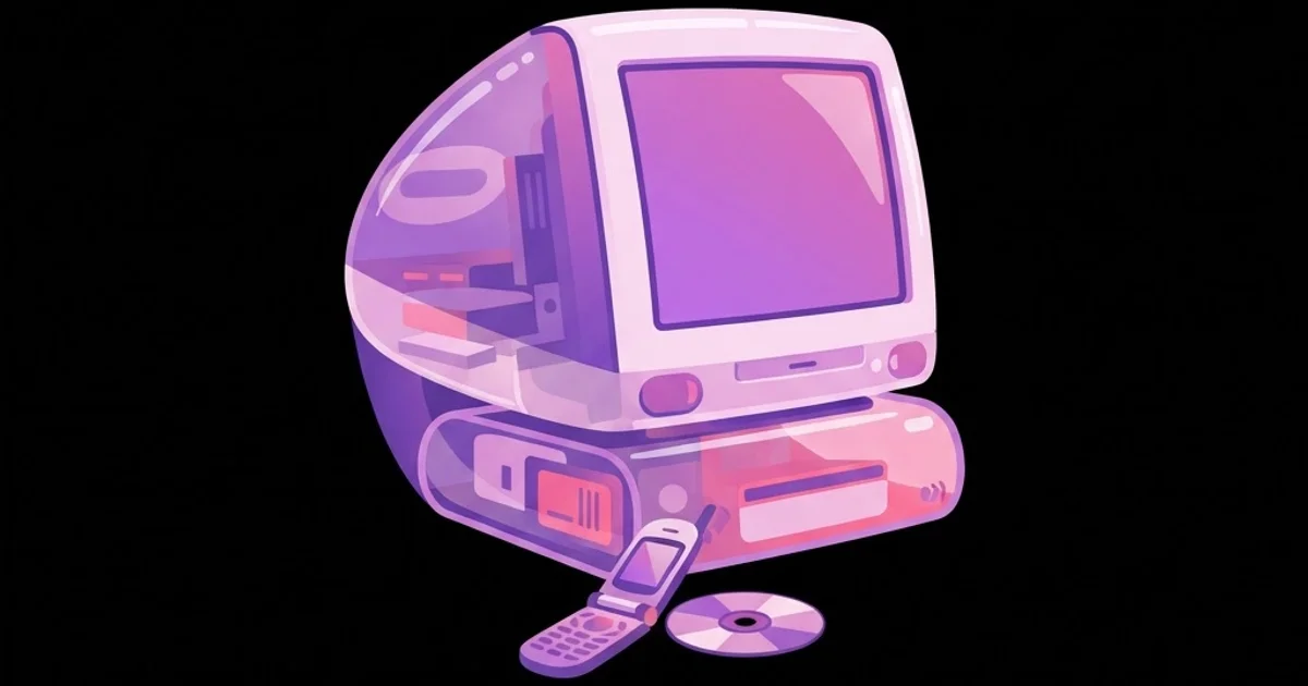
Translucency and frosted plastic came from industrial design, most famously from consumer electronics that revealed their internal components through coloured transparent shells. Graphic design absorbed it immediately: layered semi-transparent panels, coloured glass effects, and interfaces that mimicked physical translucent objects.
Bubble and blob geometry replaced the angular severity of early-1990s grunge. Rounded rectangles, capsule forms, organic droplet shapes, and soft-cornered interface elements dominated. The underlying message was approachability: technology presenting itself as friendly rather than industrial.
Glossy bevelled typography combined extended or squarish sans-serifs with bevels, drop shadows, gradients, and reflections. Type was treated as a manufactured object with surface properties rather than as flat marks on a page.
Technological and cosmic motifs completed the set: starbursts, lens flares, grid planes receding into space, circuit patterns, wireframes, and interface fragments used decoratively. The palette leaned to silver, icy blue, acid green, hot pink, and purple, frequently on black or white. Getting these gradients and metallic ramps to render correctly requires judging subtle tonal transitions, which is precisely where an accurate display matters, as explained in this guide to monitors for colour-critical design, because banding and crushed highlights destroy a chrome effect faster than any compositional error.
Building a Credible Y2K Design System
Authenticity comes from committing to the logic of the era rather than sprinkling effects onto a modern layout. Work through these decisions in order.
- Pick a sub-era. 1997 to 1999 skews toward techno-futurism, wireframes, and millennium anxiety. 2000 to 2002 is peak glossy optimism, translucent plastic, and bubble forms. 2003 to 2004 drifts toward early social web and softer pop. Mixing all three produces mush.
- Choose one dominant surface treatment. Chrome, frosted translucency, or glossy plastic. One should lead; the others may appear in supporting roles. Applying all three equally is the most common tell of an inauthentic pastiche.
- Set a tight palette. Silver and icy blue with one acid accent, or black with hot pink and purple. Y2K palettes were bold but not unlimited, and restraint is what keeps the result legible.
- Select period-appropriate type. Extended and squarish sans-serifs, technical grotesques, and occasional italic speed forms. Avoid contemporary geometric sans faces, which instantly read as current rather than period.
- Add dimensional treatment deliberately. Bevels, inner glows, and reflections were construction techniques, not garnish. Apply them consistently to a defined set of roles rather than to whichever element feels empty.
- Use motion and interface fragments as decoration. Progress bars, cursors, window chrome, and loading indicators appear as ornament. This is authentic to the period, when interfaces were novel enough to be aspirational.
- Resolve legibility last but without compromise. Period work frequently sacrificed readability. Contemporary work cannot, so keep body copy clean and confine maximalism to display elements.
Y2K Elements and How to Use Them Today
This table separates what transfers well to modern work from what should be used sparingly or avoided entirely.
| Element | Period Origin | Modern Use | Caution |
|---|---|---|---|
| Chrome gradients | Early accessible 3D rendering software | Display type, logos, hero graphics | Banding on flat gradients; poor small-size legibility |
| Translucent panels | Transparent consumer electronics casings | Cards, overlays, layered compositions | Contrast failures over busy backgrounds |
| Bubble and blob shapes | Friendly product and interface design | Buttons, containers, decorative masses | Reads as generic if not paired with period type |
| Bevelled glossy type | Filter-based type treatment of the era | Titles, logotypes, posters | Never use for body copy or interface labels |
| Starbursts and lens flares | Optimistic millennium futurism | Accent moments, transitions | Quickly becomes visual noise when repeated |
| Wireframe grids | Early 3D and cyberspace imagery | Backgrounds, spatial depth cues | Competes with foreground if contrast is too high |
Why Y2K Returned, and What That Means for Designers
Revival cycles are not random, and understanding the mechanics helps you use a revived style intelligently rather than riding it until it collapses. Two forces are visible in the current Y2K resurgence.
The first is generational. Styles tend to return once the cohort that experienced them as children reaches cultural production age, at which point the aesthetic carries nostalgia for its participants and novelty for everyone younger. Y2K is being revived largely by people who remember it as an environment rather than as a professional practice, which is why current interpretations emphasise surface and mood over the structural conventions of the original work.
The second is technological contrast. Y2K optimism is the exact emotional opposite of the flat, minimal, systematised design language that dominated the 2010s. After a decade of restraint, a maximalist style that celebrates surface, shine, and excess becomes genuinely refreshing. This is the same oscillation that has driven revivals repeatedly, and it is visible if you compare how the ornamental confidence of one decade tends to be answered by the rationalist discipline of the next, a pattern that runs right back through the mid-century modern era and its design conventions.
The practical consequence for working designers is about timing and depth. A trend in its early phase rewards commitment because it signals cultural awareness. In its late phase it becomes a liability, because the same treatments now date the work precisely. The way to extend the useful life of a revived style is to adopt its structural ideas rather than its surface effects. Y2K's structural ideas are worth taking seriously: confident scale contrast, willingness to treat type as an object, layered depth, and a rejection of timid neutrality. Those survive long after chrome stops being fashionable.
There is also an honest limitation to acknowledge. Original Y2K work was produced under constraints we no longer share: low screen resolutions, limited colour depth in some contexts, slow bandwidth, and immature typesetting tools. Some of what reads as charming period character was simply technical compromise. Reproducing those compromises faithfully at high resolution can look wrong, because the imperfection loses its context.
Y2K Mistakes That Give the Game Away
Applying chrome to everything. In period work, chrome was expensive to produce and therefore reserved for focal elements. Blanket application flattens hierarchy and immediately signals a filter rather than a design decision.
Pairing period effects with contemporary typefaces. Nothing breaks the illusion faster than a modern geometric sans wearing a bevel. Typeface selection carries more period information than any effect, so resolve type first and effects second.
Ignoring accessibility. Translucent panels over busy backgrounds, low-contrast metallic text, and glowing type routinely fail contrast requirements. Keep the maximalism in display layers and hold body text, labels, and interactive states to modern contrast standards.
Treating Y2K as one uniform style. The visual language shifted noticeably across seven years. Mixing 1998 cyber-anxiety with 2003 pop-web optimism produces something that belongs to no moment and convinces nobody familiar with the period.
Forgetting the physical context. Much Y2K design lived on CD packaging, magazine spreads, club flyers, and low-resolution screens. Reproducing screen-native effects at print scale, or vice versa, without adaptation produces artefacts that look like mistakes rather than references.
Using it for the wrong brief. Y2K signals playfulness, nostalgia, and consumer energy. Applied to contexts requiring trust and seriousness, such as healthcare or financial services, it undermines credibility regardless of execution quality.
Executing a Y2K Project: A Worked Example
Take a realistic brief: visual identity and launch campaign for a music streaming feature targeting listeners in their twenties, delivered across app UI, social, and event collateral. Here is how to execute the style without producing a costume.
Define the reference window precisely. Choose 2000 to 2002, peak glossy optimism. Gather reference from actual period artefacts rather than from contemporary Y2K-inspired work, because copying a copy compounds distortion. Music packaging, consumer electronics, and software interfaces of the era are the strongest primary sources.
Build the system, not the poster. Specify the surface treatment hierarchy: chrome for the logotype and major display moments only, translucency for cards and overlays, flat solid colour for everything functional. Write this as a rule so it survives production pressure.
Separate expressive and functional layers. The expressive layer carries the period language: hero type, key art, transitions, event graphics. The functional layer, meaning navigation, body copy, forms, and states, uses a clean contemporary type stack with period-appropriate colour. This is how you keep the identity distinctive and the product usable.
Test the chrome at production sizes. Metallic gradients that look convincing at hero scale collapse into grey mush at small sizes and band badly under compression. Produce a simplified secondary version of the logotype for small applications, exactly as period studios did.
Design the motion to match. Y2K motion character means bouncy easing, elastic overshoot, and mechanical transitions with visible loading metaphors. Define easing curves and durations as system tokens, since inconsistent motion undermines the identity as surely as inconsistent colour would. If motion sits outside your team's capability, scope it properly as part of the engagement rather than as an afterthought, as covered in this overview of motion graphics service scoping.
Plan for the exit. Trend-led identities need a graceful downgrade path. Document which elements are the durable core, typically the logotype structure, the palette, and the type pairing, and which are seasonal surface treatments that can be retired without rebuilding the brand.
Key Takeaways
- Y2K design is defined by chrome surfaces, translucency, bubble geometry, bevelled glossy type, and technological motifs drawn from real product and software developments of the era.
- The style shifted meaningfully between 1997 and 2004, so choosing a specific sub-era produces far more convincing work than blending the whole period.
- Chrome and other expensive effects were reserved for focal elements in period work, which is why blanket application reads immediately as pastiche.
- Separating an expressive period layer from a clean functional layer keeps Y2K identities distinctive while meeting modern legibility and accessibility standards.
- Adopting the structural ideas of Y2K, such as bold scale contrast and treating type as a dimensional object, outlasts adopting its surface effects.
Frequently Asked Questions
What years does Y2K design cover?
Roughly 1997 to 2004, with peak expression around 2000 to 2002. Earlier work leans toward techno-futurism and millennium anxiety, while later work softens into early social web pop. Specifying a narrow window within that range produces more convincing results than treating it as one period.
What fonts suit Y2K graphic design?
Extended and squarish sans-serifs, technical grotesques, and italic speed-styled faces suit the era best. Typeface choice carries more period signal than any effect, so avoid contemporary geometric sans faces, which read as modern even when heavily treated with bevels and gradients.
Is Y2K design still in trend?
It remains visible across fashion, music, and consumer digital branding, though it has moved past its earliest adoption phase. Designers should weight it toward expressive layers with a documented exit path rather than embedding it into durable brand infrastructure that must last years.
How do I make chrome text look authentic?
Build a multi-stop gradient with a hard horizon between cool and warm tones, add a sharp specular highlight, and keep reflections irregular rather than symmetrical. Test at final output size, since metallic gradients lose readability and develop banding at small scales.
What is the difference between Y2K and vaporwave?
Y2K is an authentic period style from around 1997 to 2004 built on optimistic futurism. Vaporwave is a later internet-born aesthetic that remixes 1980s and 1990s corporate and consumer imagery with irony and melancholy. They share references but carry opposite emotional tones.
Can Y2K design work for serious brands?
Rarely as a primary language. It signals playfulness, nostalgia, and consumer energy, which conflicts with sectors that depend on conveying trust and stability. It can work in a limited campaign layer for such brands, provided the core identity remains consistent and credible.
How do I keep Y2K designs accessible?
Restrict metallic, translucent, and glowing treatments to display elements, and hold body copy, labels, and interactive states to standard contrast requirements. Test translucent panels against the busiest background they will ever sit on, not the cleanest one used in presentations.
Conclusion
The decision that separates convincing Y2K work from costume is whether you commit to the period's logic or merely to its effects, because the original designers were solving problems with new tools rather than decorating with nostalgia. Choose a narrow window, pick one dominant surface treatment, reserve expensive effects for focal moments, and keep the functional layer clean. Your next step is to build a reference collection from genuine period artefacts rather than from current revivals, since copying a copy is what produces the generic version of any style. For a longer view of how revivals feed each other and what survives them, study the structural discipline that underpins durable work by examining the principles of unity that hold any composition together, regardless of which decade it is quoting.