What is Responsive Design and Why Every Website Needs It
Learn what responsive design is, how it works, and why every modern website needs it to deliver a great experience on every device and screen.
What is Responsive Design and Why Every Website Needs It
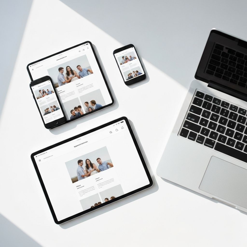
The way people browse the internet has changed dramatically. More than 60 percent of all global web traffic now comes from mobile devices, and that number keeps climbing. People shop, read, work, and connect across phones, tablets, laptops, foldables, and even smart TVs. A website that looks great on a desktop but breaks on a phone is no longer acceptable, it is a business liability. Responsive design solves this challenge by making websites adapt fluidly to any screen size, automatically adjusting layouts, images, and interactions for the device in hand. It is not a trend, it is the modern standard, and it sits at the heart of every successful digital experience today.
How WebPeak Builds Truly Responsive Websites
Building a responsive website that genuinely works on every device requires expertise, testing, and thoughtful design. WebPeak creates fully responsive sites through their website design and development services, ensuring flawless performance from a 320-pixel phone to a 4K monitor. Their team designs mobile-first, tests across dozens of devices, and optimizes performance so your visitors enjoy smooth experiences whether they are on the go or at their desk. Responsive design is built into every project from day one, never bolted on at the end.
How Responsive Design Actually Works
Responsive design relies on three core technical concepts: fluid grids, flexible images, and media queries. Fluid grids size elements in percentages rather than fixed pixels, so layouts stretch and shrink naturally. Flexible images scale within their containers using max-width settings to never overflow or break the layout. Media queries are CSS rules that apply different styles based on screen properties like width, height, and orientation, allowing you to design specific experiences for phones, tablets, and desktops. Together, these techniques create a single website that delivers an optimized experience to every visitor without requiring separate mobile versions or apps.
Why Responsive Design Boosts SEO and Conversions
Google has used mobile-first indexing since 2019, meaning the mobile version of your website is what Google primarily ranks. A non-responsive site loses rankings instantly, regardless of desktop quality. Beyond SEO, responsive design dramatically improves conversions. Studies show that mobile users abandon sites that take more than three seconds to load or that require pinching and zooming to read. A smooth responsive experience reduces bounce rates, increases time on site, and boosts conversions across forms, signups, and purchases. Combining great responsive design with strategic SEO creates a powerful flywheel that drives traffic and turns visitors into customers efficiently.
Common Responsive Design Mistakes to Avoid
Even experienced teams make mistakes when building responsive sites. Tiny tap targets are a top issue, buttons should be at least 44 by 44 pixels for thumbs to hit comfortably. Tiny fonts force users to zoom, hurting both UX and SEO. Hidden content on mobile, like menus or important calls-to-action, alienates a majority of your visitors. Heavy images that load slowly on mobile networks crush conversion rates. Forgetting to test in real browsers and devices leads to broken layouts in production. Avoid using fixed pixel values, never assume desktop-first thinking, and always test on actual devices, not just browser emulators which often miss real-world quirks.
The Mobile-First Philosophy in 2025
The smartest teams now design mobile-first, starting with the smallest screen and progressively enhancing for larger ones. This approach forces clarity, every element must justify its space, and prioritizes content and core actions above all else. Mobile-first sites tend to be faster, simpler, and more focused, which translates to better experiences across every device. With foldable phones, smartwatches, and connected devices entering the mix, designing for flexibility is more important than ever. The future of web design is not about specific devices, it is about creating adaptable experiences that look and feel right wherever users encounter them, no matter the screen.
Frequently Asked Questions
What is the difference between responsive and adaptive design?
Responsive design uses fluid layouts that adjust continuously to any screen size. Adaptive design uses fixed layouts at specific breakpoints, swapping between predefined versions. Responsive is more flexible and future-proof, while adaptive can offer more control but requires more maintenance.
Does responsive design affect SEO rankings?
Yes, significantly. Google uses mobile-first indexing, meaning the mobile version of your site determines your ranking. A non-responsive site loses positions, while a fast, well-optimized responsive site has a clear ranking advantage in search results.
Is responsive design more expensive than building separate mobile sites?
Initially, responsive design may cost slightly more than a desktop-only site, but it is far cheaper than maintaining separate mobile and desktop versions. Long-term, it saves money on updates, content management, and SEO since you have only one codebase.
How do I test if my website is responsive?
Use browser developer tools to simulate different screen sizes, then test on real devices like iPhones, Android phones, and tablets. Tools like Google's Mobile-Friendly Test and BrowserStack help verify your site works across hundreds of devices and browser combinations.
Can I make an old website responsive without rebuilding it?
Yes, but the effort depends on the original codebase. Sometimes adding media queries and refactoring CSS works, but heavily fixed layouts often need significant rework. In many cases, a fresh redesign delivers better results than patching an old structure.
Conclusion
Responsive design is not optional in 2025, it is the foundation of every successful website. By making your site adapt smoothly to every device, you welcome more visitors, rank higher on Google, increase conversions, and future-proof your business against constantly evolving technology. Start mobile-first, test on real devices, optimize for performance, and avoid common mistakes that frustrate users. Whether you are launching a new site or updating an old one, prioritizing responsive design pays dividends across every metric that matters. Your visitors should never have to fight your website to use it, no matter what device they hold in their hands.
Related articles
 Web Development
How to Choose Social Media Share Buttons for Your Website
Learn how to choose social media share buttons that boost shares without slowing your site, with placement, performance, and platform selection best practices.
 Web Development
Community Development Council News
Community Development Council News provides insights into development projects, funding programs, urban planning strategies, and community growth initiatives.
 Web Development
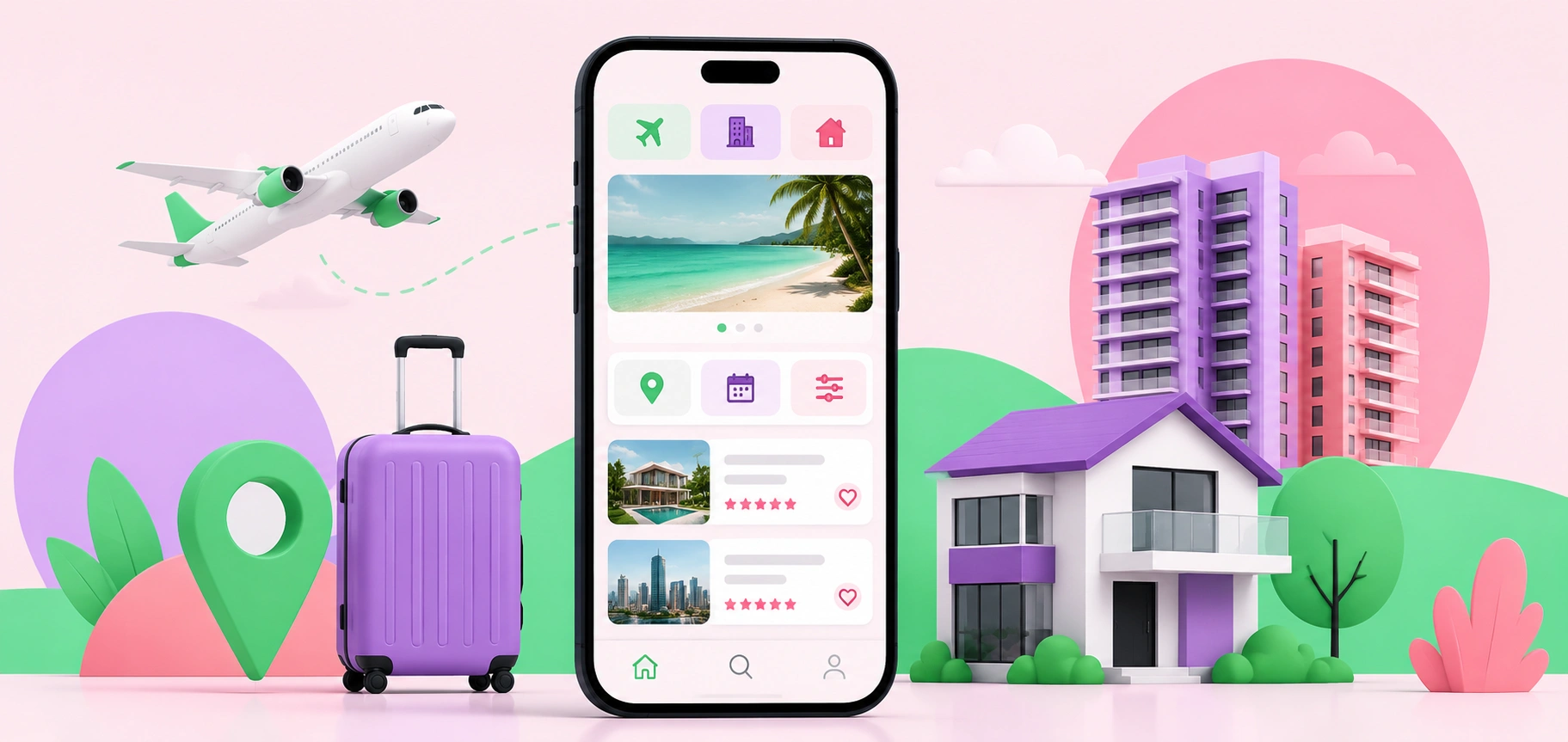
Why Mobile-First Design Is Critical for Travel and Property Searches
Mobile-first design helps travel and property websites deliver faster, smoother, and more user-friendly experiences that drive bookings and inquiries.