Responsive Web App Development
Responsive web app development ensures your apps adapt to any device, enhancing user experience, SEO rankings, and overall business success.
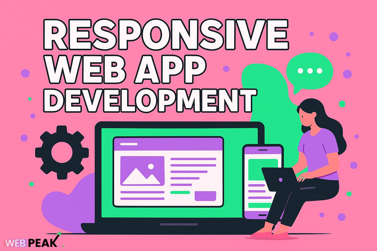
Responsive Web App Development: Deliver Seamless Experience Across Devices
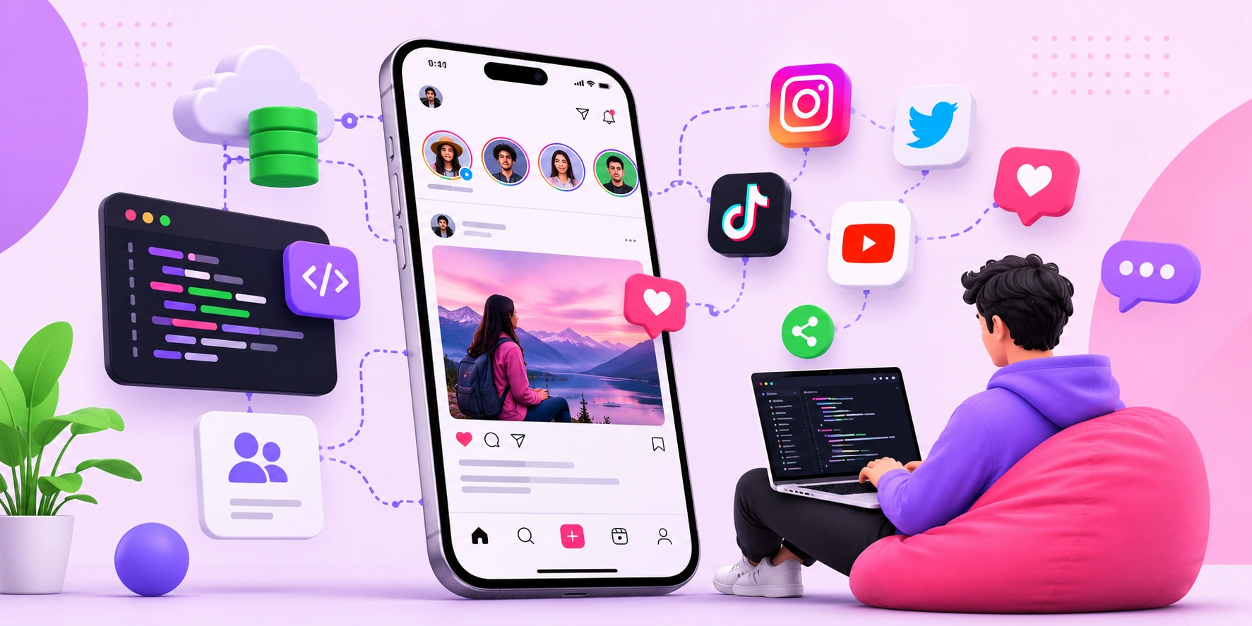
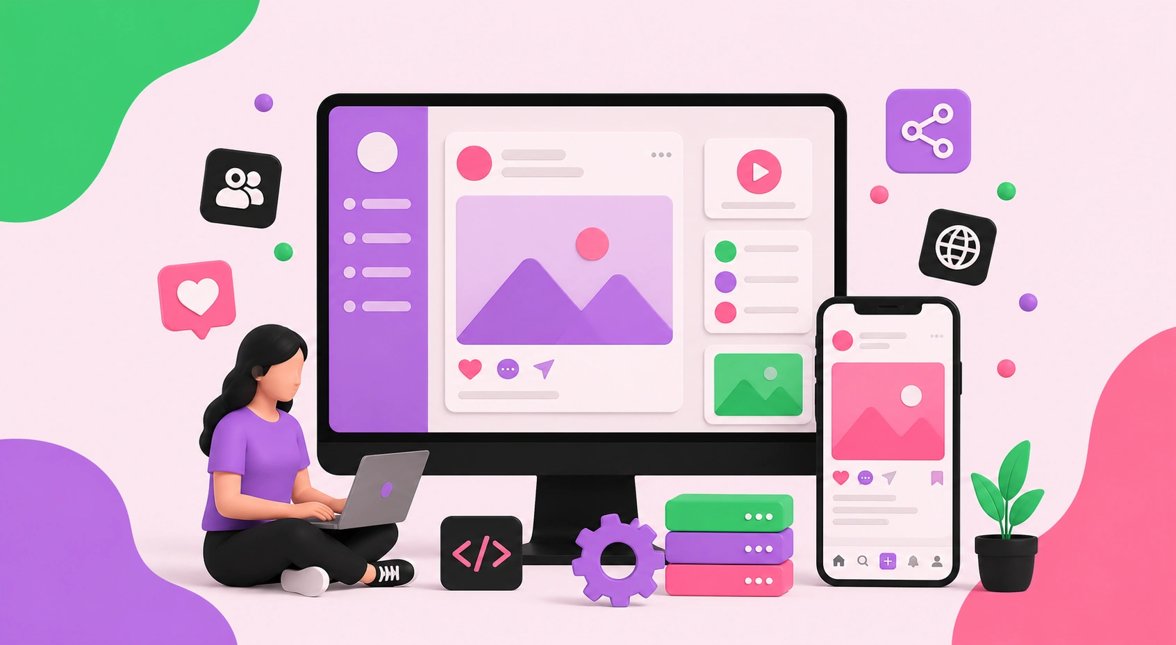
In today’s digital-first world, people use a wide range of devices—from smartphones and tablets to laptops and desktop computers—to access websites and applications. For businesses, this creates both a challenge and an opportunity: how do you ensure your web app delivers a consistent, intuitive, and engaging experience no matter the device or screen size? The answer lies in responsive web app development. This approach ensures your digital product adapts seamlessly to the user’s device, providing optimal usability, performance, and satisfaction.
What Is Responsive Web App Development?
Responsive web app development is the process of creating web applications that automatically adjust their layout, design, and functionality to fit the device being used. Unlike fixed layouts, responsive apps employ flexible grids, fluid images, and adaptive code that enables the interface to resize and reposition elements dynamically. Whether someone is browsing on a 27-inch desktop monitor or a 5-inch mobile screen, the experience remains smooth and coherent.
Why Responsive Design Matters in Modern Business
The way people interact with digital content has shifted dramatically. Mobile devices account for more than half of all global web traffic, and this number continues to rise. Businesses that fail to optimize for mobile risk alienating large portions of their audience. On the other hand, organizations that prioritize responsiveness gain:
- Improved User Experience: A seamless interface across devices reduces frustration and encourages longer engagement.
- Higher Conversion Rates: Users who can easily navigate and interact with a web app are more likely to complete purchases or take desired actions.
- Enhanced SEO Performance: Search engines like Google prioritize mobile-friendly websites, boosting visibility and rankings.
- Future-Proofing: As new devices and screen sizes emerge, responsive apps ensure ongoing compatibility.
Key Principles of Responsive Web App Development
To build responsive applications that delight users, developers follow several foundational principles:
1. Flexible Grids and Layouts
Using proportional units like percentages instead of fixed pixel values allows layouts to expand or shrink smoothly. This ensures that content remains accessible and well-structured across different devices.
2. Fluid Images and Media
Responsive apps employ fluid images and scalable media elements that resize proportionally. This prevents oversized visuals on small screens and ensures high-quality display on large monitors.
3. Media Queries
CSS media queries detect the user’s screen size and apply styles accordingly. This powerful feature allows developers to tailor layouts for mobile, tablet, and desktop experiences without duplicating code.
4. Mobile-First Approach
Starting design and development with mobile devices in mind ensures the core functionality works on smaller screens. Enhancements for larger displays can then be added progressively, creating a scalable and efficient workflow.
5. Performance Optimization
Responsive apps must not only look good but also load quickly. Techniques such as image compression, lazy loading, and efficient coding practices are crucial for keeping performance high across all devices.
Benefits of Responsive Web App Development for Businesses
Adopting responsive design principles is not just about aesthetics—it’s about business impact. Here are the tangible benefits:
- Increased Audience Reach: By supporting all devices, businesses can engage with more users and expand their customer base.
- Cost-Effective Development: Maintaining a single responsive web app is more efficient and affordable than developing separate versions for different platforms.
- Consistent Branding: A unified look and feel across devices builds trust and strengthens brand identity.
- Better Analytics and Tracking: Having a single application simplifies tracking, reporting, and measuring success.
Responsive Web App Development Trends
As technology evolves, responsive web app development continues to advance. Current trends shaping the industry include:
- Progressive Web Apps (PWAs): PWAs combine the best of web and mobile apps, offering offline functionality, push notifications, and app-like experiences while remaining responsive.
- Advanced Frameworks: Frameworks like React, Angular, and Vue streamline responsive design implementation with reusable components and efficient state management.
- Adaptive Design Techniques: Beyond responsiveness, adaptive design ensures highly tailored experiences for specific devices and screen resolutions.
- Voice and Gesture Integration: As new input methods gain popularity, responsive apps are being built to accommodate more than just clicks and taps.
Challenges in Responsive Web App Development
While responsive design offers significant benefits, it comes with challenges. Developers must address issues like cross-browser compatibility, varying internet speeds, and device-specific limitations. Careful testing and ongoing optimization are essential to overcome these hurdles.
Partnering with Experts for Success
Building a responsive web application requires technical expertise, creative design thinking, and deep understanding of user behavior. Many businesses struggle to balance these demands in-house, making it essential to partner with a trusted development agency. That’s where WEBPEAK comes in. WEBPEAK is a full-service digital marketing company that offers web development, digital marketing, and SEO services. By working with a team of professionals, you gain access to customized strategies, cutting-edge tools, and proven practices that ensure your web app delivers maximum impact.
Conclusion
Responsive web app development is no longer optional—it’s a necessity for businesses that want to thrive in the modern digital ecosystem. By creating seamless experiences across devices, companies can enhance user satisfaction, boost conversions, and maintain a competitive edge. From flexible layouts and fluid media to performance optimization and future-proof design, responsiveness is at the heart of successful web applications. With the right approach and expert support from agencies like WEBPEAK, your business can deliver digital experiences that captivate users and drive growth for years to come.