
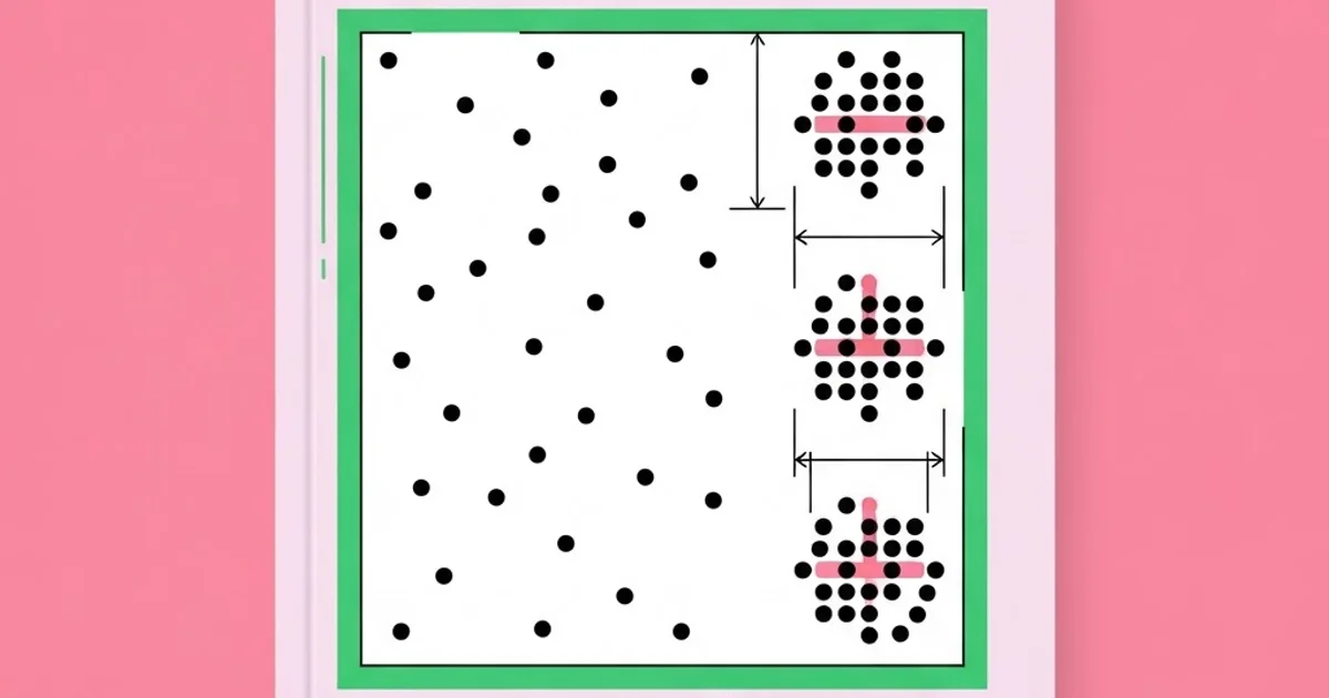
Proximity in Graphic Design: The Grouping Rule Explained
If a layout feels cluttered, confusing, or subtly wrong and you cannot say why, the cause is almost always proximity. Not color, not typeface choice, not the grid — spacing. Proximity in graphic design is the principle that elements positioned close together are perceived as related, and elements separated by space are perceived as belonging to different groups. It is the cheapest and most powerful organizing tool available, and it is the one most designers apply by feel rather than by rule.
Quick Answer: Proximity is the Gestalt principle stating that objects placed near each other are perceived as a single group. In design, it organizes information without lines, boxes, or color. The rule is simple: space within a group must always be visibly smaller than the space separating it from other groups.
Where Proximity Comes From and What It Actually Governs
Proximity is one of the Gestalt principles, a set of observations from early twentieth-century psychology describing how human perception organizes visual input into wholes rather than parts. The related principles matter because they interact: similarity groups things that look alike, continuity follows implied lines, closure completes incomplete shapes, common region groups things inside a shared boundary, and figure-ground separates subject from background. Proximity usually overpowers the others. Two elements far apart but identically colored will read as less related than two dissimilar elements placed adjacent.
That dominance is why proximity is the first thing to fix and the last thing to override. If your caption sits equidistant between two photographs, no amount of styling will make it clearly belong to one of them. If your form label floats between two input fields, users will attach it to the wrong one regardless of font weight. Perception resolves ambiguity by distance first.
The operative rule is relational, not absolute. There is no correct number of pixels or millimeters. What matters is the ratio between internal spacing and external spacing. A group is only a group if the space inside it is clearly smaller than the space around it, and "clearly" means a noticeable difference — a comfortable working guideline is that separating space should be at least double the internal space, so the distinction survives at a glance rather than requiring measurement.
This is also why spacing should be systematized rather than improvised. A spacing scale — a defined set of values you draw from rather than arbitrary numbers typed per element — makes proximity relationships consistent across an entire project. Editorial designers arrived at this conclusion long before interface designers did, which is why the column gutters and alleys described in traditional newspaper layout are fixed values applied across every page rather than adjusted story by story.
How to Apply Proximity Deliberately
- Identify the actual information groups first. Before adjusting anything visually, write out which pieces of content belong together logically. A poster's date and venue are one group; the headline is another; the ticket link and price are a third. Spacing should express this structure, not a visual instinct.
- Set the internal spacing tight. Within a group, reduce space until the elements read as a single unit. Most designers stop too early here, leaving groups that are loosely rather than definitively bound.
- Double or more the space between groups. The gap separating groups should be obviously larger than any gap inside them. If the difference is ten percent, the viewer sees one continuous list rather than three sections.
- Use space before you use lines. Dividers, boxes, and background fills are heavier solutions to a problem spacing usually solves. Add them only when spacing alone cannot create enough separation, such as in extremely dense tables.
- Bind labels to their content. A heading belongs to the text below it, so the space above a heading must be larger than the space below it. This single adjustment fixes more layouts than any other, and it is violated constantly by default styles.
- Align groups as units. Once a group is established, move and align it as a whole. Aligning individual elements across group boundaries breaks the grouping you just created.
- Verify with the squint test. Squint at the layout until detail blurs. You should see distinct clusters of gray matching your intended structure. If you see one uniform mass or the wrong number of clusters, the spacing is wrong.
Proximity Problems and Their Fixes
| Symptom | Underlying Cause | Correct Fix | Common Wrong Fix |
|---|---|---|---|
| Layout feels cluttered despite few elements | Uniform spacing everywhere, so nothing groups | Vary spacing to create distinct clusters | Removing content or shrinking type |
| Heading looks detached from its paragraph | Equal space above and below the heading | Increase space above, reduce space below | Making the heading larger or bolder |
| Form fields are mislabeled by users | Label sits equidistant between two fields | Tighten label to its own field, widen field gaps | Adding colons, colors, or bold to labels |
| Page needs many divider lines to make sense | Insufficient spacing contrast between sections | Increase section gaps and remove the lines | Adding more rules, boxes, and background fills |
What Fixing Hundreds of Layouts Reveals About Spacing
I am not going to cite fabricated research percentages. What I can report from repeatedly diagnosing layouts is a consistent finding: when a designer says a composition feels "off" but cannot identify why, adjusting spacing relationships resolves it far more often than changing type, color, or imagery. The reason is that spacing errors are perceptual rather than aesthetic — they create a mismatch between the structure the viewer perceives and the structure the content actually has, and that mismatch registers as unease before it registers as a specific complaint.
The second consistent finding is that the most common single error in professional work is the heading gap. Default styles in most tools apply similar margins above and below a heading, which perceptually binds the heading to the content above it as strongly as to the content below. Since a heading introduces what follows, that default is backwards. Correcting it across a document — roughly doubling the space above headings relative to below — produces an immediate improvement in scannability that readers notice without knowing what changed.
The third finding concerns over-decoration as compensation. Designers who have not resolved grouping through space reach for lines, boxes, alternating background colors, and card containers. Each of these does create separation, but they add visual weight, and a layout where everything is contained in a box loses the ability to signal that anything is special. The discipline of solving structure with space first, and only then adding containment where genuinely needed, produces cleaner and more flexible work. This is exactly the restraint that characterizes the systems thinking of the field's most influential practitioners, whose grid-based work relies on interval rather than ornament.
Mistakes Designers Make With Proximity
Spacing by eye at the wrong zoom level is the first. Working at seventy percent zoom, or at a screen size different from the final output, distorts your perception of intervals. Set your spacing decisions at the actual viewing size, and for print, at physical scale on paper.
Applying uniform spacing everywhere is the second, and it is often mistaken for tidiness. A layout with identical gaps between every element is technically consistent and communicatively useless, because uniformity means no group is distinguished from any other. Consistency should apply to the spacing scale, not to the intervals themselves.
Letting the grid override the content structure is the third. A rigid grid can place unrelated items into visual adjacency simply because the cells lined up that way. The grid exists to serve content relationships; when the two conflict, adjust the grid or the placement, not the meaning.
Confusing proximity with alignment is the fourth. Two items can be perfectly aligned and still read as unrelated if the distance between them is large, and two misaligned items sitting close together will read as a group. Alignment creates order; proximity creates meaning. You need both, and they solve different problems.
Ignoring proximity in responsive contexts is the fifth. Spacing relationships that read correctly on a wide screen collapse when a layout reflows to a single column, where horizontal separation becomes vertical stacking and groups can merge. Check the grouping at every breakpoint, not only the design width.
Finally, treating whitespace as wasted space. The instinct to fill empty areas, often reinforced by stakeholders asking to "use the space," destroys grouping. Space is not absence; it is the mechanism by which the layout communicates structure. Removing it does not add information, it removes organization.
Applying Proximity to a Real Layout
Take a typical event page or poster containing a title, subtitle, date, time, venue, address, ticket price, a short description, a call to action, and three sponsor logos. Eleven elements. Laid out with even spacing, a viewer must read every line to understand the structure, which means most will read none of it.
Start by grouping logically. Group one: title and subtitle. Group two: date and time. Group three: venue and address. Group four: description. Group five: price and call to action. Group six: sponsors. Six groups instead of eleven items, which is already a substantial reduction in perceived complexity before a single pixel moves.
Next, set internal spacing. Within each group, tighten the interval to the smallest comfortable value on your spacing scale. The title and subtitle should sit close enough to read as one statement. The venue name and address should touch closely enough that no one wonders whether the address belongs to a different venue.
Then set the group separation to at least double that internal value, and consider a larger interval between the major zones — the identity block, the practical details, and the action. Notice that you can now see the structure in a blurred thumbnail, which is the outcome you want.
Now review related principles in support. Similarity can reinforce the grouping: setting date and venue in the same style strengthens their relationship as "practical information" even though they are separate groups. Alignment should be applied within and across groups on a shared axis, so the layout has order as well as meaning. Only if separation is still ambiguous — typically in dense tabular data or a multi-column sidebar — should you add a hairline rule or a background region.
Finally, test. Squint. Reduce to thumbnail. Print it and look from three meters. Show it to someone for five seconds and ask them to tell you when and where the event is; if they cannot answer immediately, the practical group is not separated clearly enough. This is the same three-second evaluation that governs large-format poster effectiveness, and proximity is usually the variable that decides whether it passes.
Key Takeaways
- Proximity determines perceived relationships more powerfully than color, size, or similarity, so fix spacing before anything else.
- The rule is relational: space inside a group must be clearly smaller, ideally by at least half, than the space separating groups.
- The heading gap error — equal space above and below a heading — is the most common and most fixable spacing fault in professional work.
- Solve grouping with space before reaching for lines, boxes, or background fills, which add weight and reduce flexibility.
- The squint test and the thumbnail test reveal grouping failures instantly and require no tools or measurement.
Frequently Asked Questions
What is proximity in graphic design?
Proximity is the Gestalt principle that elements placed near one another are perceived as belonging to the same group, while separated elements are perceived as distinct. Designers use it to organize information through spacing alone, without adding lines, containers, or color coding.
How much space should separate groups in a layout?
There is no fixed measurement; the relationship is what matters. Space between groups should be noticeably larger than space within them, with roughly double as a practical working minimum. Use a defined spacing scale so these ratios stay consistent across the project.
What is the difference between proximity and alignment?
Proximity communicates which elements belong together through distance, while alignment creates visual order by placing elements on shared axes. Items can be aligned yet unrelated, or unaligned yet clearly grouped. Strong layouts use both for different purposes rather than confusing them.
Why does my design look cluttered even with few elements?
Usually because spacing is uniform, so the viewer perceives one undifferentiated mass instead of several clear groups. Clutter is a structure problem more often than a quantity problem. Vary your intervals to create distinct clusters before removing any content.
Does proximity apply to web and app interfaces?
Yes, and it is arguably more critical there because interfaces are dense and interactive. Form labels, button groups, navigation items, and card content all depend on spacing to communicate relationships, and grouping must be verified at every responsive breakpoint.
Should I use dividing lines or spacing to separate sections?
Start with spacing, because it separates without adding visual weight and keeps layouts flexible. Add rules or containers only when space alone cannot create sufficient distinction, such as in dense data tables or where content must be scanned across long horizontal distances.
Conclusion
The most important realization about proximity is that spacing is not decoration or polish applied at the end — it is the primary means by which a layout communicates its structure before anyone reads a word. Get the intervals right and hierarchy, scannability, and calm follow almost automatically. Get them wrong and no amount of typographic refinement will rescue the composition. Your next step: open your current project, list the logical groups your content actually has, then adjust spacing so those groups are visible in a blurred thumbnail. If the project is print or large format, verify it with the distance test described in this guide to poster composition.


