Newspaper Graphic Design: Layout Rules That Still Work
Newspapers solved a design problem most digital products are still struggling with: presenting forty competing pieces of information on one surface so that a reader can find what matters in under three seconds, in bad light, while holding the thing with one hand. Newspaper graphic design is the discipline of organizing editorial content — headlines, body text, images, captions, and advertising — within a fixed grid under severe production constraints. The constraints are what made it rigorous, and the rigor is why it still transfers directly to dashboards, landing pages, and print collateral today.
Quick Answer: Newspaper graphic design organizes editorial content on a fixed column grid using clear typographic hierarchy, modular story blocks, and disciplined white space. Core rules include a dominant lead element per page, consistent column widths, narrow measures for readability, and strict alignment so the reader's eye moves in a predictable path.
The Vocabulary and Structure of a Newspaper Page
Every newspaper page is built on a column grid, traditionally six columns for a broadsheet and five for a tabloid format. Columns are not decorative divisions; they exist because a line of text becomes hard to read past roughly seventy to eighty characters, and because advertising is sold in column widths. That commercial reality produced an unusually honest design system: the grid served the reader and the business simultaneously.
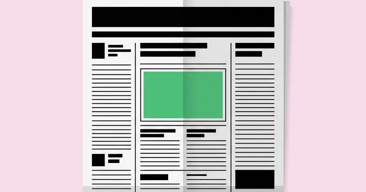
The terms are worth knowing precisely. The masthead is the publication's nameplate at the top of the front page. The folio is the running line carrying page number, date, and section. Above the fold means the top half of the page, visible when the paper sits folded on a newsstand — which is exactly where the digital phrase came from. A deck is the secondary headline under the main one. A kicker sits above a headline to categorize the story. A pull quote is an extracted line set large to break up gray text. Gutters are the spaces between columns, alleys the horizontal equivalents. Jump lines tell the reader where a story continues. Measure is line length, and leading is the vertical space between baselines.
The structural principle underneath all of it is modularity. A well-designed newspaper page is composed of rectangular story blocks that tile cleanly rather than interlocking in complex dogleg shapes. Modular layout came into dominance because it is faster to produce, easier to reflow when a story is cut, and dramatically easier to read — the reader never has to hunt for where a column continues. That same reasoning underpins every modern card-based interface, and it is the clearest example of how physical constraints produced principles that outlived their medium. Designers coming from screen work will recognize it immediately as the discipline behind grouping related elements through spatial relationships, applied at full-page scale under deadline pressure.
The Layout Rules That Transfer to Any Medium
- Establish one dominant element per page. A page with three equally weighted headlines has no entry point, and the reader's eye stalls. Pick the lead story, give it decisive size advantage in headline or image, and subordinate everything else clearly.
- Use a consistent column grid and honor it. Every element should align to column edges. The visual calm of a well-set page comes almost entirely from alignment discipline, not from decoration.
- Keep the measure narrow. Aim for roughly forty-five to seventy-five characters per line for body text. Longer lines cause the eye to lose its place on the return sweep, which is why dense text is always set in columns rather than full width.
- Build hierarchy with three to four type sizes maximum. Headline, deck, body, caption. Every additional size weakens the distinction between the others. Vary weight and case before adding new sizes.
- Make white space structural, not leftover. Consistent gutters and alleys separate stories more effectively than rules and boxes do. When every module is boxed, the boxes stop meaning anything.
- Anchor the page corners. Strong elements at the top-left and a resolved bottom-right prevent the layout from feeling like it is sliding off the page.
- Caption every image. Captions are among the most-read text on any page. An uncaptioned photograph wastes the reader's most reliable attention.
- Design for the worst reproduction case. Newsprint absorbs ink, dot gain thickens type, and contrast drops. Anything that survives that will look excellent everywhere else.
Newspaper Elements and Their Modern Equivalents
| Newspaper Element | Function on the Page | Design Rule | Modern Equivalent |
|---|---|---|---|
| Masthead | Identifies the publication and anchors the front page | Largest type on the page, consistent every issue | Site header and brand lockup |
| Lead story block | Directs first attention and sets page priority | One clear dominant element, no competitors | Hero section or featured card |
| Deck and kicker | Add context and category before the reader commits | Smaller than headline, distinct weight or case | Subheading and category tag |
| Pull quote | Breaks long text and rewards scanning | Set large, aligned to grid, never mid-sentence | Callout block or highlighted statistic |
What Production Constraints Taught Editorial Designers
Rather than cite invented figures, consider what the physical process enforced. Newsprint is absorbent, low-contrast paper printed at high speed on web presses, which means ink spreads slightly and fine details close up. That single fact dictated much of newspaper typography: serif text faces with sturdy, relatively thick hairlines and open counters were chosen because delicate high-contrast typefaces disintegrate under dot gain. Type sizes stayed above a practical floor because smaller text filled in. Reverse type — white on black — was used sparingly because ink spread chokes the letterforms.
Deadline enforced the second set of lessons. A page had to be built, corrected, and sent in a fixed window every single day, which made reusable templates and named styles mandatory rather than optional. Editorial designers were among the first practitioners to work fully in styles and master pages because there was no time to format anything manually. That habit is the direct ancestor of component libraries and design tokens, and designers who adopt it still produce work faster and more consistently than those who style elements individually.
The third lesson is about attention economics. A front page competed with other papers on a rack, so it had to communicate its most important story at several meters and then reward closer reading with layered detail. That two-distance design thinking — legible at a glance, rich on approach — is exactly the problem that poster design solves with scale and contrast, and it is the reason editorial and poster designers have always borrowed from each other. Any interface with a scannable list and a detail view is solving the same problem with different tools.
Common Mistakes in Editorial Layout
The first is competing dominance. Two large headlines of similar weight on one page create a visual tie, and the reader resolves ties by disengaging. Decide what leads, then make the decision unmistakable through size, position, and surrounding space.
The second is over-ruling the page. Adding a hairline between every module is a reflex when a layout feels loose, but the actual problem is usually inconsistent spacing. Fix the gutters first; if the separation still reads ambiguously, then add rules selectively. A page where everything is divided is a page where nothing is grouped.
The third is ignoring the measure. Setting body text across a wide column because the space happened to be there produces lines the eye cannot track. Either add a column, increase the type size proportionally, or restructure — but never let convenience set the measure.
The fourth is trapped white space. Awkward pockets of emptiness inside a layout, surrounded on all sides by content, read as mistakes rather than as breathing room. White space should connect to the page margins or form a deliberate, repeated interval. The distinction between intentional and accidental space is one of the fastest ways to judge a layout's craft.
The fifth is neglecting the jump. Continuing a story on a later page without a clear, consistent jump line and a matching continuation header loses readers permanently. The digital equivalent is the pagination or "read more" pattern that breaks context, and it fails for identical reasons.
The sixth is treating captions and folios as afterthoughts. Small type carries enormous functional weight: captions are read more than body copy, and folios are how a reader navigates. Design them deliberately, set them consistently, and never let them be the leftover styling decision made at the end of the process.
Building an Editorial Layout From Scratch
Begin with the format and the margins, not the content. Decide the trim size, then set margins that account for how the piece is physically handled — a wider gutter margin if it is bound, a generous foot margin because thumbs sit there. Then define the column grid: five or six columns for a broadsheet feel, three or four for a newsletter or magazine-style piece. Add a baseline grid so that text in adjacent columns aligns horizontally, which is the single change that most reliably makes an amateur layout look professional.
Next, build the type system before laying out a single story. Choose a text face that performs at small sizes and a display face that can carry headlines, and confirm they share enough structural logic to coexist. Define the styles: headline, deck, kicker, body, body first paragraph, caption, pull quote, byline, folio. Set the body size and leading first and derive everything else from it, so the scale is proportional rather than arbitrary.
Then block the page in gray before adding real content. Sketch rectangles for each story and image at their intended proportions and evaluate the composition purely as shapes. If the page reads clearly as gray blocks — one dominant, clear secondary, calm alignment — it will read clearly with content. If it does not, no amount of beautiful typography will rescue it.
Place content and edit to fit. Editorial design is a negotiation: headlines get rewritten to fit the column, photographs get cropped to the module, and stories get trimmed. Designers who refuse to request edits produce cramped pages, and editors who refuse to grant them produce ugly ones. The negotiation is the craft.
Finish with production discipline. Check that every image has adequate resolution at final printed size, that color is converted to the correct output profile, that total ink coverage is within the printer's limit for the stock, and that type is either outlined or properly packaged. Print a full-size proof and read it at arm's length, then at two meters. Errors that are invisible on a screen become obvious on paper, which is also why color-critical checks belong on a properly calibrated display rather than a laptop; if you approve print work regularly, the setup considerations for an accurate design monitor are part of this workflow rather than separate from it.
Key Takeaways
- One dominant element per page is the rule that makes every other hierarchy decision legible to a reader.
- Modular rectangular story blocks are faster to produce, easier to revise, and substantially easier to read than interlocking layouts.
- Keeping the measure between roughly forty-five and seventy-five characters is the most reliable readability control available.
- Consistent gutters separate content more effectively than rules and boxes, which lose meaning when applied everywhere.
- Designing for the worst reproduction conditions produces work that performs well in every better condition.
Frequently Asked Questions
What grid is used in newspaper design?
Broadsheets traditionally use a six-column grid and tabloids commonly use five, with a baseline grid ensuring text aligns across columns. The column count balances readable line length against advertising sales units, which is why these structures remained stable across decades of production.
Why do newspapers use serif fonts for body text?
Sturdy serif text faces were selected because ink spread on absorbent newsprint closes up delicate strokes and fine counters. Serifs with moderate contrast and open apertures survive that reproduction and remain legible at small sizes under poor lighting conditions.
What does above the fold mean in design?
It refers to the upper half of a folded broadsheet, the portion visible on a newsstand, and therefore the space reserved for the most important story and image. The digital usage describing content visible before scrolling borrows the concept directly.
Do newspaper layout principles apply to web design?
Yes, directly. Column grids, dominant hero elements, restrained type scales, modular content blocks, and consistent spacing all transfer. Newspapers were solving dense information hierarchy at scale long before screens existed, and their solutions remain among the most tested available.
How many typefaces should a newspaper layout use?
Two is typical: one text face for body copy and one display family for headlines, each with several weights. Additional families multiply inconsistency risk without adding hierarchy that weight, size, and case variations cannot already provide more cleanly.
What is modular layout and why does it matter?
Modular layout arranges stories into clean rectangles rather than irregular interlocking shapes. It matters because readers never lose the thread of a column, editors can cut or expand stories without rebuilding the page, and production under deadline becomes dramatically more reliable.
Conclusion
The insight worth carrying out of newspaper design is that hierarchy is a decision, not an effect. Every strong editorial page begins with someone deciding what matters most and then using size, position, and space to make that decision impossible to misread. Constraints did not limit this discipline; they forced it to be clear. Your next step: take any layout you are currently working on, reduce it to gray blocks, and check whether a stranger could identify the single most important element in two seconds. If they could not, fix the dominance before touching anything else, then tighten the grouping using the spacing logic explained in the proximity principle.