
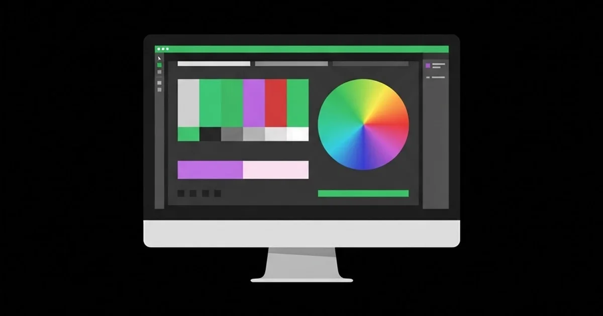
Best IPS Monitor for Graphic Design: A Buyer's Guide
The monitor is the only tool in a design studio that silently changes the meaning of every decision you make. Pick the wrong one and you will spend years nudging colors that were never wrong, approving print files that come back muddy, and arguing with clients about a brand red that looks correct on your desk and wrong everywhere else. An IPS monitor for graphic design is a display built on in-plane switching LCD technology, chosen because it holds color and brightness consistently across wide viewing angles — the one property that makes color judgment repeatable.
Quick Answer: An IPS monitor is the standard choice for graphic design because in-plane switching keeps color accurate across viewing angles. For design work, prioritize a 27-inch or larger panel at 2560x1440 or higher, full sRGB coverage, at least 95 percent DCI-P3 or Adobe RGB if you print, 10-bit color, and hardware calibration support.
What IPS Means and Why Designers Standardized On It
IPS refers to how the liquid crystals are aligned and switched inside the panel. In older TN panels the crystals twist perpendicular to the screen surface, which makes light output shift dramatically as your head moves — the classic effect where the top of the screen looks washed out and the bottom looks dark. IPS aligns the crystals parallel to the glass, so the light path stays consistent whether you are looking dead-on or from thirty degrees off axis. VA panels sit in between: deeper blacks and higher contrast, but noticeable gamma shift off-center that makes subtle tonal work unreliable.
That off-axis stability is not a luxury feature. Designers do not sit motionless. You lean back to judge a layout, you lean in to check kerning, you turn the screen so a colleague can see it. On a TN or a strongly shifting VA panel, every one of those movements changes the image you are evaluating. On IPS, it does not. That single property is why IPS became the default in design, photo, and print environments, and why OLED — which is genuinely superior in contrast — still competes rather than replaces, given burn-in risk with static toolbars and panels.
The vocabulary you need before shopping is small but strict. Gamut is the range of colors a panel can physically display, expressed as coverage percentages of sRGB, Adobe RGB, or DCI-P3. Bit depth is how many steps exist between colors: 8-bit gives 256 levels per channel, 10-bit gives 1024, and the difference shows up as smooth versus banded gradients. Delta E measures the difference between a requested color and the displayed color, where values under two are generally considered imperceptible to the eye. Uniformity describes whether the center and the corners show the same brightness and color, which cheap panels frequently do not. Hardware calibration means the correction is written into the monitor's own lookup table rather than applied by the operating system, which preserves tonal steps instead of discarding them.
One more decision precedes the spec sheet: what you actually produce. A designer working exclusively on screen deliverables needs different coverage than one preparing packaging for offset print. This is the same triage logic that separates web-first from print-first workflows generally, and it maps closely to the craft distinctions covered in print layout fundamentals for editorial work, where paper, ink limits, and viewing conditions dictate the target rather than the screen does.
The Specifications That Actually Change Your Work
Manufacturer spec sheets list forty numbers, of which roughly eight matter. In priority order:
- Panel size and resolution together. Judge pixel density, not inches. A 27-inch panel at 2560x1440 gives about 109 pixels per inch, which is comfortable and sharp. A 27-inch at 4K gives roughly 163 PPI and looks superb but requires interface scaling. A 32-inch at 1440p drops to about 93 PPI and shows visible pixel structure at normal viewing distance. Density determines whether you can trust what a hairline rule or a 6-point caption really looks like.
- sRGB coverage first, wide gamut second. Full, accurate sRGB coverage is non-negotiable because it is the baseline for web, UI, and most client deliverables. Wide gamut matters only if your pipeline is color-managed end to end; on an uncalibrated wide-gamut display, ordinary sRGB images render oversaturated, which is worse than a plain accurate sRGB panel.
- Adobe RGB versus DCI-P3. Adobe RGB extends into cyan and green, which maps better to CMYK print gamuts. DCI-P3 extends into reds and is the standard for digital video and modern device displays. Print-heavy studios want Adobe RGB coverage; screen and motion work wants P3.
- 10-bit color support. Needed for smooth gradients, subtle skin tones, and large flat fields of color. Check whether it is true 10-bit or 8-bit plus frame rate control, and confirm your GPU and cable can carry it at your intended resolution and refresh rate.
- Factory calibration report and hardware LUT. A printed per-unit report with measured Delta E values means the manufacturer tested that exact panel. Hardware calibration support means you can re-profile it accurately as it ages, which every backlight does.
- Uniformity compensation. Professional panels include circuitry to even out brightness across the screen. It costs a little peak brightness and is worth it if you judge large flat color areas or lay out multi-panel spreads.
- Connectivity and power delivery. USB-C with enough wattage to charge a laptop while carrying video removes two cables from your desk. Verify DisplayPort version if you want 4K at higher refresh with 10-bit color.
- Matte versus glossy coating. Matte is standard and controls reflections but slightly lowers perceived contrast and can add a faint sparkle on some panels. Glossy renders blacks better and is only usable in a controlled-light room.
Comparing Monitor Tiers for Design Work
| Tier | Typical Spec Profile | Best Suited For | Main Limitation |
|---|---|---|---|
| Entry IPS | 24-27 inch, 1920x1080 to 2560x1440, 8-bit, near-full sRGB | Students, social and web graphics, layout drafting | No wide gamut, software-only calibration, weaker uniformity |
| Prosumer IPS | 27 inch, 2560x1440 or 4K, 8-bit+FRC, 95%+ DCI-P3, USB-C | Freelancers doing mixed digital and light print work | Factory calibration is generic rather than per-unit |
| Professional IPS | 27-32 inch, 4K, true 10-bit, 99% Adobe RGB, hardware LUT | Print, packaging, retouching, brand color approval | High cost and requires a colorimeter to stay accurate |
| Reference IPS | 31-32 inch, 4K or higher, uniformity compensation, built-in sensor | Studio color approval and pre-press sign-off | Overspecified for most independent designers |
Calibration Is the Variable That Beats Hardware
Here is the practitioner observation that saves people the most money: a calibrated mid-tier IPS panel produces more dependable output than an uncalibrated professional one. Color accuracy is not a property you buy once. Backlights drift as they age, ambient light in your room changes through the day and across seasons, and every operating system update can reset or reinterpret your display profile. Without measurement, you are guessing — confidently, but still guessing.
A hardware colorimeter is the fix, and the workflow is straightforward. Set the monitor's brightness to a level appropriate to your room rather than to maximum; a dim, controlled room needs far less brightness than an office with windows, and most designers work far brighter than they should. Choose a white point target consistent with your output environment, profile the display with the colorimeter, and repeat monthly. Write the date in a note, because you will not remember.
Two environmental factors matter as much as the device. First, ambient light: judging color next to a window on a partly cloudy day means your reference changes every few minutes. Neutral gray walls, consistent artificial lighting, and a monitor hood produce more accuracy improvement per dollar than upgrading panels. Second, the surrounding desktop: a saturated wallpaper or a bright interface theme behind an image measurably changes how you perceive its color, which is why most color-critical applications default to gray interfaces.
Soft proofing closes the loop for print. Rather than trusting that your screen equals paper, apply the output profile your printer supplies and preview the conversion, paying attention to out-of-gamut warnings on saturated brand colors. The vivid green that glows on a P3 panel may be unreachable in CMYK on uncoated stock, and discovering that at proof stage rather than on press is the difference between an adjustment and a reprint. Designers who sell work on visual impact — for example anyone building large-format poster campaigns — should soft proof before they commit to a palette, not after.
Mistakes Buyers Make and What To Do Instead
Buying on refresh rate is the most common error. A 165Hz gaming IPS is a fine general-purpose screen, but high refresh contributes nothing to still design work, and the marketing budget spent on speed is usually subtracted from color accuracy and uniformity. Buy for gamut, bit depth, and calibration support; treat refresh rate as a tiebreaker only.
Buying a wide-gamut panel without color management is the most expensive error. If your applications and operating system are not correctly handling profiles, everything sRGB will render with exaggerated saturation, and you will design to compensate for a distortion that only exists on your desk. Either commit to a managed workflow with calibration, or buy an accurate sRGB panel and be genuinely accurate within that space.
Chasing size over density is the third. A 32-inch 1440p panel looks generous in a photo and coarse in practice. If you want a larger canvas, step to 4K so that type rendering and fine rules stay trustworthy at normal distance.
Trusting factory presets is the fourth. Most monitors ship in a vivid or standard mode tuned for retail floors, with brightness near maximum and contrast pushed. Switch to the sRGB or calibrated preset on day one, then lower brightness to match your room before you do any color-sensitive work.
Ignoring the second-monitor mismatch is the fifth. Running a good IPS panel next to an older secondary screen means you will inevitably drag a window across and see two different versions of the same file. Designate one screen as the reference display and keep all color judgment there, using the second strictly for tools, references, and communication.
Finally, neglecting ergonomics. A panel that cannot be raised to eye level or tilted out of window glare will cost you more in neck strain and squinting than it returns in gamut coverage. Check stand adjustability and VESA compatibility before purchase.
A Buying and Setup Walkthrough
Start by writing down your actual output mix for the past six months: what percentage was web and UI, what percentage was social and video, what percentage went to print. If print is under twenty percent, a high-quality sRGB or P3 panel with solid calibration support serves you better than paying a premium for Adobe RGB you rarely reach. If print exceeds half your work, Adobe RGB coverage and a hardware LUT become genuinely necessary rather than aspirational.
Next, set the physical constraints. Measure your desk depth: a 32-inch panel needs roughly eighty centimeters of viewing distance to be comfortable, and a shallow desk makes it a neck-turning exercise instead of an upgrade. Check your machine's display output capability for the resolution, bit depth, and number of panels you intend to run, and buy certified cables rather than whatever came in the box.
On arrival, run a structured check during the return window. Display a full white field and look for tinted corners or clouding. Display a full black field in a dark room and check for backlight bleed along the edges. Display mid-gray and look for dirty-screen effect and uneven patches. Run a dead-pixel test across red, green, blue, white, and black. Then display a smooth gradient and look for banding. Any serious failure here is a return, not a tolerance to live with.
Then calibrate: set your target brightness for the room, profile with a colorimeter, save the profile, and confirm the operating system is applying it. Re-check after the next system update, because profiles get silently dropped. Finally, build a validation habit — keep one reference file containing your brand colors, a neutral gray ramp, a skin tone, and a fine-type specimen, and open it after every calibration. If it looks different from last month, something changed, and you want to know which thing before a client does. The same discipline of setting a reference and checking against it repeatedly is what separates consistent studios from inconsistent ones, and it is the habit shared by nearly every designer profiled among the field's most influential practitioners.
Key Takeaways
- IPS is the design standard because color and brightness stay consistent off-axis, making repeated visual judgment reliable.
- Pixel density, not screen size, determines whether fine type and hairline rules can be trusted on screen.
- Full accurate sRGB beats partially managed wide gamut; only buy Adobe RGB or P3 coverage if your workflow is color managed.
- A calibrated mid-tier panel outperforms an uncalibrated professional one, because accuracy is maintained rather than purchased.
- Ambient lighting, neutral surroundings, and a monthly calibration habit deliver more accuracy per dollar than a hardware upgrade.
Frequently Asked Questions
Is IPS really better than OLED for graphic design?
OLED offers superior contrast and per-pixel blacks, but static interface elements create burn-in risk over years of design work, and brightness behavior varies with content. IPS remains the safer long-term choice for a primary work display, while OLED suits motion and video review environments better.
Do I need a 4K monitor for graphic design?
Not strictly. A 27-inch 1440p panel is sharp enough for layout and brand work at normal distance. Choose 4K when you work with fine typography, detailed retouching, or want a 32-inch canvas, and confirm your machine can drive it at full bit depth first.
What is a good Delta E value for a design monitor?
An average Delta E under two is generally treated as visually imperceptible for most colors, and under one is excellent. Look for per-unit factory reports rather than marketing claims, and remember measured accuracy drifts over time without recalibration.
Can I use one monitor for both design and gaming?
Yes, if you choose a color-accurate IPS with a high refresh rate and use separate display presets. Keep a calibrated sRGB preset for design work and a vivid preset for games, and never do color approval while the vivid mode is active.
How often should I calibrate my design monitor?
Monthly is a sensible baseline for professional work, and quarterly is acceptable for casual use. Recalibrate immediately after moving your desk, changing room lighting, updating your operating system, or noticing that a familiar brand color looks unfamiliar.
Does monitor coating affect color accuracy?
Coating affects perceived contrast and reflection handling more than measured accuracy. Heavy matte coatings can introduce a subtle grain that makes fine type look less crisp, while glossy panels show truer blacks but demand controlled lighting to avoid reflections dominating the image.
Conclusion
The decision that matters is not which panel to buy but whether you will maintain it. An accurate, calibrated, well-lit mid-tier IPS display gives you dependable color for years; an expensive uncalibrated one gives you confident mistakes. Match the gamut to your real output mix, prioritize density and calibration support over refresh rate and marketing features, and control the light in the room around it. Your next step: measure your current display with a borrowed or rented colorimeter before spending anything, because the results will tell you whether you need a new monitor or simply a correct profile. If your output leans heavily toward print, pair that measurement with the layout and reproduction discipline described in editorial print design practice so your screen and your press agree.


